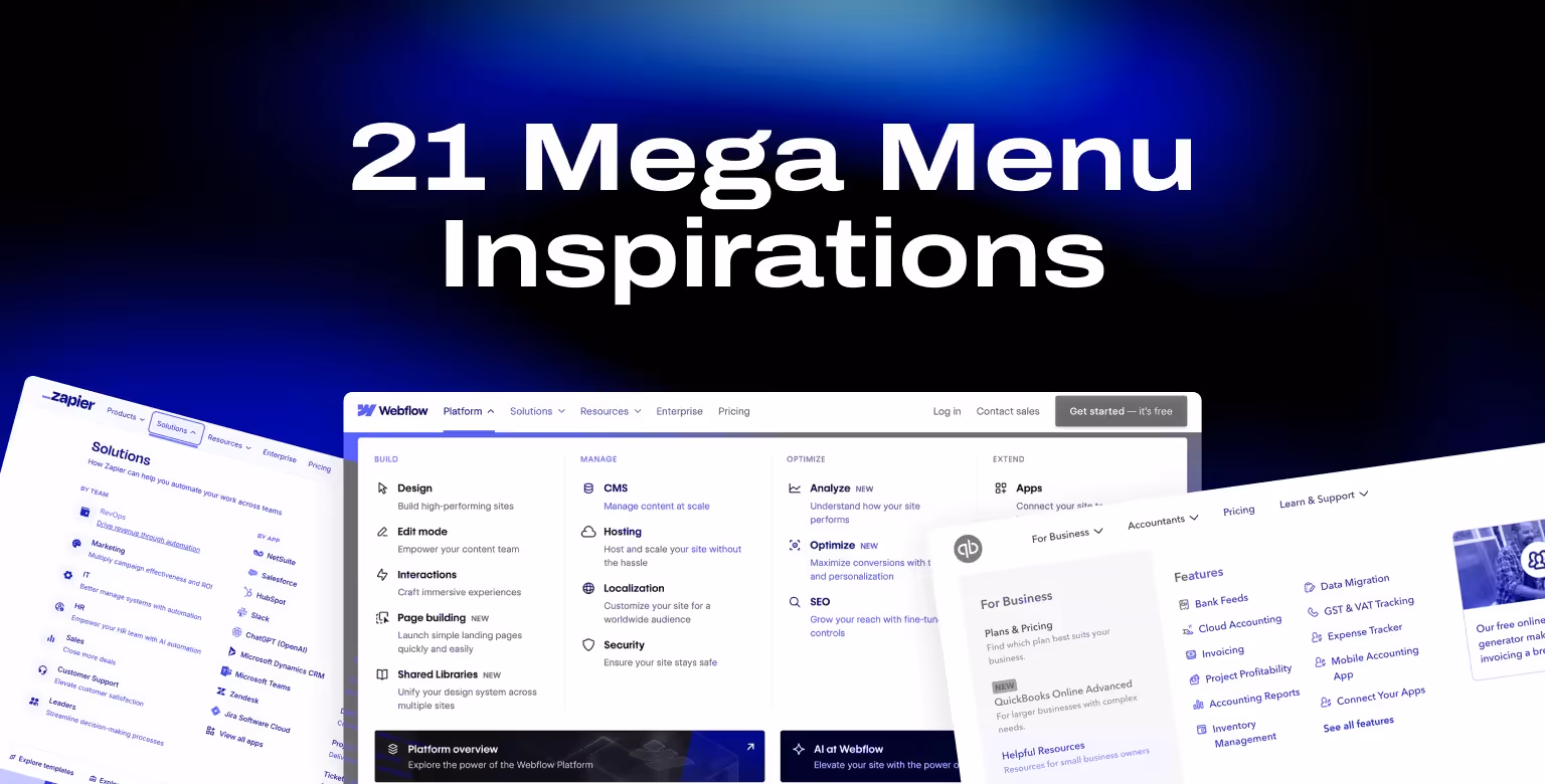


38% of visitors will leave a website if they find navigation confusing. That’s why mega menu examples are an essential resource for designers and marketers working on content-heavy platforms. A well-designed mega menu organizes links and categories into a clear, multi-column layout, helping users navigate complex websites with ease.
This article showcases 22 hand-picked mega menu examples from B2B, SaaS, e-commerce, and tech brands. Drawing from our experience as a B2B web design agency for SaaS and tech companies, we know how crucial intuitive navigation is for turning visitors into customers. Each example highlights how smart design choices combine structure, usability, and visual appeal to create seamless user experiences.
Of course, a well-designed navigation system is only one part of an effective B2B website strategy that helps attract and convert the right audience.
Equally important is having a high-converting pricing page — you can draw inspiration from some of the best pricing page examples to ensure yours is optimized for conversions. And to see how all these elements come together, check out our list of the best B2B websites for broader web design inspiration beyond navigation.
Whether you’re building a SaaS platform with dozens of features or an e-commerce store with hundreds of products, these mega menu designs will give you the inspiration you need to improve your site’s navigation.
What is a Mega Menu (and Why Use One)?
A mega menu is an expanded navigation interface that displays multiple columns of links, categories, and sometimes rich content in a single dropdown panel. Unlike traditional dropdown menus, mega menus provide users with a comprehensive overview of a site’s structure at a glance. As Nielsen Norman Group explains, they also reduce the number of clicks needed to reach deeper pages, improving usability on large websites.
Key Features of Mega Menus
- Multi-column layouts to organize links logically.
- Headings and subheadings for better hierarchy.
- Visual elements like icons or images to improve scannability.
- Quick access to deep site content without multiple clicks.
Benefits of Mega Menus
- Simplify navigation on content-heavy sites.
- Reduce bounce rates by helping users find pages faster.
- Surface key sections or products for better discoverability.
- Improve user experience on large-scale SaaS, e-commerce, or enterprise sites.
Mega menus are especially valuable for websites that cater to diverse audiences or offer numerous products and services. They flatten navigation hierarchies, allowing visitors to find relevant pages without excessive drilling down.

B2B & SaaS Mega Menu Examples
[fs-toc-h2]Cryptoworth Mega Menu: Streamlined Navigation for Web3 Finance Solutions
Cryptoworth uses a structured mega menu across four main categories: Product, Solutions, For Accountants, and Resources. Each dropdown organizes content by function—like "By ERP" or "By Segment"—and includes sub-items such as Audit Readiness, API access, and integrations with tools like Fireblocks and Coinbase.
The navigation supports different user types, including CFOs and accounting firms, and includes resource links like case studies, webinars, and certifications. It’s a practical example of how SaaS platforms can streamline access to features, integrations, and support materials through focused menu architecture.

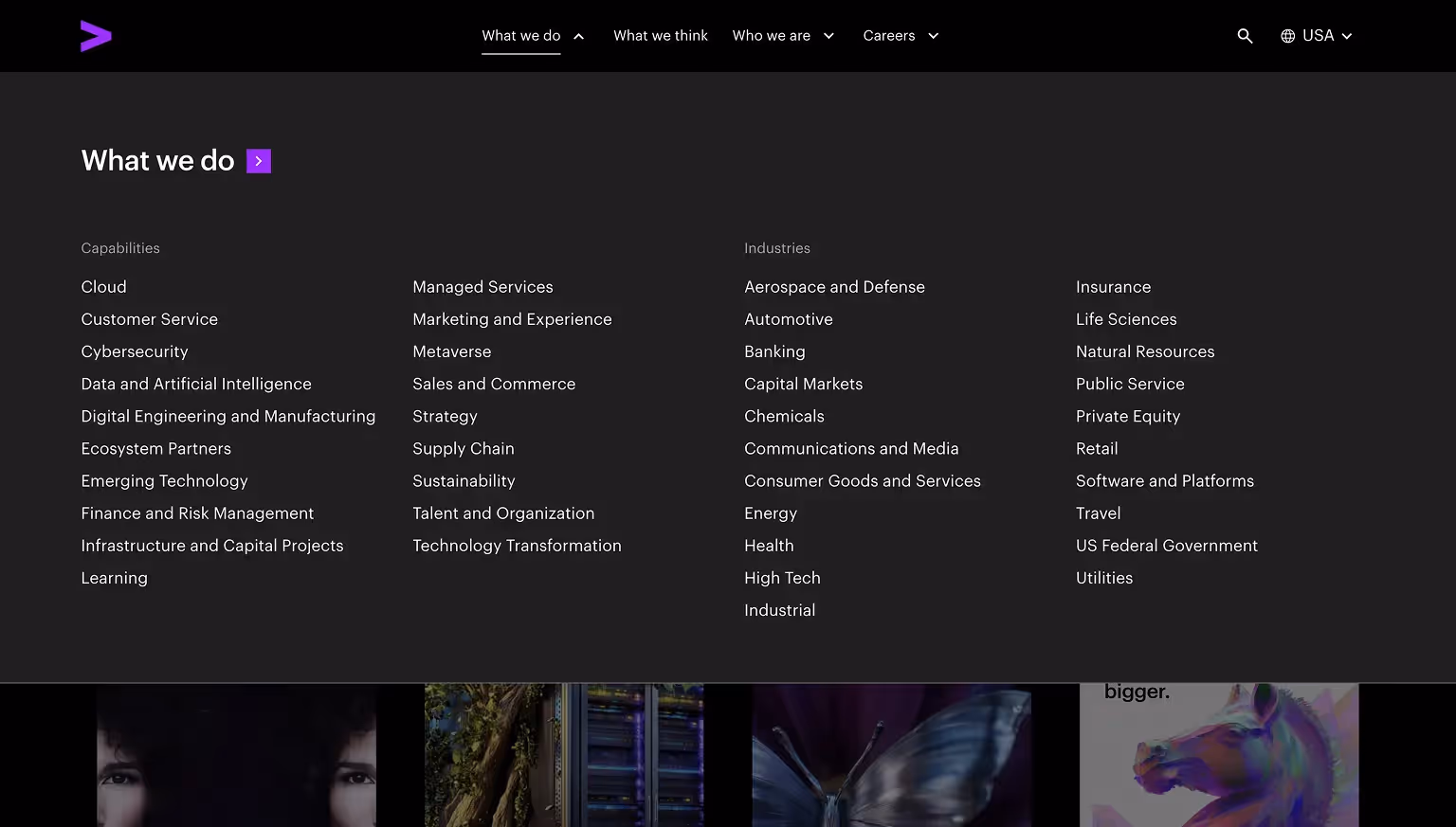
[fs-toc-h2]Accenture Mega Menu: Services, Industries, and Thought Leadership
Accenture’s mega menu focuses on Services, Industries, and Insights. Each section uses headings and supporting descriptions to guide users to relevant consulting solutions or thought leadership content.
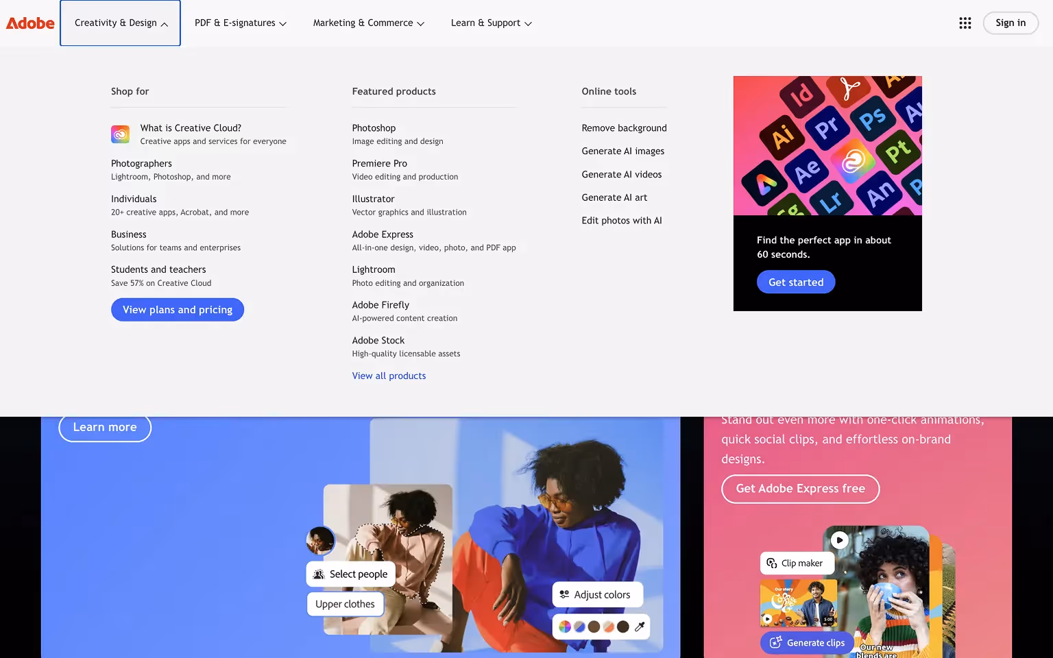
[fs-toc-h2]Adobe Mega Menu: Creative Tools and Business Solutions
Adobe’s mega menu showcases its wide array of creative tools and solutions, from Photoshop and Illustrator to enterprise services like Adobe Experience Cloud. The menu is neatly organized into categories like “Creativity & Design,” “PDF & E-Signatures,” and “Business Solutions.” Featured product tiles and subtle visuals make it easy for users to explore Adobe’s ecosystem without feeling overwhelmed.
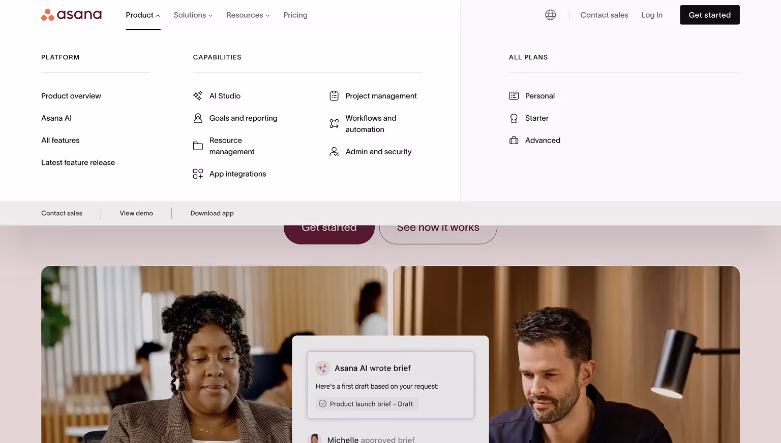
[fs-toc-h2]Asana Mega Menu: Organized Product Features and Solutions
Asana’s mega menu organizes product features, solutions, and resources into clear columns. Each section includes concise headings and links, allowing users to quickly navigate to specific areas. Call-to-action buttons like “Try Asana for Free” are integrated into the menu for direct conversions.
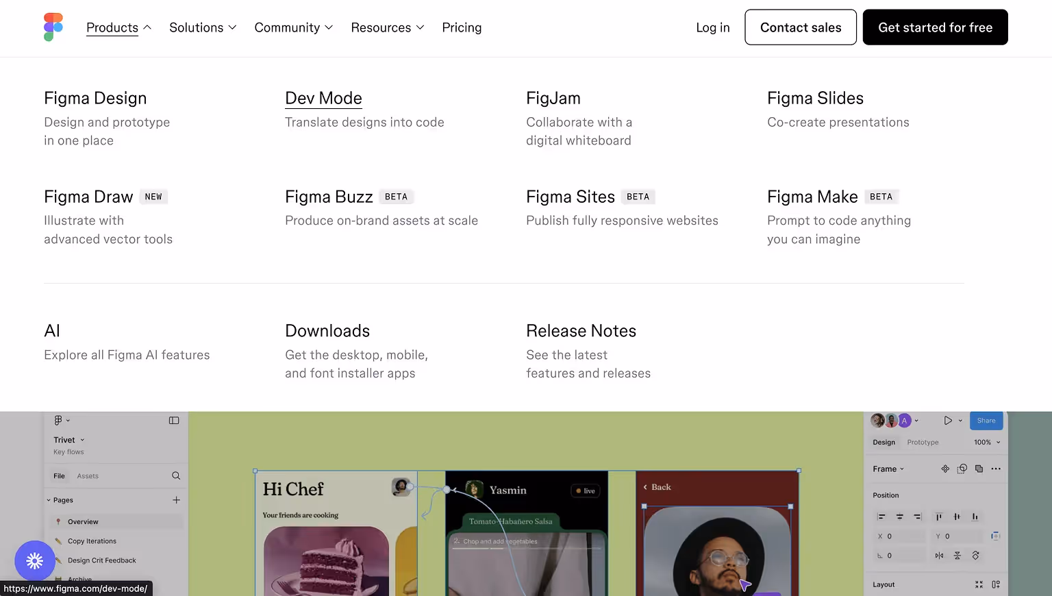
[fs-toc-h2]Figma Mega Menu: Clean Typography and Creative Resources
Figma’s mega menu uses clean typography and icons to present its products and community resources. The menu reflects Figma’s brand aesthetic while ensuring that users can easily discover tools like FigJam or access the plugin library.
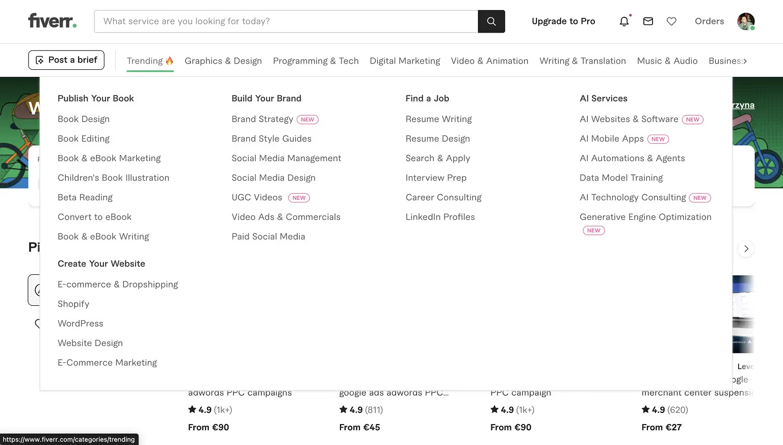
[fs-toc-h2]Fiverr Mega Menu: Freelance Service Categories for Quick Browsing
Fiverr’s mega menu is designed for quick browsing of freelance service categories. It uses clear headings like Graphics & Design, Digital Marketing, and Writing & Translation. Subcategories within each section allow users to drill down into specific services efficiently.
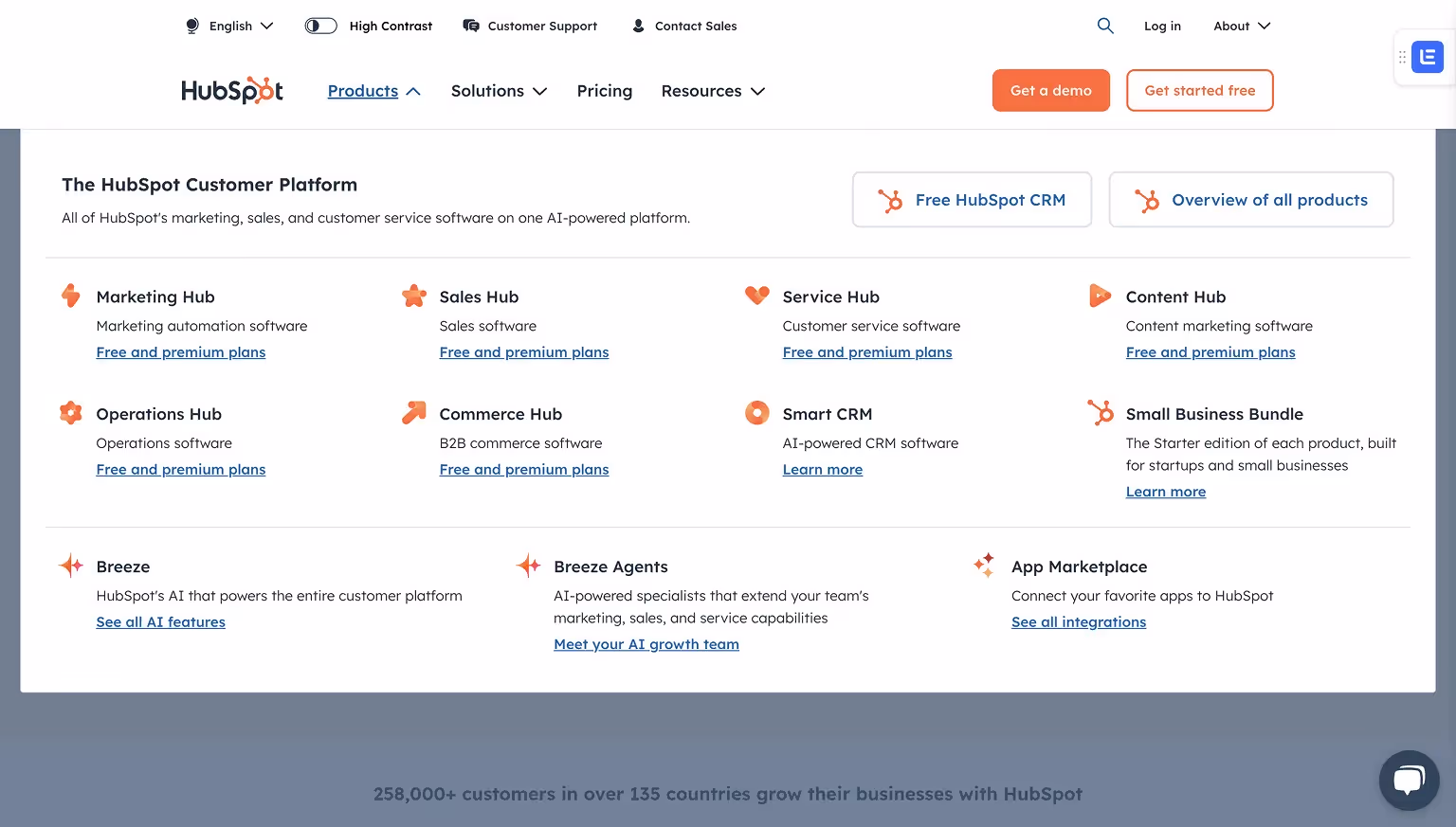
[fs-toc-h2]HubSpot Mega Menu: Marketing, Sales, Service, and CMS Hubs
HubSpot’s mega menu highlights its hubs (Marketing, Sales, Service, CMS) with clear groupings. It also features resource links for blogs, templates, and academy content, making it easy for users to explore tools and educational material.
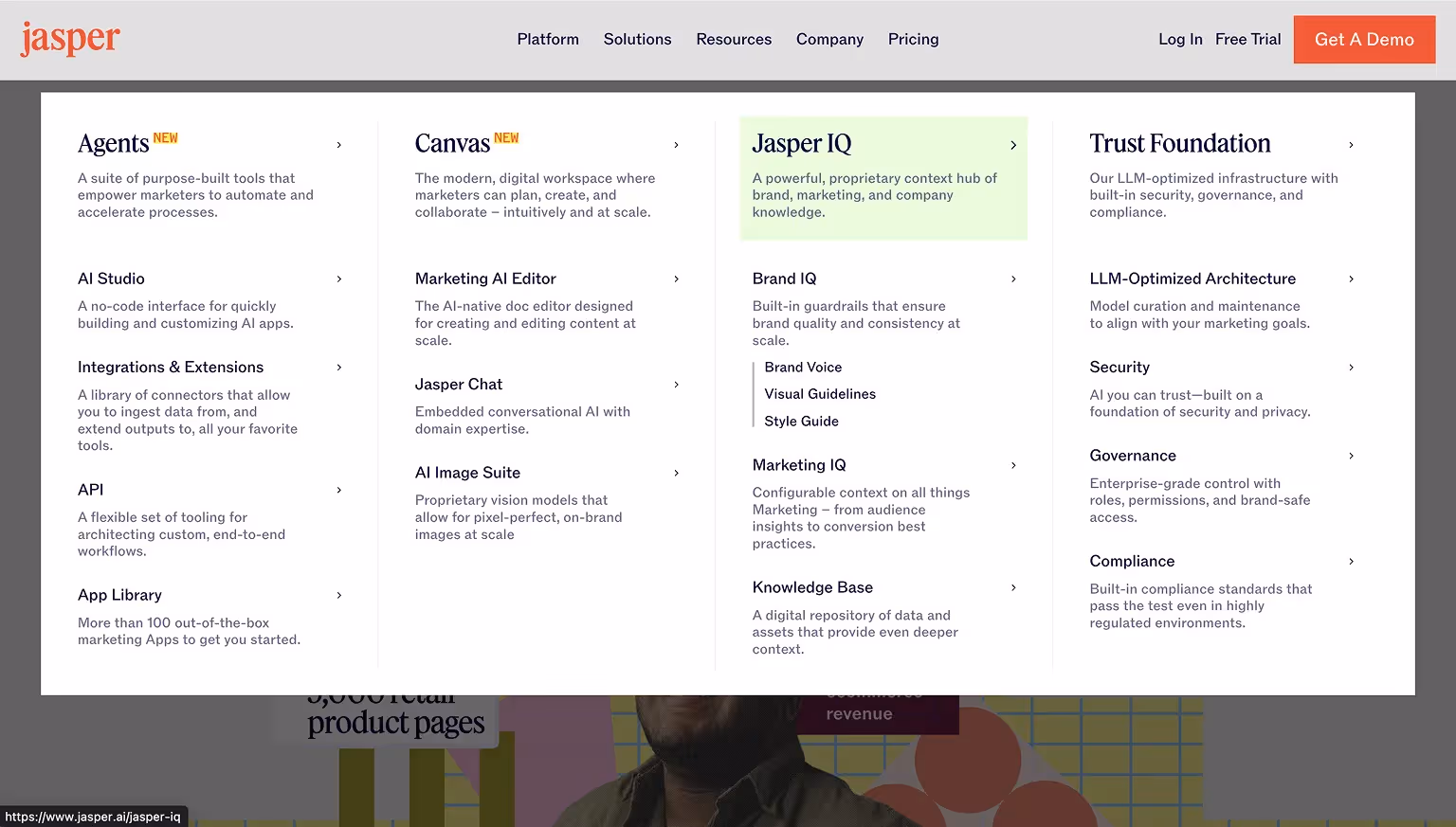
[fs-toc-h2]Jasper Mega Menu: AI Tools and Templates Organized by Use Case
Jasper’s menu caters to both new and returning users by listing AI tools and templates by use case. Visual cues like icons help users scan options quickly, while featured links to webinars and resources promote product education.
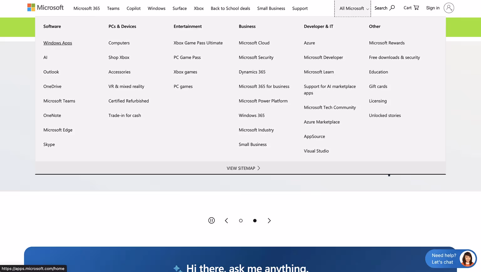
[fs-toc-h2]Microsoft Mega Menu: Enterprise Products and Subcategories
Microsoft’s mega menu categorizes links by product families such as Office, Azure, and Surface. It uses icons and subcategories for a clean, user-friendly navigation experience tailored to business and consumer audiences.
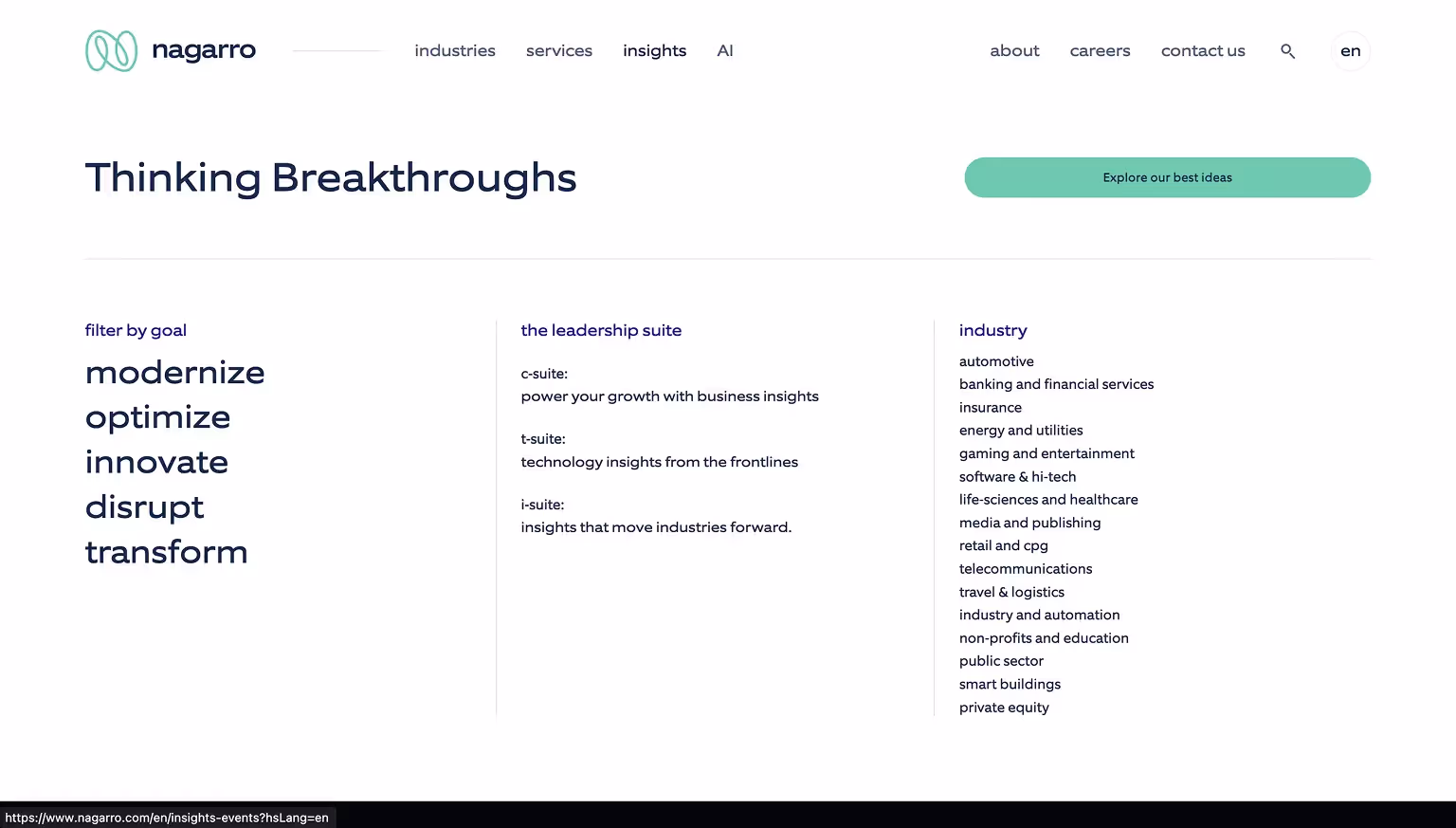
[fs-toc-h2]Nagarro Mega Menu: Enterprise Services and Industries at a Glance
Nagarro’s mega menu reflects its role as a global digital engineering leader. The menu organizes solutions and industries into intuitive groups, with featured sections like “Industries,” “Services,” and “About Us.” The clean design and use of whitespace make it easy for enterprise users to find relevant content quickly.
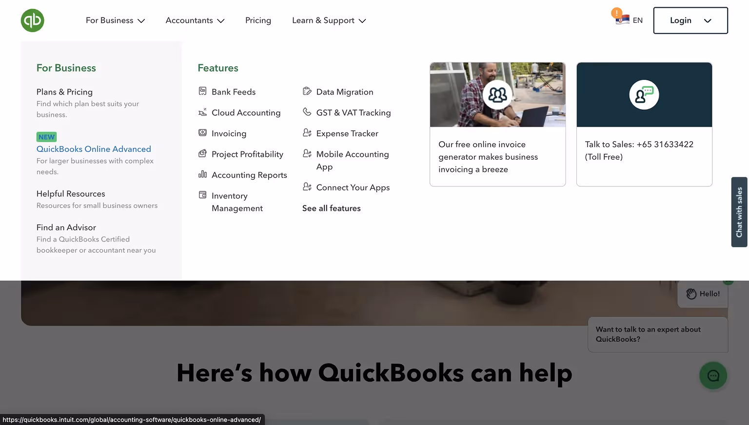
[fs-toc-h2]QuickBooks Mega Menu: Plans, Features, and Support Links
QuickBooks organizes its mega menu into clear categories like Plans, Features, and Resources. It provides quick links for both small businesses and accountants, streamlining access to tools and support pages.
[fs-toc-h2]Webflow Mega Menu: Balanced Layout for Products and Community
Webflow’s mega menu balances a large volume of content with a structured layout. It includes columns for Products, Solutions, Resources, and Community. Icons enhance usability, while links to educational content and community forums support different user segments.

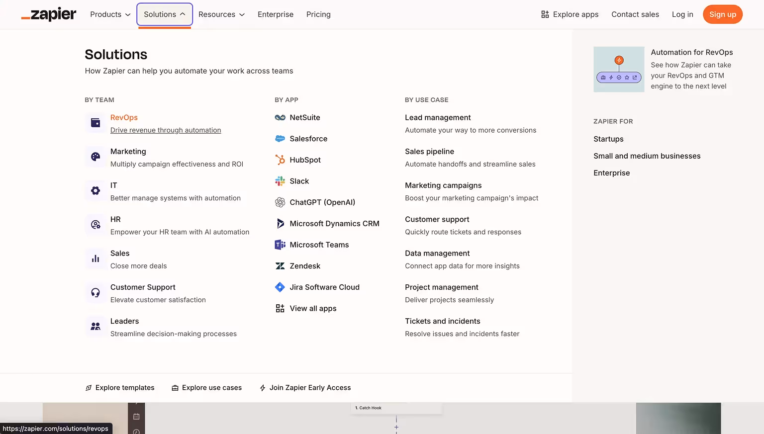
[fs-toc-h2]Zapier Mega Menu: Simplified App Integration Navigation
Zapier’s mega menu simplifies navigation for a platform with hundreds of app integrations. It divides content into two approaches: by app name and by use case, making it easier for users to explore workflows or locate specific integrations. New features are highlighted with badges for visibility.
These examples illustrate how B2B and SaaS brands use mega menus to guide diverse audiences efficiently, promote key actions, and reflect their brand identity.
E-Commerce & Retail Mega Menu Examples
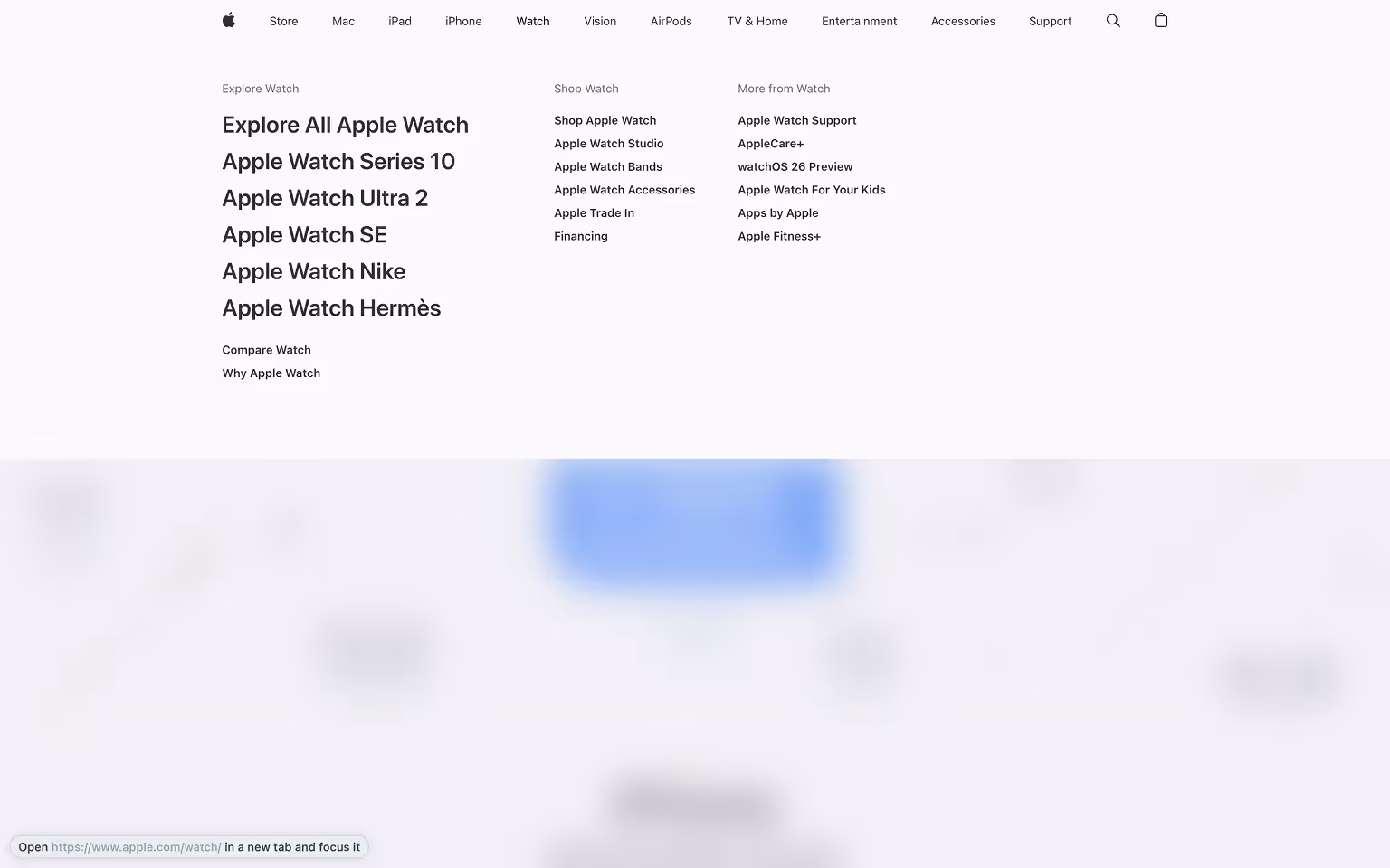
[fs-toc-h2]Apple Mega Menu: Minimalist Layout Showcasing Product Families
Apple’s mega menu provides a clean and simple layout. It showcases product families like Mac, iPhone, and iPad with icons and minimal descriptions, reflecting Apple’s design philosophy.
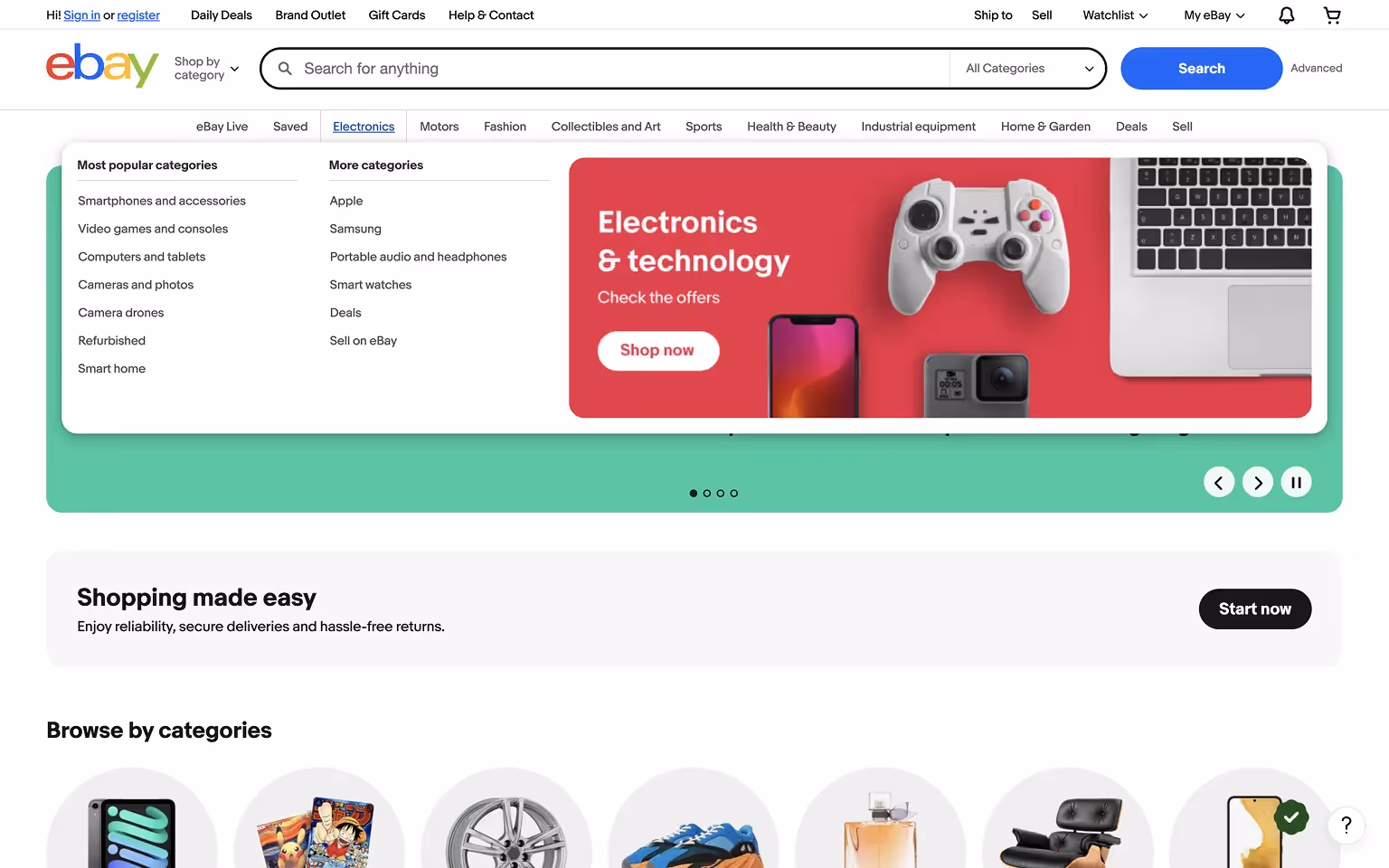
[fs-toc-h2]eBay Mega Menu: Category Icons and Seasonal Sales Highlights
eBay’s mega menu lists categories with supporting icons and highlights seasonal sales or trending products. Users can easily browse departments like Electronics, Fashion, and Home & Garden.
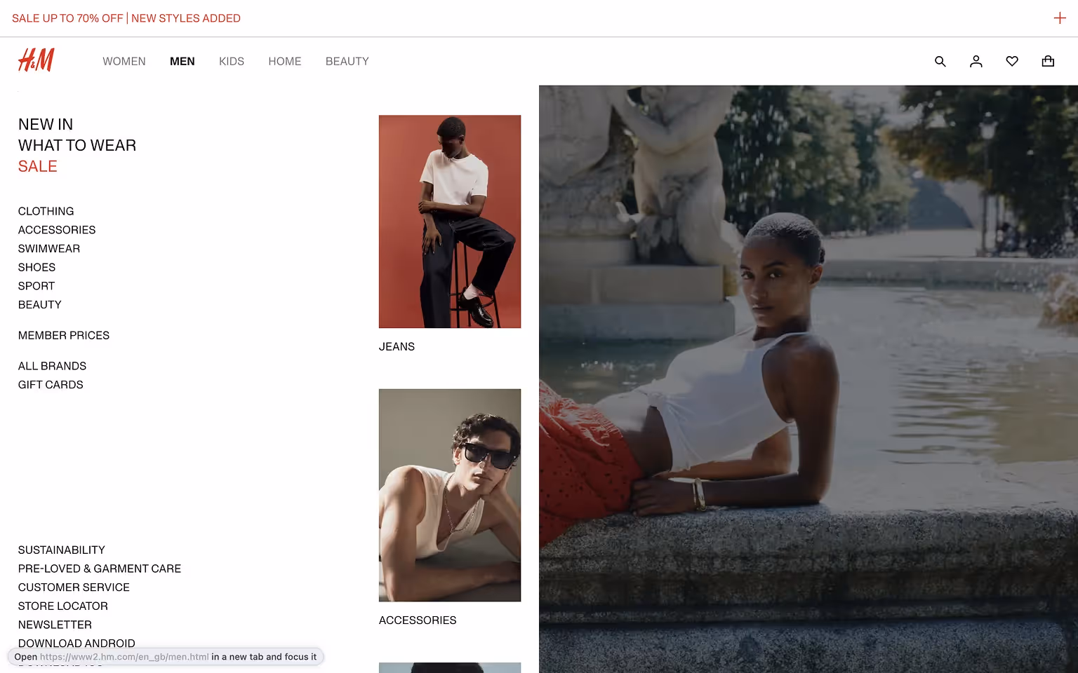
[fs-toc-h2]H&M Mega Menu: Fashion Categories and Trend Campaigns
H&M’s mega menu combines product categories with imagery for trending collections and campaigns. Strategic placement of sale and loyalty program links adds marketing value to the navigation.
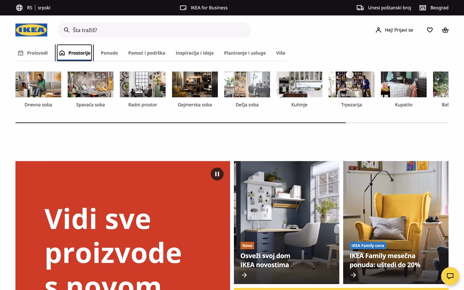
[fs-toc-h2]IKEA Mega Menu: Room-Based Navigation with Clear Icons
IKEA uses a mega menu to help users browse by room (Living Room, Kitchen, Bedroom) or product type. Simple icons and clear headings improve usability, while featured links highlight promotions or new arrivals.
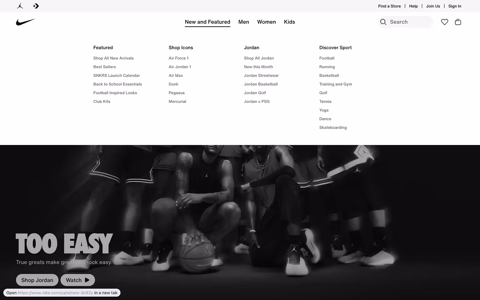
[fs-toc-h2]Nike Mega Menu: Clothing and Footwear Categories by Audience
Nike’s mega menu showcases Men’s, Women’s, and Kids’ categories with sub-sections for Shoes, Clothing, and Accessories. Featured collections and new releases are paired with product images, creating a visually engaging navigation experience.
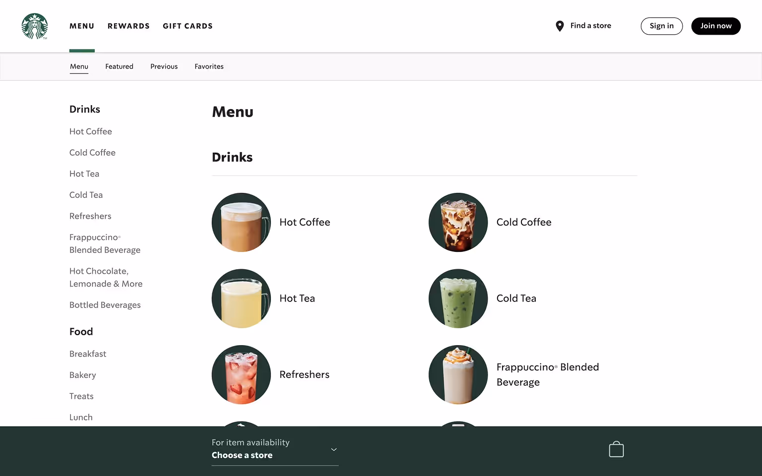
[fs-toc-h2]Starbucks Mega Menu: Food and Drink Categories with Visuals
Starbucks uses a mega menu for sections like Menu and Coffee. Each category includes images or icons to showcase drinks, food items, and seasonal offerings.
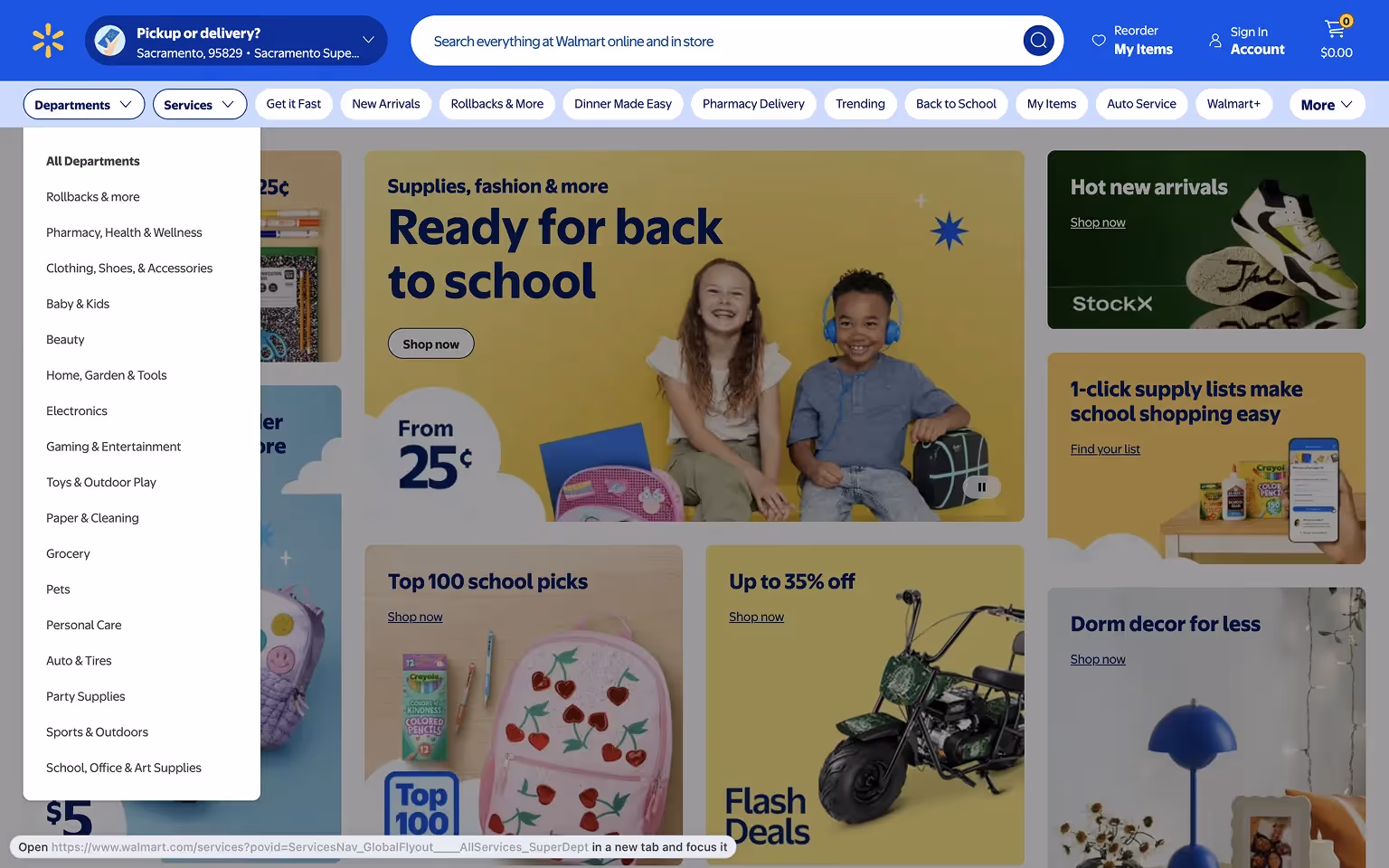
[fs-toc-h2]Walmart Mega Menu: Departments and Promotions for Quick Access
Walmart’s mega menu simplifies browsing with clearly labeled departments like Grocery, Electronics, and Clothing. It highlights seasonal promotions, top deals, and services like pharmacy pickup, making it easy for users to access high-demand areas.
These examples show how e-commerce brands use mega menus not just for navigation, but also for merchandising and driving user engagement.
Tech & Digital Platform Mega Menu Examples
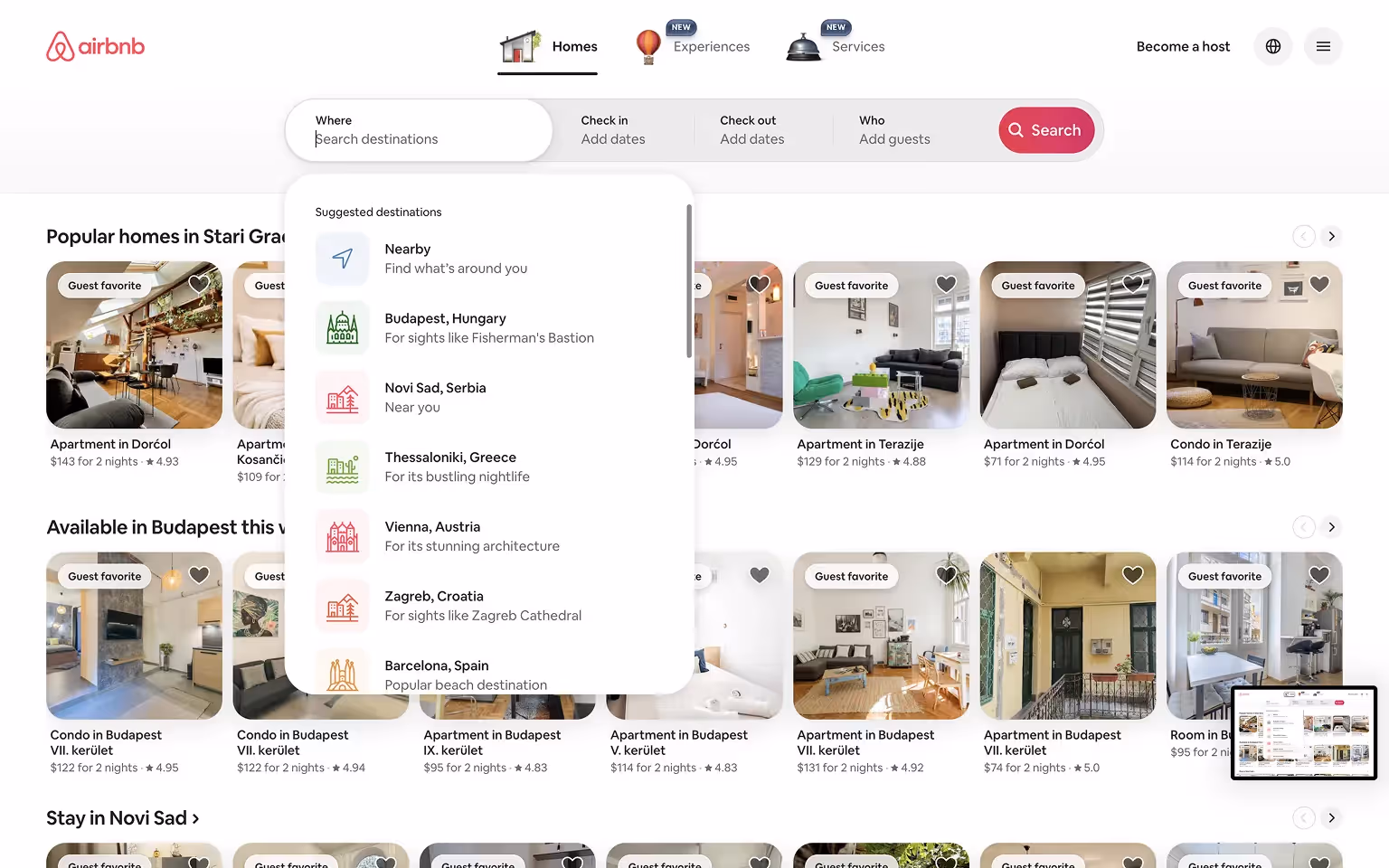
[fs-toc-h2]Airbnb Mega Menu: Stays and Experiences for Seamless Browsing
Airbnb’s navigation focuses on categories like Stays and Experiences. While not a traditional mega menu, its dropdown effectively guides users into search flows for rentals and activities.
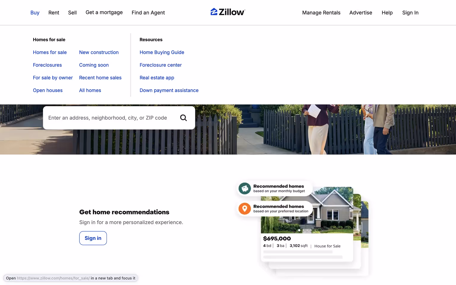
[fs-toc-h2]Zillow Mega Menu: Real Estate Categories for Buyers and Renters
Zillow’s mega menu organizes services for buyers, sellers, and renters. Categories include Buy, Rent, Sell, and Home Loans, often supported by tools like mortgage calculators and search filters.
Mega Menu Design Best Practices
Organize Content Logically
Structure links into clear columns with headings and subheadings. Group related items together to help users scan and navigate easily.
Use Visual Elements Sparingly
Icons or images can enhance usability but should not overwhelm the menu. Prioritize clarity and keep visual elements subtle.
Keep Menus Clean and Focused
Avoid clutter by limiting the number of links. Highlight only the most important categories and pages to reduce decision fatigue.
Prioritize Mobile Responsiveness
Adapt mega menus for smaller screens using collapsible sections or simplified mobile menus. Ensure touch targets are large enough for easy navigation.
If you’re building in Webflow, working with an experienced Webflow development agency can help you implement responsive mega menus that scale with your site’s needs.
Include Strategic Calls-to-Action
Embed key actions like “Contact Sales,” “Shop Now,” or “Get a Demo” within the menu to guide users toward conversions.
Test and Optimize
Monitor user behavior and refine your mega menu over time. A/B test designs to improve usability and engagement.
These practices ensure that mega menus improve navigation, enhance user experience, and align with overall site goals.
Want to take your SaaS site’s navigation to the next level? Our Ultimate SaaS Website Navigation Playbook gives you the strategy and tools to design user flows that convert.
Frequently Asked Questions (FAQs) about Mega Menus
What is the difference between a regular dropdown menu and a mega menu?
A regular dropdown menu shows a single column of links, while a mega menu displays multiple columns with categories, subcategories, and sometimes images. Mega menus are better suited for websites with a large number of pages or products.
When should I use a mega menu on my website?
Use a mega menu if your site has extensive content or product categories that need to be easily accessible. They work best for e-commerce sites, SaaS platforms, and large corporate websites.
What are the drawbacks of mega menus?
Poorly designed mega menus can overwhelm users or cause usability issues on mobile devices. They also require careful coding to remain accessible and SEO-friendly.
Are mega menus good for SEO?
Mega menus can support SEO by providing internal links to key pages, but they should follow a clean site structure as outlined in MDN’s guide to website performance.
Do mega menus work on mobile devices?
Yes, but they need to be adapted for mobile with collapsible sections or simplified navigation patterns to maintain usability on smaller screens.