


AI is everywhere. But strong AI websites? Those are rare.
Most AI startups focus so much on the tech that they forget the basics of communication: Who is this for? What does it solve? Why should anyone care?
The best AI websites explain the offering clearly, guide users toward action, and build trust in seconds. Be it through crisp messaging, smart layout, or interactive UI demos, these sites turn complex functionality into compelling narratives.
In this article, we break down 33 of the best AI websites across categories like voice interaction, sales enablement, vertical-specific tools, and more. We’re looking both at what these AI products do and examining how their design, UX, and positioning help them stand out.
If you're building or marketing an AI product, this is your benchmark for clarity, conversion, and credibility in 2026.
Looking ahead, staying on top of emerging web design trends 2026 for AI brands will help ensure your site remains innovative and effective into the new year.
Conversational AI & Voice Platforms
These tools don’t just talk back — they qualify leads, handle real-time conversations, and even simulate human coaching. Great conversational AI sites don’t get bogged down in how the tech works. Instead, they focus on user outcomes and create an intuitive path from curiosity to conversion.
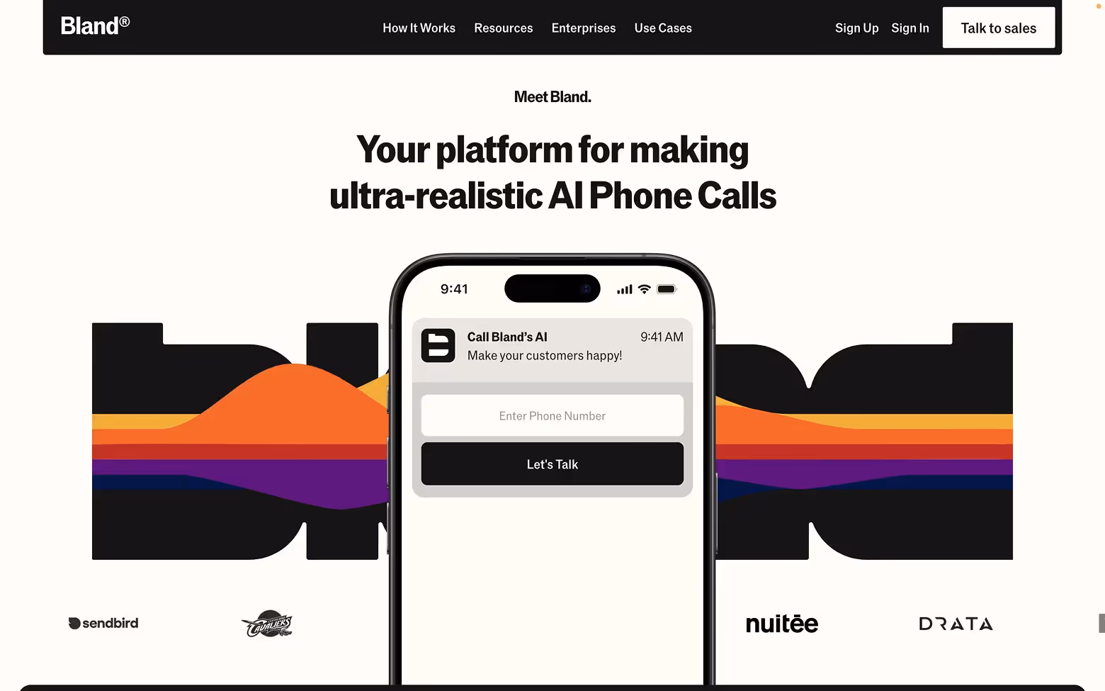
[fs-toc-h2]1. Bland.ai
What they do:
Bland enables outbound voice agents that sound nearly human. It automates cold calls at scale, making it a great fit for sales teams that want to save time and increase call volume.
Why the site works:
We at Tilipman Digital recently led the full site revamp for Bland.ai, and one of the key goals was clarity. Bland.ai makes a strong impression by keeping things simple and focused. The layout feels fast, the copy is clear and to the point, and the entire site pushes users toward one goal: booking a demo.
There’s no clutter, just a confident explanation of what the product does and why it matters. It quickly builds trust by showing real traction and scale, without trying too hard to impress. The result is a site that respects the visitor's time, which is exactly why it converts well.
Want a similar outcome? Explore our Webflow for Conversational AI services.
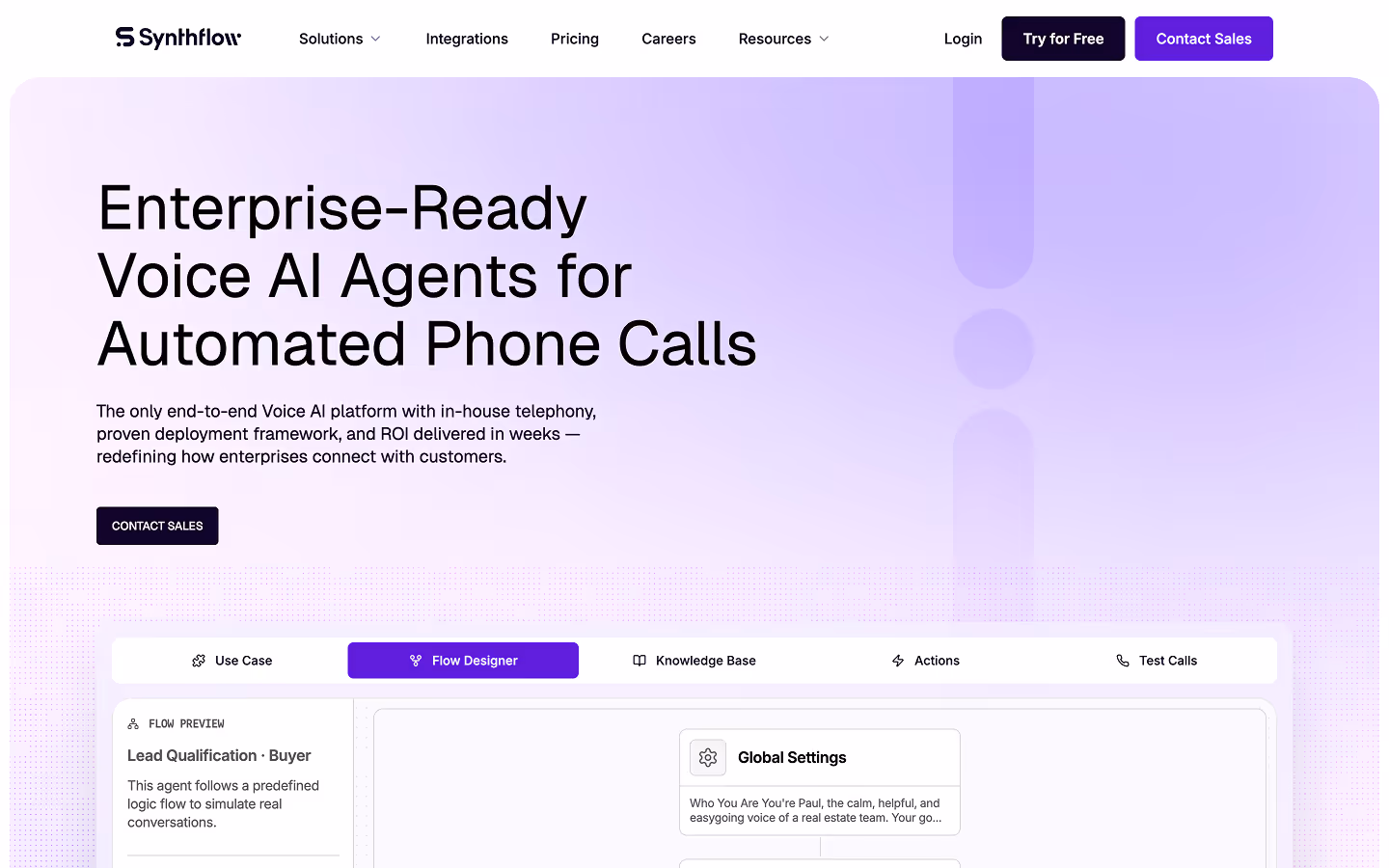
[fs-toc-h2]2. Synthflow.ai
Synthflow lets users build AI voice agents without writing code. The platform is designed to deploy smart phone agents in just minutes.
Why the site works:
We recently revamped Synthflow’s site around a product-led experience. The new homepage focuses on clarity, interaction, and momentum, using a strong visual hierarchy and intuitive layout to guide visitors through core features and benefits. Interactive elements, like real voice demos, show the platform in action without requiring a signup.
The design builds trust quickly, with clear messaging, proof points, and CTAs placed with intent. It’s built to support both high-volume traffic and high-intent conversions, especially as Synthflow grows post–Series A.
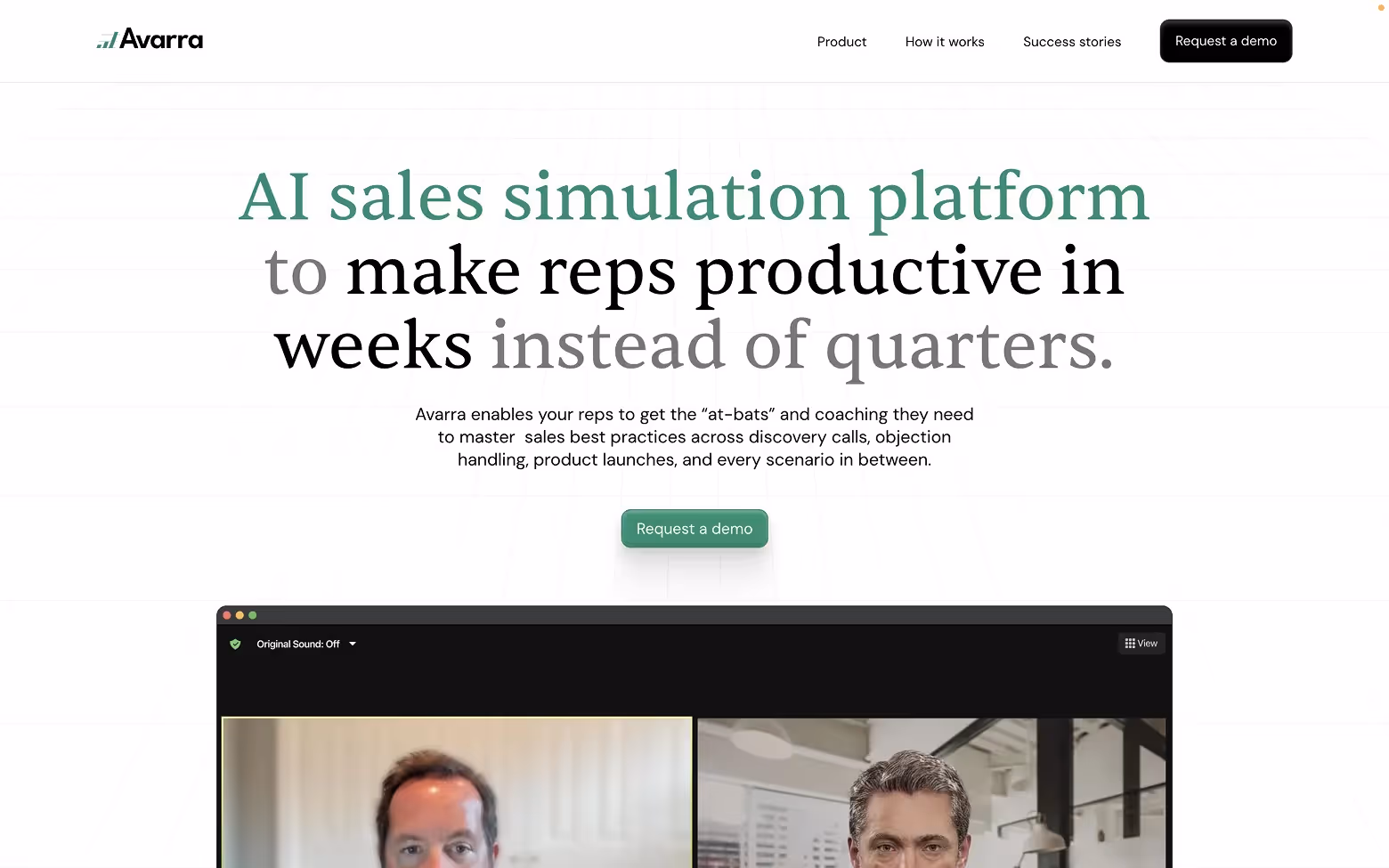
[fs-toc-h2]3. Avarra.ai
Avarra offers simulated sales coaching using AI avatars. Sales reps can role-play objection handling or demo calls in a realistic training environment.
Why the UX stands out:
We recently revamped Avarra’s site with a focus on clarity and outcomes. That’s exactly what the new experience delivers from the first screen. It communicates the product’s purpose immediately, without overwhelming visitors with technical language. The design feels clean and confident, using interface visuals to explain the experience with minimal text.
The layout is built for short attention spans, guiding users through benefits and calls-to-action with ease. It’s a thoughtful approach that clearly shows how the product fits into a sales team’s workflow, which is why it drives engagement quickly.
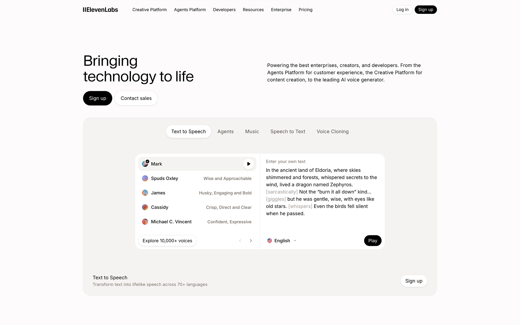
[fs-toc-h2]4. ElevenLabs
ElevenLabs generates lifelike speech and helps teams build voice agents using tools like text-to-speech, voice cloning, and speech-to-text.
Design the design works:
ElevenLabs does a great job at convincing you about it's capabilities by testing different product aspects right away. The above-the-fold voice gallery makes the value obvious in seconds, without forcing visitors to decode technical language or paying before testing the product.
The design is clearly built with enterprise buyers in mind: it’s clean, restrained, and credibility-first. Most of the “color” and character is used to showcase the product itself (voices, demos, examples) rather than decorative branding, which keeps attention on what matters.
The site stays organized with a clear split between "Creative" and "Agents," so different audiences can find the right path fast. CTAs are straightforward for both self-serve users and enterprise buyers, while safety and research sections add credibility without pulling focus from the main story. The result is a product-led website that feels immediate, clear, and high-trust.
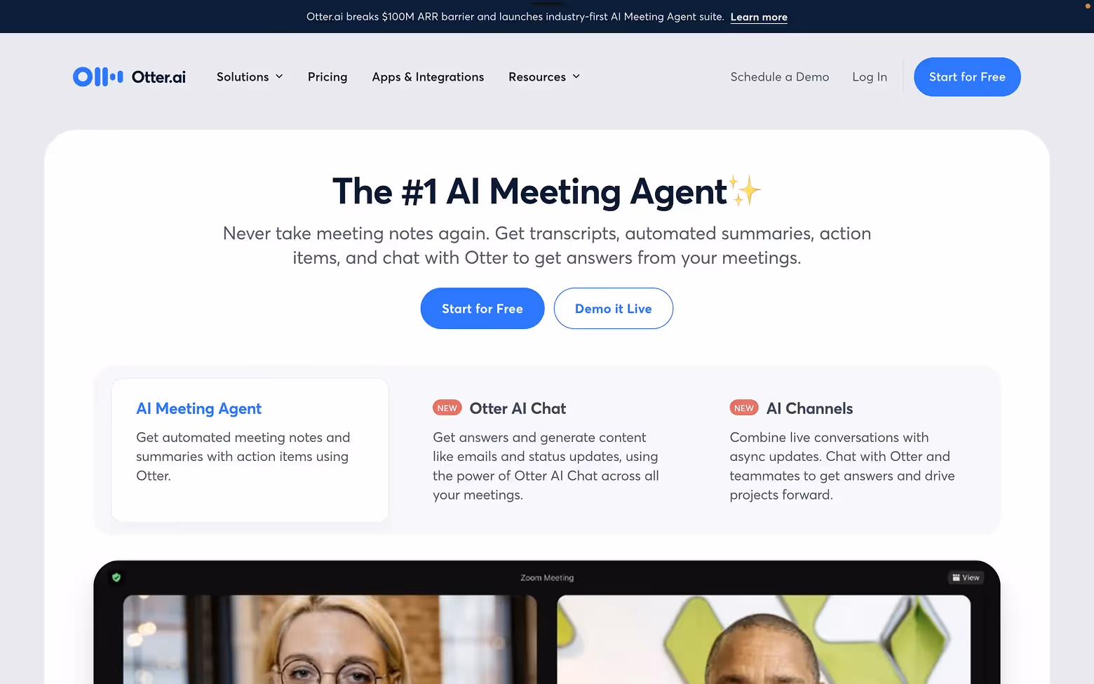
[fs-toc-h2]5. Otter.ai
Otter transcribes meetings in real time, generating summaries, highlights, and action items.
Design that works:
The brand uses a clear and open design that makes the product feel accessible right away. The site focuses on real-world use cases, helping users quickly understand how Otter fits into their daily routines.
Every part of the experience supports clarity, from visuals and copy to layout. It avoids distractions and stays focused on what matters most — showing how Otter saves time and improves meetings. The result is a trustworthy, well-structured site that makes it easy for users to take the next step.
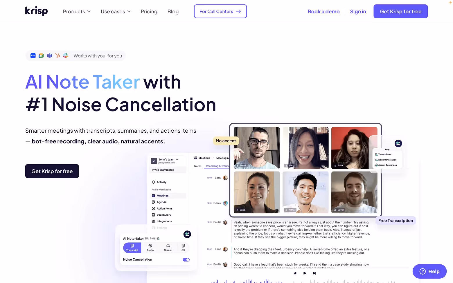
[fs-toc-h2]6. Krisp.ai
Krisp removes background noise and adds AI note-taking to calls. It’s designed for professionals who want cleaner audio and stronger meeting insights.
What makes the site effective:
Krisp.ai gets straight to the point with a polished, professional design. The product takes center stage, and the visuals show how it fits into daily workflows without needing lengthy explanations.
The layout is clean, and each section highlights a specific benefit, making the experience easy to follow. The site speaks to both teams and individuals, and it does that effectively. By focusing on reliability and function, Krisp builds trust and helps users quickly see why it’s worth trying.
Design takeaways:
- Show real product behavior through motion or demo elements
- Make benefits obvious for each target persona
- Keep CTAs above the fold and crystal clear
Want to go deeper? Here’s how web design and marketing strategy intersect to drive business results.
As a B2B Web Design Agency, we've helped AI teams like Avarra and Bland create high-converting product pages. If you're building something similar, we'd love to help!
AI Sales Enablement & Outreach Tools
Sales teams need speed, structure, and personalization. The best AI tools don’t just automate email copy or enrich lead data, they drive pipelines. These four platforms stand out for both their product strength and how effectively their websites communicate value.
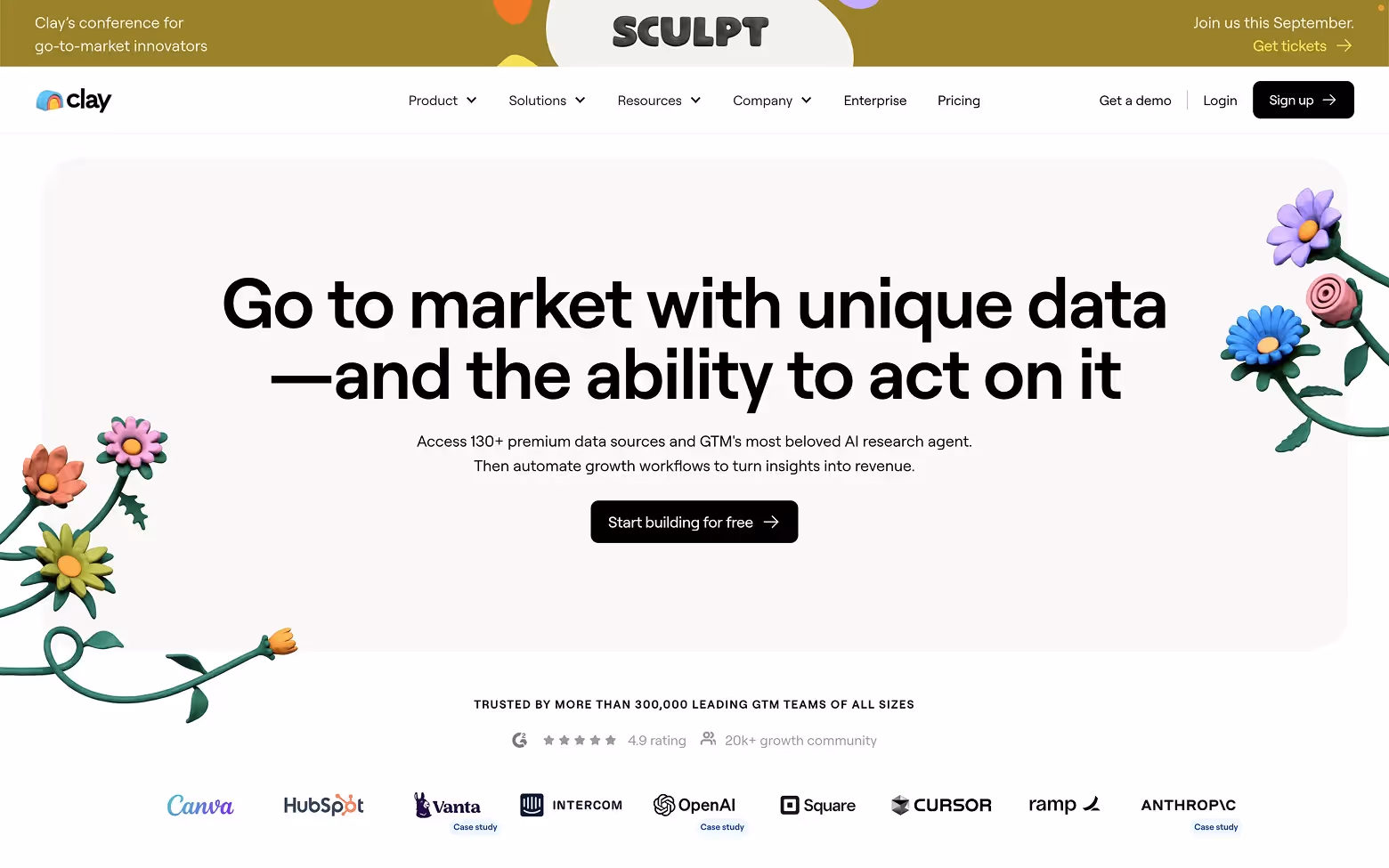
[fs-toc-h2]7. Clay.com
Clay enriches your CRM with live, contextual data pulled from across the internet. Imagine LinkedIn, Zapier, and a sales assistant rolled into one. Users can build powerful workflows to research leads, automate outreach, and sync updates in real time.
Why the site works:
Clay.com focuses on what users can accomplish, not just what the product offers. It skips the buzzwords and highlights real outcomes, making the experience feel honest and clear.
The modular layout is easy to scan, helping visitors understand the value in seconds. Interactive elements are used with intention, not as decoration. The design feels purpose-built for professionals who prioritize speed, structure, and results, which builds trust and encourages action.
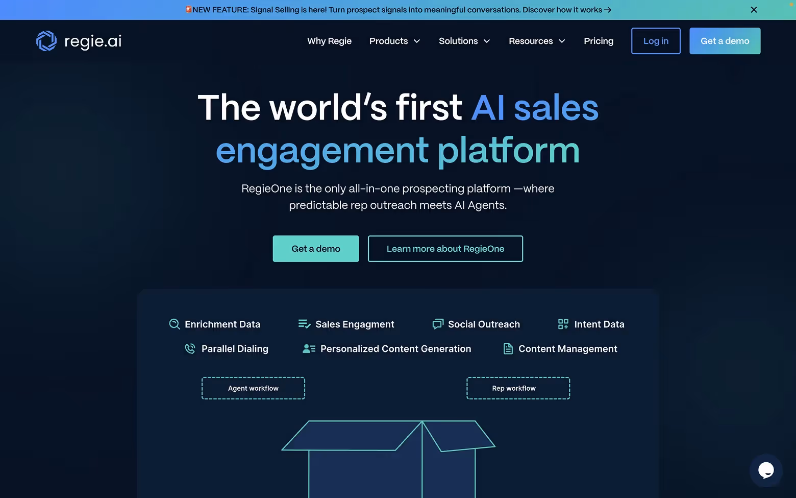
[fs-toc-h2]8. Regie.ai
Regie helps SDRs write entire outbound sequences using AI. From emails and LinkedIn messages to cold calls, it automates the writing so reps can focus on converting.
Design strengths:
Regie.ai is built with a clear understanding of how sales teams operate. The site’s structure mirrors a typical sales conversation, making the flow feel intuitive.
Bold copy and clean visuals keep attention on what matters most. Every section is action-oriented, with the product always visible—either directly or through relevant examples. It’s a strong combination of clarity and focus, helping users quickly understand how the tool can support their outreach efforts.
[fs-toc-h2]9. Apollo.io
Apollo is a full-stack sales platform that combines CRM, prospecting, and sequencing in one tool. It features AI-powered prioritization, enrichment, and outreach across multiple channels.
Why it stands out:
Apollo.io leads with scale and proves it quickly. The site builds trust early by showcasing strong social proof, bold performance metrics, and well-known brand logos.
Its structure is role-aware, guiding different types of users through tailored journeys based on their goals. The design is clean and fast, with product previews and calls-to-action appearing at just the right moments. Everything on the site is geared toward helping users see what they can achieve with the platform, making it effective for both newcomers and seasoned sales teams.

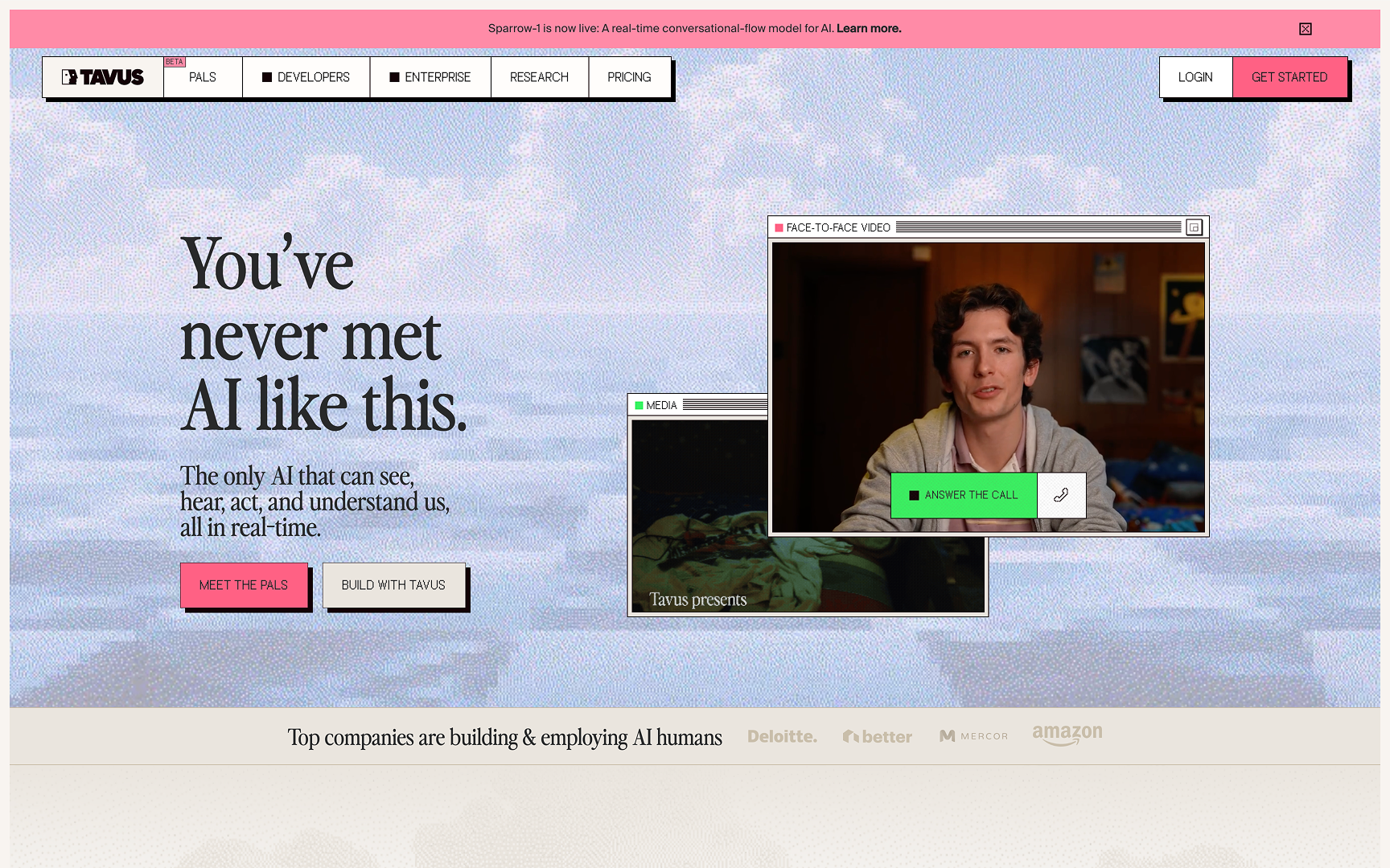
[fs-toc-h2]10. Tavus
Tavus lets users record one video, then automatically generate personalized versions at scale. It’s designed for sales teams that want to send AI-personalized outreach videos including the viewer’s name, company, or industry.
Effective design elements:
Tavus focuses on showing value rather than just explaining it. The homepage uses dynamic visuals to immediately demonstrate how personalized video works, grabbing attention quickly. The design feels smooth and well-paced, with short sections that keep attention on the main benefits.
Messaging is clear and emphasizes being the only AI with such a personal touch. It’s a strong example of how to sell an AI-driven product by delivering an experience, not just listing features.
Design takeaways:
- Show AI outputs in-context (email, video, CRM)
- Use demos or previews as part of the scroll experience
- Position the product for different team roles, not just generic buyers
Many of the websites featured here were built using visual development platforms like Webflow, a favorite among early-stage teams for its speed and flexibility. If you're building something similar and need a high-quality site for your AI product, our Webflow Development Agency can help you design and launch a high-converting experience.
Industry-Specific AI Platforms
AI is becoming highly specialized. These platforms stand out by going deep into a niche, whether it’s real estate, education, mental health, or the legal world. Their success comes not just from smart AI, but from messaging and UX that speak directly to their industry audience.
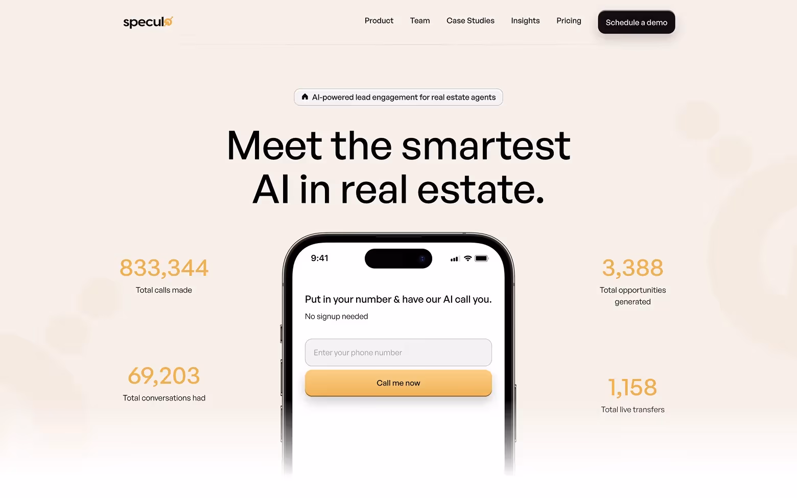
[fs-toc-h2]11. Speculo.ai
Speculo is designed for real estate agents who are overwhelmed by lead follow-up. It uses AI to instantly call, qualify, and re-engage leads, allowing agents to focus on closing.
Why the site works:
We also led the site revamp for Speculo.ai, bringing a sharper focus to clarity and conversion. The site is built for action, and the design makes that clear from the start. The homepage features live stats that build trust and highlight real usage, which captures attention quickly. The user flow is simple and focused, guiding visitors from interest to demo with minimal friction.
Every element is crafted for real estate professionals, with copy and visuals that speak directly to their day-to-day challenges. The site respects users' time and communicates its value without unnecessary distractions.
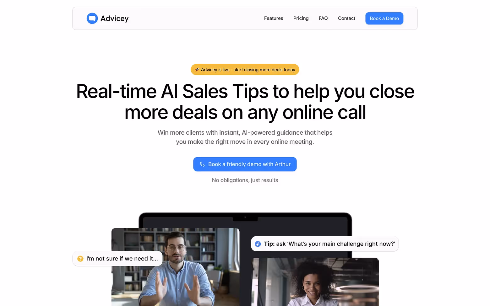
[fs-toc-h2]12. Advicey.io
Advicey lets users ask AI tough questions in fields like law, finance, or technology. It replicates the experience of speaking with a specialized consultant.
Design strengths:
Advicey.io maintains a calm and focused tone, which fits the nature of its service. The design avoids clutter and puts the product experience front and center, using a simple chat interface paired with smart examples that demonstrate its capabilities.
The layout is clean, the copy is minimal, and everything feels intentional. The site builds confidence by reducing friction, making it feel easy to get started and immediately helpful.
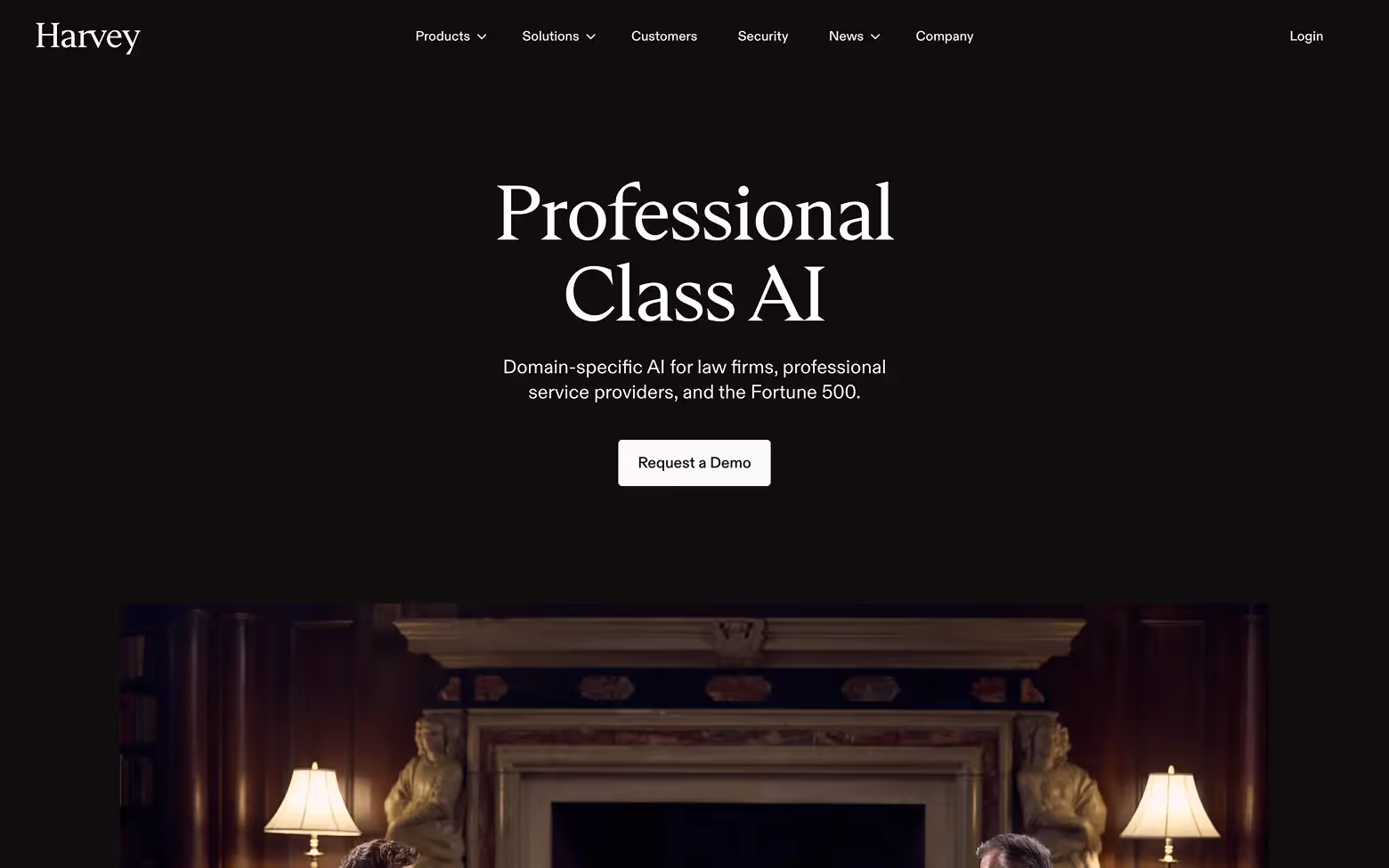
[fs-toc-h2]13. Harvey.ai
Harvey is an AI-powered legal assistant built for law firms. It helps legal teams research, draft, and analyze documents faster using natural language prompts.
Why it stands out:
Harvey.ai presents a professional, focused experience from the start. The design is clean and calm, which reflects the trust and reliability expected in legal services. Messaging is clear, with thoughtful use of space and typography that keeps attention on what matters.
The flow feels intentional, guiding users through what the product does without pressure. It speaks to serious users with high standards, and the design supports that tone without getting in the way. It’s a great example of how to balance credibility, clarity, and user focus.
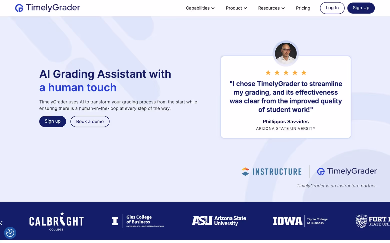
[fs-toc-h2]14. TimelyGrader.ai
TimelyGrader uses AI to help educators grade assignments more efficiently, especially in math and science. It can scan handwritten work, group similar answers, and generate structured feedback in bulk.
Effective UX decisions:
TimelyGrader takes a focused and modern approach that works well in the education space. The site is clean and light, with a structure that helps users quickly understand what the tool does and how it helps.
Messaging is clear and benefit-driven, centered on saving time and improving grading accuracy. Interface visuals are thoughtfully placed to support trust without adding noise. It’s a well-balanced design that respects both the user’s time and the demands of academic work.
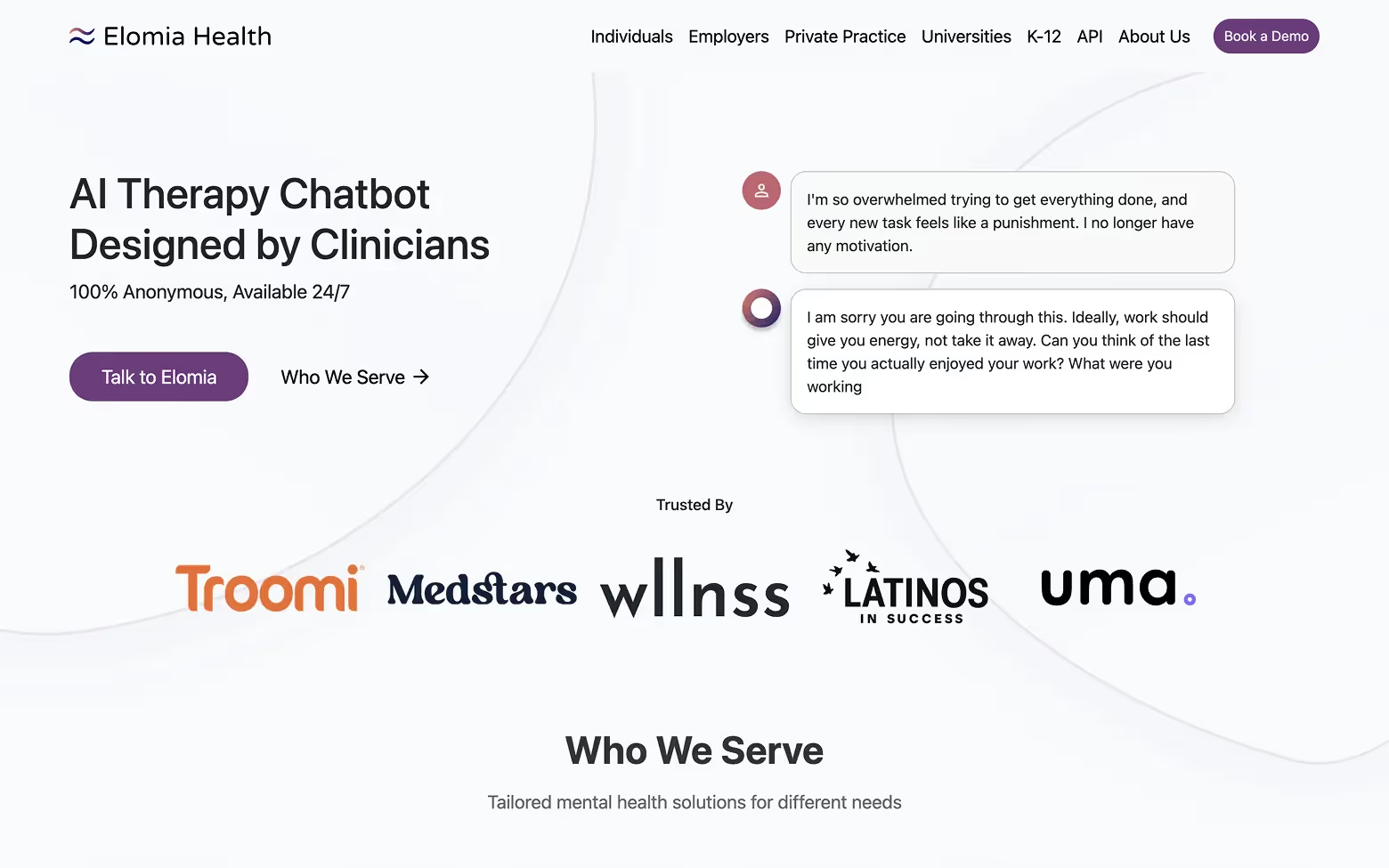
[fs-toc-h2]15. Elomia.com
Elomia is a digital mental health assistant that uses conversational AI to help users manage emotions, reflect on their thoughts, and improve their emotional well-being.
Why the site works:
Elomia makes a strong first impression with a calm and modern design that fits the tone of mental health support. The layout is simple and focused, helping users understand what the product is and how to start using it quickly.
Messaging is empathetic and clear, and the visual style creates a sense of safety and trust. The site avoids clutter while still feeling approachable and supportive. The overall experience is crafted to reduce hesitation and make the first step feel easy.
Design takeaways:
- Speak the language of the industry, not the tech
- Use data, demos, or role-based flows to connect with users
- Match tone and layout to the emotional context of the product
Many of the best AI websites in this list succeed because of their intuitive layouts and thoughtful interactions, the kind of results that come from strong UI/UX design services focused on clarity, trust, and conversion.
AI Creative & Design Tools
From generating artwork to editing video, these AI platforms put creative power in the hands of non-creatives. What sets these tools apart isn’t just what they can do, but how well their websites visualize the output.
[fs-toc-h2]16. DALL·E 3
DALL·E by OpenAI transforms text prompts into detailed images. Now in its third generation, the tool is more accurate, creative, and stylized than ever.
Why the site works:
DALL·E’s site keeps the focus on exploration. The design is minimal but visually engaging, allowing the AI-generated images to speak for themselves. Prompt examples and visual results are placed front and center, sparking curiosity and encouraging interaction. The layout supports continuous discovery without overwhelming the user. It’s a strong example of how to showcase a creative tool by letting the output take the lead, while the interface stays clean and supportive.

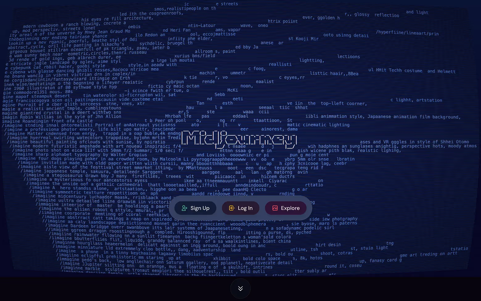
[fs-toc-h2]17. MidJourney.com
MidJourney is a generative AI platform known for producing high-concept, surreal visuals from text prompts. While the tool lives entirely on Discord, the website plays a strategic role.
Design decisions that matter:
MidJourney.com takes a bold and intentional approach by saying very little, and that’s exactly what makes it effective. The homepage is stripped down with no traditional marketing copy, only stunning AI-generated art. This minimalist presentation builds credibility with a creative audience and sends a strong message: the work speaks for itself. The site feels like a digital gallery, elevating the product’s artistic appeal.
[fs-toc-h2]18. Khroma.co
Khroma is an AI-powered color palette generator. It learns your preferences and creates endless color combinations based on your unique style.
What the site does well:
Khroma.co pulls users into the experience immediately. There’s no slow build-up, interaction starts right away, which makes the product feel playful and intuitive. The interface is bold and colorful, perfectly matching the tool’s purpose. A minimal layout keeps focus on the palettes and interactions, not the site itself. It’s a smart example of letting product output drive design and reducing friction for users.

[fs-toc-h2]19. Runway ML
Runway offers AI tools for video editing, motion graphics, and creative content production. It includes features like background removal, motion tracking, and text-to-video generation.
Why the design shines:
Runway ML creates a cinematic, immersive experience from the start. Full-screen video previews show exactly what the tool can do, which builds immediate trust and excitement. The layout is clean but intentional, focusing on visual storytelling over text. Each section flows smoothly, guiding users through features without creating friction. The design mirrors the creative workflows it supports, making it both inspiring and practical.

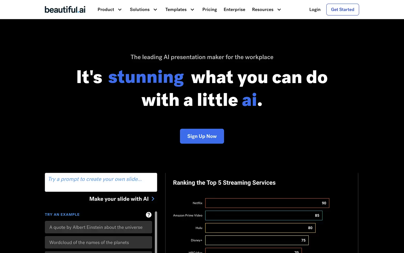
[fs-toc-h2]20. Beautiful.ai
Beautiful.ai is a presentation tool that helps users design polished slides automatically, without worrying about layout or spacing.
Design strengths:
The site opens with clarity and structure. Rather than focusing on templates, it showcases full presentations, helping users instantly understand the value. Smooth animations and layout previews clearly explain the product without needing long descriptions. The tone is professional and approachable, and the design supports fast, intuitive navigation. It’s built to make slide creation feel easy, guided, and visually impressive.
Design takeaways:
- Showcase product output front and center (images, videos, color, layouts)
- Let visuals do the selling—especially if your tool is visual by nature
- Use minimal UI when the work speaks for itself
Most of the sites featured are more than just well-designed; they also perform. That’s often the result of combining thoughtful UX with a clear SEO strategy. If you're building an AI product and want to bring in more qualified traffic over time, this SEO guide for tech startups covers the principles we apply when helping teams grow visibility without sacrificing brand or conversion quality.
AI Website & UI Builders
These tools turn sketches, prompts, or basic inputs into working websites. The best ones do more than generate structure and layouts; they generate confidence. That confidence is built through smart UX, quick previews, and messaging that emphasizes speed without sacrificing control.
[fs-toc-h2]21. Webflow AI
Webflow AI is Webflow’s built-in generative tool that helps designers and marketers build, edit, and customize sites faster. It can generate layouts, update page structure, and write copy using prompts, all directly inside the Designer mode.
Why it stands out:
Webflow AI keeps its focus on speed and creative control. The site doesn’t try to over-sell, it simply shows how AI fits into a visual workflow that users already trust. The messaging is confident and built around real use cases, like faster layout creation and in-designer editing. The design stays true to Webflow’s brand: clean, sharp, and user-focused. It makes it clear that this is AI made for professionals who still want full control, not shortcuts.
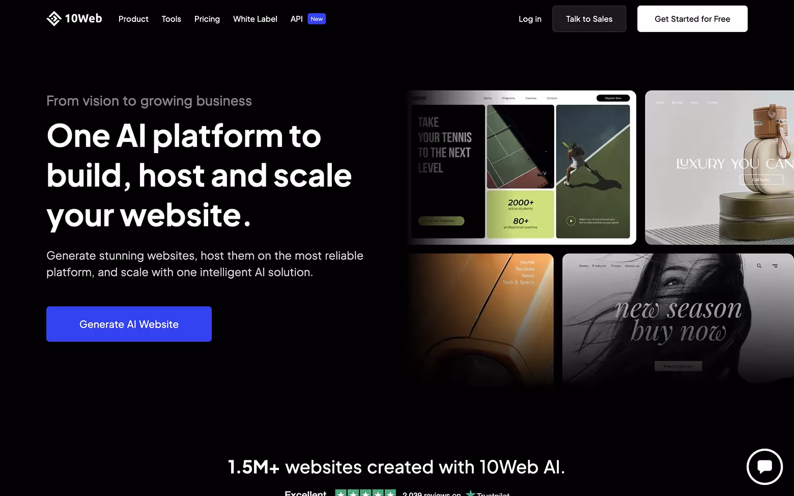
[fs-toc-h2]22. 10Web.io
10Web uses AI to build WordPress sites from a simple prompt. It also includes hosting, performance optimization, and a drag-and-drop editor.
What works well:
10Web.io leads with a clear promise and supports it with a focused layout. The site emphasizes speed and automation, and every part of the design reinforces that visually. Step-by-step previews show how the platform works, reducing guesswork and keeping users engaged. The design feels accessible, especially for users familiar with WordPress, and it avoids overwhelming them with excessive features. It’s a practical, benefit-first approach that builds confidence early in the user journey.
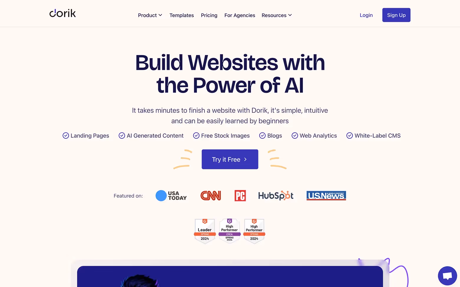
[fs-toc-h2]23. Dorik AI
Dorik AI creates clean, fast-loading landing pages from a single prompt. It’s a popular choice among startups, creators, and indie builders.
Design strengths:
Dorik AI delivers a modern interface that emphasizes simplicity and speed. The homepage immediately communicates its core value—building websites quickly with AI. The layout is straightforward, with clear calls to action and brief explanations of features. Visuals, like icons and screenshots, illustrate the platform's capabilities without overwhelming the user. The design feels friendly and efficient, making it ideal for users looking for a quick and easy solution.
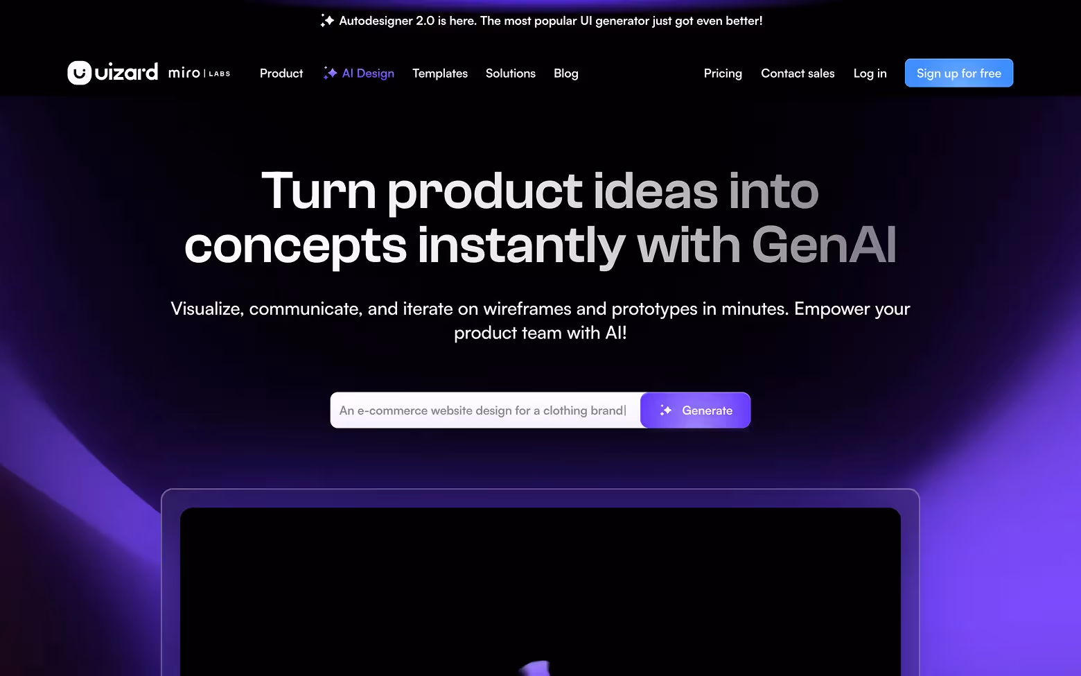
[fs-toc-h2]24. Uizard.io
Uizard turns wireframes, screenshots, or text prompts into design-ready mockups. It’s aimed at non-designers who want to move from idea to interface fast.
Why it stands out:
Uizard.io is built to feel quick and accessible, and the website communicates that immediately. It starts with use-case paths tailored to different roles, helping users find their place quickly. Motion previews demonstrate how wireframes become full interfaces, offering a tangible sense of progress. The layout is energetic yet structured, focusing on real results. It balances creativity with clarity, making the tool approachable for beginners without compromising on power.
If you're mapping out your own project, our business website guide walks you through the full process.
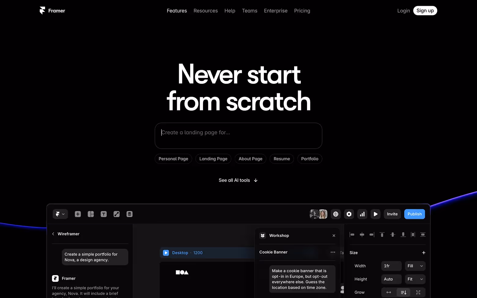
[fs-toc-h2]25. Framer AI
Framer generates production-ready websites using natural language prompts. It’s known for elegant templates and smooth page transitions.
Design highlights:
Framer AI presents itself as a premium creative tool, and the design reinforces that impression from the start. The site feels sharp and fast, with refined typography, fluid animations, and a layout that reflects strong design sensibility. The AI flow is shown instantly rather than explained, which makes a strong impact. Every section feels intentional and polished, giving the experience a premium feel. It’s built for users who care about visual quality and want control without the friction of traditional tools.
[fs-toc-h2]26. Durable.co
Durable builds full business websites in under a minute, complete with CRM and essential business tools. It’s designed for solopreneurs and small business owners.
Design decisions that matter:
Durable.co prioritizes speed, and the design communicates that instantly. The homepage speaks directly to solo entrepreneurs with clear messaging and a friendly tone. The layout is lightweight but effective, guiding users through the product's value in just a few scrolls. Visuals clearly explain the AI process, and every section encourages quick decisions. The site makes it easy to understand, try, and trust the product, all within the first minute.

Design takeaways:
- Lean into simplicity — users want fast results, not configuration menus
- Preview the output early and often
- Use landing pages and CTAs that speak directly to your audience’s goals
AI Productivity & Collaboration Tools
These AI tools integrate seamlessly into everyday workflows, making people more efficient at writing, planning, and managing work. The best sites in this space reflect that simplicity and utility with interfaces that get out of the way and content that speaks directly to busy professionals.
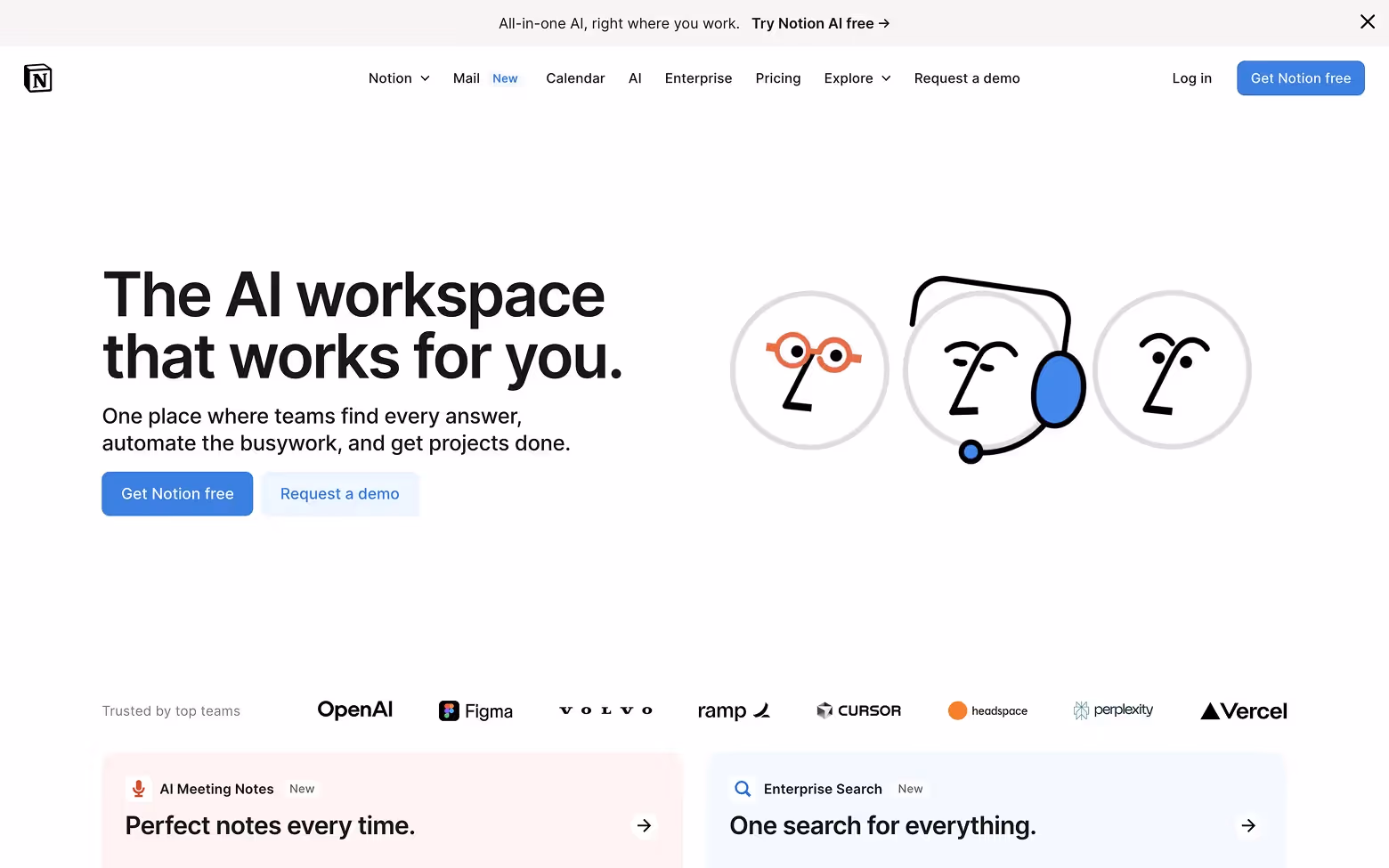
[fs-toc-h2]27. Notion AI
Notion AI brings writing and summarization features into the Notion workspace. From turning meeting notes into summaries to helping with brainstorming, it blends seamlessly into existing pages.
Why the site works:
Notion AI blends into the core product experience, and the website reflects that seamlessly. The design is modular and calm, matching Notion’s signature style. Each section shows how the AI fits into real workflows, summarizing, writing, organizing, without overselling. The visuals are product-focused, and the messaging stays simple and benefit-driven. It’s a smooth extension of the main platform, built to help users immediately see how AI adds value without changing how they already work.
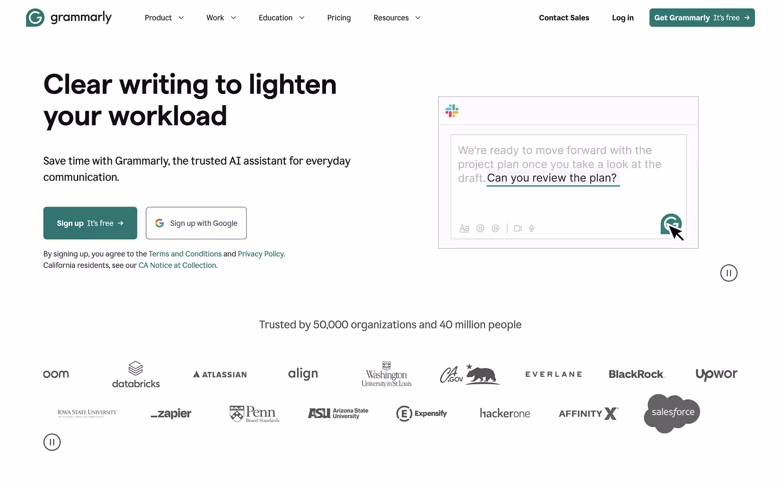
[fs-toc-h2]28. Grammarly AI
Grammarly has evolved from grammar checker to full-blown communication assistant. Its AI can rewrite, rephrase, and adjust tone across apps.
Design strengths:
Grammarly AI stays true to its core: clarity, confidence, and control. The site is built around outcomes, with before-and-after examples that make the product’s value easy to grasp. The layout is clean and highly readable, reflecting the product’s promise of better communication. Design choices feel familiar and trustworthy, which matters in a tool users rely on daily. It’s a simple, confident experience that supports both new users and loyal ones with the same clarity the product delivers.
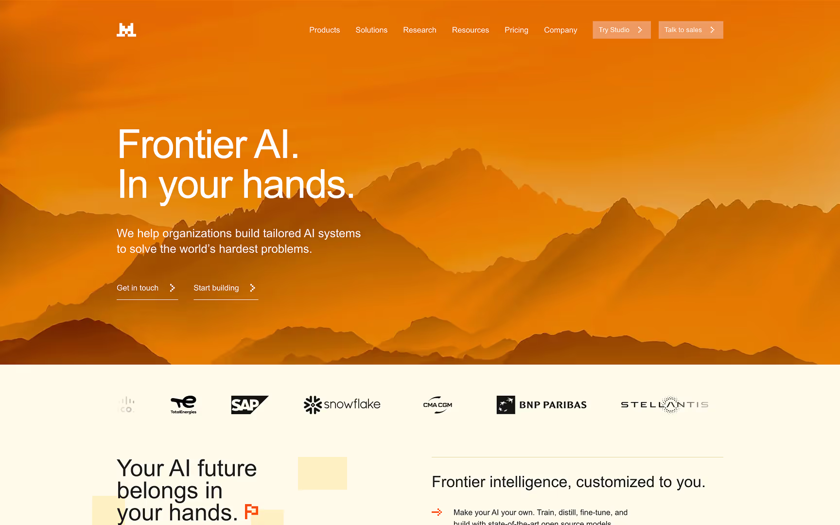
[fs-toc-h2]29. Mistral.ai
Mistral AI is a foundation model company used to power assistants, search, and internal copilots, helping teams build and deploy AI systems using their models, APIs, and products like Studio.
What works well:
Mistral’s site leads with one sharp idea: control. "Frontier AI. In your hands." frames the product as something you can own and deploy and not lease. The layout stays minimal and confident, with clear navigation and a simple split between builder and buyer paths (“Try Studio / Start building” vs “Talk to sales / Get in touch”). Trust is earned fast through enterprise signals like customer logos, while the copy stays outcome-led and avoids jargon. The result is a premium, high-credibility homepage that makes a technical platform feel straightforward. The bold orange palette and pixel-style techy icons add personality without reducing credibility, giving the site a technical yet approachable look and feel.
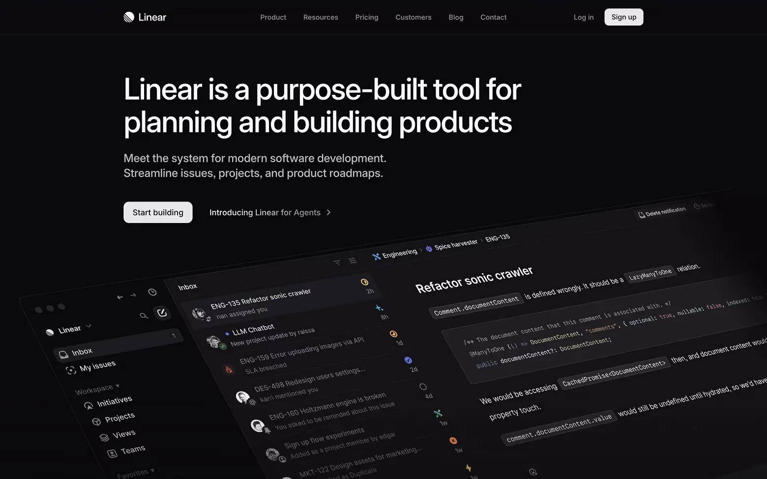
[fs-toc-h2]30. Linear.app
Linear is a project management tool with AI-assisted workflows for planning, issue tracking, and team collaboration.
Why the site stands out:
Linear’s site mirrors the product, fast, focused, and elegant. The visual design is sharp, with clean typography and subtle motion that create a smooth rhythm while you scroll. Every section has space to breathe, and nothing slows you down. It’s a great example of how to communicate speed and precision through design alone. The experience feels like using the product itself: minimal, structured, and highly refined.
Design takeaways:
- Reflect the product's UI patterns and pace in the site experience
- Focus on showing vs. telling, especially when illustrating workflow speed
- Speak to professionals in their own language (clarity, structure, impact)
AI Writing & Content Generation Tools
These platforms help users write better, faster, and more consistently. Whether you’re drafting landing pages, LinkedIn ads, or long-form blog posts, these tools remove the blank page and replace it with momentum. Their websites highlight clarity, flexibility, and scale.
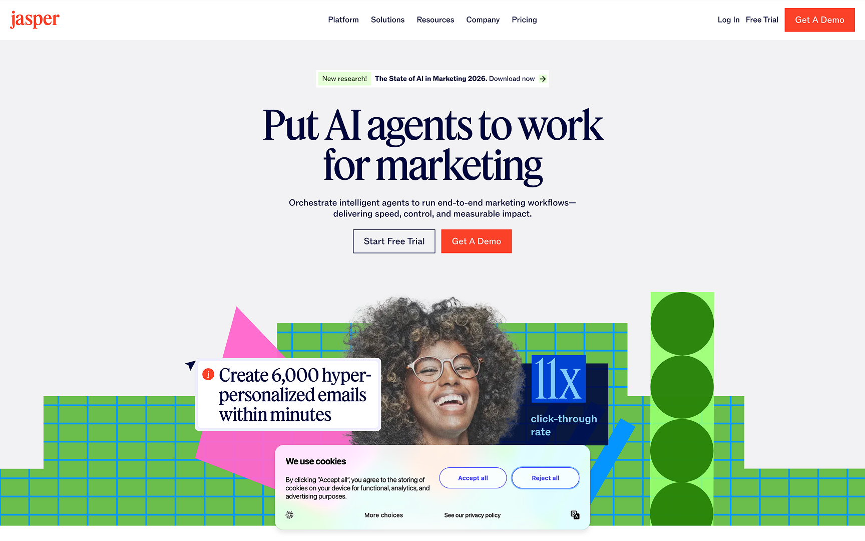
[fs-toc-h2]31. Jasper.ai
Jasper is a brand-aligned AI writing assistant used for sales copy, marketing content, product descriptions, and more. It's built for teams that want to move fast without sacrificing voice.
Why the site works:
Jasper.ai feels polished and confident right from the start. The design combines strong branding with a clear focus on business outcomes, showing how the tool fits into real marketing workflows. Animations, UI previews, and role-specific messaging all work together to guide different types of users. The layout is structured without feeling rigid, and every section has a job. It’s a site that builds trust quickly while showing off both capability and scale.
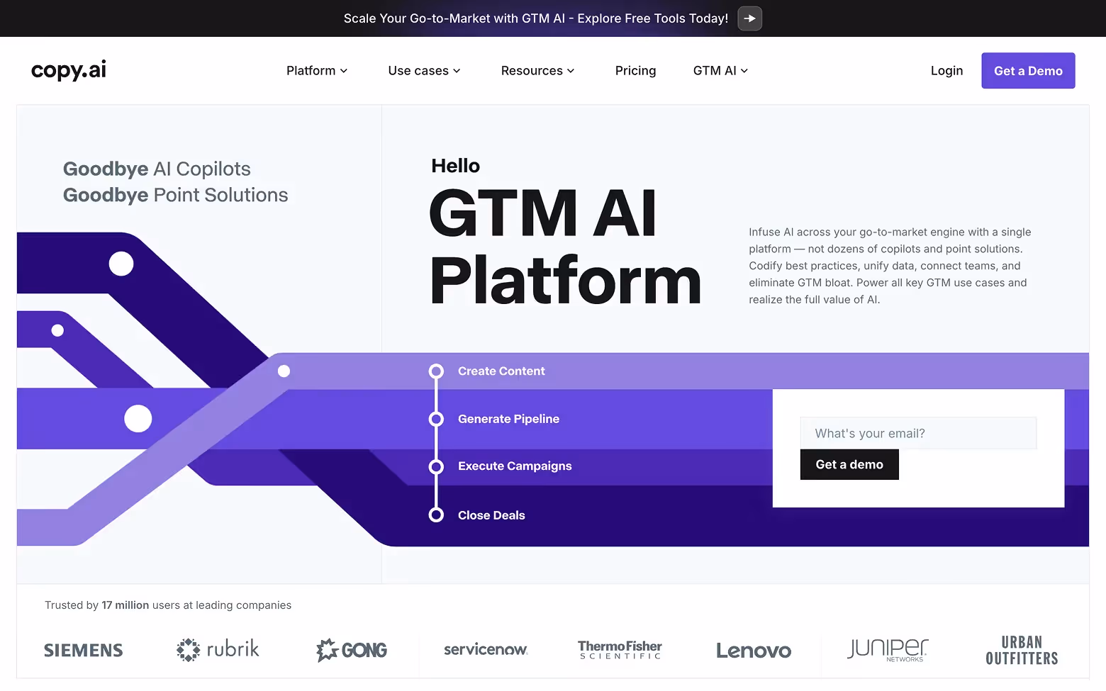
[fs-toc-h2]32. Copy.ai
Copy.ai helps marketers generate content for emails, ads, blog posts, and product pages. Its strength lies in giving structured templates and quick suggestions to keep you moving.
Design highlights:
Copy.ai leads with clarity and keeps the experience focused. The headline is actionable, the layout is direct, and you can try the product without creating an account, which lowers friction right away. Each scroll reveals a new use case or tool, backed by simple visuals and global-ready design. The tone is practical, the UI is light, and the message is clear: get your content done faster. It’s built to convert quickly without overwhelming the user.
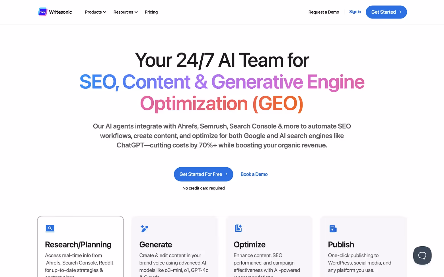
[fs-toc-h2]33. Writesonic
Writesonic is a content generation platform for businesses looking to scale their marketing output. It includes everything from blog tools to chatbot scripting and ad variations.
What stands out:
Writesonic’s site is fast, bold, and packed with motion. The design moves quickly from feature to feature, showing how the product can support everything from blog writing to ads and chatbots. Each section is distinct but keeps a consistent rhythm, which makes the experience feel dynamic without getting messy. The bright visuals and embedded previews reinforce speed and versatility. It’s a high-energy layout that matches the platform’s focus on scaling content creation.
Design takeaways:
- Use live previews and guided templates to reduce cognitive friction
- Balance strong brand visuals with utility-first layouts
- Speak to multiple audiences by breaking use cases into clear buckets
Conclusion
The AI space is crowded, but good design is still rare.
The 33 websites in this guide build trust, guide users to action, and reflect a deep understanding of their audience. Each site offers its own lesson:
- If your AI is complex, simplify with motion and UI previews.
- If your category is saturated, differentiate with personality and tone.
- If your product does a lot, anchor it in specific use cases.
The common thread? Great AI websites aren't about the technology. They are about clearly communicating the outcomes the technology provide.
One could say it's the common thread across B2B websites in general. You can see for yourself in our 17 best B2B websites roundup.
Because how you present your AI is the first signal of how useful it will actually be.
If you want help turning your AI product into a website that builds trust and drives demos, we’re an AI web design agency built for AI teams. Contact us to see how we can help.