


Why Cozy Websites Keep Users Engaged (and Drive Conversions)
Most websites look polished but feel cold. When users don’t connect, they leave, and conversions drop.
This happens because brands often prioritize visuals over emotion. Cozy design fixes that by creating spaces that feel welcoming and professional, helping users stay, engage, and convert.
If you’re starting from scratch, follow our step-by-step guide to building a business website first to set a solid foundation.
In this guide, you’ll learn eight ways to make your website feel more inviting, starting with the most powerful design element: color.
Tip 1: Use a Warm, Inviting Color Palette
Color is one of the most effective ways to influence how visitors feel on your website. Warm tones like muted oranges, soft yellows, and earthy neutrals can create a sense of comfort and approachability. Avoid cold, sterile palettes dominated by grays or stark whites, which often make a site feel impersonal.
For more inspiration, explore 32 of the best AI website examples that combine cutting-edge design with inviting, human-centered visuals.
Do this:
- Use warm accent colors strategically to reinforce emotional connection.
- Combine soft backgrounds with rich, bold brand colors for balance.
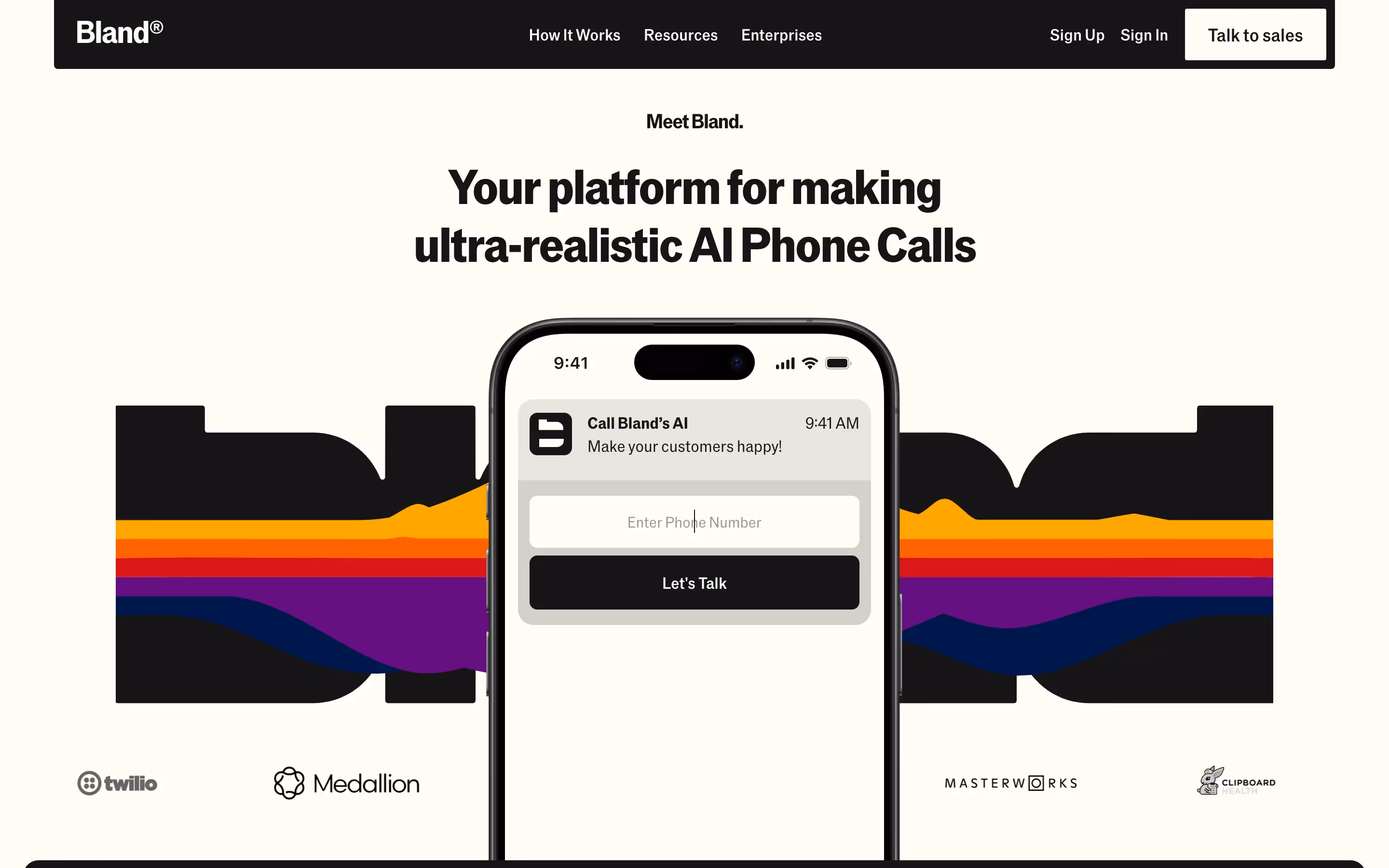
At Bland AI, we brought a warm beige background and deep blue accents to life during the build, creating an interface that felt both sophisticated and inviting.
“Tilipman Digital delivered the site at record speed—right in time for our Series B announcement. Since the revamp, we’ve seen a 35% increase in organic traffic and stronger conversions across the board.”
— Dimitrije Gujanicic, Growth Coordinator @ Bland AI

This color approach was part of a broader site revamp during their hypergrowth phase—see the Bland AI case study.
Tip 2: Choose Friendly, Readable Typography
Typography shapes how users perceive your website. The right typefaces make your content approachable and effortless to read. Rounded, open fonts combined with generous line spacing can create a softer, more human feel.
Do this:
- Use modern, legible typefaces like Lato, Nunito, or Open Sans.
- Set a base font size of at least 16px with ample line height.
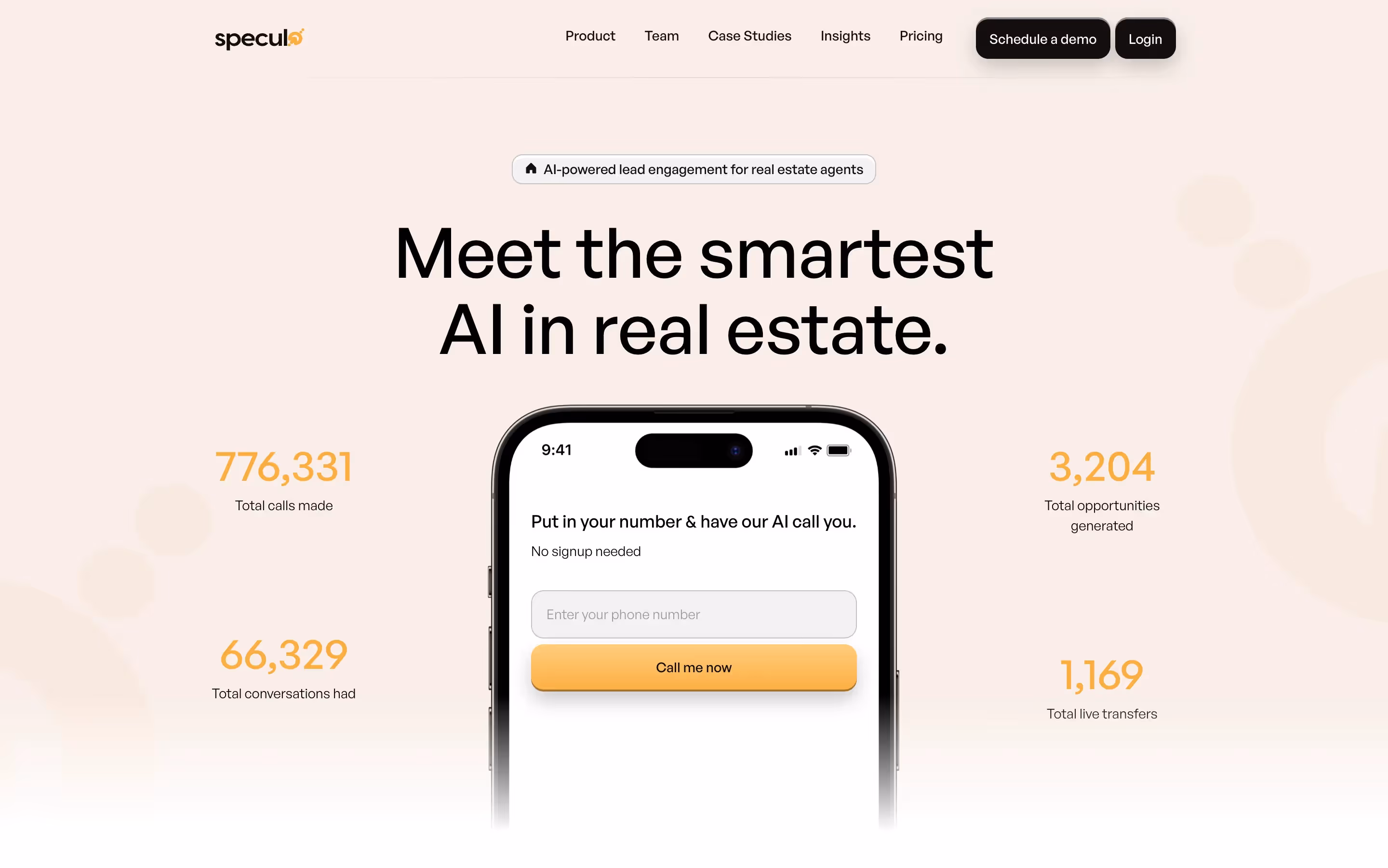
When we worked with Speculo AI, we focused on approachable typography to make their advanced AI product feel accessible to a non-technical audience. This was part of a full website redesign—see the Speculo AI case study—where clean, legible type and thoughtful spacing kept the user experience warm while maintaining a professional tone.
Tip 3: Incorporate Thoughtful Imagery and Custom Illustrations
Visuals are essential for setting the tone of your site and building emotional connections. High-quality, relevant imagery creates relatability, while generic stock photos often feel cold and impersonal.
Do this:
- Integrate custom illustrations and lifestyle photography for a human touch.
- Use subtle visual elements that align with your brand personality.
At Speculo AI, we introduced animated visuals and carefully curated imagery to humanize their highly technical product and make it more engaging to their audience.
If you’re planning your website from the ground up, check out our 7-step website creation guide to build a strong foundation before applying these cozy design tips.
Tip 4: Embrace White Space and Gentle Layouts
Cluttered designs overwhelm users. Generous white space and clean layouts create a sense of calm and focus, helping users navigate comfortably.
Do this:
- Apply grid-based layouts and card-style sections for clarity.
- Give text and visuals room to breathe for a relaxed experience.
At Speculo AI, we prioritized clean layouts and intentional spacing to make their content-heavy pages approachable. This balance between structure and openness reduced user fatigue and made navigation intuitive.
Tip 5: Add Texture, Shadows and Subtle Animations
Small design details can make your website feel more tactile and dynamic without overwhelming visitors. Thoughtful use of textures, soft shadows, and animations adds depth and makes interactions feel more natural.
One powerful tool for this is Lottie animations. They’re lightweight, scalable, and perfect for creating smooth, interactive motion graphics without slowing down your site. When used strategically, Lottie animations can bring key elements to life, strengthen brand identity, and deliver a more premium user experience.
Other subtle animations—like hover effects, scroll-triggered transitions, and micro-interactions—are also essential for creating a polished feel. While these are typically added during the development phase, it’s important to account for them in the design stage to ensure they integrate seamlessly and feel intentional.
Do this:
- Use light background textures and soft shadows to add visual depth.
- Incorporate refined animations like hover effects, smooth transitions, and Lottie animations for a modern, interactive feel.
We implemented a Lottie animation in the hero section of Bland AI’s website to reinforce their brand identity and provide additional brand value. The subtle yet dynamic brandmark animation made their first impression feel more innovative and human-centered.
To learn more, read our guide on implementing Lottie animations and discover how they can elevate your user experience.
At Bland AI, these carefully crafted animations enhanced user engagement and positioned the brand as both cutting-edge and approachable—all while maintaining fast load times.
Tip 6: Prioritize Comfort in Forms and CTAs
Forms and calls-to-action are often where users decide whether to engage or leave. Designing these areas to feel welcoming and frictionless can boost conversions.
Do this:
- Use rounded buttons and warm accent colors.
- Write microcopy that feels conversational and approachable.
- Simplify forms by reducing required fields and providing clear validation feedback.
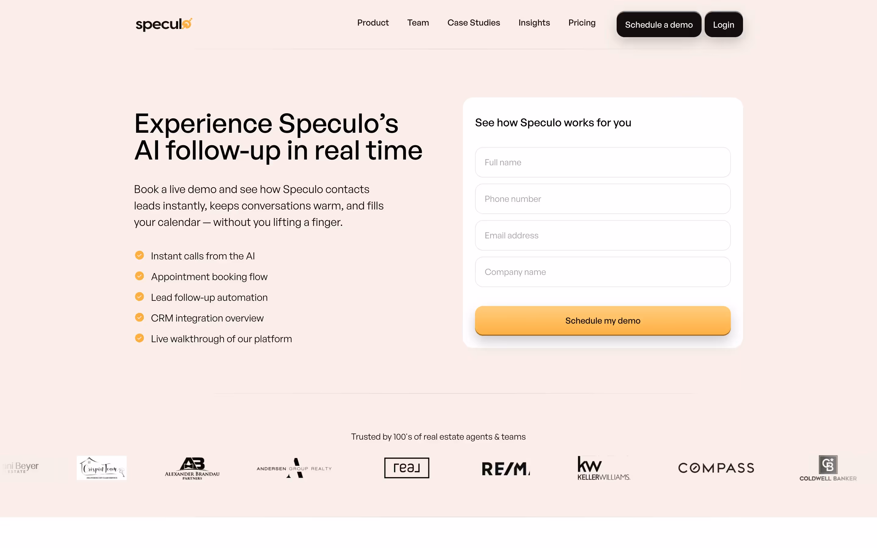
With Speculo AI, we redesigned key CTAs to feel more approachable, replacing generic labels with action-oriented text like “Schedule my Demo.”
Pro tip: If the site required a multi-step form, it would be beneficial to add a progress indicator to all forms to guide users through the process smoothly.
Tip 7: Maintain a Professional Touch
A cozy design doesn’t mean sacrificing professionalism. For B2B websites, consistent branding, structured layouts, and high-quality visuals are essential to building trust and guiding decision-makers through complex buying journeys.
Do this:
- Ensure navigation is intuitive and user flows are logical. Get our playbook on crafting the ultimate website navigation for actionable strategies to design menus that guide users effortlessly.
- Keep branding cohesive across all pages to reinforce credibility.
At Speculo AI, we combined warm, inviting visuals with a highly structured, professional design to position their platform as both cutting-edge and enterprise-ready. Their redesigned site helped clarify their value proposition to non-technical audiences while maintaining the sophistication expected in the AI space. This balance strengthened their brand identity and supported daily demo requests within weeks of launch.
Learn how our B2B Web Design Agency helps startups and scale-ups create high-performing websites that balance trust and warmth.

Tip 8: Leverage Storytelling and Microcopy
Stories create emotional connections and make websites more memorable. Adding thoughtful microcopy can guide users naturally through key actions.
Do this:
- Share your brand mission, team culture, and client success stories.
- Write conversational microcopy (e.g., “You’re almost there” on forms) to make interactions less transactional.
For Speculo AI, we integrated storytelling into their product pages to make their cutting-edge technology approachable.
“Tilipman Digital helped us make our AI product clear and approachable for a non-technical audience. The live demo on the homepage became a huge selling point, and just weeks after launch, we were seeing multiple organic leads and demos booked daily.”
— Kyle Fedewa, Co-Founder @ Speculo AI

Conclusion
A cozy website is more than an aesthetic choice; it is a strategic design approach that fosters trust and drives results. By using warm colors, approachable typography, thoughtful visuals, and carefully crafted microcopy, you can create an experience that feels inviting while remaining professional.
Want to see our step by step implementation process? You can read how we go around implementing these tips as part of our website design process.
And if you're ready to turn your website cozy, let's talk about how we can do it for you. Book a strategy call today (it's free).
Frequently Asked Questions About Cozy Website Design
How do I make a website look cozy yet professional?
Balance warm colors and friendly typography with structured layouts and consistent branding. This ensures the design feels inviting without compromising credibility.
What colors make a website feel warm?
Earthy tones, muted oranges, soft yellows, and warm neutrals are excellent for creating a cozy atmosphere. Pair them with accent colors that align with your brand.
Can a cozy design work for B2B websites?
Yes. Emotional design elements like storytelling, approachable visuals, and intuitive layouts build trust even in professional settings.
Is minimalism or coziness better for conversions?
It depends on your audience. Minimalism reduces distractions, while cozy designs foster emotional connection. The best approach often combines both for clarity and warmth.
What are examples of cozy website designs?
You can find cozy UI inspiration on platforms like Dribbble and Pinterest, where designers share layouts featuring muted color palettes, custom illustrations, and warm typography.
Can cozy design help improve conversion rates?
Yes. A cozy, approachable design makes users feel at ease, which reduces friction and encourages them to take action. At Tilipman Digital, we’ve seen this approach increase conversions for B2B sites like Speculo AI and Bland AI.