

Not all design processes are created equal.
You might have worked with other web design agencies before and want to see how we actually get things done compared to them. Or maybe you’ve been following Tilipman Digital and want a deeper look at how we work.
No matter who you are, we’ll walk you through our exact website design process, which is the second stage in our five-part website delivery framework. Curious about strategy, development, SEO, or QA? Those will be linked in our TL;DR section once the content is written.
Before getting into the design side of the process, getting a high-level overview of the whole framework will help you understand why we structured our processes like we did.
The Website Delivery Framework: Why It’s Structured This Way
Great websites don’t come from winging it. They also don’t come from a single person doing everything end to end.
Here’s the truth: designers aren’t marketers. Marketers aren’t developers. Developers aren’t copywriters. And nobody catches all mistakes without a second set of eyes. We’ve structured our delivery process to reflect that, each phase has a clear purpose, an owner, and a handoff point. That’s how we avoid common breakdowns and keep projects moving toward results.
Here’s a high-level overview of how it works:
Stage 1: Discovery & Strategy
We start with clarity before the scope is signed.
Discovery is the best time and place to collect important information that will decide the project’s success. We pressure-test assumptions and build the foundation for everything that follows. That means reviewing what’s working on the current site, what isn’t, and where the opportunities lie for us to come in and optimize.
Since we started out as a Webflow development agency, our thinking used to be: “If it’s not broken, don’t change it.” That’s changed. Now it’s: “If it’s not broken, optimize it.” Traffic, conversion points, page performance; if something’s doing okay, our goal is to make it great. That mindset shift helped us improve the outcomes for our clients across many projects.
During this stage, we cover:
- Business goals and KPIs
- The website’s role in revenue and pipeline
- Messaging direction and positioning
- Stakeholder alignment and team capacity
- Tech stack, integrations, and other considerations
- Initial sitemap and content planning
This research helps us make decisions, whether to take on the project, forward it elsewhere, or simply help the lead understand if what we’re offering is even relevant to them.
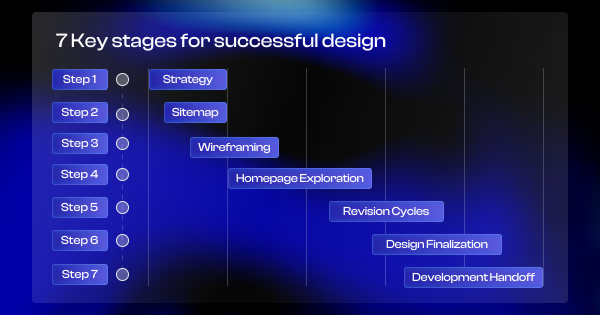
Stage 2: Design
In this stage, the strategy becomes visual.
We start by finalizing the information architecture, then move into low-fidelity wireframes to plan layout and content flow. At this stage, we’re thinking through hierarchy, messaging weight, and where conversions need to happen.
Once that’s approved, we move into visual design, starting with any refinements to the visual component of the brand identity (if needed). That might include typography, spacing, layout systems, and how the brand shows up across the site.
Looking good is great, but in B2B, performance comes first. If a design converts better by being simpler or more direct, we go with that. Design serves the business, not the other way around.
We cover the stage in detail in this article.
Stage 3: Development
Once the designs are approved, we build the site from scratch, usually in Webflow, our preferred development tool. We also work in Framer, Divhunt, or WordPress depending on the project, but most of our builds happen in Webflow.
Let’s clear something up: Webflow isn’t a design tool. It’s a front-end development platform. Just because a designer creates great mockups in Figma doesn’t mean they should be the ones building the site. If this doesn't make sense, our web design vs web development article clears this up.
Our developers own this phase. Their job is to make sure the build is clean, scalable, responsive, and properly integrated with your marketing stack.
This separation matters. When designers try to handle development, it leads to technical issues in 9 out of 10 cases. That means you’ll have broken integrations, or missing marketing functionality. We’ve seen that play out a few too many times and it’s why we treat development as its own discipline.
Stage 4: SEO Optimization
SEO isn’t a last-minute checklist. SEO runs in parallel with the rest of the build.
Once information architecture is finalized and content laid out, our SEO team works alongside designers to make sure pages are structured around real search intent and keyword opportunities. This way we’re ensuring your audience can actually find you for the things they’re already searching for, and that the page is built to match that intent.
On the technical side, SEO is really just the correct implementation of development. Structured HTML, performance, internal linking, metadata. That’s what makes a site indexable and competitive. Developers who know how to read documentation but don't want to build full features often land in SEO for that reason.
That’s why our SEO works hand-in-hand with the developer throughout the process. It’s not one person jumping in at the end, but baked in from the ground up.
Stage 5: Quality Assurance (QA) & Launch
“Simple first, powerful later.” We believe in that, but simple still has to work.
A stripped-back site that’s broken or untested doesn’t help anyone. That’s why QA isn’t handled by the person who built the site. A separate team member reviews each page right after it’s been developed.
We test for:
- Layout and spacing issues across screen sizes
- Browser compatibility
- Form behavior and submission flows
- CMS output and dynamic content rendering
- Integration with tools like HubSpot, Google Analytics, and CRM platforms
Things break. That’s expected. QA exists to catch it early, not after you’ve launched.
Back on track, let’s talk about design.
Step 1: Before Design Starts: The Strategy Workweek
Design doesn’t start in Figma, but with strategy.
After signing the scope, we dedicate the first week to structured discovery. It’s a focused phase where we align on goals, content, structure, and messaging, before a single layout is designed.
Here’s what happens during that week:
- Strategy Workshop: We map business goals, value props, and user segments.
- Content Workshop: We define messaging pillars, CTAs, and content needs.
- Product Walkthrough: We get a live demo and play with the product ourselves.
- Sitemap & IA: We outline the full site structure and user flows.
- References & Moodboards: We collect visual references, build initial moodboards, and align with the client in direction before design begins.
- Strategy Doc: We compile all key decisions into a client-approved document that guides the design phase.
This alignment gives the design team a clear runway for smooth execution.
By the end of this phase, we’ve locked in the foundation: business intent, page hierarchy, content placeholders, and creative direction. That’s the groundwork for meaningful design.

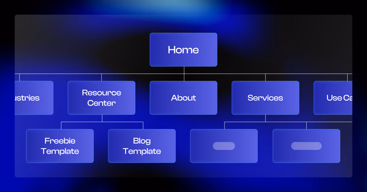
Step 2: Defining the Sitemap & IA (Blueprint of the Site)
Once the website strategy is signed off, we move into structuring the site. This stage sets the foundation for how users navigate, how content is organized, and how conversions happen.
We define:
- What pages exist and why
- How they function and interlink
- What content each page needs to convert
Our funnel mapping template provides a structured way to plan what funnel stage each page is in and what content is missing to help the site convert more leads.
Page Inventory by Type and Function
We group every page into one of three categories:
- Static Pages: custom-designed, manually managed (e.g. Homepage, Product, About)
- Dynamic CMS Pages: content-driven and templated (e.g. Articles, Case Studies)
- Utility Pages: essential for UX and system flows (e.g. 404, Login, Thank You)
Each page is also labeled by:
- Intent: commercial, informational, or navigational
- Funnel Stage: TOFU, MOFU, or BOFU
This helps us map user intent to layout and tailor each page to its job in the funnel.
Journey Control via Interlinking
In theory visitors land through a certain path, but in reality they don’t always do that. Especially with SEO, they can enter at random, be it through blog posts, use cases, or even 404 pages.
So while we do plan for structured flows (especially if PPC is involved), we never rely on a fixed journey.
Instead, we build interlinking systems that actively guide users, using:
- Contextual CTAs
- Crosslinks between TOFU, MOFU, and BOFU pages
- Navigation logic that nudges users forward
This ensures visitors always have a clear next step, no matter where they land.
Section-Level Content Frameworks
Before we wireframe, we sketch a high-level outline of what each page needs to include:
- Key headline blocks
- Supporting proof (e.g. testimonials, logos, stats)
- CTA type and placement (primary, secondary, or contextual)
There is no copywriting yet; we focus on laying out the macro pieces that help designers and content writers come up with the necessary items.
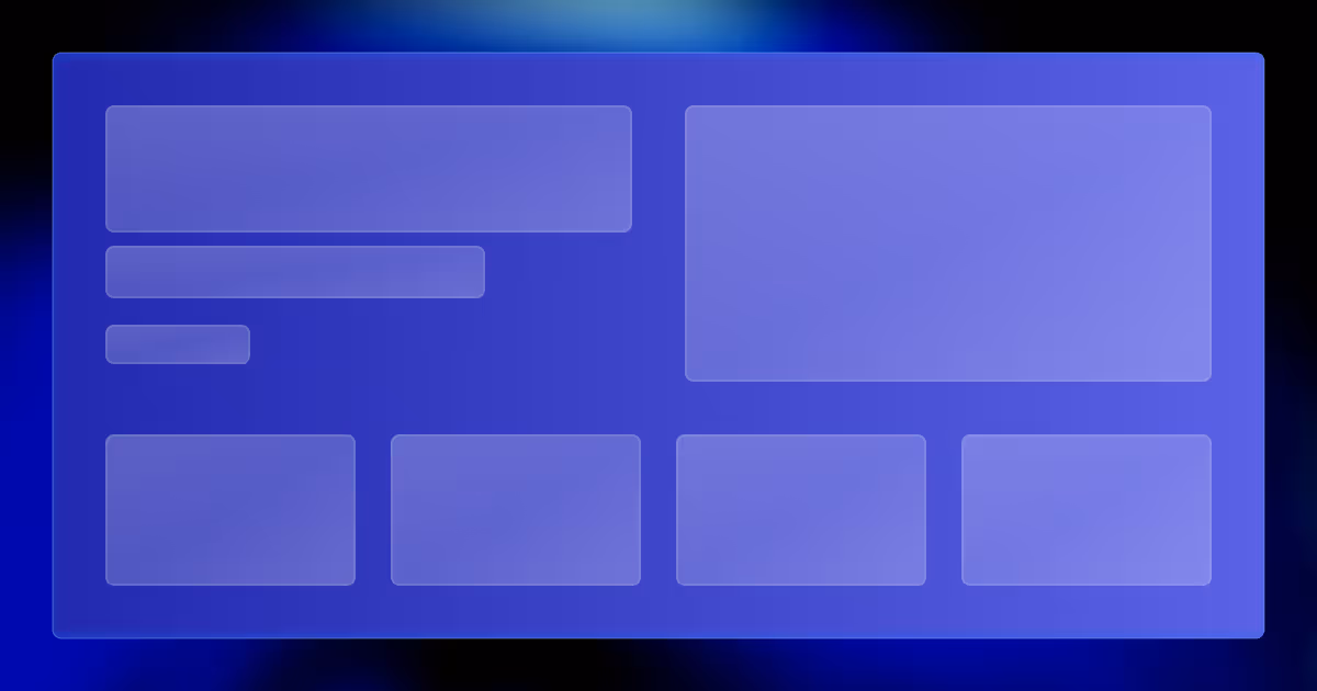
Step 3: Wireframing the Layout (UX Before UI)
Once the sitemap and content scaffolding are set, we move into wireframing to establish layout, structure, and finalize content.
Why Wireframes?
Wireframes are low-fidelity, black and white mockups that help us visualize the page’s layout and content. We use them to:
- Visualize messaging hierarchy: What comes first, what needs emphasis
- Finalize content needs: Stripped of color and visual noise, content stands on its own — so we can critique it clearly
The goal is to validate how clients will showcase the site, before adding any visual elements and actual design.
What We Use to Fill in Gaps
Not all final content is usually available at this stage and that’s normal. When needed, we use AI tools to help generate draft content; enough to simulate realistic page flows.
Wireframes help us explain utility. Once the structure is approved, we move into visual exploration.
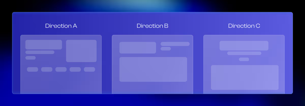
Step 4: Homepage Design Exploration
With wireframes approved, we move into visual design. The home page is the one that sets the creative direction for the rest of the build.
Why We Start With the Homepage
The homepage acts as the visual foundation. It’s one of the highest-traffic pages, and anchors the visuals and messaging tone for the remainder of the site. It’s where we test design ideas before committing to a single direction.
Exploring Multiple Section Styles
We create the first few sections (usually up to 5), starting with the hero and core value proposition instead of tackling the full page immediately. These are designed in two to three distinct visual directions, based on the moodboards approved during strategy.
This gives us room to explore how far the brand can go while staying consistent with the strategy, without committing to a single direction.
Finalizing Visual Identity
Once a direction is chosen, we refine and finalize the visual identity. That includes:
- Typography choices and layout rhythm
- Color systems and spacing
- Logo
- UI patterns
This is then scaled up for every page that follows.
What Clients Get
Clients get a Figma file that includes:
- A homepage concept built for conversion
- Design elements tied to the approved moodboards
- Annotations explaining design choices and developer instructions
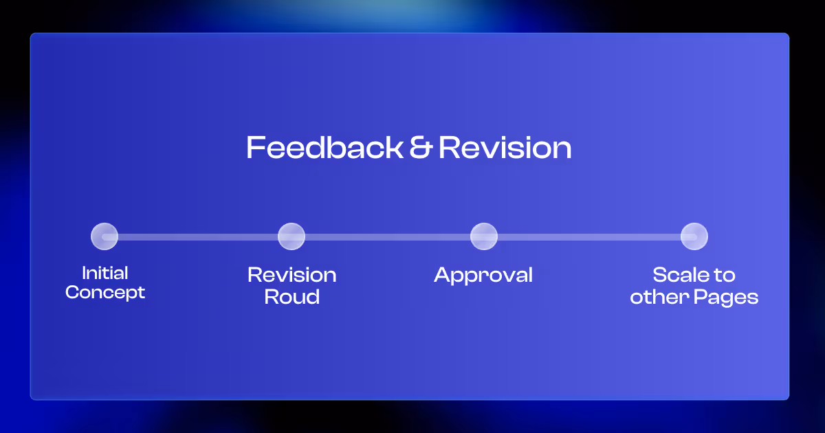
Step 5: Feedback & Revision Cycles (Refining the Homepage Direction)
Once the homepage concept is approved, we move into home page refinement. This step ensures the design is polished.
Feedback That Moves the Needle
We don’t limit clients in giving feedback. Technically, it can be unlimited. That said, there are rules. We only iterate if needed. As long as the feedback pushes the project forward and supports the approved strategy, feedback will be taken into account and implemented. This avoids pixel-pushing that doesn’t improve outcomes and delays launch.
Multi-Touchpoint Collaboration
Clients review designs in Figma. We keep communication synchronously at times, but async most of the time. It is organized through a few key channels:
- Pinned Figma comments for precise, element-specific feedback
- Slack threads for broader questions and strategic discussion
- Loom walkthroughs to explain rationale or walk through iterations
- Google meets to sync on larger decisions
This format helps keep everyone aligned and moving forward.
Maintaining Momentum
To keep timelines on track, we agree on:
- Review windows after each update
- Internal deadlines for gathering feedback
- Clear change log with attached footnotes
This allows us to be flexible without sacrificing delivery speed.
When We Move On
Once we’ve approved the homepage and ensured it reflects the goals set in the strategy phase, we treat it as the design foundation. From here, we begin scaling the visual system across the rest of the site.
Step 6: Designing the Remaining Pages
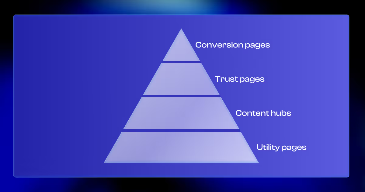
With the homepage direction approved, we move into full-site design, tackling remaining pages in focused sprints based on the site’s navigation and funnel priority.
Sprint-Based Approach
We design in priority order:
- Conversion-focused pages: Services, Product, Pricing
- Trust-builders: Case Studies, About
- Content hubs: Blog, Podcast, Resources
- Utility: Contact, 404, Legal
Each sprint is reviewed and refined before the next begins. It keeps work paced, decisions fresh, and priorities aligned.
Scaling the Visual Language Across Pages
Core styles and components are pulled from the homepage and extended across pages:
- Layout patterns and spacing rules
- Buttons, forms, and interaction logic
- Typography and color behavior
We adapt flexibly without fragmenting the design language, create new components as needed and add them into the style guide.
Collaborative Review Cycles
Pages are delivered in small batches (2-3 at a time), allowing for:
- Faster feedback turnaround
- More contextual design decisions
- Less backtracking
Once all pages are approved, we’re ready to move into development.
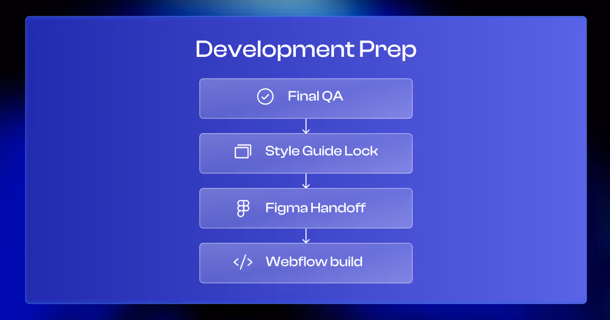
Step 7: Development Prep
Once all designs are approved, we prepare everything for development. This step exists to transition in the most polished way.
Final QA and Content Check
Before handoff, we review:
- Spacing and alignment across all pages
- Consistent use of components
- Color contrast for accessibility
- Final content added and approved
Essentially, we verify that everything should be in its final form.
Style Guide Lock
We finalize the design system:
- Colors, typography, spacing
- Reusable components and layout rules
- Notes for animations, hover states, and CMS setup
This system keeps the site consistent and easy to scale.
Figma Handoff for Development
We prepare the Figma files for the developers:
- Clean layers and labels
- Notes on functionality and animations
- Exportable visual assets ready for web
The files are easy to follow and ready to be built without confusion.
Moving to Webflow
With the design fully signed off, the development team starts building in Webflow. Because we handle both design and development in-house, everything is built exactly as planned.
This wraps the design phase and moves the project into production.
FAQs: Our Website Design Process at Tilipman Digital
Here are the most common questions we hear from founders and marketers about our website redesign process.
How long does the design process take?
An average project of ours takes 3-4 weeks depending on the client response time (10-15 pages). That includes homepage exploration, revisions, and the design of all remaining pages. Exact timelines are confirmed during kickoff.
How many revision rounds are included?
Technically unlimited. We don’t cap revisions. As long as feedback supports the approved strategy and improves outcomes, we’ll incorporate it. We use structured review rounds to keep things focused and prevent bottlenecks.
Do I need to have all my content ready before we start?
Not at all. Final copy isn’t required at the start. We work with rough content direction, placeholders, and draft copy (sometimes AI-assisted) to move forward. Copy gets finalized during wireframes and homepage refinement. At that point, be ready to either extend the duration of the project or pass over the existing copy.
Can I see and comment on the designs?
Yes. We design in Figma and invite you to review and leave comments directly. You won’t need to install anything or learn new tools.
Why do you design in Figma instead of directly in Webflow?
Designing in Figma allows faster iteration, real-time collaboration, and design system clarity before development (Webflow is a development tool). Once it’s all approved, we hand off organized files for a clean Webflow build.
How do you make sure the design actually converts?
Conversion starts in strategy. We define goals, messaging, and page flow early, then bring that into design through CTA placement, content structure, and layout logic. Every design decision supports your funnel.