

A great thank you page confirms the action, tells people what happens next, and points to one obvious next step. Use this gallery to borrow proven patterns by context, then measure impact with simple GA4 events.Many teams discover their lead-gen TY pages need design and dev muscle to ship quickly. If you need hands-on help building these flows, our Webflow development agency can implement them fast with clean, scalable components.
Why Thank You Pages Matter
A thank you page is a high-intent moment right after commitment. It reduces uncertainty, maintains momentum, and routes people to the next best step while making post-conversion actions measurable.
What a thank you page does
- Confirms success: Clear status (order received, form submitted, seat reserved).
- Sets expectations: What happens next, when, and where to get receipts/downloads.
- Guides the next step: One focused CTA that fits the intent.
- Builds trust: Social proof and helpful links (support, returns, docs).

Launching soon? Don’t wing it.
Use our free website launch checklist to avoid common pitfalls—like broken links, tracking issues, and SEO mistakes. It’s a comprehensive pre- and post-launch guide built for teams that care about getting it right the first time.
Typical contexts and goals
Metrics to watch
- Secondary Action Rate (click-through on the next CTA)
- Revenue per TY view / attach rate (ecommerce)
- Demo bookings / content engagement (B2B)
- Monthly-donor opt-ins / shares (nonprofit)
Best Practices for High-Converting Thank You Pages
Keep the page simple, specific, and action-oriented so the next click is obvious and measurable.
Core elements
- Clear confirmation headline + key details (order #, item, date, amount).
- “What happens next” in two bullets with timing/access.
- One primary CTA, visually dominant; avoid competing actions.
- Deliver promised value (download/receipt/registration info).
- Light trust: logos, guarantees, or support links.
Patterns to reuse
- Progressive upsell (ecom): Order-aware recommendations or bundle.
- Recurring prompt (donation): “Make it monthly” with impact framing.
- Onboarding nudge (SaaS): 2–3 step checklist to first value.
- Referral/share: One-click share or invite a colleague.
Copy & tracking
- Write plainly, thank the user, keep sentences short, and use benefit-first CTAs.
- Track
ty_viewandty_secondary_action; add UTMs to every TY CTA. - For setup, link your GA4 + Webflow guide.
Ongoing edits to UTMs and events keep your attribution clean. We can handle that as part of Webflow maintenance so TY tracking stays healthy.
11 Best Thank You Page Examples (by Use Case)
Below are focused, write‑ups for real patterns you can ship today. Each use case gets its own section so you can copy the layout, microcopy, and tracking plan without sifting through noise.
Donation Thank You Page Examples
Use the post‑gift high‑intent moment to reinforce impact, invite ongoing support, and make sharing effortless. Keep choices tight, deliver the receipt, and spotlight one clear next action.
Example 1: World Bicycle Relief — “Thanks for Donating” (share + fundraise)
This page thanks the donor, confirms a receipt is coming, then channels momentum into two post‑gift actions: social sharing and starting a fundraiser.
What to copy
- Immediate gratitude + receipt note
- Two next steps only: Share and Start a fundraiser
- Employer‑match lookup to increase impact
Why it works
- Low‑friction share plus higher‑commitment fundraiser meets different motivation levels
- Tight choice set avoids decision fatigue and sustains momentum
- Matching tools amplify perceived impact
KPI to watch
- Secondary Action Rate (shares + new fundraising starts /
ty_views)
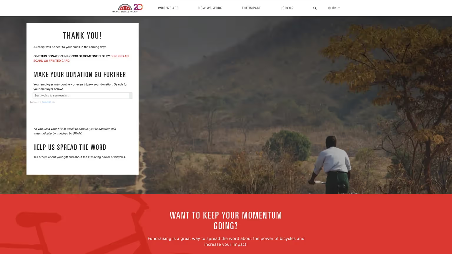
Source: World Bycicle Relief
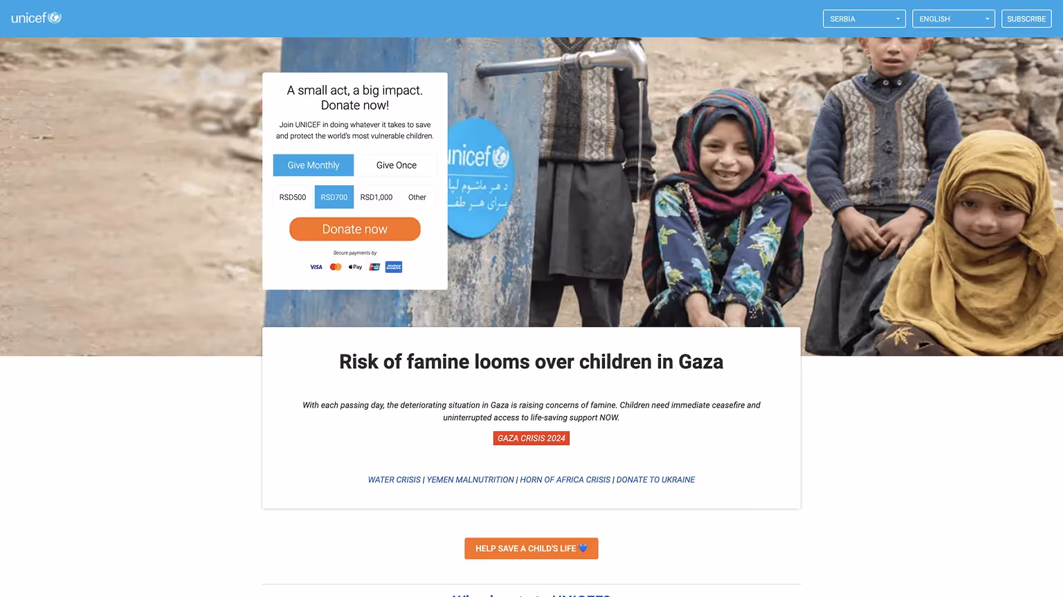
Example 2: UNICEF — Clear donate flow + monthly default (localized)
UNICEF keeps the decision simple with a Give Monthly / Give Once toggle, local currency presets, and one dominant Donate now button. A crisis banner below adds timely context without crowding the primary action.
What to copy
- Simple Monthly / Once toggle with preset local amounts
- One high‑contrast Donate now CTA with secure‑payment badges
- One‑line value prop above the form (“A small act, a big impact.”)
- Contextual crisis block below to channel urgency
Why it works
- Local currency + presets remove calculation friction and speed decisions
- Monthly is visible by default, planting the seed for recurring support
- Single, dominant CTA prevents dead‑end scanning
- Timely crisis context raises perceived impact without hijacking flow
KPI to watch
- Monthly conversion rate (monthly / total gifts), average gift size, form completion rate
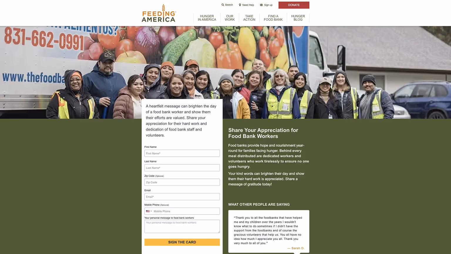
Example 3: Feeding America — “Share Your Appreciation” micro‑action + UGC proof
A low‑friction campaign invites visitors to write a short note of thanks to food bank workers. Real messages on the page model tone and make participation feel communal.
What to copy
- Short form (name, email, optional phone) + free‑text message
- Clear, specific headline and one bold CTA: Sign the card
- Social proof module with real supporter notes
Why it works
- Micro‑commitment converts passive visitors into engaged supporters
- UGC lowers blank‑page anxiety and boosts completion
- First‑party data capture fuels gentle follow‑ups (volunteer, donate, pledge)
KPI to watch
- Card‑sign rate (submissions / page views), email capture rate, post‑card CTA uptake
Ecommerce Thank You Page Examples
A strong post‑purchase page reduces uncertainty and drives one relevant next step. Lead with the order summary and support links, then offer a focused action that feels helpful—not pushy. For inspiration on aligning post-purchase messaging, browse our pricing page examples.
Example 4: Sephora — Loyalty + attach
Pairs order details with a prominent Beauty Insider enrollment and a small row of hand‑picked products.
What to copy
- Order summary and receipt/print options above the fold
- Loyalty enrollment as the primary next step
- Basket‑aware “People also bought” items, kept to a tight set
Why it works
- Reassures first, then channels energy into loyalty
- Curated items feel like service, not spam
- Limited choices keep attention on the main CTA
KPI to watch
- Attach rate from TY (loyalty signups or cross‑sell clicks /
ty_views)

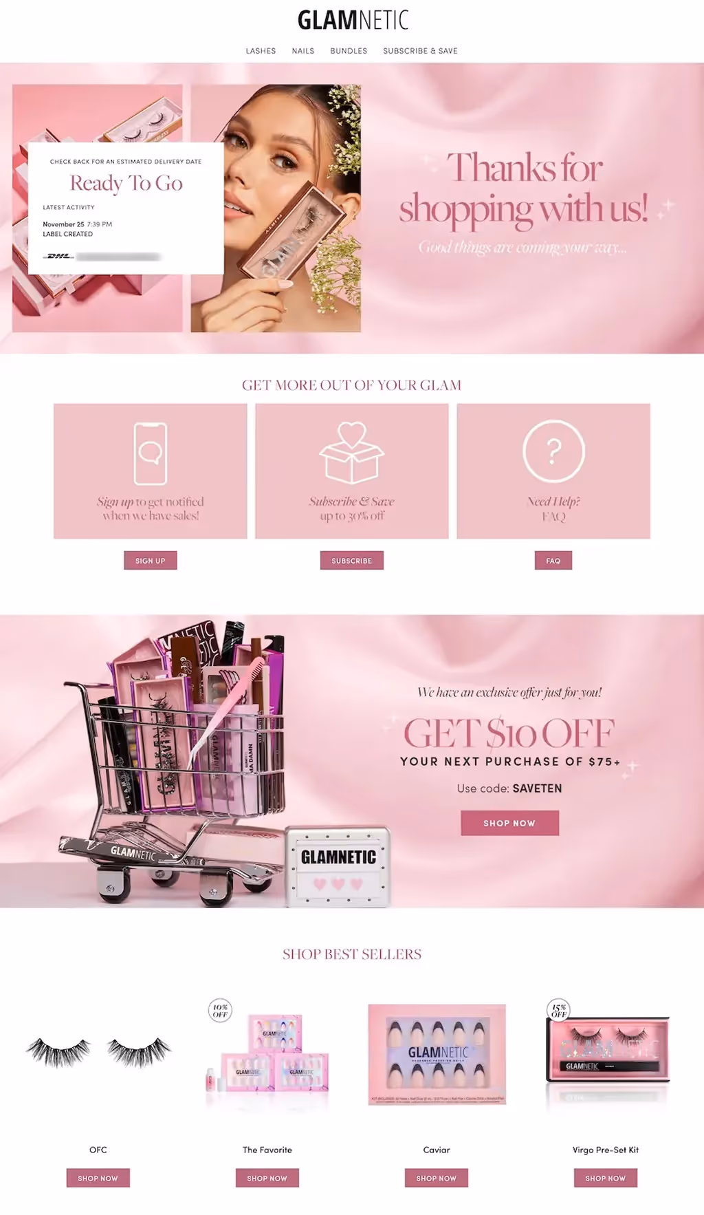
Example 5: Glamnetic — Post‑purchase nurture + time‑boxed incentive
Beauty brand TY reinforces the good vibes with order status, then invites three actions (alerts, subscribe‑and‑save, help) and presents a $10 off next order incentive before showcasing best‑sellers.
What to copy
- Visual order status (“Ready to go”) to reduce anxiety
- Three‑card action row: notifications, subscribe‑and‑save, FAQ
- Time‑boxed next‑order incentive with a clear code + Shop now
- Best‑sellers grid to capture warm intent
Why it works
- Status clarity cuts “where is my order?” tickets
- Action cards segment shoppers by intent without clutter
- Modest incentive nudges a fast second purchase
KPI to watch
- Coupon copy/use rate, best‑seller CTR, revenue per TY session
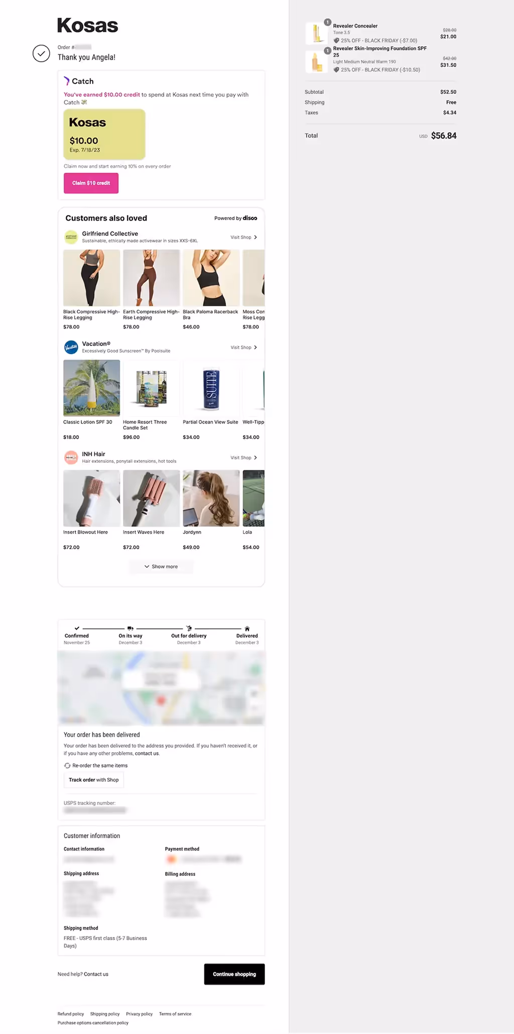
Example 6: Kosas — Wallet credit + marketplace recommendations
A Shopify‑style TY highlights a $10 credit via a wallet partner and shows tasteful, third‑party recommendations alongside delivery milestones and tracking.
What to copy
- Credit/loyalty unlock banner with a single Claim CTA
- “Customers also loved” carousel kept scannable
- Delivery timeline + tracking and easy reorder
Why it works
- Immediate value (credit) increases return‑visit likelihood
- Cross‑brand recs broaden discovery without feeling salesy
- Clear logistics reduce support and build trust
KPI to watch
- Credit claim rate, rec CTR, reorder/return visit rate
Survey Thank You Page Examples
After someone completes a survey, close the loop, deliver any incentive, and guide engaged respondents to one clear next action.
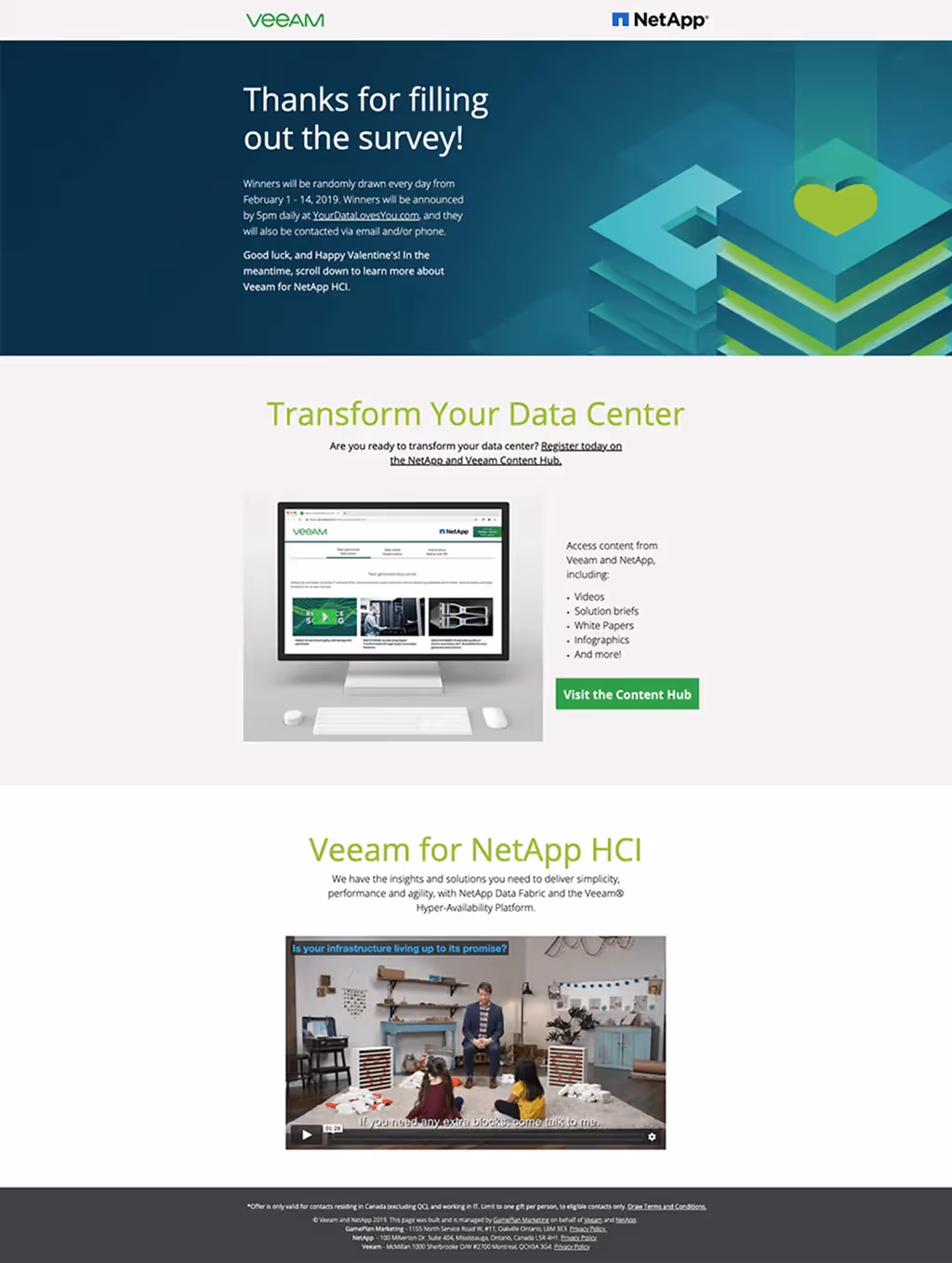
Example 7: Veeam — Contest survey → gated hub
Confirms entry and timing, then routes the most motivated visitors into a content hub and a short explainer video.
What to copy
- “You’re in” confirmation + when winners are announced
- Primary CTA to a relevant resource hub; add a short teaser video
- Secondary paths kept to one or two items max
Why it works
- Moves from micro‑commitment to value‑rich opt‑in without pressure
- Clear timing lowers support pings and no‑shows
KPI to watch
- Hub join‑rate and video plays from TY
Example 8: Center for Medicare Advocacy — Plain‑language confirmation
Thanks respondents, explains how results will be used, and offers a light follow‑up option (newsletter/webinar).
What to copy
- Gratitude‑first headline; no jargon
- Short paragraph on “how we’ll use your feedback”
- One optional follow‑up action (subscribe / register)
Why it works
- Closes the loop respectfully; reduces follow‑up emails
- Keeps engagement optional, preserving trust
KPI to watch
- Click‑through to updates or related content

Example 9: North Country HealthCare — Survey → personalized next steps
Reflects the respondent’s result, then offers two clear actions: request follow‑up or email the results to yourself.
What to copy
- Result‑aware headline and brief summary
- Two actions only: Request Information and Email me my results
- Visible support path for questions
Why it works
- Personalization makes the TY feel useful, not generic
- Dual‑path CTA meets both high‑ and low‑intent needs
KPI to watch
- Request‑info submissions and email‑results clicks /
ty_views

Thank You Landing Page Examples (Lead‑Gen)
TY flows should mirror your overall funnel strategy. See how TY pages fit into the bigger picture in our B2B website strategy guide. Goal is to deliver what you promised immediately, then offer a specific, low‑friction next step for sales‑ready visitors while nurturing everyone else.
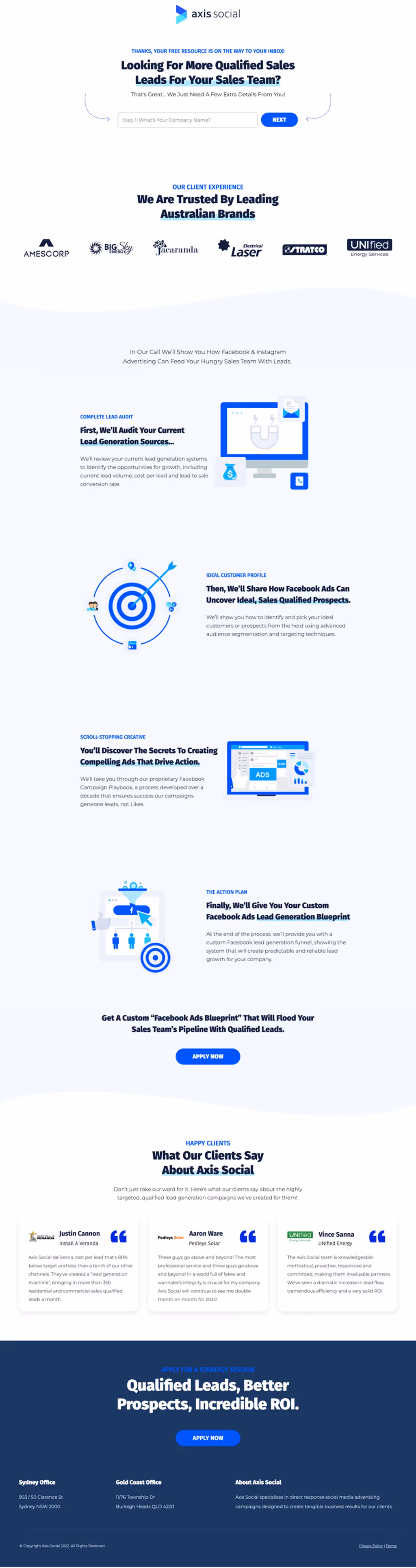
Example 10: Axis Social — From MQL to SQL with a specific call invite
The asset is on its way; the TY invites a short consultation with clear outcomes and uses logos and testimonials to de‑risk the click.
What to copy
- “Resource is on the way” confirmation
- Specific consult CTA (e.g., 15‑minute audit) above the fold
- Client logos + bite‑size proof and a few scannable value sections
- Secondary path to case studies/content for non‑sales‑ready visitors
Why it works
- Specificity beats “Talk to sales”; it sets expectations and feels helpful
- Social proof and a preview of the call agenda reduce hesitation
KPI to watch
- TY → meeting‑booked rate; scroll depth before booking
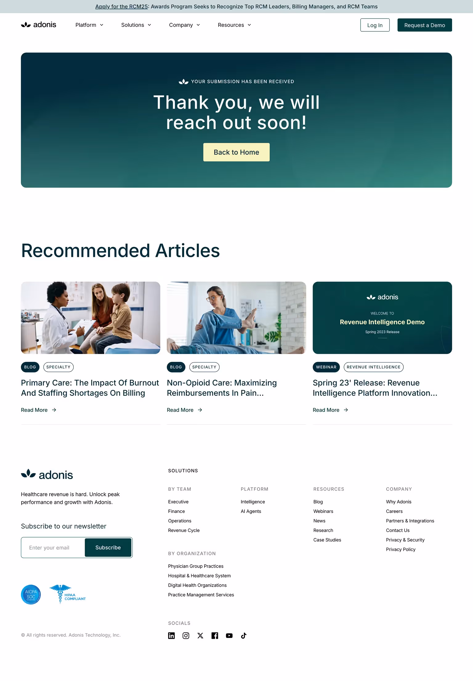
Example 11: Adonis — Content‑first nurture after contact
After a contact form, Adonis confirms receipt with a friendly headline and routes visitors to recommended articles, plus a newsletter opt‑in.
What to copy
- Clear confirmation (“we will reach out soon!”)
- Curated Recommended Articles module that matches the form topic
- Lightweight Subscribe field for ongoing nurture
Why it works
- Keeps momentum while the team follows up
- Content recommendations maintain relevance without a hard sell
KPI to watch
- Article CTR from TY and subsequent return‑visit rate
Common Mistakes to Avoid (Quick Checklist)
Use this skim list to fix the biggest leaks fast; each item pairs a signal with a one‑line remedy so you can act immediately.
Tracking Thank You Pages: the 6 must‑have items
Track the page view, the main click, and any high‑value interactions so you can attribute secondary actions and improve what matters.
ty_view— page view of the thank‑you URL (e.g., /thank-you/*).- ty_secondary_action — click on the primary CTA; include
cta_typeparam. - Optional events —
ty_add_to_calendar,ty_coupon_copy,ty_referral_click. - UTMs on TY CTAs —
utm_source=ty,utm_medium=internal,utm_campaign=post_conversion, plusutm_content=[cta_type]. - Audiences — all TY viewers, and segments by cta_type clicked for retargeting.
- Setup guide — see our GA4 + Webflow walkthrough: Google Analytics Integration
Driving conversions doesn’t stop at the first form submit; it includes post-conversion actions. For more on improving conversion paths (including post-signup pages), reach out to our Conversion Rate Optimization Experts.
FAQs
What’s a good example of thank you page?
A strong example of thank you page confirms the action in plain language, sets expectations in a sentence or two, and offers one obvious next step that matches intent. Here are two live, copy-able models:
Donation — World Bicycle Relief
World Bicycle Relief thank you page confirms the gift, shows impact, then offers just two follow-ups (share the cause or start a fundraiser).
Why it works: zero ambiguity, momentum into one low-friction action plus one higher-commitment option.Survey — North Country HealthCare
North Country HealthCare thank you page reflects the respondent’s result and gives two clear choices (“Request Information” or “Email me my results”).
Why it works: personalized confirmation and dual-path CTA meet both high- and low-intent users without clutter.
What should a thank you page include?
A clear confirmation, concise next steps, delivery of the promised value, and one relevant next action. Add light social proof and support links so users feel confident and know where to go next. See our website thank you page examples for the full checklist.
Should I use a separate thank you page or an inline message?
A separate page is usually better because it gives room for a focused next step and clean tracking. Use inline confirmations only for very small interactions where another click would add friction.
Can a thank you page improve conversions?
Yes. By lowering uncertainty and guiding a second action while intent is high, TY pages raise secondary action rate, accelerate time‑to‑value, and lift average order value or demo volume.
How do I track thank you page performance?
Track a unique page view on the TY URL and the primary CTA click. Add UTMs to all TY CTAs so downstream goals attribute correctly, and review funnel steps in GA4 or your BI tool.
What are good next‑step CTAs by context?
Match the CTA to the action the user just took and limit choices. This keeps momentum and reduces decision fatigue.
- Ecommerce: related items, next‑order coupon, account creation
- B2B lead: demo scheduler, product tour, case study
- Donation: monthly gift prompt, share the cause, employer match
- Survey: incentive delivery, join beta list, follow product updates
Should my thank you page be indexed?
For most transactional scenarios, no. These pages are thin or user‑specific and can expose private details. Use noindex,follow, keep them out of the XML sitemap, and leave URLs publicly accessible so redirects and analytics work. If a TY doubles as a generic resource with no PII and real value, you can allow indexing, but consider a canonical to the main resource.
How do I handle privacy/compliance on TY pages?
Minimize PII on the page and in URLs, respect consent before firing tags, and deliver receipts securely. Link your Privacy Policy and provide easy routes to support.
Do
- Avoid query‑string PII (e.g., ?email=) and mask sensitive fields
- Email a receipt or place it behind login; keep receipt pages noindex
- Use Consent Mode where required and load non‑essential tags only after consent
- Use HTTPS, HSTS, short cache headers for dynamic TY pages
Don’t
- Show full addresses or payment details on the page
- Fire marketing pixels before consent in regulated regions
Donation/tax notes
- Include legal name, registration number, date, amount, and a short deductibility statement
Send a PDF receipt by email and mark files noindex, noarchive.