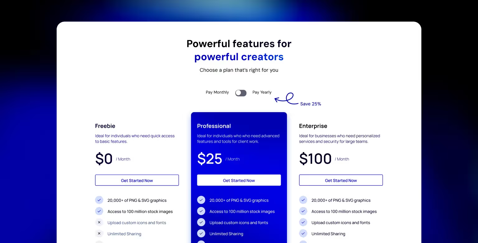
The pricing page often decides whether a visitor signs up, books a demo, or leaves. This article showcases 23 real‑world examples, including Webflow, Chili Piper, and some of the Tilipman Digital clients as well.
You will see how teams structure tiers, explain value, and guide choices with toggles, calculators, and FAQs. Each example includes a practical takeaway you can apply to your own page.
If you’re at an earlier stage and still creating your site, our guide on how to build a business website will help set a solid foundation before you work on the pricing page.
Why an Effective Pricing Page Matters for Conversions
For most SaaS and B2B products, the pricing page is the final step before a conversion. Visitors who reach it are no longer in a discovery phase; they are evaluating whether your product is worth the investment. How this page communicates value, structure, and trust will directly impact your revenue.
If your business operates in the B2B space, working with a specialist B2B web design agency can ensure your pricing page and other high-intent pages are designed to convert.
The Pricing Page as a Decision Point
- It is often one of the top three most-viewed pages on a site.
- Prospects arrive with clear questions: What does it cost? Which plan is right for me? Can I trust this company?
- If the answers are not easy to find, they leave and may not return.
What High-Performing Pricing Pages Achieve
- Clarity – Plan names, pricing, and features are easy to understand at a glance.
- Guidance – Visitors are shown which plan fits their needs, reducing decision fatigue.
- Trust – The page reassures through testimonials, customer logos, security badges, or guarantees.
- Action – Clear, repeated CTAs lead the visitor to sign up, start a trial, or contact sales.
The Risk of Neglect
A pricing page that hides details, overwhelms with jargon, or fails to match buyer expectations can lose prospects who were ready to convert. Even small friction points, such as unclear feature differences or missing annual pricing, can push a qualified lead to a competitor.
Proven ROI, Even With Usage-Based Pricing
For platforms like Speculo AI, pricing scales with database usage. That means ROI needs to be visible quickly for the investment to make sense. This is exactly what happened after their redesign.
Within weeks of launch, they saw:
- Multiple organic demos booked daily
- Shorter sales cycles
- A faster payback period than projected, even with database-based pricing
Before we explore examples, it’s important to understand the common building blocks of a high-converting pricing page.
Key Elements of High-Converting Pricing Pages
While every product and audience is different, most successful pricing pages share a set of design and content patterns. These elements reduce friction, answer key questions, and guide visitors toward a confident decision. After a transaction, directing users to a thank you page helps reassure them the order is received and encourages further engagement.
1. Clear Pricing Structure
Present plans in a way that is easy to scan.
- Use a consistent card or column layout.
- Keep the number of plans manageable, often three or four.
- Show the most important information above the fold.
2. Distinct Plan Differentiation
Help visitors self-select the right tier.
- Use short, descriptive plan names.
- Provide one-line summaries of who each plan is for.
- Use feature checklists to highlight differences.
3. Billing Option Toggles
Allow users to compare monthly and annual pricing without leaving the page.
- Show any discounts clearly when switching billing cycles.
- Keep the toggle visible even when scrolling.
4. Feature Clarity Without Clutter
Balance detail with readability.
- Use tooltips or expandable sections to explain complex features.
- Avoid cramming too much text into the main view.
5. Strong, Consistent CTAs
Give each plan a prominent call-to-action button.
- Use specific language (“Start Free Trial,” “Book a Demo”) rather than generic “Learn More.”
- Repeat CTAs at key points on the page.
6. Trust and Reassurance
Address concerns directly on the page.
- Include customer logos, testimonials, or industry certifications.
- Add short FAQs about refunds, contracts, and upgrades.
7. Mobile Optimization
Ensure the page is equally functional on small screens.
- Consider stacking plans vertically.
- Use accordions for feature details.
- Keep CTAs visible without excessive scrolling.
Applying website management best practices will help maintain mobile usability and conversion readiness long after launch.
These 7 elements will appear throughout the examples in this article, each adapted to the brand, audience, and pricing model.
The following examples show how SaaS, B2B, and Web3 companies approach pricing page design. Each one highlights a different strength, from layout and copy to interactive features and trust signals.
Web Development & Design Tools
Platforms in this category target designers, developers, and agencies building websites or digital products. Their pricing pages often balance technical clarity with visual polish, offering multiple plans for different project scopes and team sizes.
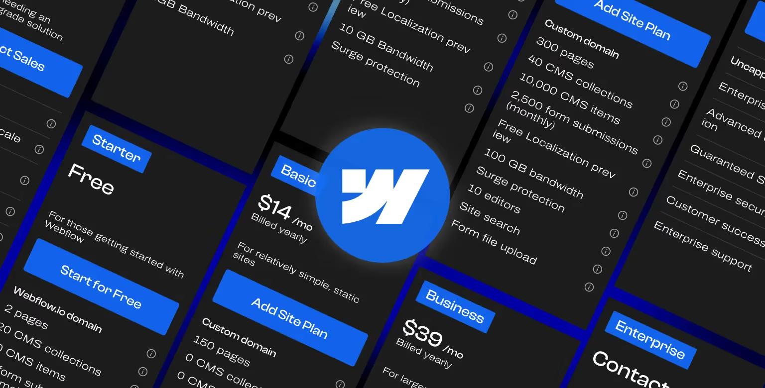
1. Webflow – Clear, Scalable Pricing for Multiple Audiences
What it is: Webflow is a visual development platform for designers, developers, agencies, and enterprises to build fully custom websites without code.
If you’re specifically interested in understanding Webflow’s pricing model, we’ve broken it down in detail in our Webflow pricing explained guide.
Here’s what we love:
- Separates Site Plans (hosting + CMS) from Workspace Plans (collaboration + permissions) to reduce confusion.
- Each plan includes a short description, bullet-pointed features, and a toggle for monthly vs annual billing.
- Inline explanations for technical terms help non-technical buyers understand exactly what they’re getting.
Takeaway: If your product serves more than one audience or use case, segment your pricing page into clear categories so visitors find their relevant option fast.
2. Vercel – Developer-Centric Clarity
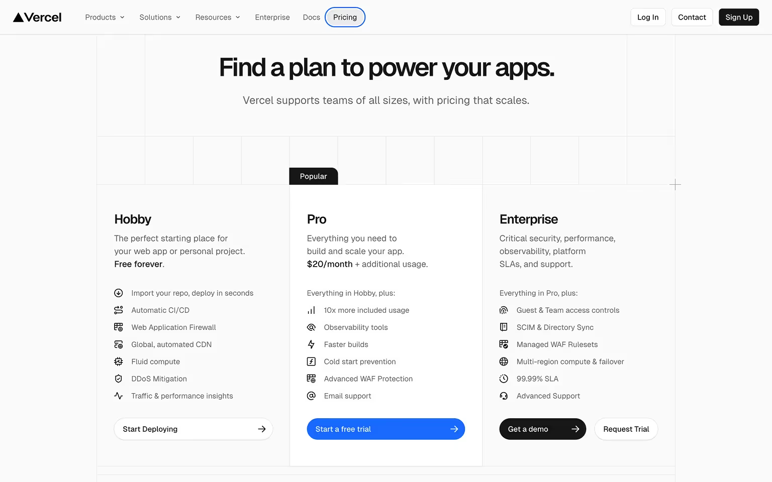
What it is: Vercel is a frontend cloud platform for developers to deploy, scale, and optimize web applications.
What we love:
- Uses a dark-themed layout that resonates with a developer audience and keeps focus on the content.
- Clear tier names and straightforward feature descriptions reduce friction for technically minded buyers.
- Highlights the “Pro” plan with a bright accent color, guiding the eye to the plan that fits the majority of users.
- Comparison grid presents technical features logically, with tooltips to explain advanced terms.
Conversion touchpoints:
- “Start Deploying” and "Start a free trial" CTAs for entry-level tiers to encourage low-commitment sign-ups.
- “Get a demo” and "Request Trial" for enterprise customers needing custom infrastructure.
Takeaway: Match your pricing page design to your audience’s preferences and make the decision path obvious with visual hierarchy.
3. Netlify – A Complete Best-Practice Pricing Page
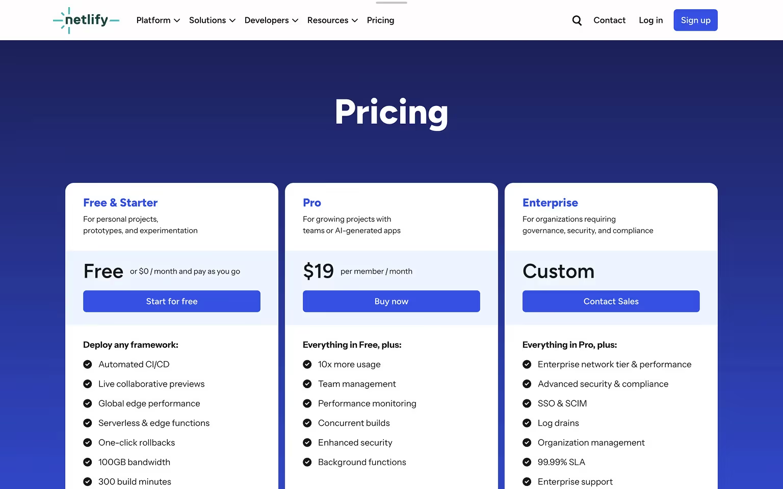
What it is: Netlify is a web development platform for building, deploying, and scaling modern web projects with serverless architecture.
What we love:
- Pricing page includes all core best practices in one place: clear tiers, monthly/annual toggle, free plan, and well-defined feature lists.
- Strong headline and subhead communicate value immediately, supported by concise plan descriptions.
- Trust elements are integrated throughout, including customer logos, testimonials, and case study links.
- Comprehensive FAQ addresses technical limits, support details, and upgrade paths without forcing visitors to another page.
Conversion touchpoints:
- “Start for free” and "Buy now" CTA for free and lower-tier plans.
- “Contact Sales” for enterprise packages with complex requirements.
Takeaway: A pricing page can be both comprehensive and user-friendly if information is structured logically and broken into digestible sections.
Marketing & Sales SaaS
Tools focused on improving lead generation, conversions, and sales processes. Their pricing pages often highlight ROI, clearly separate self-serve from enterprise tiers, and show transparent feature breakdowns.
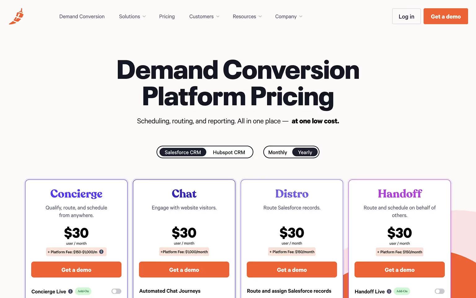
4. Chili Piper – Modular Pricing for Multiple Products
What it is: Chili Piper is a scheduling and lead-routing SaaS for sales and marketing teams that accelerates meeting booking and pipeline conversion.
What we love:
- Users first select the specific product they need, then see a tailored pricing table for that product.
- Keeps tables focused, preventing overwhelm for visitors who only care about one solution.
- Consistent visual design across all modules reinforces brand trust while making cross-comparison simple.
Takeaway: For multi-product companies, modular pricing pages help visitors zero in on what matters most to them.
5. Amplemarket – Dark Mode with Detailed Feature Comparison
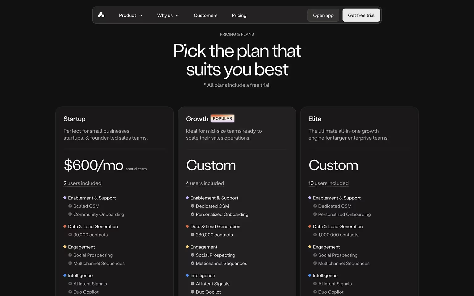
What it is: Amplemarket An AI-powered sales platform that automates lead generation, outreach, and workflow management for sales teams.
What we love:
- Striking dark-mode design that aligns with its tech-savvy audience.
- Scrollable feature comparison table allows users to dive deep into details without cluttering the main view.
- Strong visual hierarchy makes plan names, prices, and CTAs easy to spot against the dark background.
Conversion touchpoints:
- Prominent “Request a 14 day trial” buttons on self-serve plans.
- “Book a demo” for growth and elite packages with advanced customizations.
Takeaway: A distinctive visual style combined with a smart layout can enhance usability while making the pricing page memorable.
6. PostHog – Interactive Usage-Based Pricing
What it is: PostHog is an open-source product analytics platform for engineering teams to track, analyze, and improve user behavior in web and mobile applications.
What we love:
- Interactive sliders and toggles let visitors adjust variables like event volume or hosting type (cloud vs self-hosted) to see real-time pricing updates.
- Transparent cost breakdown helps technical buyers understand exactly how usage impacts their bill.
- Dark-themed interface with clear typography keeps complex data easy to read.
- Playful microcopy and on-brand language make a technical pricing model approachable.
Conversion touchpoints:
- Instant “Get started - free” CTA for low-volume usage.
- “Contact Sales” option for large-scale or enterprise deployments.
Takeaway: For usage-based pricing models, interactive calculators reduce uncertainty and build trust by showing prospects exactly what they’ll pay.

7. Customer.io – Balanced Conversion-Focused Layout
What it is: Customer.io is a marketing automation platform for sending targeted emails, push notifications, and SMS messages.
What we love:
- Three straightforward plans with concise descriptions, making it easy for prospects to self-identify the right tier.
- Soft green gradient accents highlight key headings and prices without overwhelming the page.
- Collapsible detailed feature matrix allows power users to access specifics without cluttering the default view.
- Mid-page highlight of a startup program offers discounts for early-stage companies, appealing to a key growth segment.
Conversion touchpoints:
- "Get started" and "Book a demo" CTA for Essentials and Premium plans to reduce friction.
- "Talk to sales" CTA for enterprise-level prospects seeking custom solutions.
Takeaway: Combine simplicity with optional depth, and use targeted offers within the pricing page to speak directly to priority audience segments.

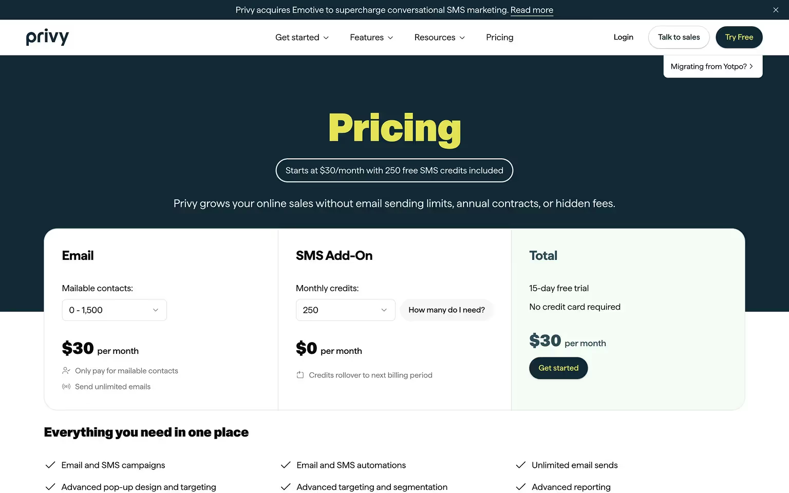
8. Privy – Calculator-Driven Pricing Experience
What it is: Privy is an email and SMS marketing platform for e-commerce businesses, particularly Shopify store owners.
What we love:
- Embeds a pricing calculator directly on the page, allowing users to input their number of contacts and instantly see the most suitable plan and cost.
- Three-tier pricing structure keeps choices simple while accommodating a range of business sizes.
- Plan descriptions highlight specific benefits for online retailers, making the content highly relevant to the target audience.
Conversion touchpoints:
- "Get Started" CTA alongside calculator results for a seamless decision-to-action flow.
- Emphasis on integration with Shopify to reduce adoption friction for their core market.
Takeaway: Interactive calculators personalize the pricing experience and give users immediate clarity on costs, increasing the likelihood of conversion.
9. Jasper – Bold Branding with Engaging Microinteractions
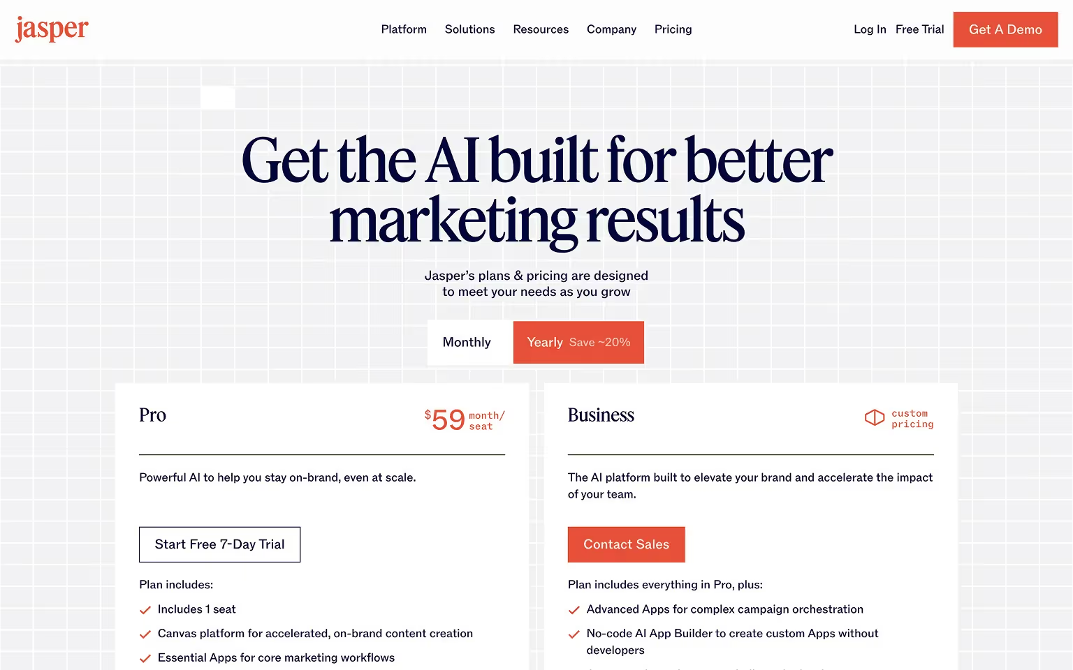
What it is: Jasper is a content generation platform built for marketers, offering AI-driven tools to create high-quality copy, visuals, and campaigns. Its pricing page clearly targets professional and enterprise teams, emphasizing value through collaboration and advanced capabilities.
What We Like:
- Simple Plan Structure: Only two main plans — Creator ($39/month) and Pro ($59/month) — plus a custom-priced Business plan, making the decision process straightforward.
- Comprehensive Feature Breakdown: The long, color-coded comparison table clearly groups features into categories like Jasper IQ, Browser & App, Integrations & API, and Brand Voice, allowing prospects to easily see the value gap between tiers.
- Emphasis on Collaboration: Multi-seat options and brand voice customization are positioned as key upgrades for higher tiers.
- Security & Quality Messaging: “Enterprise-grade security, quality outputs” is highlighted mid-page, reinforcing trust for larger organizations.
- Strong Support for Decision-Making: Multiple FAQ sections answer pricing, plan upgrade, and technical capability questions directly on the pricing page.
- Clear Call-to-Action: CTAs like “Start Free” and “Book a Demo” are repeated strategically throughout to catch users at different decision stages.
Key Takeaway for Your Pricing Page:
If your product has many features across different categories, use a visually distinct, categorized table to help prospects navigate complexity. Combining this with a limited number of core pricing plans keeps the buying process simple without overwhelming visitors.
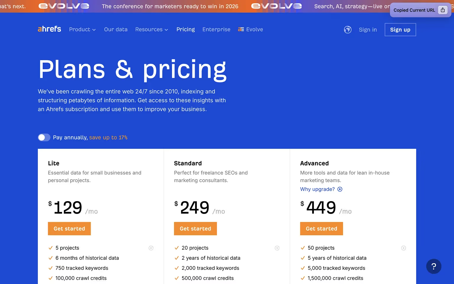
10. Ahrefs – Data-Rich but User-Friendly
What it is: Ahrefs is an SEO software suite for marketers, content teams, and website owners to analyze backlinks, keywords, and competitors.
What we love:
- Prominent monthly/annual toggle at the top makes billing differences immediately clear.
- Feature-heavy pricing table is organized with anchored headers so users always know which plan they are viewing.
- Tooltips explain advanced SEO terms without cluttering the main layout.
- Customer testimonials placed near CTAs reinforce credibility and success stories.
Conversion touchpoints:
- "Get started" CTA for lower-tier plans to reduce commitment risk.
- "Talk to sales" for high-volume enterprise needs.
Takeaway: Even with a complex, data-driven product, you can keep pricing accessible by layering information and providing context only when needed.
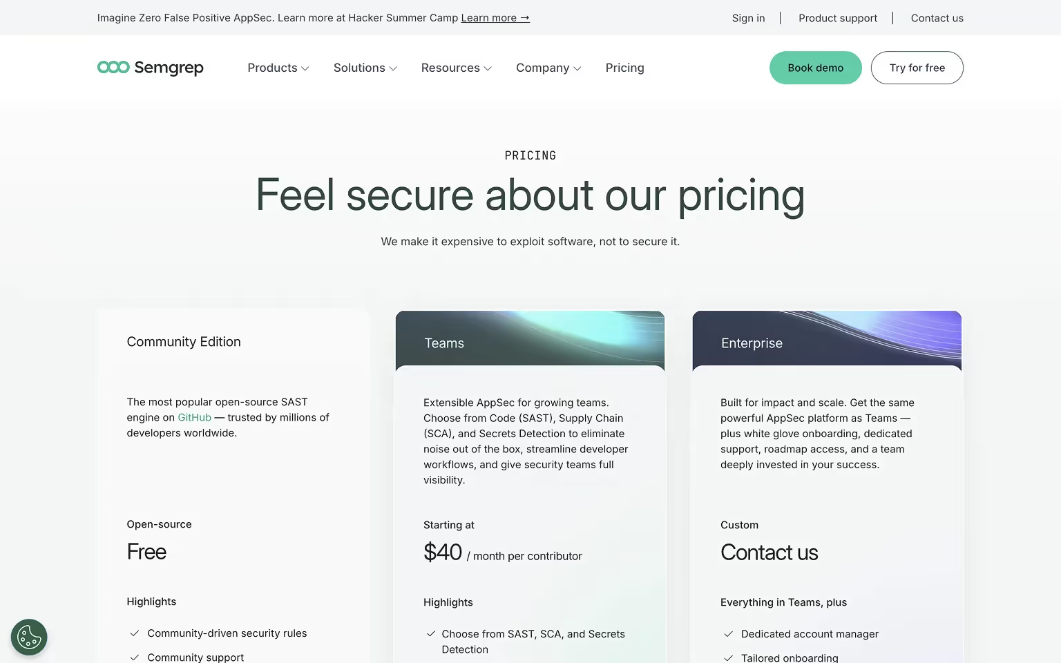
11. Semgrep – Purposeful Layout for Multiple Offerings
What it is: Semgrep is an open-source security platform for developers and security teams to detect and prevent vulnerabilities in code.
What we love:
- Clearly separates plans by audience, such as open-source users, small teams, and enterprises, making it easy for each segment to find relevant pricing.
- Modern design with subtle gradients and pastel accents that keep the page visually appealing without distracting from the content.
- Combines a feature comparison table, testimonials, and FAQs into a single cohesive flow.
- Includes a scrolling “trust bar” of client logos to build credibility with security-conscious buyers.
Conversion touchpoints:
- "Try for free" CTA for community edition users.
- "Contact us" for enterprise buyers requiring advanced security capabilities.
Takeaway: When serving distinct audiences, explicitly label who each plan is for and ensure the design supports a smooth path to the right option.
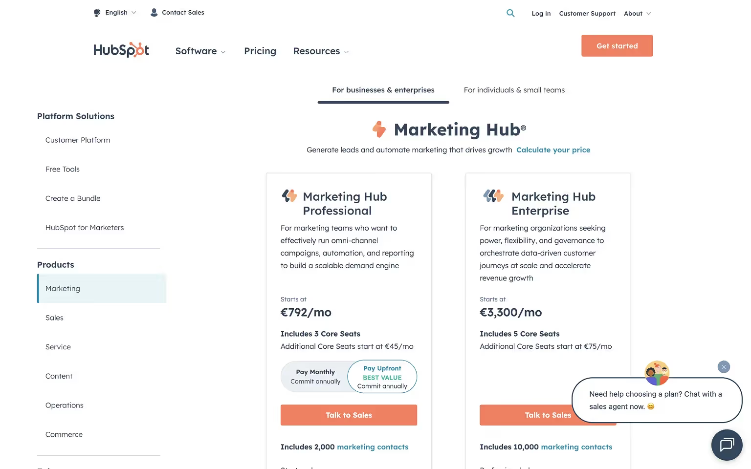
12. HubSpot – Handling Complexity with Intuitive UX
What it is: HubSpot is a CRM and marketing automation platform serving small businesses to large enterprises with multiple product lines and pricing models.
What we love:
- Organizes complex offerings into tabs and filters for different hubs (Marketing, Sales, Service, CMS), preventing overwhelm.
- Interactive sliders adjust pricing based on variables like contact count or user seats, showing real-time cost changes.
- Clean design with ample white space keeps the experience approachable despite the volume of options.
- Extensive FAQ access directly from the pricing page ensures visitors get answers without leaving.
Conversion touchpoints:
- "Get Started" for free tools to capture low-commitment leads.
- "Talk to Sales" for higher-tier plans and bundled solutions.
Takeaway: Complex pricing structures can still be user-friendly with clear navigation, dynamic elements, and a well-organized layout.
Communication & Collaboration Tools
These tools need to be easy to adopt at any scale, so pricing highlights collaboration features and transparent scaling for growing teams.
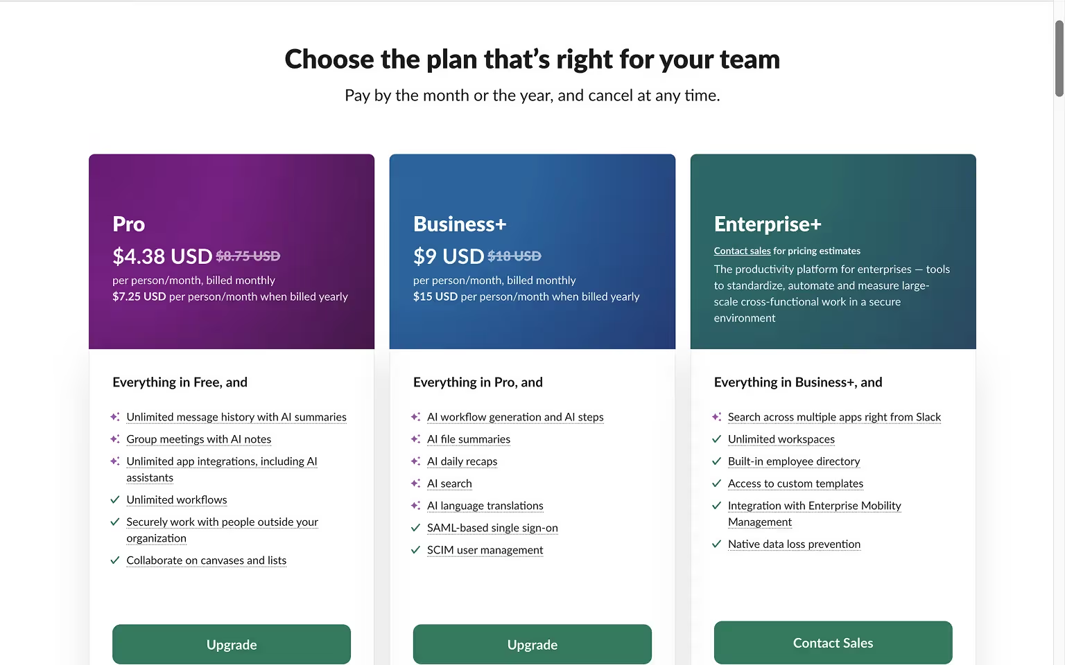
13. Slack (Mobile) – Optimized Pricing Page for Small Screens
What it is: Slack is a team communication and collaboration platform used by organizations of all sizes.
What we love:
- Mobile-first design that prioritizes vertical scrolling for plan cards, making them easy to swipe through.
- Accordion-style sections reveal feature details without forcing users to load long comparison tables.
- Sticky CTAs keep sign-up buttons visible while browsing, reducing the need to scroll back up.
- Integrates short FAQs and customer stories directly into the mobile experience to address common questions on the spot.
Conversion touchpoints:
- "Get started" buttons remain fixed in position for quick action.
- "Contact sales" CTA is visible for the enterprise plan.
- In-line plan descriptions help users choose without leaving the mobile view.
Takeaway: Optimize pricing pages for mobile as carefully as for desktop. Small-screen usability can significantly impact conversions, especially for high-traffic SaaS products.
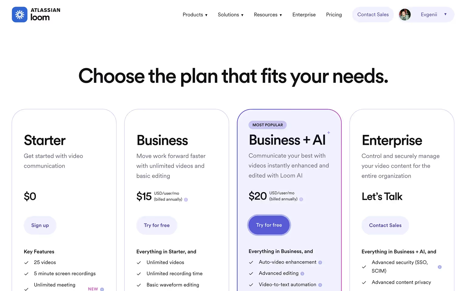
14. Loom – Minimalist Design with Focus on UX
What it is: Loom is a video messaging platform for teams to record, share, and collaborate asynchronously.
What we love:
- Clean, minimalist layout with generous white space, making the pricing structure easy to scan.
- Fixed pricing header bar remains in view while scrolling through the comparison table, ensuring users never lose context.
- Bright blue icons draw attention to key plan features without overwhelming the design.
- Mid-page CTA links back to the top, offering a quick path to conversion after exploring details.
Conversion touchpoints:
- "Signup" CTA for the free tier.
- Paid plans have direct upgrade buttons, while still using "Try for free" CTAs for non-members eliminating extra navigation steps.
Takeaway: Minimalism works best when paired with subtle UX features that keep important information accessible at all times.
Finance & HR Platforms
Trust, compliance, and clarity drive these pages — they clearly outline costs while addressing security and industry regulations.
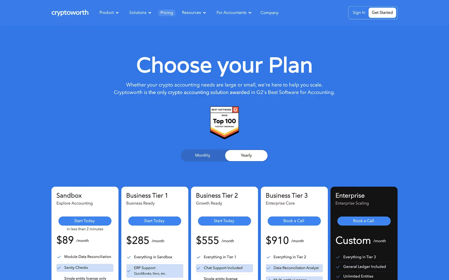
15. Cryptoworth – Pricing Page Built for Enterprise Crypto Clients
What it is: Cryptoworth is a crypto accounting automation platform for exchanges, blockchain enterprises, and Web3-native businesses managing multi-chain transactions.
What we love:
- Balances transparency with credibility in a sector where pricing is often opaque.
- Tiered packages for smaller customers alongside custom enterprise pricing for large institutions.
- Trust signals such as partner logos, compliance certifications, and integration lists build authority.
Conversion touchpoints:
- Immediate "Start Today" sign-up CTAs for entry tiers.
- "Book a Call" CTAs for high-value tiers.
- FAQ section addressing volatility concerns, onboarding steps, and security practices.
Takeaway: In high-trust industries, combine clear pricing with strong proof of reliability to move cautious buyers toward action. For more detailed guidance on pricing strategy in the crypto sector, see our Web3 & Crypto Pricing Page Blueprint.
16. Brex – Straightforward Tiers with Rich Feature Comparison
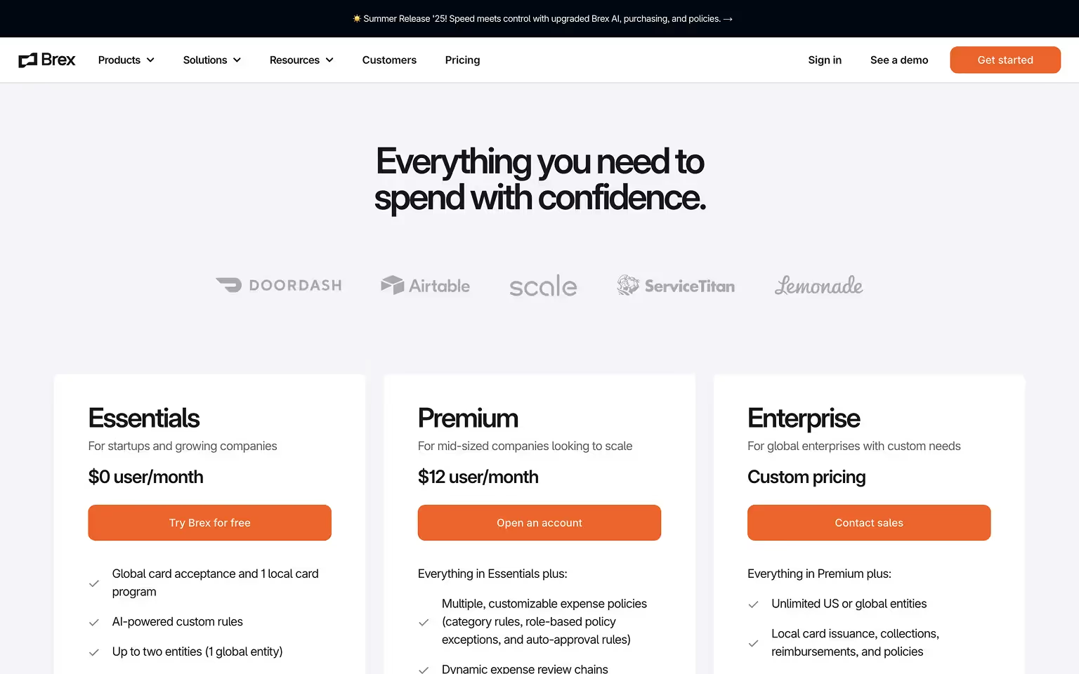
What it is: Brex is a financial platform offering corporate cards, expense management, and financial software for startups and enterprises.
What we love:
- Three clearly defined plans with intuitive names, making it easy for visitors to identify the right fit.
- Detailed feature checklist that uses icons and collapsible sections to avoid overwhelming the viewer.
- Strategic placement of trust signals, including well-known customer logos, to reinforce credibility in the finance sector.
- Consistent visual hierarchy, ensuring prices, features, and CTAs are easy to locate.
Conversion touchpoints:
- "Try Brex for free" and "Open an Account" CTA for direct onboarding to the entry and mid-tier plans.
- "Contact Sales" for enterprise accounts needing advanced financial controls.
Takeaway: A clear tier structure combined with an organized feature comparison helps both quick decision-makers and detail-oriented buyers.
17. Gusto – Clarity, Tooltips, and an Objection‑Handling FAQ
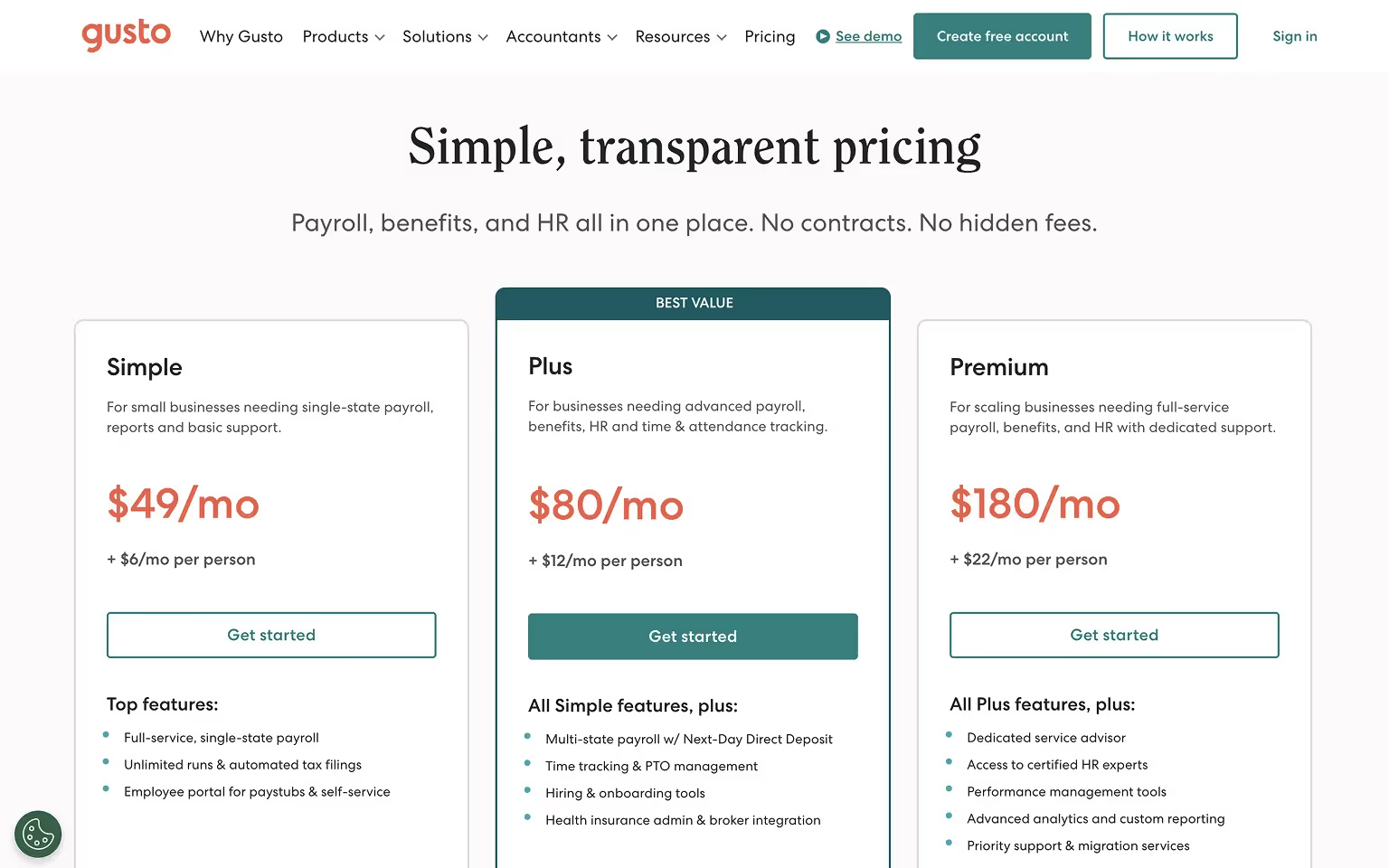
What it is: Gusto is a payroll, benefits, and HR software for small and midsize businesses.
What we love:
- Straightforward tier cards with a one‑line “best for” summary.
- Extensive tooltips and expandable rows to explain payroll and compliance features.
- A robust FAQ that answers billing, tax, and onboarding questions on the spot.
- “Most popular” plan tag to guide choice and reduce analysis paralysis.
Conversion touchpoints:
- "Get Started" self‑serve signup for core tiers.
Takeaway: Pair simple cards with deep, on‑demand explanations and FAQs to handle complex, regulated offerings.
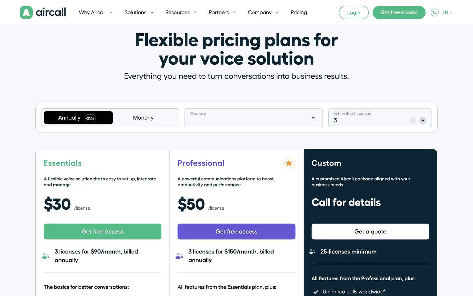
18. Aircall – Interactive Pricing With a Built‑In Calculator
What it is: Aircall is a cloud-based business phone system for sales and support teams to manage calls, routing, and analytics.
What we love:
- Interactive calculator to estimate costs by seats and add‑ons without leaving the page.
- Clear monthly vs annual toggle with visible savings.
- Concise feature lists per tier, plus tooltips for definitions.
- Trust signals near CTAs, including customer logos and integrations.
Conversion touchpoints:
- "Get free access" for self‑serve adoption.
- "Get a quote" for larger rollouts needing implementation support.
Takeaway: When pricing depends on users or add‑ons, embedded calculators reduce uncertainty and speed up decisions.
Developer / Technical Tools
These platforms cater to technical buyers, with pricing that emphasizes scalability, integrations, and clear usage-based cost breakdowns.
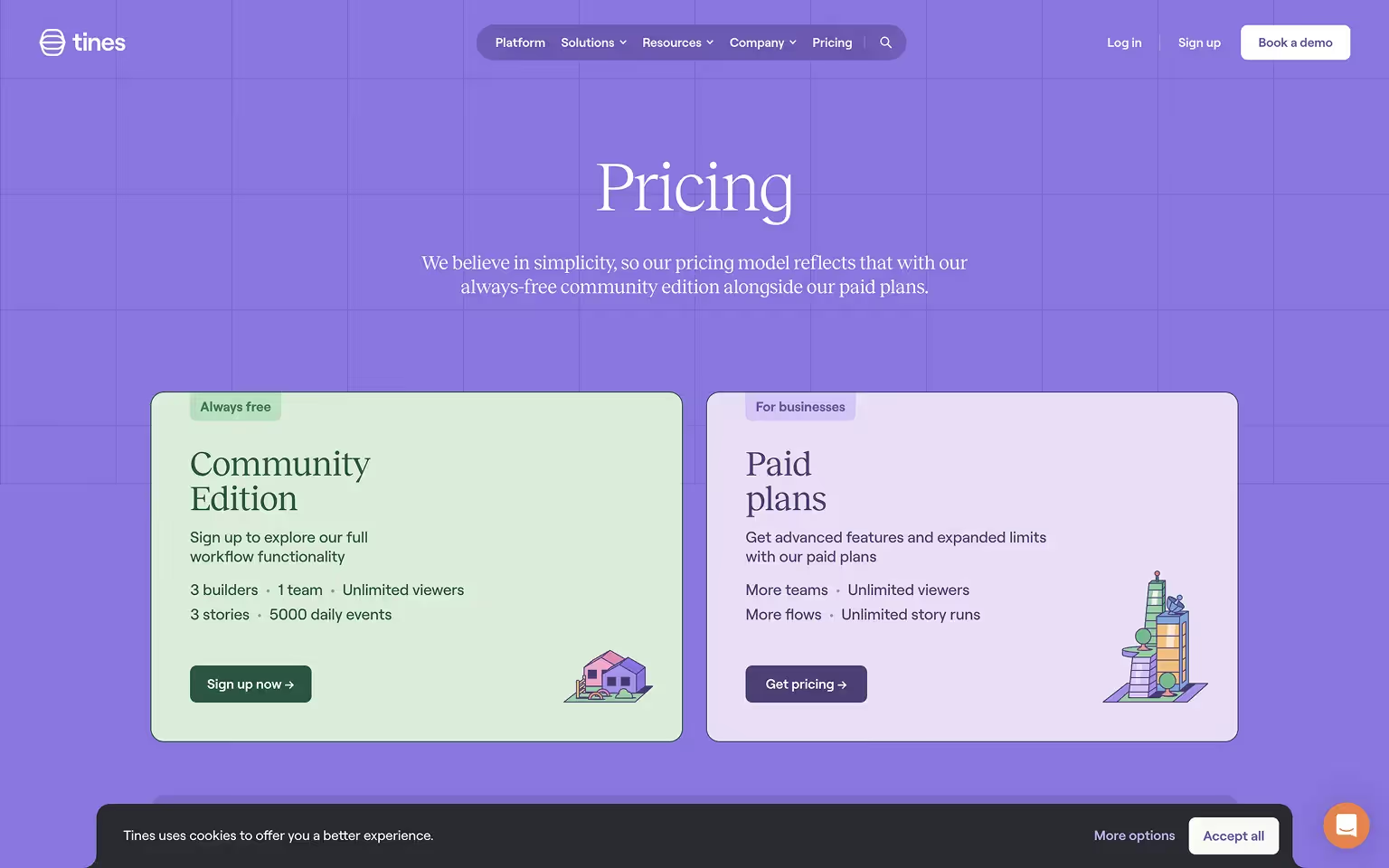
19. Tines – Story-Driven Pricing Presentation
What it is: Tines is a no-code automation platform for security and operations teams to create custom workflows without writing code.
What we love:
- Uses a narrative scroll instead of an immediate comparison table, explaining the philosophy behind each plan before revealing prices.
- Soft pastel color palette and friendly illustrations align with brand personality while keeping the layout clean.
- Modular pricing structure combines a base platform fee with optional add-ons, giving customers flexibility without cluttering the main view.
Conversion touchpoints:
- "Sign up now" option for the free community plan to encourage adoption.
- "Get Pricing" CTA for business buyers who need tailored solutions.
Takeaway: Storytelling is an effective way to present pricing, especially when your audience needs context before comparing numbers.
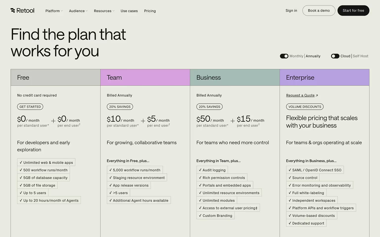
20. Retool – Clean Layout With Cloud vs Self‑Hosted Toggle
What it is: Retool is a low‑code platform for developers and ops teams to build internal tools with prebuilt components and data connectors.
What we love:
- Prominent toggle for Cloud vs Self‑Hosted pricing, so buyers see the right model instantly.
- Minimalist cards with crisp feature summaries and links to detailed matrices.
- Logical visual hierarchy that keeps plan names, prices, and CTAs easy to scan.
- Subtle trust elements aimed at technical buyers, such as security notes and enterprise references.
Conversion touchpoints:
- "Try for Free" for cloud trials.
- "Request a Demo" for self‑hosted and enterprise deployments.
Takeaway: If you support multiple deployment models, surface that choice first, then keep details tidy with progressive disclosure.
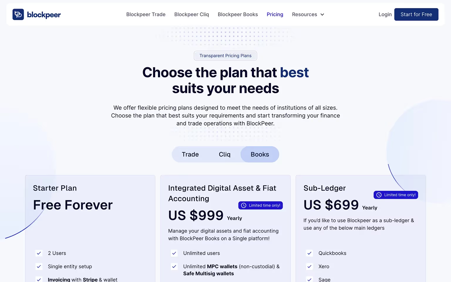
21. Blockpeer – Digital Asset & Fiat Accounting Platform
Blockpeer is a financial operations platform designed for institutions of all sizes, offering solutions for trade, digital asset, and fiat accounting. Their pricing page follows a clear and professional layout, targeting enterprise-level buyers while still offering an entry-level “Free Forever” plan.
What We Like:
- Tiered Pricing for Multiple Needs: Four clear tiers — Starter (Free Forever), Growth (US $999/year), Sub-Ledger (US $699/year), and Enterprise (custom). They make it easy for different organization sizes and needs to find the right fit.
- Comprehensive Feature Comparison Table: A large, detailed comparison chart spans all tiers, allowing prospects to quickly assess differences in capabilities such as multi-entity support, HR & payroll modules, and unlimited exchanges import.
- Promo Pricing Highlight: Discounted annual pricing is clearly marked to create urgency without cluttering the design.
- Strong CTA Placement: Each plan includes a direct “Get Started” or “Contact Us” button, keeping the decision process streamlined.
- FAQ Section at the Bottom: Addresses common objections like payment methods, plan flexibility, and discounts for annual payments.
Key Takeaway for Your Pricing Page: When selling to both SMEs and large enterprises in the finance space, pair a clean tiered layout with a feature-rich comparison table. This allows buyers to self-qualify before sales outreach while reinforcing transparency and trust.
Productivity Apps
In a crowded market, pricing stands out by highlighting time savings, seamless integrations, and use cases for different work styles.
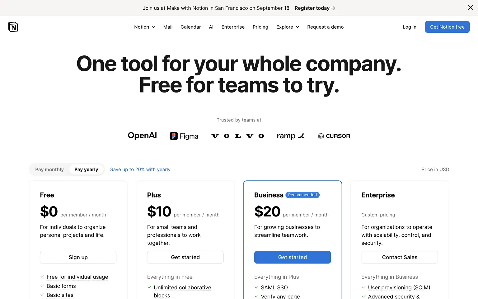
22. Notion – Simple, Scalable Pricing for All User Types
What it is: Notion is an all-in-one workspace app for individuals, teams, and enterprises to manage notes, documents, projects, and databases.
What we love:
- Offers a clear freemium model with a free plan for individuals, ensuring accessibility for casual users.
- Paid plans scale up logically, each with a short “best for” descriptor to guide decision-making.
- Minimalist design with ample white space keeps focus on the content and pricing, avoiding distractions.
- Monthly/annual toggle is easy to find, and discounts are clearly displayed.
Conversion touchpoints:
- "Sign up" and "Get Started" CTA on free and lower-tier plans to encourage immediate onboarding.
- "Contact Sales" for enterprise plans requiring custom features and onboarding support.
Takeaway: Simplicity works when each plan’s purpose is obvious and there’s a clear path for users to grow into higher tiers.
23. UpKeep – Guiding Users to the Right Plan
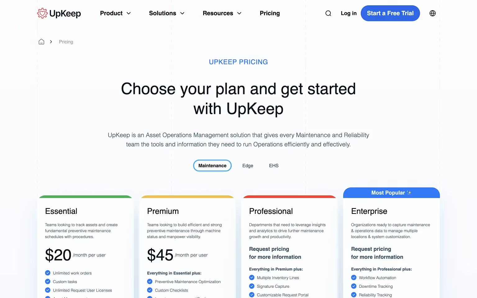
What it is: Upkeep is a maintenance management SaaS platform used by facilities teams to schedule, track, and optimize maintenance operations.
What we love:
- Opens with a selector tool or toggle that helps users choose the type of plan they need before viewing prices.
- Highlights the “Most Popular” plan to reduce decision fatigue and give visitors a clear recommendation.
- Clear, concise feature lists make it easy for prospects to compare plans without scrolling endlessly.
Conversion touchpoints:
- “Get Started” CTAs for self-serve plans.
- “Request Demo” CTAs for higher-value, more complex offerings.
Takeaway: Use interactive guidance and visual cues to help visitors self-select the plan that best fits their needs, minimizing choice paralysis.
Key Takeaways From 23 Pricing Page Examples
Across all 23 examples, certain patterns consistently stood out:
- Clarity first – Pricing, features, and plan differences must be instantly understandable without scrolling or deciphering jargon.
- Guided choice – Use “most popular” tags, audience-specific plan descriptions, or interactive calculators to help visitors decide quickly.
- Trust at the point of decision – Customer logos, testimonials, certifications, and transparent policies reduce friction and hesitation.
- Mobile-friendly design – Optimizing for small screens ensures the page performs for the portion of visitors browsing on mobile.
- On-demand detail – Tooltips, expandable sections, and toggles allow users to dive deeper without overwhelming the main layout.
The best pricing pages adapt these principles to their audience and pricing model. For a step-by-step approach to launching or overhauling your site after a pricing page redesign, see our website launch checklist.
A complex enterprise platform may require layered detail and demo CTAs, while a self-serve SaaS benefits from simplicity and instant signup options. The common thread is removing uncertainty and making the next step obvious.
Frequently Asked Questions (FAQs) About Pricing Pages
How do I write a pricing page?
You should focus on value, not just price. Utizilize both features and benefits of what the customers will be getting. The simpler the content, the better. Include a strong call to action.
What makes a pricing page effective?
An effective pricing page clearly communicates each plan’s value, differentiates options, and guides the visitor toward a decision. It should be easy to scan, use straightforward language, and address common questions directly on the page. Trust signals, such as testimonials or client logos, reinforce credibility.
How many pricing tiers should I offer?
Most companies perform best with three to four tiers. This gives enough flexibility to serve multiple customer segments without creating choice overload. Too many options can cause hesitation, while too few may exclude important audiences.
Should I display prices publicly or require contacting sales?
Transparent pricing works well for products with standard packages or self-serve models. If your offer is highly customized, showing only starting prices or prompting visitors to “Contact Sales” can make more sense. Hybrid approaches — listing standard plans while keeping enterprise packages behind a contact form — are also effective.
How can I optimize my pricing page for conversions?
- Use clear, action-oriented CTAs for each plan.
- Place social proof near pricing tables.
- Offer low-risk entry points such as free trials or guarantees.
- Optimize for mobile performance and page load speed.
- Test headlines, CTA text, and feature layouts to see what drives the most conversions.
If you’re not sure where to start, consider working with our conversion rate optimization experts.
Should I include an FAQ directly on the pricing page?
Yes. A targeted FAQ section helps answer last-minute objections without sending visitors to another page. Focus on questions about pricing structure, billing cycles, plan differences, and upgrade/downgrade policies.
