


Introduction
Choosing between Fill and Cover means deciding how your background images should behave based on the object-fit property in CSS. These are two of the most commonly used values for object-fit, though others exist (like contain, none, and scale-down). However, Fill and Cover are the most popular in Webflow projects because of their versatility and visual impact.
If you're new to managing styles in Webflow, it might help to first review our guide on how to use classes in Webflow effectively.
In this guide, we’ll walk you through Webflow Fill vs Cover object-fit settings, breaking down when and how to use each setting for optimal results.
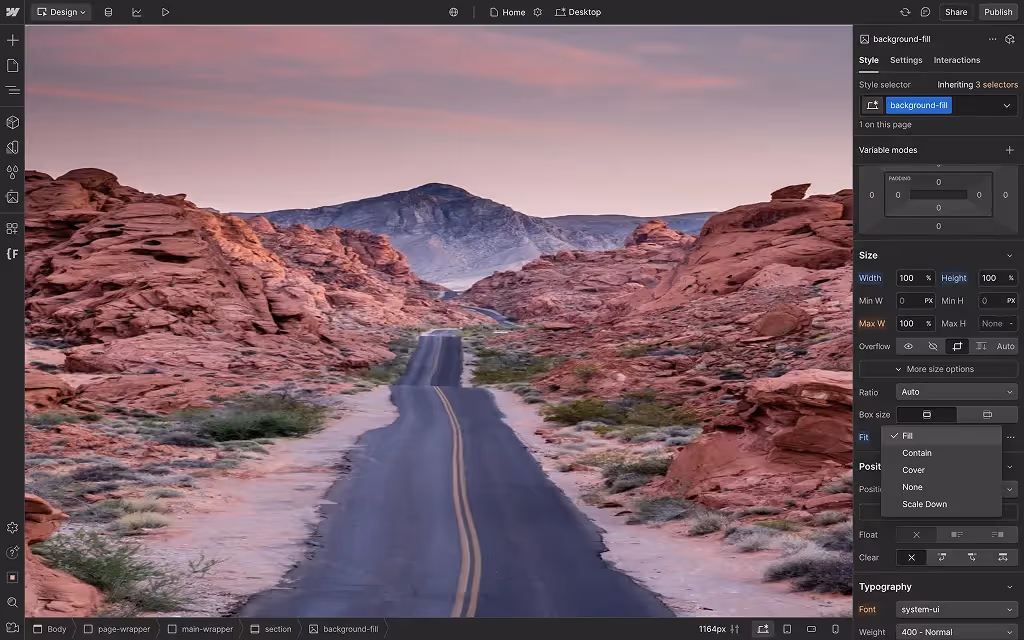
What Is Webflow Fill?
In Webflow, Fill forces your background image to stretch and occupy 100% of the container’s width and height — regardless of the image’s original dimensions or aspect ratio.
- Pros: Ensures no blank space is left in the background. Great for subtle patterns or abstract textures that don’t rely on fixed proportions.
- Cons: Because the image is stretched to fill the space, it can become distorted or pixelated, especially on large screens or retina displays.
Use Fill when image clarity isn't essential but full coverage is.
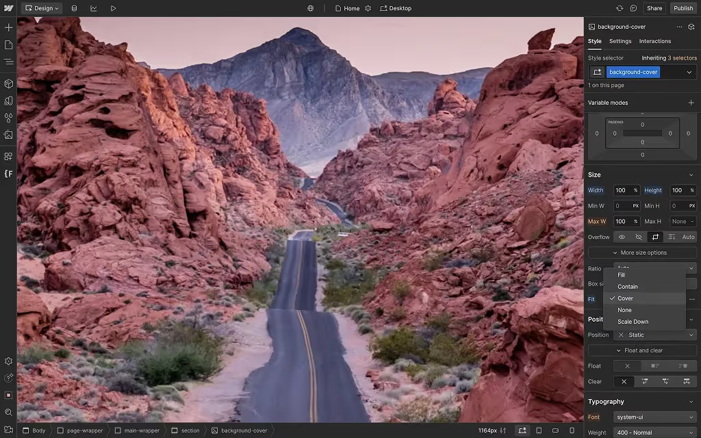
What Is Webflow Cover?
Cover in Webflow scales your background image to maintain its aspect ratio while still filling the container. It will crop the image if necessary to ensure full coverage without distortion.
- Pros: Preserves the image’s proportions, making it ideal for photography or visuals where subject clarity matters.
- Cons: You may lose parts of the image due to cropping, especially on containers with non-standard dimensions.
Use Cover when image integrity is critical — like hero images or branded backgrounds.
Webflow Fill vs Cover: Key Differences
Let’s compare the two object-fit settings side by side:
When to Use Fill vs When to Use Cover
Not sure which to choose? Let's try visualizing how the same image would look like in a hero section with different settings applied. The example we will take will be this image of a road.

Here are some real-world use cases:
Use Fill when:
- You’re working with patterns, gradients, or noise textures
- The background serves a decorative purpose, not informational
- You’re designing for a uniform grid or section with flexible scaling
Use Cover when:
- You’re featuring high-quality photography
- The image contains branding elements or text
- You're creating a hero section that needs to retain visual clarity
Consider the screen size and how your container behaves. On narrow viewports, Cover may crop too aggressively. On wide screens, Fill may stretch and distort.
Best Practices for Background Images in Webflow
To ensure your backgrounds look good and load fast:
- Compress your images: Use tools like TinyPNG, ImageOptim, or built in Webflow's asset compressor
- Stick to web-friendly formats: WebP or optimized JPEGs
- Match image resolution to container size: Avoid 5000px wide images for a 1440px container
- Set background position to control crop focus (e.g., top-center for headshots)
- Use media queries or combo classes if switching settings per breakpoint is needed
It is important to remember that neither the performance nor the responsiveness should be sacraficed.
Real-World Examples and Design Tips
Here’s how top designers use these settings:
- Cover is popular in B2B SaaS projects and especially in projects where a sharp visual needs to grab attention in the hero
- Fill works great for section dividers using gradient textures or repeating patterns
- At the end of the day, both settings are merely tools. The best design teams mix them up, using Cover for hero sections and Fill for background accents. And if you're looking to get some professional design help, our B2B web design agency is here to help.
Want inspiration? Check out Webflow's case studies to see how real-world projects handle backgrounds.
TL;DR:
- Use Fill when distortion isn’t an issue and you want full coverage
- Use Cover when visuals need to remain crisp and professional
- There are other object-fit options besides Fill and Cover
Conclusion: Making the Right Choice
Both Fill and Cover have their place in Webflow. The right choice depends on your image type, container size, design goals, and your use case. Don’t be afraid to experiment within the Webflow Designer — a little trial and error often leads to the most polished result.
Object fit settings is only one design element one needs to master when working with imagery. If you'd like to learn more about how to work with imagery, we have articles ranging from basic ones such as changing backgrounds in Webflow to creating parallax effects in Webflow that might be worth exploring.
And if you've got a Webflow project that you need help refining, our Webflow Development Agency is here to help.
Frequently Asked Questions
Can I mix Fill and Cover in the same project?
Yes. You can use different settings for different sections to match your design intent. While you can use different object-fit settings throughout the project, you can use only one setting per image.
How do I avoid distortion when using Fill?
Use abstract, non-detailed images that won’t look “off” when stretched. Avoid using Fill with logos or detailed graphics.
What’s the best image size for Cover?
Aim for at least 1500–2000px wide, with a 16:9 or 4:3 aspect ratio. This balances clarity and performance across devices.