

In B2B, we commonly interact with social media or websites as the first point of contact. If that experience is poorly executed, it’s usually the last impression too; and that’s consistent with what we hear from most business owners we talk to.
The good news: buyer expectations aren’t hard to crack. Your site must have clear messaging, simple navigation, and lots of proof showcasing the outcomes. It sounds simple; it's not easy.
In this article, we’ll share 19 best-in-class B2B websites across B2B SaaS, e-commerce, and enterprise. We’ll break down what makes them work and show how we’ve applied the same learnings in our client work. You’ll walk away with a short list of patterns you can copy to improve your own site.
How We Selected the Best B2B Websites
With so many B2B websites online, we applied clear criteria to identify the ones worth highlighting. Each site on this list was chosen based on:
- Value proposition: As a visitor, can I understand the brand's offering in seconds?
- User experience: Is the site easy to navigate? DO pages load fast? Is the site optimized for mobile use?
- Trust signals: Are testimonials used? Are there case studies for different use cases? Are client logos showcased? Is there any type of certification displayed?
- Content strategy: Is there a variety of content? Is it SEO optimized? Is it relevant to the visitor's needs?
- Conversion focus: Is it clear what happens after CTA click? Are there no dead ends on site?
- Design execution: Does the design solve a problem? Does it solve it well? Are the design decisions aligned with the business goals?
These benchmarks ensure the list reflects sites based on parameters that are focused on the business bottom line instead of visual appeal (although it still plays a role). If you’re working on your own B2B website strategy, these criteria are a solid place to start.
B2B Website Best Practices – What Makes a Site Great?
Before jumping into examples, you can follow these following practices to improve your understanding of how you can take your B2B site from good to great.
Clear Value Proposition
- Use the heading above the fold to explain what you do in simple terms. Don't use jargon.
- Explain how you achieve whatever it is you do in the subheading. Focus on solutions and outcomes.
- Speak to the pain points of your target audience.
Design and User Experience
- Navigation should help the user navigate. Make logical categories and submenus (wherever needed).
- Improve page loading times and optimize for mobile bereakpoints.
- Make sure you use the right visuals that don't distract users from the content. Ensure your layouts guide users toward key actions.
Content and SEO
- Build topical authority with blogs, downloadable resources, and case studies.
- Incorporate use case specific keywords into your content. Try to answer the most common buyer questions related to the topic of your content pages.
- Organize content for readability with headings, tables, lists, and visuals.
Our SEO agency for tech startups helps tech companies in B2B attract the right audience with tailored content strategies that convert.
Trust Signals
- Display client logos, testimonials, or certifications prominently. Every page should have some sort of trust signal.
- Highlight case study results or data-driven outcomes. Data is king.
- Incorporate security or compliance badges where relevant. Some common ones include SOC2, HIPAA, and GDPR.
Conversion Optimization
- Use strong CTAs like “Request a Demo” or “Schedule a free consultation.” See what we did there?
- Place CTAs contextually throughout the site rather than only at the end. Most users are not going to scroll through more than 30% of your page where they land.
- Experiment with ICP based personalization, such as content tailored by industry or role.
Following these tips should allow any B2B website to into a reliable channel for lead generation and brand awareness.
Best B2B SaaS Website Examples (Inspiration for Software Companies)
B2B SaaS companies are often ahead in digital design because their websites must communicate value quickly and clearly to a variety of decision-makers. Below are some of the best B2B SaaS websites that combine strong branding with effective conversion paths.
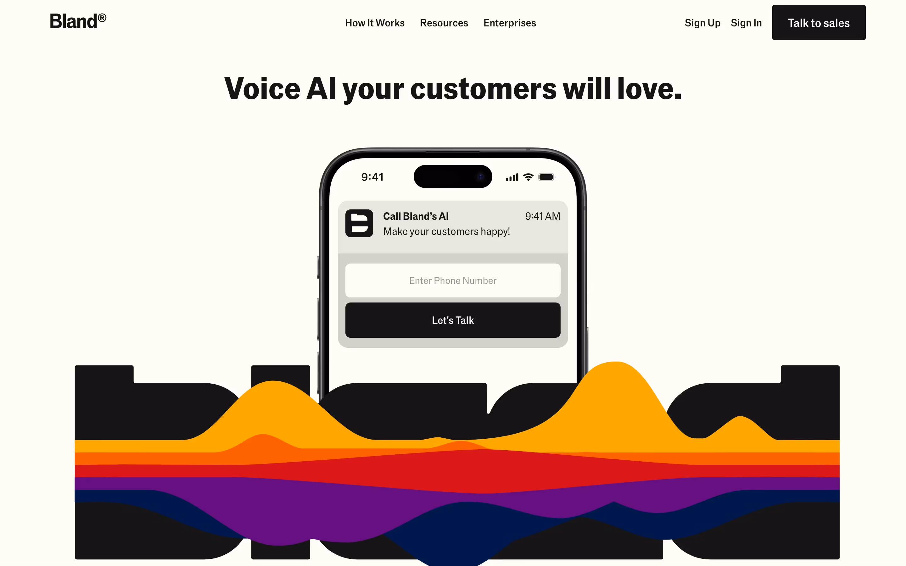
[fs-toc-H2]Bland AI – Positioning a Fast-Growing SaaS Brand
Bland AI is a brand focused on AI-driven voice agents. It helps businesses automate phone calls and streamline customer interactions. Some of the most common use cases include customer support, outbound sales, and appointment scheduling.
Website Style: The site blends a dose of minimalism with abstract and playful brand. It features clean typography, that's easy to read, crisp and colorful visuals, and messaging that speaks directly to enterprise buyers. The site uses a lot of white space to avoid clutter and lead visitors through the content.
What We Like:
- A clear value proposition that instantly explains what Bland AI does.
- Conversion-focused design featuring product showcase and strategically placed demo booking CTAs.
- Consistent branding that signals trust and maturity for enterprise clients.
- Effective use of whitespace and structure to guide visitors through the story without distraction.
Bland AI shows how strong positioning helps emerging players stand alongside enterprise SaaS leaders. Looking for more AI specific inspiration? We have written an article showcasing 32 AI website examples.
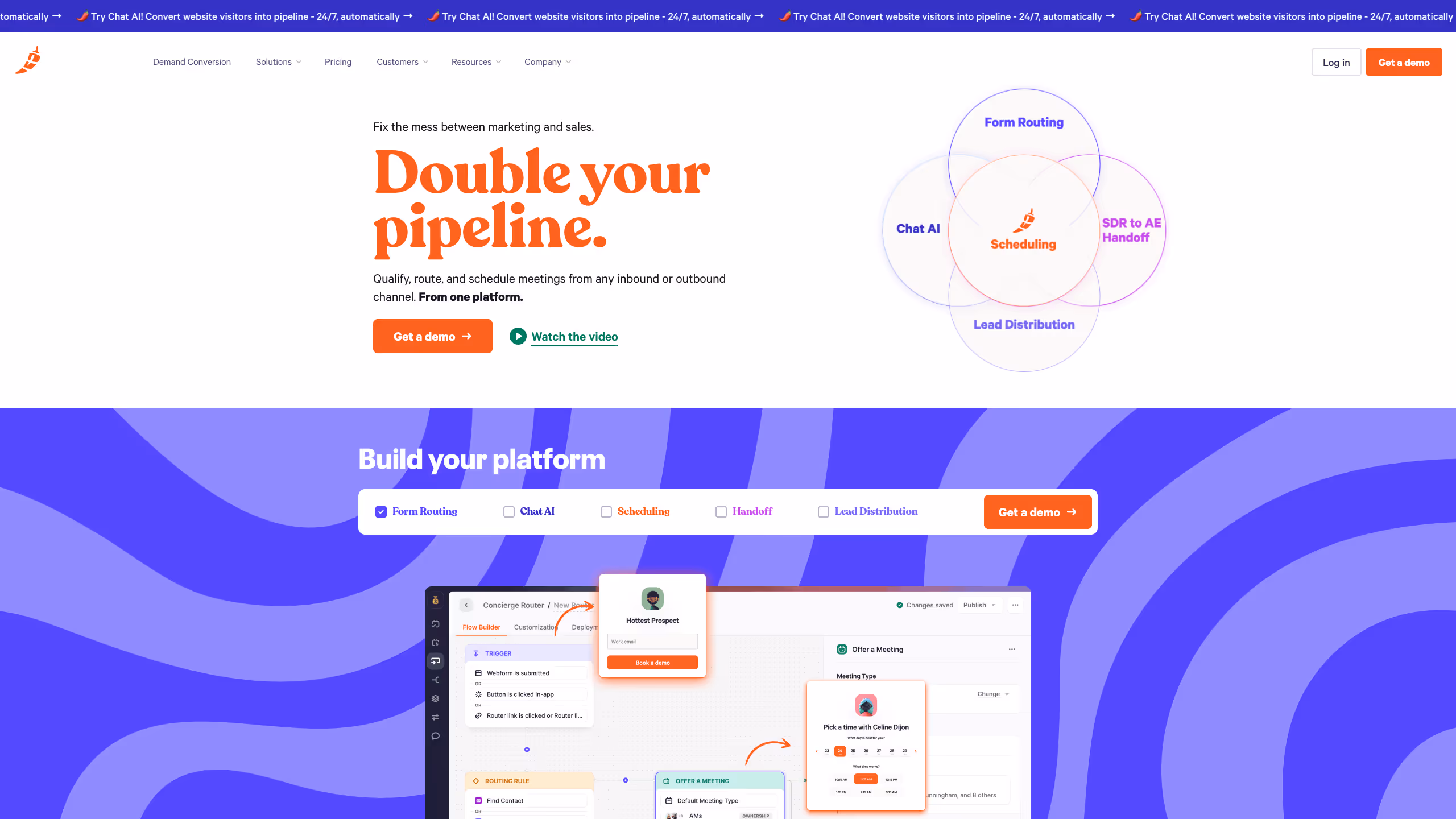
[fs-toc-H2]Chili Piper – Turning Inbound Leads into Booked Meetings
Chili Piper is a revenue acceleration platform that automates meeting scheduling, lead routing, and handoff between marketing and sales teams. Its mission is simple: fix the friction between demand and conversion.
Website Style:
The homepage makes a bold statement with the hero headline “Double your pipeline.” Bright orange typography, and a clean grid system make the product story instantly clear. A Venn diagram highlights Chili Piper’s core solutions: Form Routing, Chat AI, Scheduling, Lead Distribution, and SDR to AE Handoff, all unified under one platform. The design uses whitespace and animation sparingly to maintain focus on conversions. Another highlight is the interractive form, giving you access to the demoofthe product you have selected.
What We Like:
- Instant clarity: The headline communicates value without jargon, while the subtext connects it directly to ROI.
- Conversion-first layout: Prominent CTAs (“Get a demo,” “Watch the video”) appear above the fold and repeat across the page.
- Visual storytelling: Product screenshots and UI flows visually walk users through lead capture and routing without heavy text.
- Modern brand identity: Bold color palette (orange, violet, and deep blue) creates energy and distinction.
- Integrated proof: Mentions of top B2B adopters and integrations signal trust at enterprise scale.
- Demo form: On brand and playful form making you want to play with it.
Chili Piper’s website perfectly balances aesthetics with function. Every interaction, from the hero to the flow builder demo, reinforces its mission to remove friction from B2B conversions.
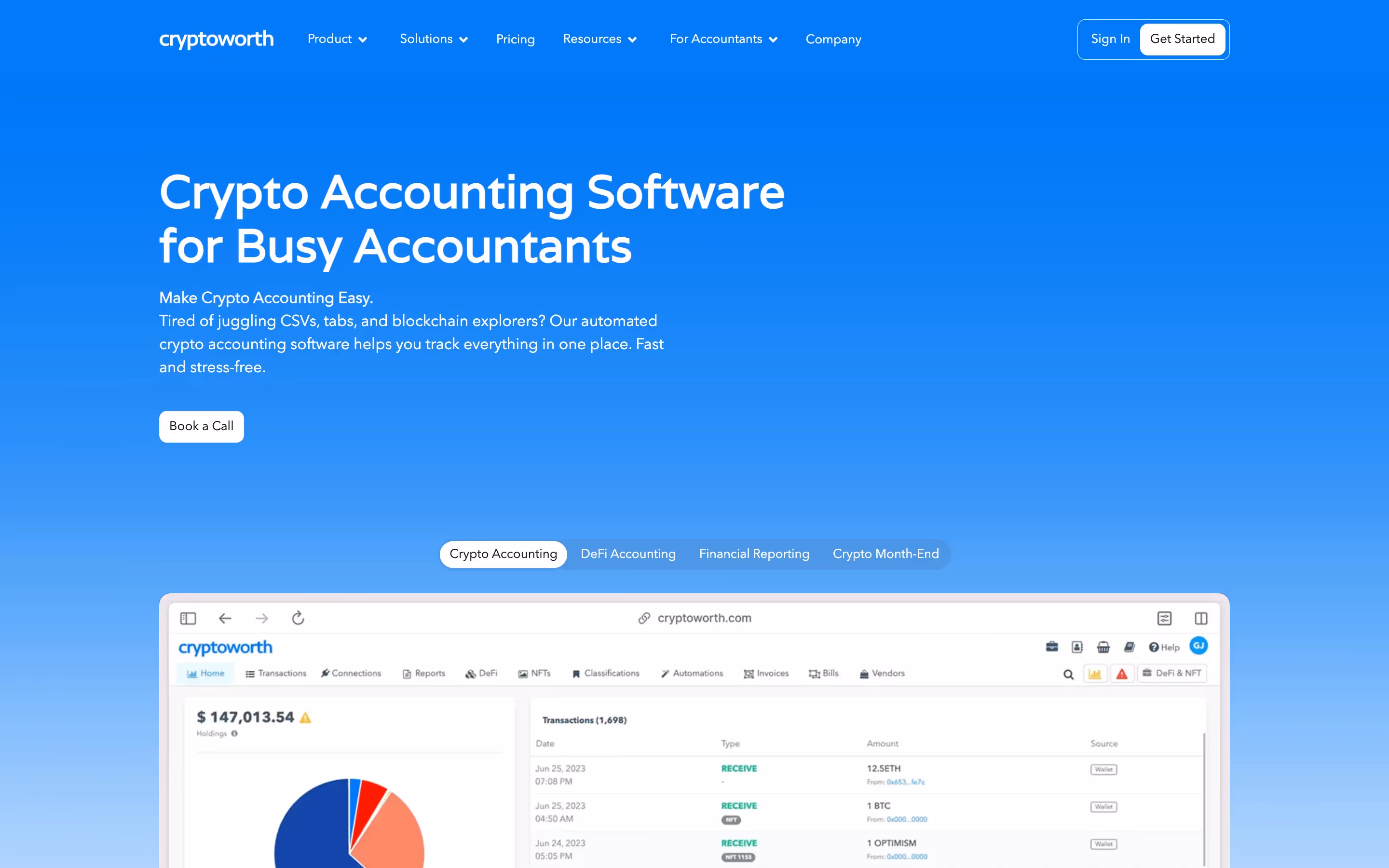
[fs-toc-H2]Cryptoworth – Trust and Clarity in FinTech
Cryptoworth is a crypto accounting and portfolio management platform built for enterprises, accountants, and CFOs. The brand aims to become the most trusted brand aimed at simplifying compliance and financial reporting for brands dealing with digital assets.
Website Style: The site focuses on clarity and trust. Blue-themed design with many product shots elements communicate professionalism and the platform's value.
What We Like:
- Strong emphasis on credibility in a trust-sensitive industry.
- Clear, role-based messaging that speaks directly to CFOs, accountants, and enterprise teams.
- Technical SEO foundations baked into the site to reach decision-makers searching for crypto accounting solutions.
- Professional visuals paired with straightforward copy that simplify a complex value proposition.
"They’ve been the best vendor we’ve had… From now on, they’re my only SEO agency recommendation.”
— Ariel Eiberman, CMO @Cryptoworth

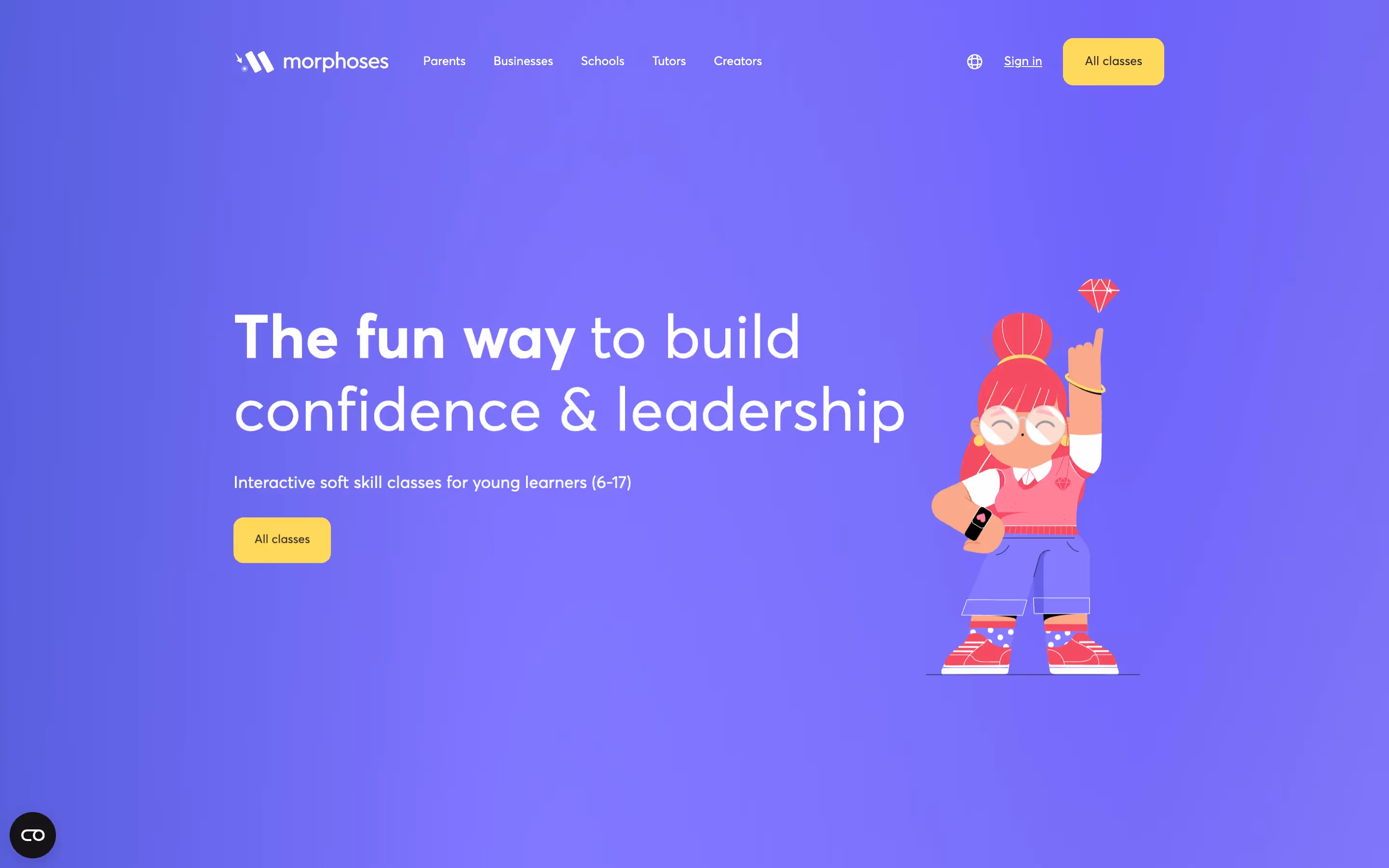
[fs-toc-H2]Morphoses – EdTech Platform for Skills Development
Morphoses is an education technology company that focuses on developing future skills for different age groups. Its platform combines engaging content with personalized learning paths designed for different ICP such as schools, content creators and businesses.
Website Style: The site uses a vibrant and approachable design that makes an abstract concept, future skill-building, tangible. The site is incredibly engaging with interactive scroll based animations. Thoughtful use of color and typography make the content easy to navigate.
What We Like:
- Strong use of visual storytelling to communicate complex ideas.
- Strong brand showcased through custom visual assets.
- Interactive features and animations (GSAP, Lottie) that engage users without overwhelming them.
- Case study sections that build credibility with enterprise buyers and educational institutions.
- A balance of creativity and clarity that makes the site inviting yet professional.
The animations and smooth UX get constant praise — and the site now plays a key role in closing deals.
— Kimon Tousmanof, Marketing Lead @Morphoses

Ready to elevate your website? Explore our B2B Web Design Agency services or get in touch to start planning your next move.
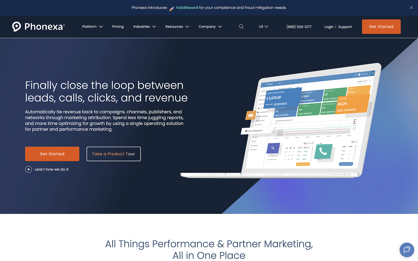
[fs-toc-H2]Phonexa – Integrated B2B Platform for Call, Lead Tracking and Distribution
Phonexa is an integrated marketing automation platform for tracking, distributing, and analyzing leads and phone calls. From affiliate networks to advertisers to larger-scale publishers, any business that manages leads and phone calls at scale can benefit from comprehensive insights in a single, real-time dashboard.
Website Style: The site takes a practical, conversion-focused approach with a dark blue color scheme that builds trust. Rather than flashy design elements, Phonexa relies on it's free product tour and a quick-start offers on the first screen, showing different dashboard views and interactive graphics to explain what the platform does. The design is straightforward and text-heavy (optimized for search engines), with proven layouts that prioritize function over form. The navigation is intuitive, naturally presenting the two core solutions and six add-ons within Phonexa’s platform.
What We Like:
- Visual product storytelling: Aside from describing features, the site shows you the platform through detailed dashboard mockups and funnel visualizations that make the offering tangible.
- Clear mission statement: uniting lead and call tracking, distribution, and analytics in one place.
- Conversion-first mindset: Design choices are purposeful. In example, the usage of big orange button (BOB), simple layouts, etc.
- SEO-optimized content: The text-heavy approach means the team has been focused on optimizing the site for the search engines.
- User-friendly menu comprising every major tool and feature that Phonexa offers.
- Highlighting the industries that benefit most from using Phonexa, such as finance, insurance, home services, and affiliate marketing.
Whether lead tracking and distribution or call tracking and analytics, Phonexa’s website is an easy guide to one of the most comprehensive platforms in the market, the one with a quite steep learning curve yet also with gigantic benefits for almost any business relying on leads and phone calls.
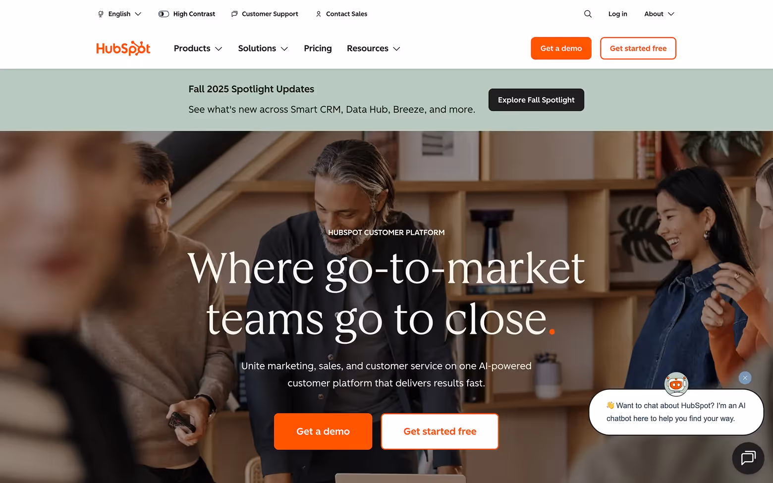
[fs-toc-H2]HubSpot – Content-Driven Inbound Marketing
HubSpot is a leading CRM and inbound marketing platform that provides tools for marketing, sales, service, and operations. It serves as both a product suite and an educational hub, helping businesses grow through content-driven strategies.
Website Style: HubSpot’s site is designed for clarity and trust. It features approachable layouts, bold CTAs, and segmentation by product line, making navigation intuitive. AI-powered agents, integrations, and case studies are woven throughout, highlighting the platform’s depth and adaptability.
What We Like:
- Strong focus on inbound marketing with a vast resource library of blogs, guides, and templates.
- Clear homepage messaging paired with bold CTAs like “Get a Demo” and “Get Started Free.”
- Strategic use of client stories and recognizable brand logos to establish authority.
- Seamless integration of AI features, showing innovation alongside trust.
HubSpot is an example of a brand doing both the conversion-focused design and content right. Its educational hub is a powerful lead-generation engine.
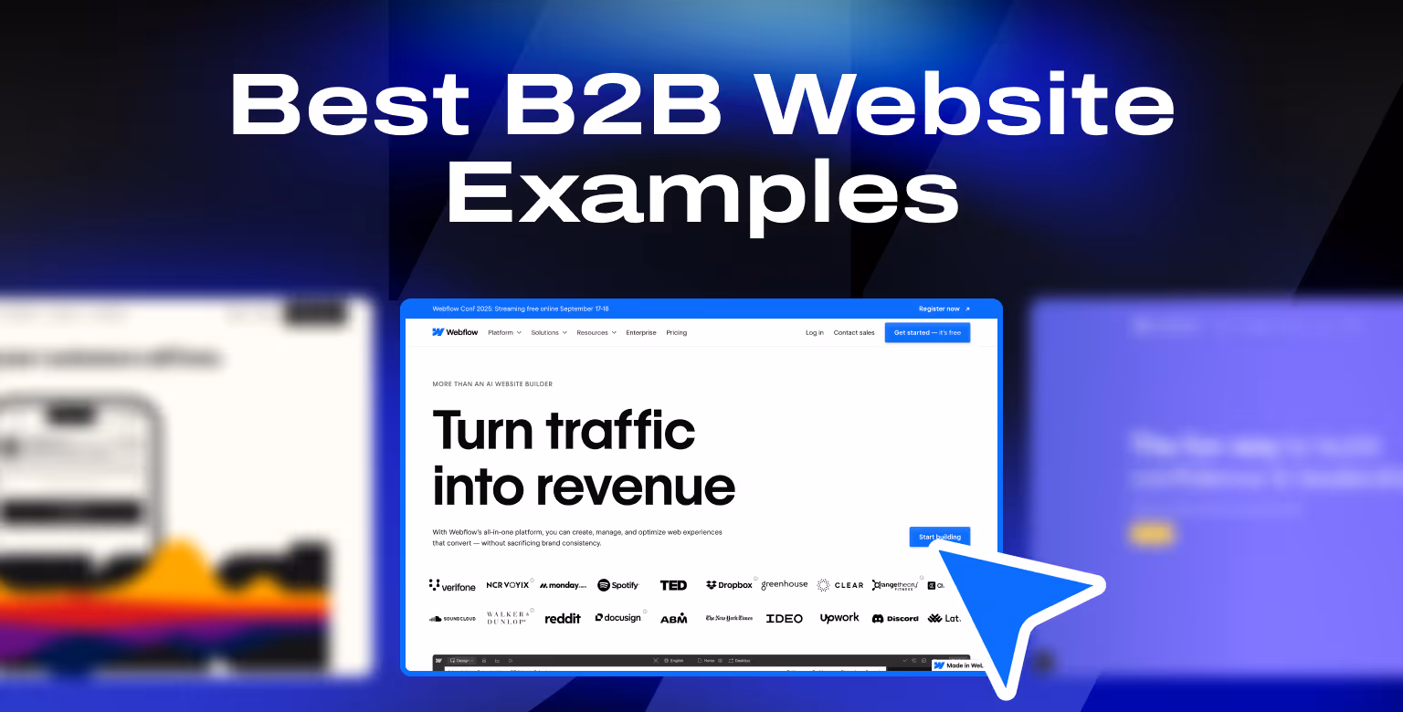
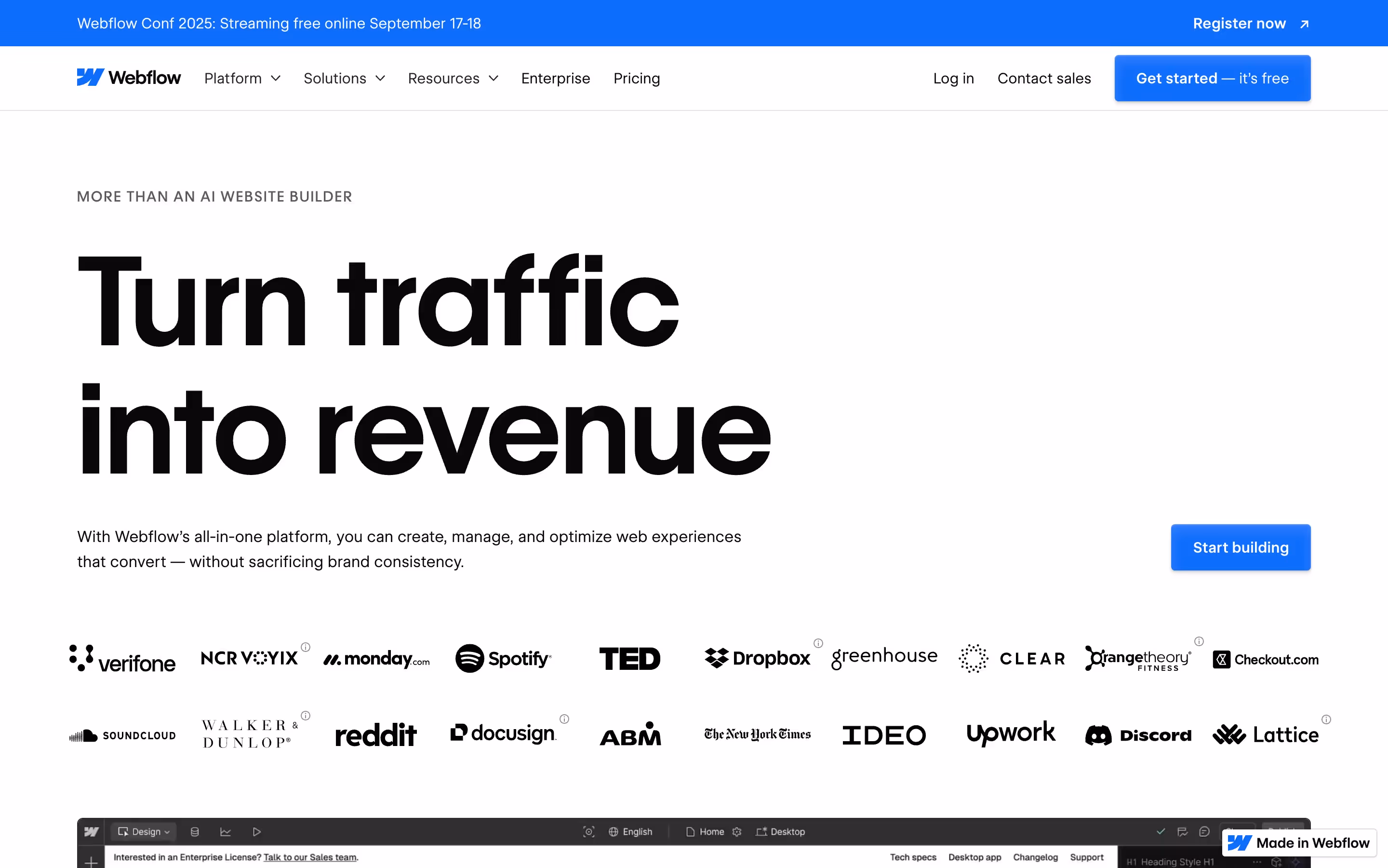
[fs-toc-H2]Webflow – Visual Showcase of Design Flexibility
Webflow is a visual development platform that enables teams to design, build, and launch responsive websites without relying fully on developers. It’s a go-to choice for startups and enterprises that want speed and design freedom in one platform.
Website Style: The homepage makes a bold impression with black-and-white contrasts, interactive previews, and polished typography. Product benefits are paired with visuals that immediately demonstrate what Webflow can do. Structured storytelling takes the visitor from traffic growth to site launches, content management, and AI-powered features.
What We Like:
- Hero headline "Turn traffic into revenue" communicates value instantly.
- Strong emphasis on use cases: traffic growth, content management, and scaling.
- Interactive design and scrolling previews that demonstrate product capabilities in action.
- Clear and frequent CTAs like "Get started — it’s free" reduce friction for new users.
- Social proof from well-known companies reinforces trust and adoption.
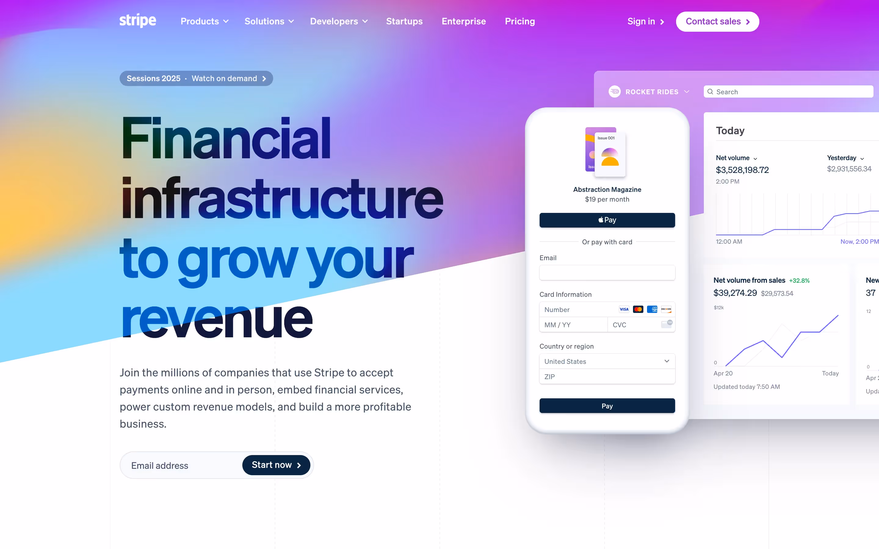
[fs-toc-H2]Stripe – Simplicity and Developer-Friendly Design
Stripe is a global financial infrastructure platform that powers online payments and broader financial services for startups, enterprises, and everything in between. It is widely regarded as one of the most developer-friendly platforms in the industry.
Website Style: Stripe’s site combines a minimalist design with technical clarity. Strong use of gradients, clean typography, and crisp visuals highlight the sophistication of its offering. The design communicates trust and scale, while product documentation and integration details are easily accessible.
What We Like:
- Headline messaging that quickly conveys Stripe’s core mission: enabling revenue growth.
- Developer-first approach with fast access to API documentation and integration guides.
- Case studies and recognizable customer logos that strengthen credibility.
- Clean product breakdowns with visual explanations of financial workflows.
Stripe’s website strikes the right balance between visual simplicity and technical depth, making it equally useful for CFOs, developers, and startup founders.
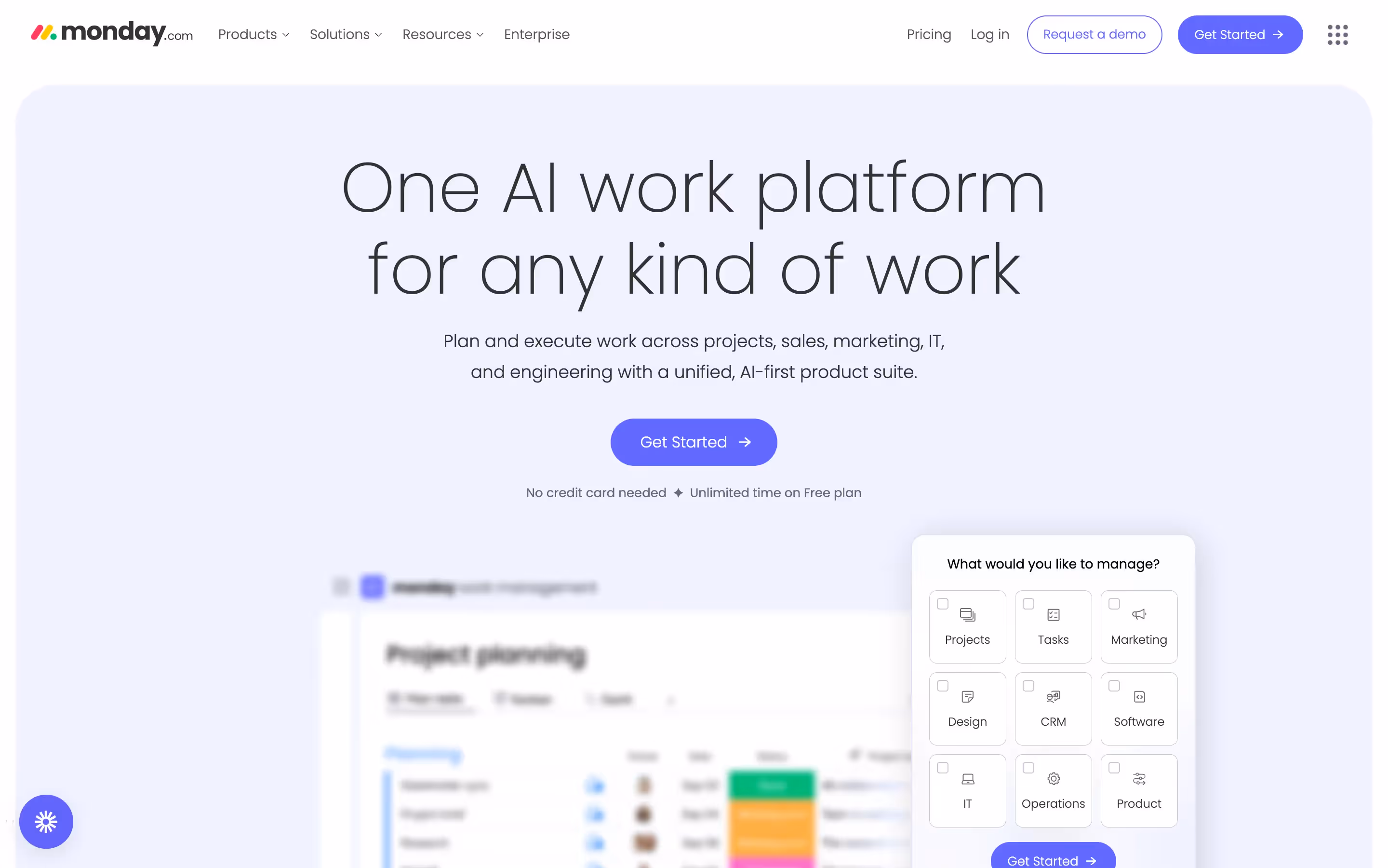
[fs-toc-H2]Monday.com – Use-Case Driven Personalization
Monday.com found an interesting approach to product management platform. It is marketing itself as a system to help professionals manage their work (Work OS). It is designed to help teams plan, organize, and manage workflows, no matter the industries. It offers ops tools beyond project management.
Website Style: Unlike the name suggests, the site is bold, colorful, and dynamic. It's a clear reflection of the platform. Visitors are the heores of the brand and they can immediately navigate to use cases that match their role or industry.
What We Like:
- Clear, visual navigation that allows visitors to find relevant workflows instantly.
- Bright branding and dynamic product visuals that communicate energy and flexibility.
- Strategic use of case studies and adoption statistics from well-known companies.
- Enterprise-grade security messaging that reassures larger organizations.
Monday.com is using blend of personalization and interactivity to ensure an approachable user experience.
Traffic without conversions is wasted. And Monday.com has done a great job at optimizing their site in that regard. Our conversion rate optimization experts can help you turn visits into leads with smart design, UX, and A/B testing.
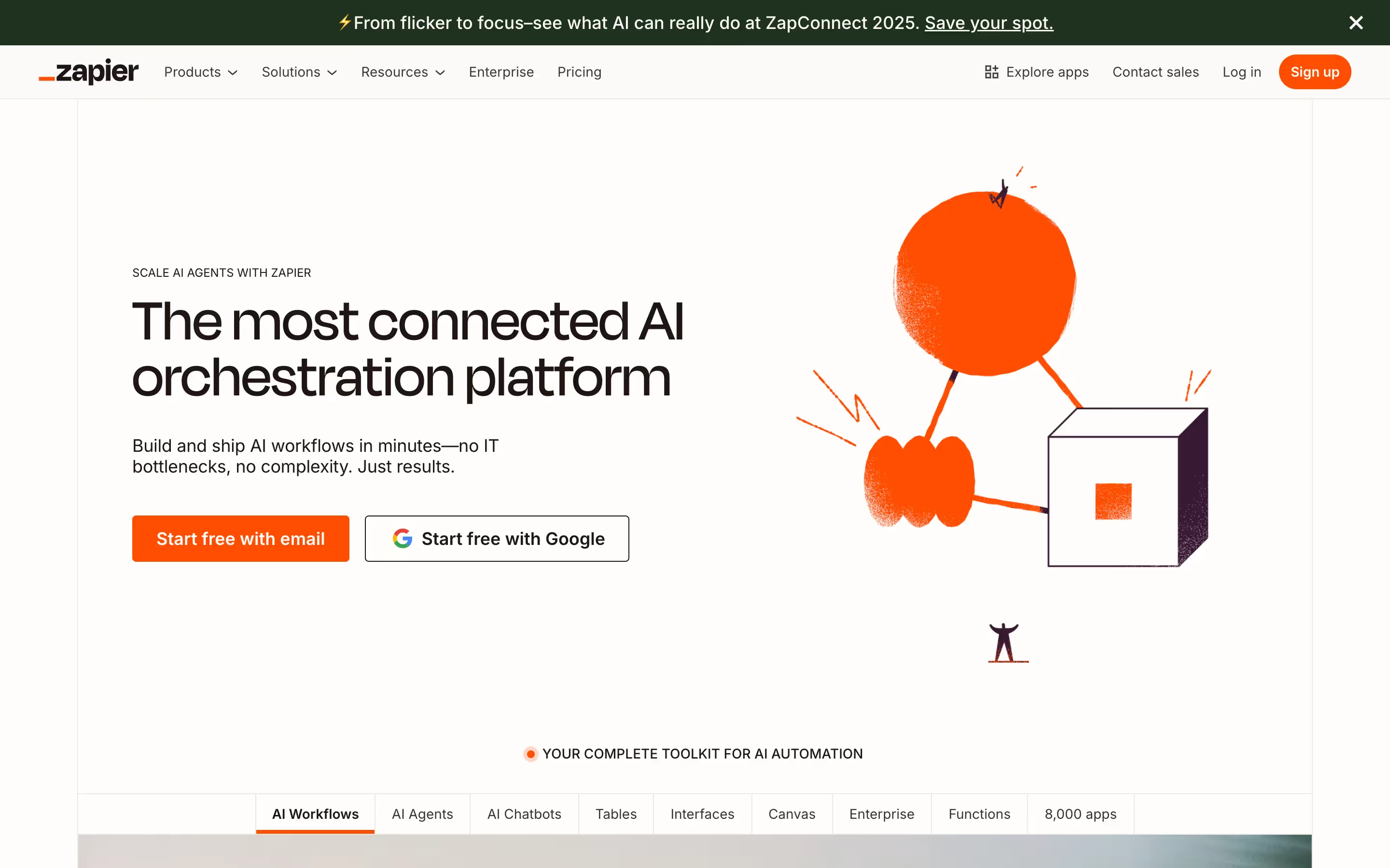
[fs-toc-H2]Zapier – Complex Offering Made Simple
Zapier is an automation platform that connects thousands of apps, enabling businesses to streamline workflows without heavy technical resources. Its website makes this potentially complex offering approachable for teams of any size.
Website Style: The design is structured, modern, and security-focused. Messaging emphasizes trust, compliance, and reliability, while visual workflows and integration directories simplify the breadth of options. Enterprise users are reassured with uptime guarantees and advanced security certifications.
What We Like:
- Clear messaging that explains automation in plain, jargon-free language.
- Strong focus on security and compliance (SOC 2, GDPR, enterprise SLAs).
- Visual workflow examples and integration listings that make capabilities tangible.
- Multiple CTAs (“Start Free with Email,” “Contact Sales”) tailored to different buyer types.
[fs-toc-H2]Notion – Minimalist and Team-Oriented
Notion is a collaborative workspace that combines notes, tasks, databases, and wikis into one AI-powered platform. It caters to teams of all sizes, offering flexibility for everything from project management to company-wide knowledge bases.
Website Style: The site embraces a clean, minimalist design with generous whitespace and subtle illustrations. Its focus is on showing the product in action through live demos, GIFs, and customer stories. Navigation is simple, guiding users to templates, integrations, and AI features without overwhelming them.
What We Like:
- Clear positioning as “the AI workspace that works for you,” supported by product visuals.
- Customer testimonials from recognizable brands like OpenAI and Ramp that add credibility.
- Practical demonstrations of workflows (roadmaps, notes, calendars) tailored to different teams.
- Simple CTAs like “Try Notion Free” and “Request a Demo,” placed after showcasing value.
Notion’s site is a masterclass in minimalism: all unnecessary elements are stripped away, letting the product shots and custom illustrations speak to the users.

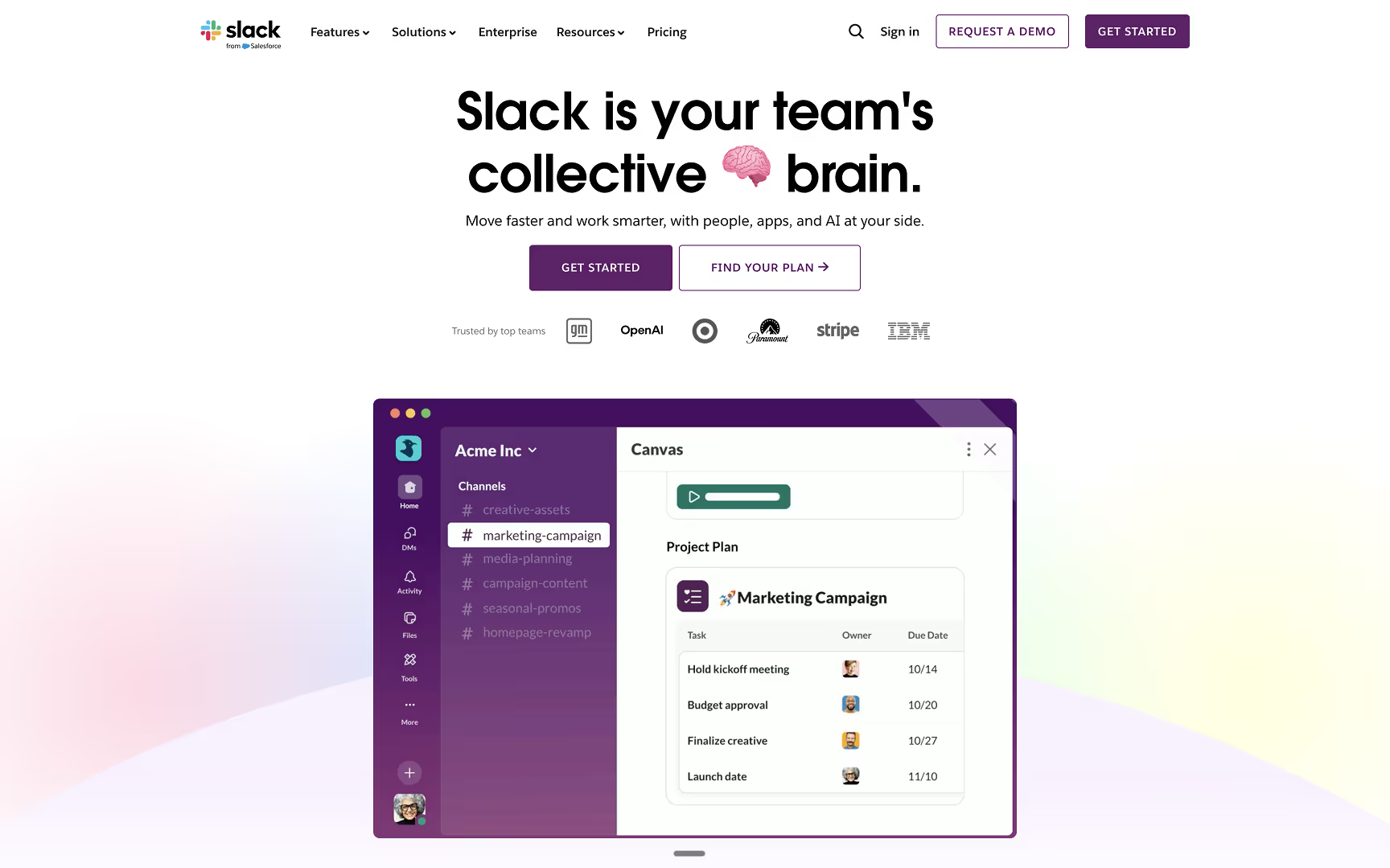
[fs-toc-H2]Slack – Playful Yet Professional
Slack is a workplace communication platform that helps teams collaborate through chat, integrations, and file sharing. It serves organizations of every size, from startups to global enterprises.
Website Style: The site balances approachability and professionalism. Bright brand colors and playful illustrations make the product friendly, while strong statistics and enterprise client stories highlight its serious business value. Clear sectioning walks visitors through communication, integrations, and productivity benefits.
What We Like:
- Headline and subhead do a good job explaining the product's value ("Slack is your team's collective brain").
- Use of client success metrics and adoption stats to prove impact throughout the home page.
- Clean visuals and interactive previews show how the product fits into daily workflows.
- Consistent, action-oriented CTAs like "Try for free" and "Get started" drive conversions.
- Customer logos and testimonials build trust with enterprise buyers.
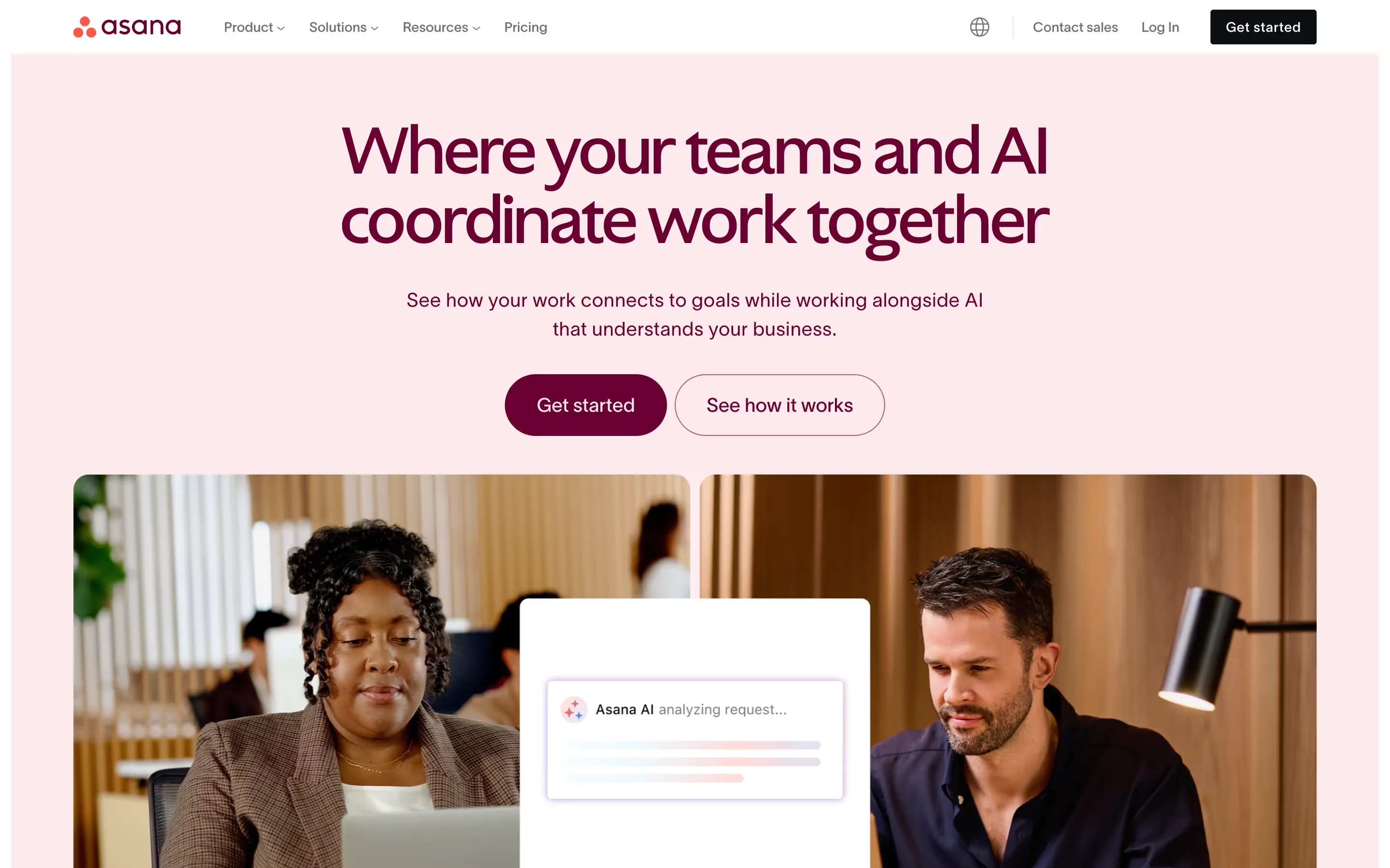
[fs-toc-H2]Asana – Organized and Friendly
Asana is a project management platform that helps teams coordinate tasks, projects, and workflows. It’s used by companies worldwide to improve clarity and accountability across departments.
Website Style: The homepage highlights teamwork and AI coordination. Pastel brand colors, approachable typography, and customer success stories make the product feel both reliable and easy to adopt. Structured layouts emphasize Asana’s ability to adapt to multiple use cases with over 300 integrations.
What We Like:
- Headline promise: "Where your teams and AI coordinate work together" is clear and timely.
- Strong emphasis on use cases across roles and industries.
- Social proof from Fortune 100 logos and client testimonials builds credibility.
- Dedicated sections that explain differentiators like clarity, AI features, and integration power.
- Straightforward CTAs such as "Get started" or "See Asana in action" remove barriers to entry.
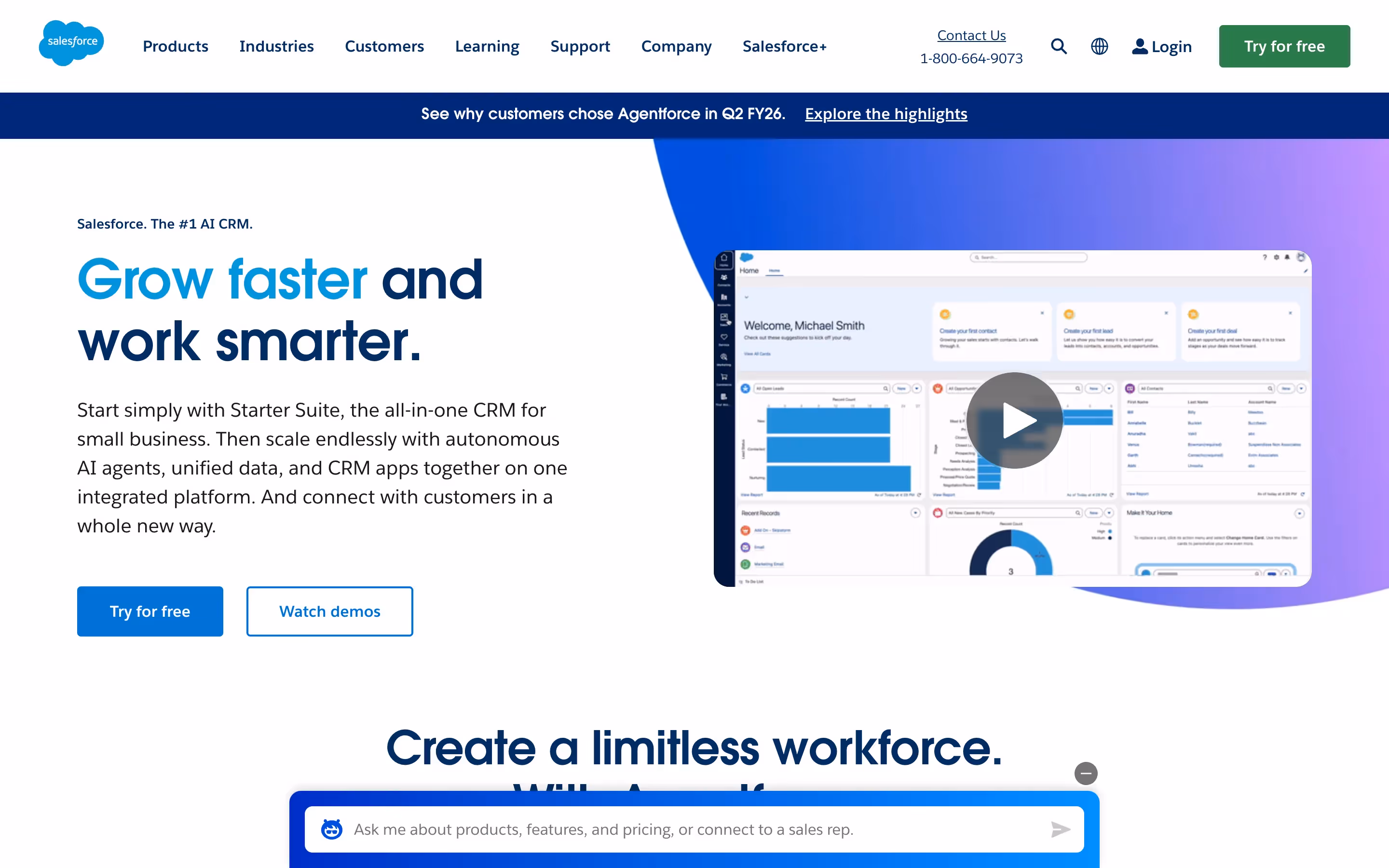
[fs-toc-H2]Salesforce – Enterprise-Level Authority
Salesforce is the global leader in CRM, offering solutions for sales, marketing, service, and analytics. It caters to organizations of all sizes but is especially strong in enterprise adoption.
Website Style: The homepage communicates scale and authority with a polished, corporate design. Bright visuals, structured layouts, and industry-specific sections help users quickly navigate to solutions. Extensive use of demos, integrations, and customer stories positions Salesforce as both flexible and enterprise-grade.
What We Like:
- Hero headline emphasizes growth and smarter work, aligning with core CRM value.
- Multiple entry points for different company sizes and industries create a personalized experience.
- Rich educational content, including webinars, whitepapers, and case studies, fuels trust.
- Heavy focus on integration ecosystem demonstrates adaptability.
- Strong CTAs like "Try for free" and "See how it works" address different buyer readiness levels.
Best B2B E-Commerce Website Examples (Top Online B2B Stores)
E-commerce in B2B must balance large product catalogs, complex pricing models, and the need for trust in high-value transactions. These examples show how some of the leading B2B e-commerce sites solve those challenges.
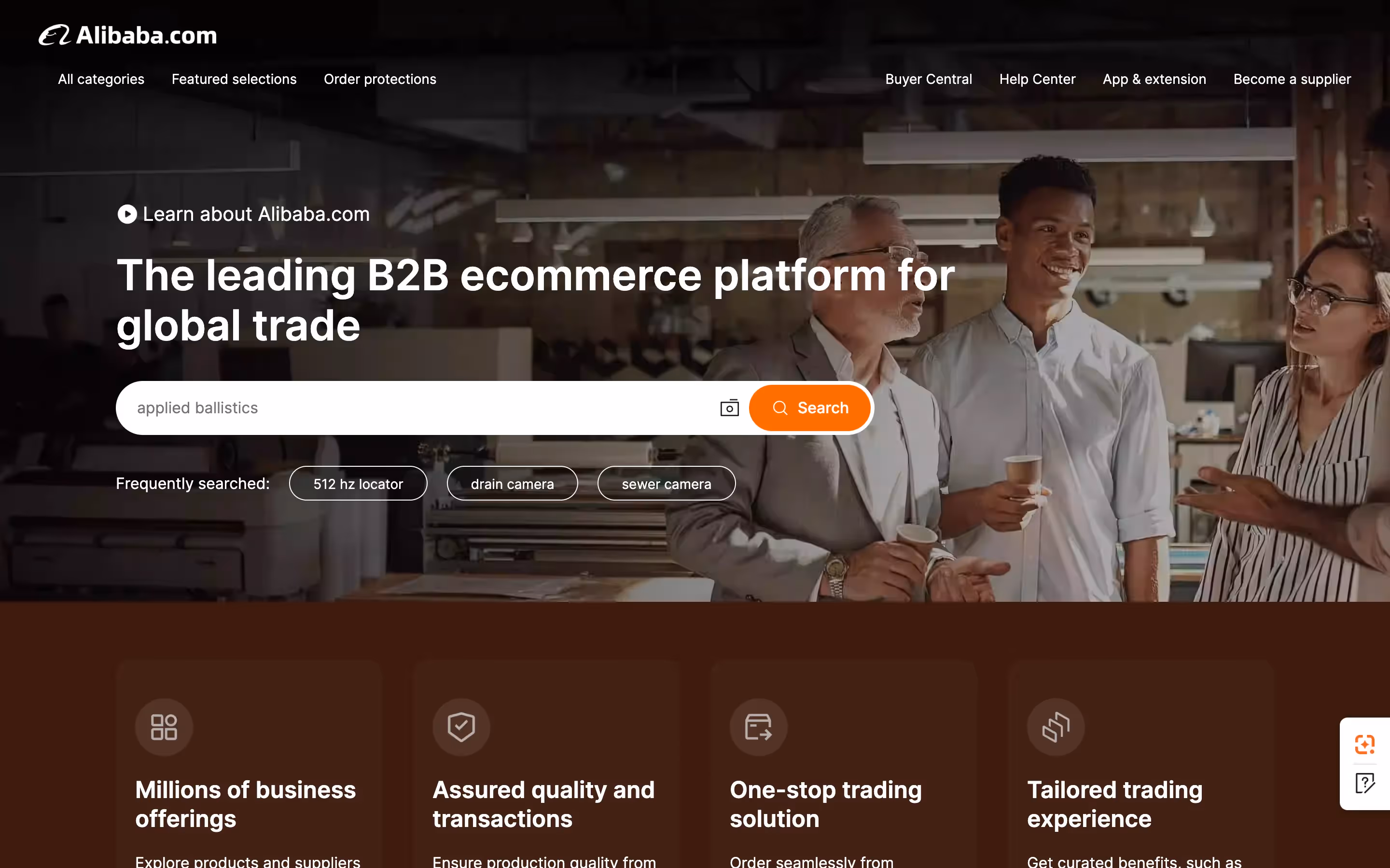
[fs-toc-H2]Alibaba – Global Marketplace at Scale
Alibaba is one of the largest global B2B marketplaces, connecting suppliers and buyers across industries worldwide. It facilitates wholesale transactions at massive scale.
Website Style: Alibaba’s site is built for scale, with robust categorization and localization features. Despite hosting millions of products, it maintains navigability and trust through structured layouts.
What We Like:
- Comprehensive category navigation and search functions that make large catalogs manageable.
- Localized content and multi-language support to reach a global audience.
- Prominent trust signals such as supplier verification badges and trade assurance.
- Streamlined CTAs like “Contact Supplier” or “Start Order” that encourage transactions.
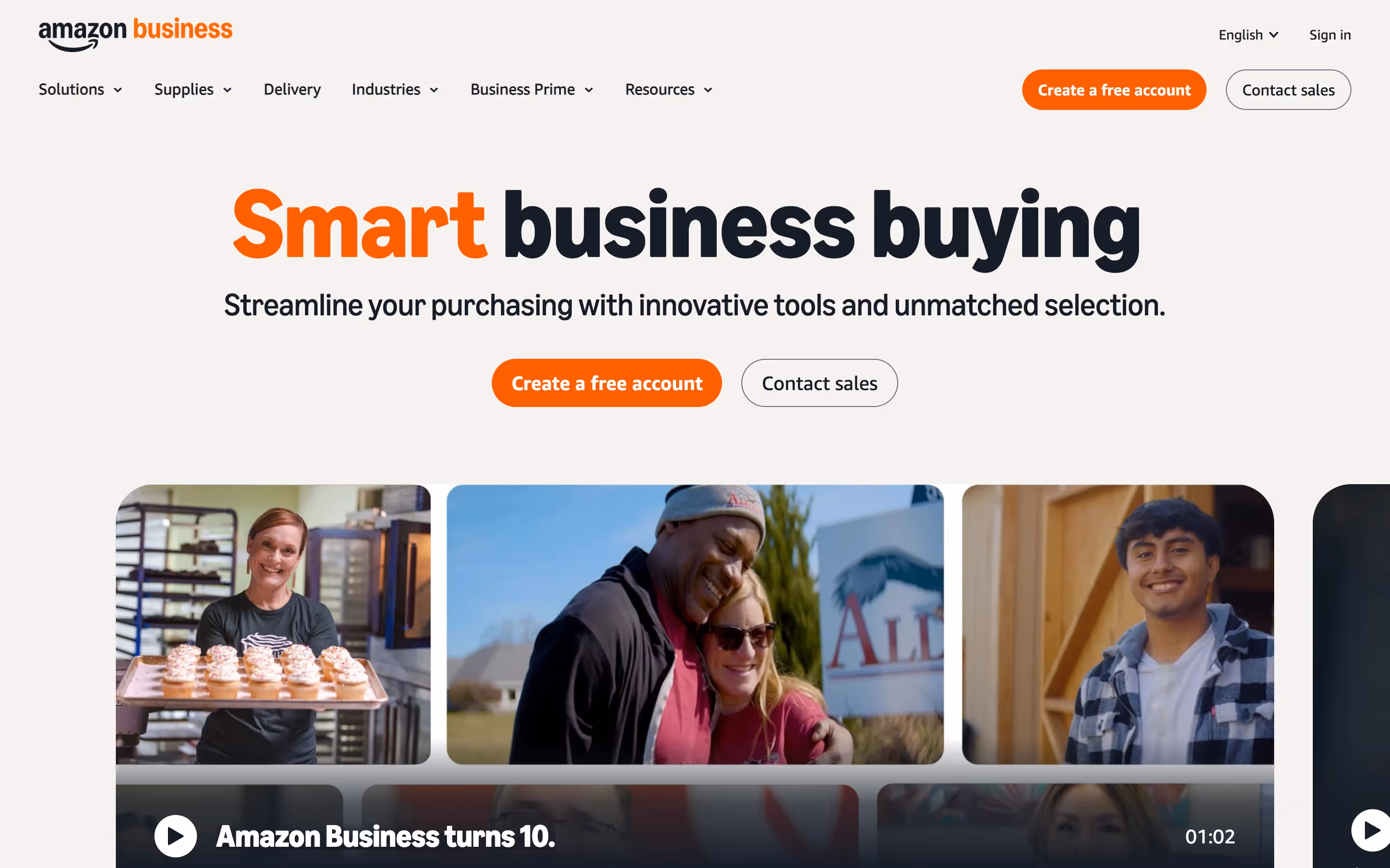
[fs-toc-H2]Amazon Business – Familiar Interface for B2B Needs
Amazon Business is Amazon’s B2B-focused marketplace, tailored to meet the purchasing needs of companies, institutions, and organizations. It offers everything from office supplies to industrial equipment.
Website Style: The site mirrors Amazon’s consumer-facing interface but adapts it for business buyers. It emphasizes bulk purchasing, account management, and cost-saving features.
What We Like:
- Familiar layout that makes adoption seamless for business buyers.
- B2B-specific features such as bulk pricing, purchase approvals, and multi-user accounts.
- Personalized recommendations that increase order values and convenience.
- Clear CTAs like “Add to Cart” and “Request a Quote” designed for procurement workflows.
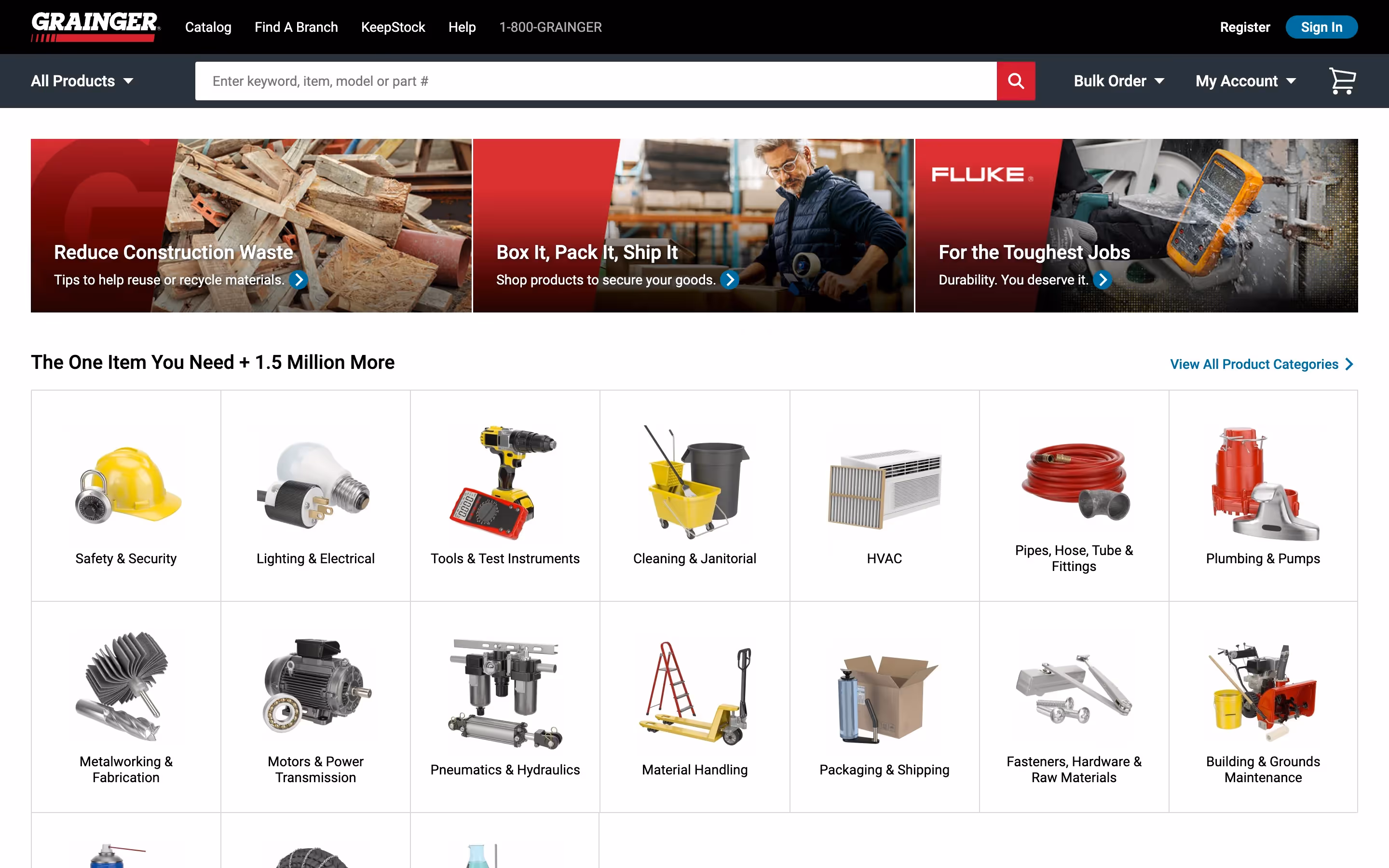
[fs-toc-H2]Grainger – Industrial Supply Specialist
Grainger is a leading distributor of industrial supplies, equipment, and tools for businesses. It serves manufacturing, construction, and maintenance industries with a vast catalog.
Website Style: The site is practical and user-focused, built around powerful search and filtering to help professionals quickly find products among hundreds of thousands of options.
What We Like:
- Strong search and advanced filtering capabilities tailored for large catalogs.
- Product pages with detailed technical specifications and real-time stock information.
- Customer account features such as custom pricing, reordering, and saved lists.
- Trust reinforced through long-standing reputation and visible support resources.
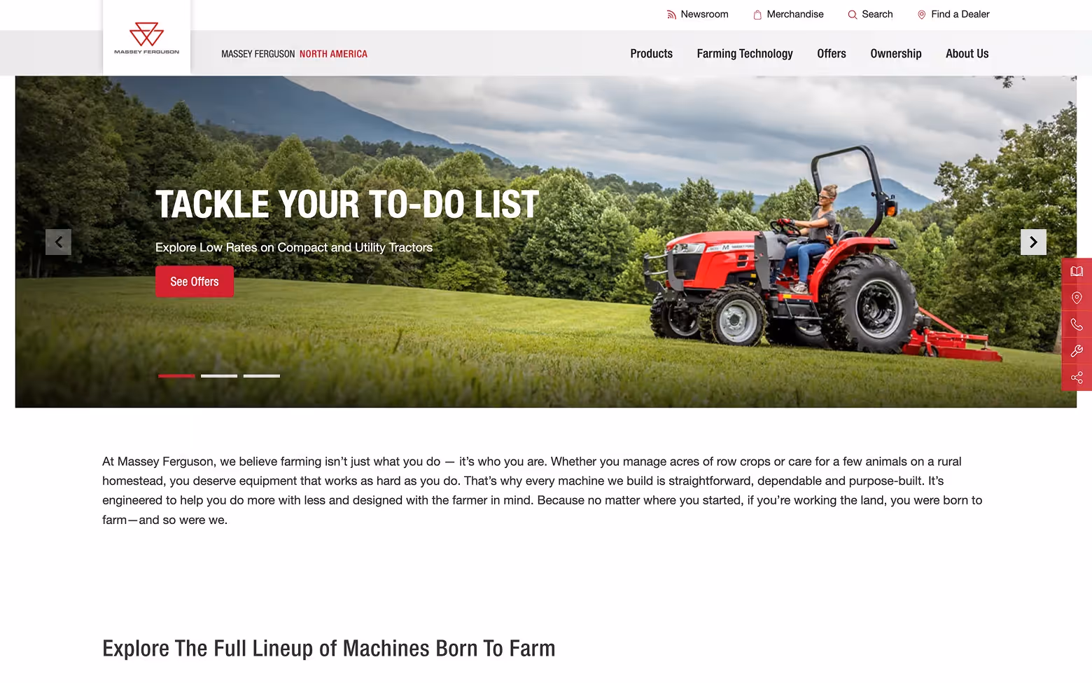
[fs-toc-H2]Massey Ferguson – Equipment with Visual Impact
Massey Ferguson is a global manufacturer of agricultural machinery, from tractors to harvesting equipment. With decades of heritage, it is trusted by farmers and distributors worldwide for durable, high-performance machines designed for real-world farming challenges.
Website Style: The site combines bold visuals with straightforward navigation, presenting tractors, harvesters, and implements in a way that feels both aspirational and practical. Product detail pages emphasize reliability and efficiency, while dealer integration ensures a seamless path from browsing to purchase.
What We Like:
- High-quality photography and video that showcase equipment in real farming environments.
- Dealer network integration with CTAs like “Find a Dealer” and “Request a Quote.”
- Clear product categories and straightforward technical descriptions.
- Messaging that emphasizes history, dependability, and performance — key trust factors in the agricultural sector.
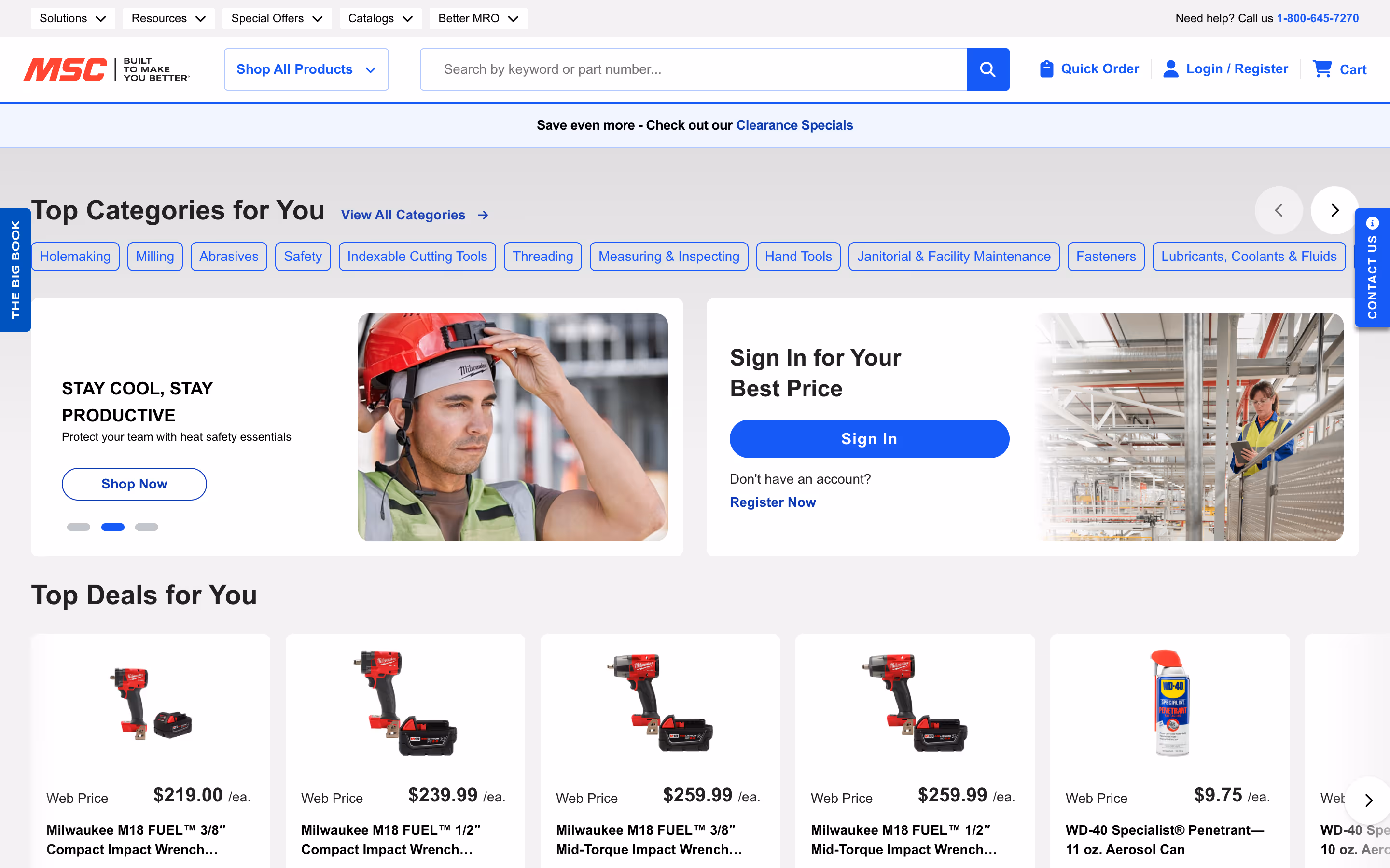
[fs-toc-H2]MSC Industrial Supply – Precision for Industrial Buyers
MSC Industrial Supply is one of the largest distributors of metalworking and MRO (maintenance, repair, and operations) products. Its platform serves manufacturers, engineers, and industrial buyers who rely on quick access to technical parts and supplies.
Website Style: The site is designed with functionality first, offering a clean and straightforward layout. Powerful search and category filters allow buyers to find specific tools, parts, and equipment across an extensive catalog. Account-based features, like custom pricing and saved lists, enhance the procurement experience for enterprise buyers.
What We Like:
- A robust search engine optimized for part numbers and technical queries.
- Detailed product pages with specifications, datasheets, and compatibility notes.
- Customer account tools, including contract pricing, volume discounts, and reordering options.
- A strong focus on usability, ensuring industrial buyers can move quickly from search to checkout.
Conclusion – Turning Inspiration into Action
The best B2B websites share consistent themes: clarity in messaging, user-focused design, content that builds authority, and trust signals that reduce friction in the buyer journey. They also guide visitors toward the next step with strong calls-to-action. A good number of these brands do so through implementing web design trends.
For companies, the lesson is clear: a website must not only inform but also convert. Even small improvements—faster load times, clearer CTAs, or the addition of case studies—can make a measurable difference.
The client examples highlighted in this article, such as Bland AI, Cryptoworth, and Morphoses, prove that applying these principles works across industries and business sizes. From enterprise SaaS to niche crypto accounting and innovative EdTech, the fundamentals stay the same.
If your B2B site does not reflect these best practices, now is the time to act. A well-executed redesign can boost engagement and create real business results. Tilipman Digital is a specialized Webflow development agency focused on B2B websites that drive conversions.
B2B Website FAQs
What is a B2B website?
A B2B website is an online presence built to sell products or services to businesses rather than individual consumers. To explore all the details, see our full guide on What is a B2B Website.
How is a B2B website different from a B2C website?
B2B websites are designed to sell to businesses, not individuals. They often feature in-depth content, case studies, and resources for multiple stakeholders, while B2C sites are optimized for faster purchasing decisions and impulse buying.
What are must-have elements of a successful B2B website?
- Clear value proposition on the homepage
- Intuitive navigation and search
- Client logos, testimonials, and case studies
- Educational resources and content for SEO
- Calls-to-action like demo requests or quote forms
- Fast, mobile-friendly performance
How can personalization improve a B2B website?
Personalization allows a site to show content or offers tailored to the visitor’s industry, role, or behavior. Examples include dynamic case studies, recommended resources, or account-specific dashboards. B2B Website Personalization can increase engagement and conversion by making content more relevant.
What is a good conversion rate for B2B websites?
B2B website conversion rates average at 1.1%. High-performing sites that combine strong SEO, effective CTAs, and optimized UX may reach 7%–10% or higher. Continuous testing and improvement are key to lifting conversion rates over time.