Synthflow AI
Synthflow AI: Turning $20M Raise Into a Scalable Web Presence


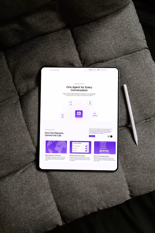
From Startup Look to Enterprise Standard
Synthflow is redefining business phone calls with AI voice agents that sound human, respond instantly, and operate 24/7. Their platform handles thousands of conversations at scale. But until recently, their website didn’t reflect any of that.
The previous site felt like an MVP. It lacked clarity, failed to build trust, and made it hard for prospects to understand or try the product. Key features were buried, and the brand didn’t reflect the technical depth or enterprise focus of the platform.
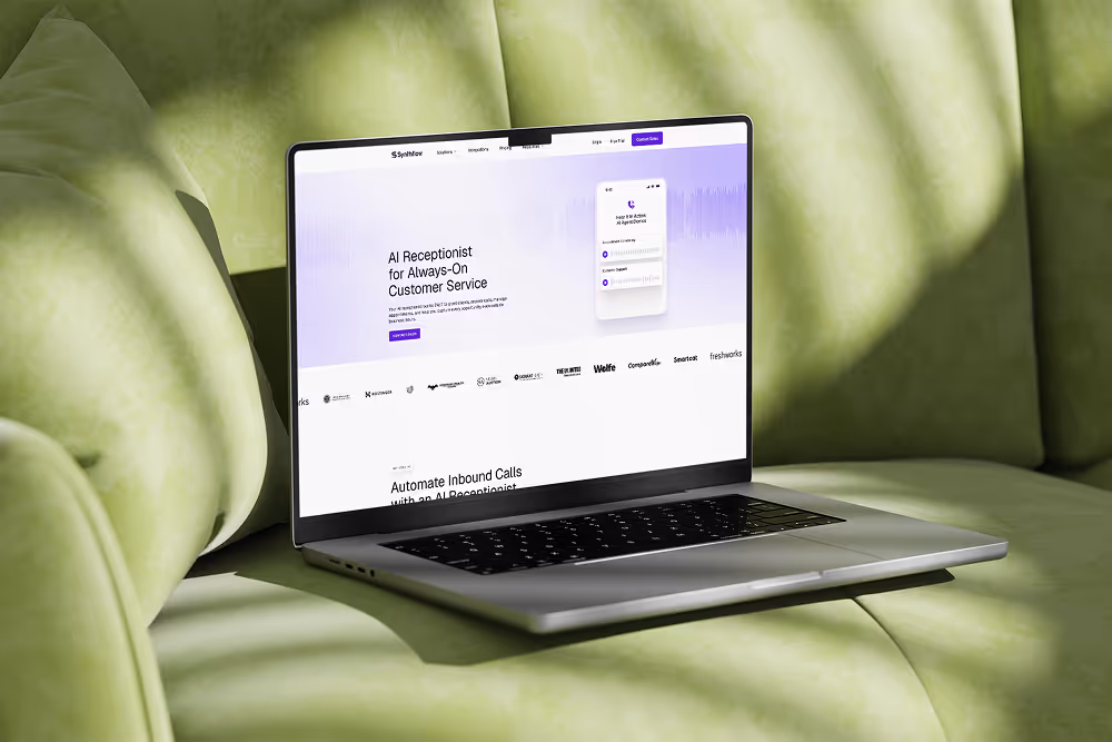
With a $20M Series A round secured led by Accel and a public announcement on the horizon, Synthflow needed a web presence that matched their product and momentum. The homepage revamp was timed around the raise and built to support the visibility that would follow.
To meet that moment, Synthflow partnered with Tilipman Digital, a Webflow Development Agency to rebuild their homepage and uplift their visual identity. The goal was to create a modern, conversion-ready site that positions them as a category leader and supports what comes next.

Softwares
Services
Deliverables
The Challenge: Visually Refined, but Strategically Misaligned
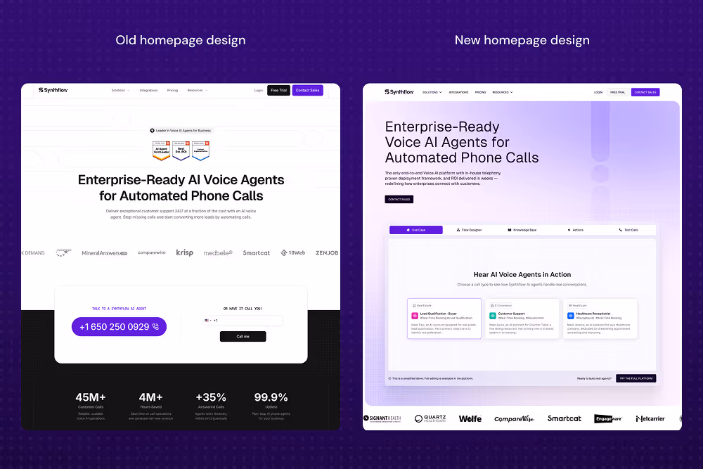
At first glance, the old Synthflow site didn’t raise many red flags. The layouts were clean, the visuals were polished, and the structure felt intentional. Without additional context, it wasn’t immediately obvious what a redesign would solve.
But during our initial strategy session, a different picture came into focus.
The issues weren’t about surface-level design — they were about usability, clarity, and conversion. The site didn’t support the product’s growth goals or reflect the depth of the platform.
Key challenges included:
- No product experience upfront — There was no way for users to test or interact with the AI. Prospects had to rely on abstract descriptions rather than seeing the product in action.
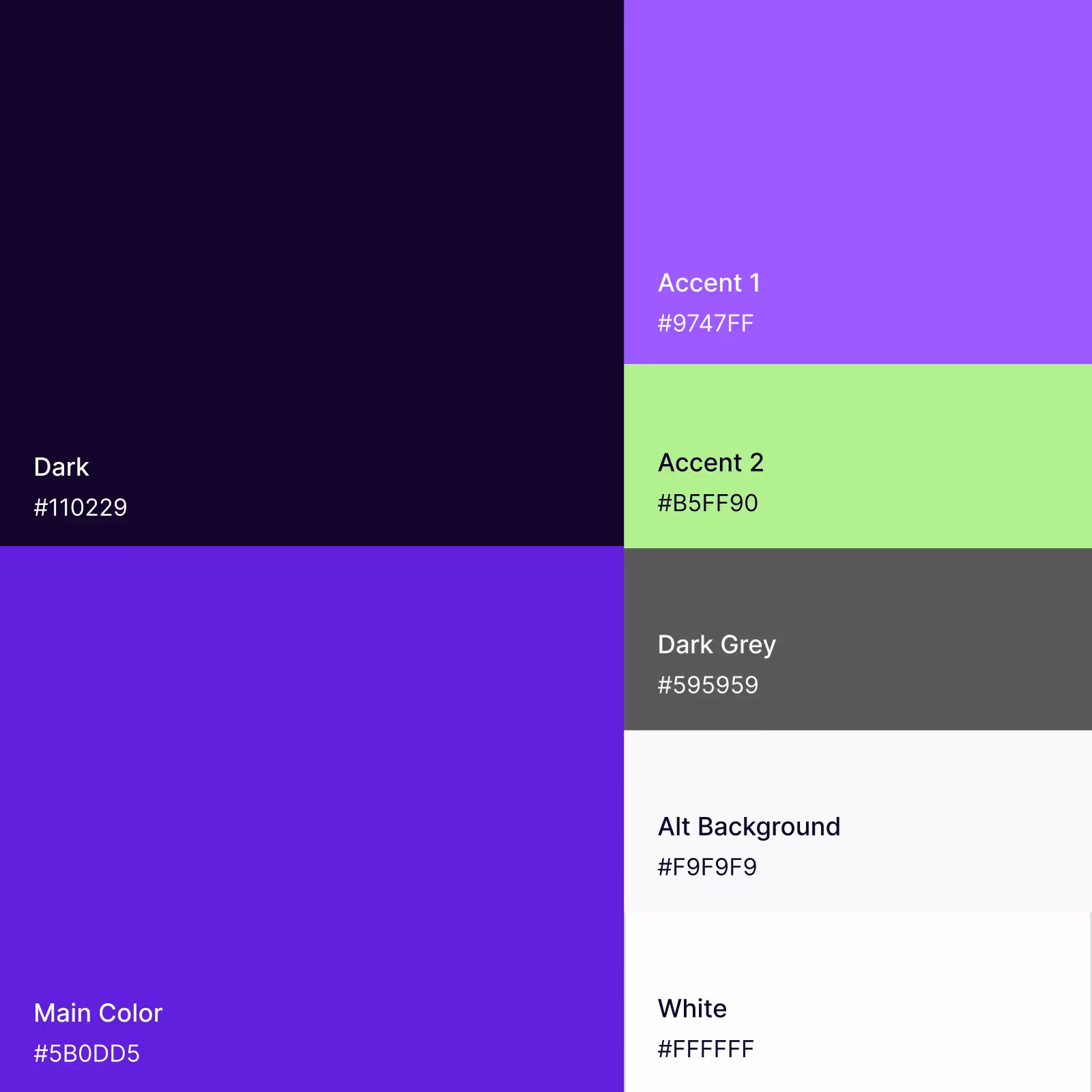
- A brand that wasn’t web-ready — The dominant purple was too saturated, and the reliance on black and white made the brand feel flat. The color system didn’t scale well across interactive UI.
- Disconnected iconography — Branded icons looked great in social campaigns and in isolation, but lacked context on the website. It didn't seem as if the users could easily connect visuals to functionality.
- Unclear value proposition — Even though the layouts were clean, the messaging wasn’t sharp enough to communicate what made Synthflow different, or why visitors should care.
In short, the challenge wasn’t in fixing a broken site. It was about elevating a brand and experience that had outgrown its visual shell, and turning it into something conversion-ready, scalable, and product-led.
Our Approach: Product-Led, Conversion-Driven
We approached the project with a clear strategy: show the product’s value instantly, build trust through design, and create frictionless ways to engage — a hallmark of our work as a B2B Web Design Agency.
Visual Identity Lift-up
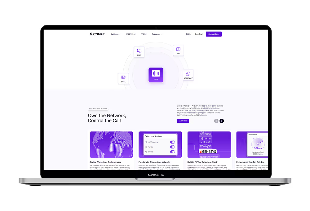
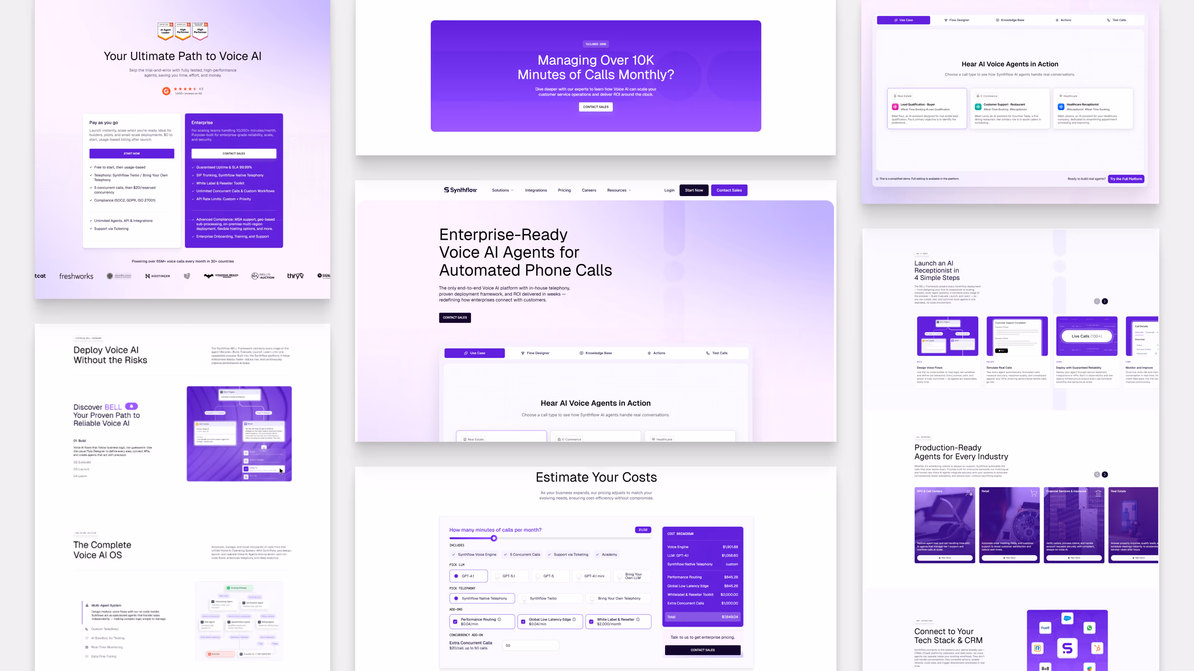
We introduced a modern, enterprise-grade design language with structured layouts, subtle gradients, sharp contrast, and clear hierarchy. The result is a look that communicates maturity, trust, and technical depth.
Interactive Product Playground
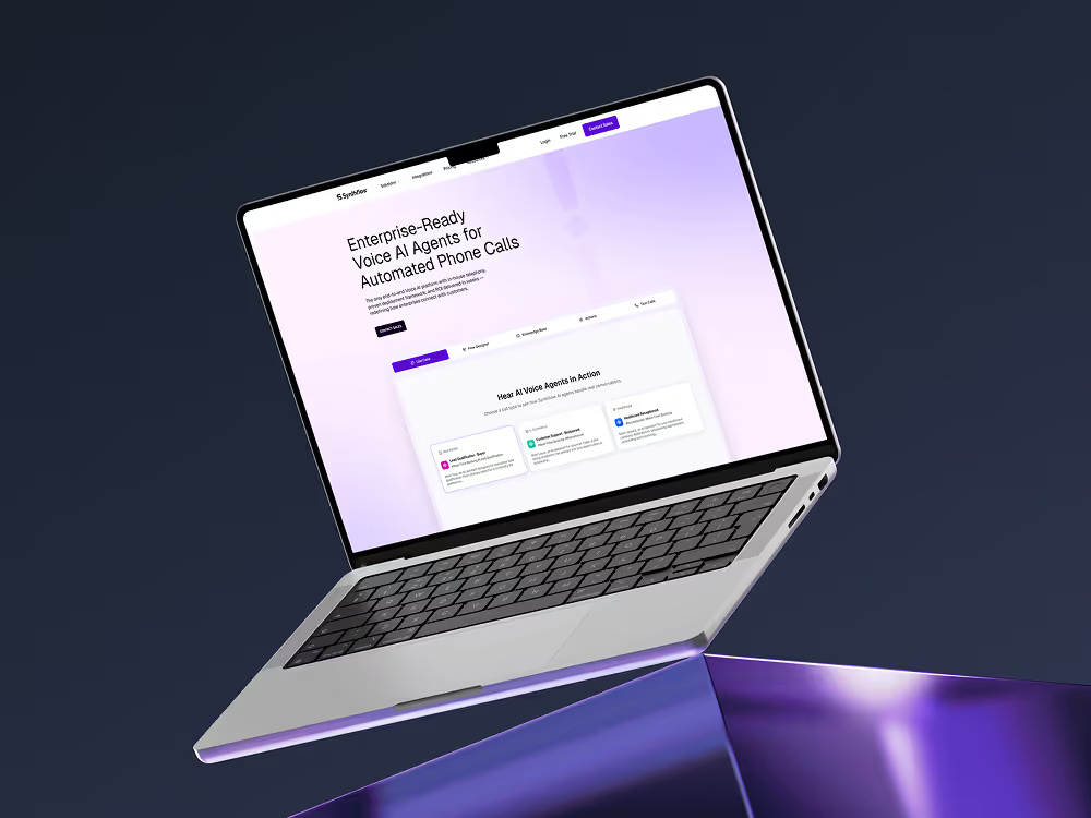
To make Synthflow’s capabilities immediately tangible, we designed a frictionless demo experience. Visitors can interact with AI voice agents, explore agent creation, and see key platform features without creating an account.
Optimized Narrative and Flow
We restructured the homepage to tell a clear, progressive story. Every section builds on the last, moving users from pain points to value to conversion, with benefits, use cases, and proof layered throughout.
Conversion Opportunities Across the Funnel
We mapped CTAs to different buyer intents, from testing the product to booking a demo. These are placed strategically across the site without overwhelming the experience.
Trust Signals and Proof
We embedded credibility indicators across the page to build confidence quickly and effectively. This included compliance badges, G2 awards, and customer logos — all strategically placed to support key conversion moments.
We also added a dedicated section showcasing real voice recordings from different use cases, allowing visitors to hear the product in action. Combined with product statistics, case study highlights, and social proof, the homepage now creates a clear picture of Synthflow’s performance, reliability, and scale.
Laying the Foundation for Future Growth
This revamp was more than a design update. It was a rebuild with growth in mind. We simplified the development framework, created reusable components, and set up a modular system Synthflow can scale across future pages and campaigns.
We worked closely with the Synthflow team throughout, ensuring the new structure supports fast iterations, easier handoffs, and long-term usability as they expand post–Series A.
The Results
- Increased on-page engagement through instant, frictionless demos
- Stronger first impression with an enterprise-ready design system
- More structured user flow that guides visitors toward action
- A clearer product story that’s easier to understand and trust
- A reliable foundation for future product and marketing initiatives
Feedback from the Client

Anna Maikova
They consistently pushed our site toward true enterprise readiness while keeping us on track through tight deadlines. Even with multiple stakeholders and last-minute changes, they stayed flexible, organized, and incredibly responsive. Their clear, proactive communication helped us move fast and launch with confidence.
Conclusion
Synthflow’s homepage revamp is one example of what happens when product clarity, design, and speed align. If you're exploring how to improve your own AI or SaaS site, we’ve put together a deeper breakdown of what strong execution looks like.
For more examples of effective AI website design, check out our article on the Best AI Websites.