


Creating a Webflow centered navigation bar is one of the most impactful ways to deliver a clean, professional, and design-forward first impression. In this guide, you'll learn exactly how to build one from scratch, why it matters for your brand, and how to troubleshoot common pitfalls.
Whether you're a web designer, developer, or business owner, mastering the navigation bar Webflow setup will elevate your site's user experience and set the tone for your brand.
Why Centered Navigation Bars Matter in Modern Web Design
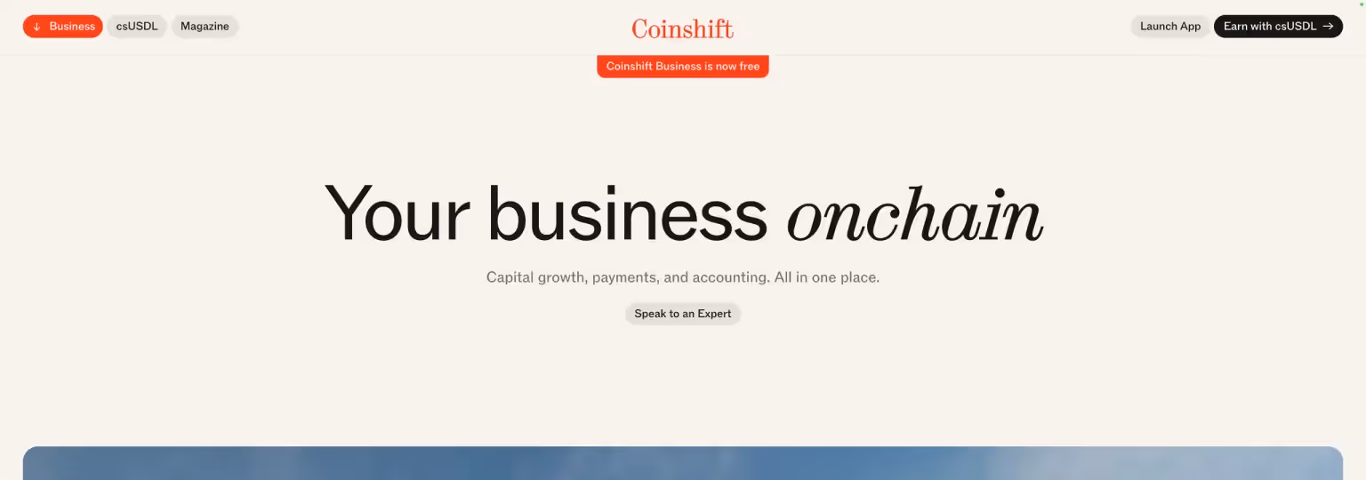
Centered navigation bars are a popular choice among design-driven startups like Coinshift. Why?
- Visual Balance: A centered logo and navigation create symmetry, helping users focus on the brand identity.
- Enhanced User Experience: A clean, simple layout improves usability, especially on larger screens.
- Brand Perception: Minimalist, centered nav bars often project a premium, modern feel.
For businesses aiming to differentiate themselves visually, a centered nav bar is a subtle but powerful tool to enhance credibility and user engagement. And if you'd like to find more Navigation examples to get inspired, we wrote a playbook on crafting the ultimate SaaS Navigaitons.
Understanding the Webflow Navbar Element
Webflow's built-in Navbar component offers a solid foundation, but by default, it arranges elements horizontally — brand/logo on the left, menu links on the right. If you're unsure how to add links to menu in Webflow, make sure to read our beginner's guide before continuing reading this guide.
To create a Webflow centered navigation bar, we need to customize the structure using Flexbox. This approach offers full control over alignment, spacing, and responsiveness.
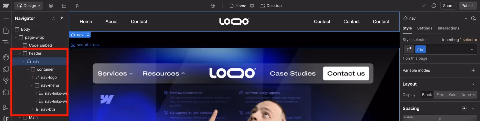
If you’re new to Webflow’s Navbar, it consists of:
- A Brand Link (Logo/Title)
- A Menu Wrapper (Navigation links)
- A Menu Button (for mobile responsiveness)
But a centered layout needs some intentional restructuring.
Setting Up Your Webflow Canvas
Before jumping into building, set yourself up for success:
- Add a Navbar component from the Webflow Add Elements panel.
- Wrap the Navbar in a Div Block, then change the Div Block’s tag to Header for better semantic structure.
- Replace the default Container inside the Navbar with a custom Div Block.
- Style the custom Div Block as a Container (set a max-width like 1200px) and center it. We wrote a guide on using classes in Webflow — helpful for beginners learning how to style elements.
- Add padding and margins as needed to give the layout breathing room.
This method ensures better flexibility, SEO, and responsive control from the start.
Structuring the Centered Navigation Layout
Here’s the updated structure for optimal accessibility and responsiveness:
Inside the main Container:
- Brand Link (Logo)
- Nav Links Wrapper (contains two lists)
- Nav Button (hidden on desktop, visible for tablet/mobile)
Inside the Nav Links Wrapper:
- Left Nav List: Contains list items, each with a link inside.
- Right Nav List: Same structure as the left list.
This approach maintains proper semantic structure, ensuring the navigation is more understandable for screen readers and search engines while improving accessibility and SEO.
Pro Tip: Using lists (<ul>and<li>) for navigation links not only improves screen reader navigation but also strengthens your site's semantic HTML and SEO.
Styling the Navigation Menus
Now that the structure is ready, let's make it look polished:
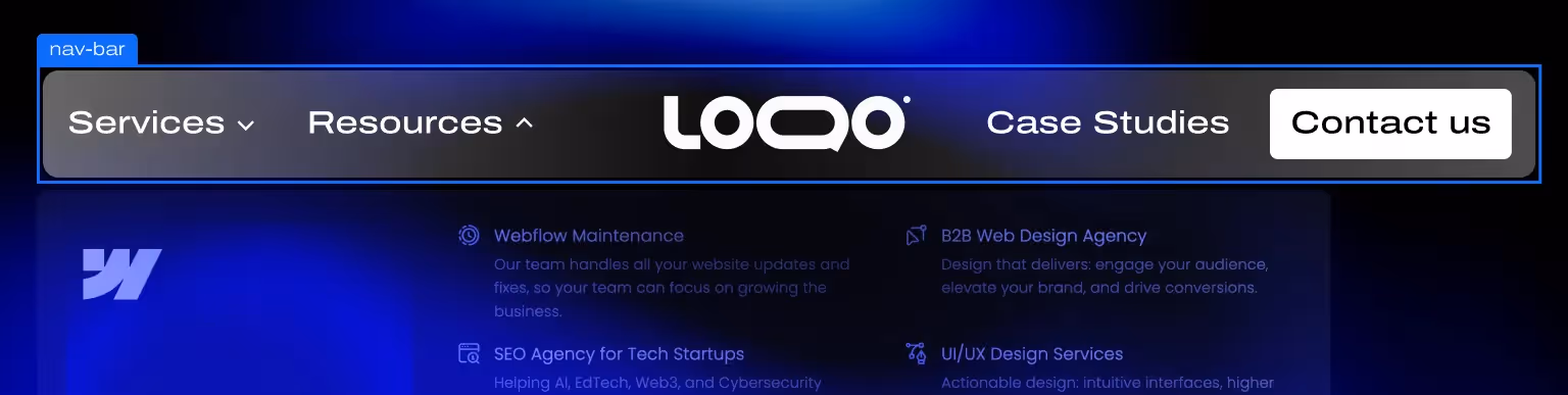
Style the Container with the following settings:
Display: FlexJustify Content: Space BetweenMargin Left and Right: AutoMax Width:Align with your design system (e.g., 1200px)
This setup ensures the navigation is centered, balanced, and scales well across different screen sizes. It also prepares our child elements by making sure:
- Left and right nav links stay balanced.
- Brand/logo remains perfectly centered.
- The navigation stays visually cohesive and responsive.
Good styling guides the user’s eye, reinforces brand experience, and supports a more intuitive navigation structure. Here are some items to consider to have a balanced centered navigation:
- Left & Right Nav Unordered Lists: Use text links or Nav Links inside the list items. Style the left list as Flex and align items to start, while styling the right list as Flex and aligning items to end.
- Typography: Choose a clean, readable font. Keep sizes and weights consistent.
- Spacing: Add even padding between list items.
- Hover States: Introduce subtle color changes, underline effects, or opacity shifts on link hover.
- Visual Hierarchy: If needed, emphasize primary CTAs (like "Book a Demo") with boldness or color accents.
- CTA Placement: Position important CTAs (like "Get Started" or "Contact") on the farthest sides of the navigation to enhance visibility and guide user flow.
- Left and Right Lists Sizing: Set the max-width of each nav list (left and right) to 40% and the width to 100%. This helps keep the brand link visually centered and the navigation proportionate, even when the number of links varies slightly. While the structure might still feel slightly unbalanced at this stage, it will look properly centered once we finish styling and aligning the logo in the next steps.
Perfectly Centering the Logo
Centering the logo visually and technically can get tricky, but here’s how to lock it down properly:
- Set the Brand Link to Position: Absolute: Position the logo absolutely within the container.
- Left: 50%
- Top: Auto
- Bottom: Auto
- Transform: TranslateX(-50%)
This method ensures the logo remains perfectly centered regardless of the width of the left and right navigation lists. Since the logo is placed first inside the container, flex settings alone cannot guarantee visual centering—positioning it absolutely allows it to break free from the normal flow and align correctly.
Troubleshooting Tip: If the logo appears off-center, double-check that:
- The parent container is set to position: relative to contain the absolutely positioned logo.
- The transform property translateX(-50%) is applied correctly.
- There are no additional margins or paddings accidentally shifting the logo.
Making the Webflow Navigation Bar Responsive
Desktop navs are one thing—but mobile friendliness is critical.
Two main options:
- Use Webflow’s Menu Button:
- Webflow’s native Navbar component opens the menu using JavaScript but also adds the necessary accessibility attributes automatically.
- The Menu Button is enabled by default starting at the tablet breakpoint, causing the navigation to automatically collapse into a dropdown.
- You can enhance the menu's interaction by using CSS @keyframes to animate elements when the menu button receives the w--open combo class (for example, fading in the dropdown or sliding links).
- If you apply custom animations, it’s a good practice to respect prefers-reduced-motion settings for better accessibility.
- Custom Hamburger Menu:
- Build a fully custom navigation by using standard div blocks and a manually created hamburger icon, not using Webflow’s native Navbar component.
- Create a hidden overlay menu (a div block) that is initially set to display: none; or opacity: 0;.
- Use Webflow Interactions to animate the menu opening and closing when clicking the custom hamburger button. Common effects include fade-ins, slide-ins, or expanding overlays.
- To ensure accessibility:
- Add appropriate ARIA attributes (like
aria-expanded,aria-controls, androle="navigation") to your hamburger button and menu overlay. - Manage keyboard focus by trapping focus inside the open menu and restoring focus back to the hamburger button upon closing.
- Respect prefers-reduced-motion for users who prefer minimal animations.
- Add appropriate ARIA attributes (like
This approach gives you maximum design flexibility but also requires extra setup to match the accessibility standards provided automatically by Webflow’s native Navbar component. If you’re interested more in Webflow’s Accessibility standards, we have written an article on the topic.
Important: Always preview and test your navigation on different devices!
Troubleshooting Common Alignment Issues
Even seasoned designers face hiccups when building a centered navigation bar Webflow setup. Here are common problems and solutions:
- Logo shifts on smaller screens: Set max width limits on your Brand Link. Also make sure that tablet, mobile (L) and mobile have padding-left set to 0px.
- Menu links uneven: Balance link counts or adjust wrapper padding manually.
- Alignment breaks when scaling: Use relative units (%, vw, em) instead of px wherever possible.
Testing across breakpoints is non-negotiable.
Bonus: Adding Hover Effects and Subtle Animations
Small touches can elevate your navigation:
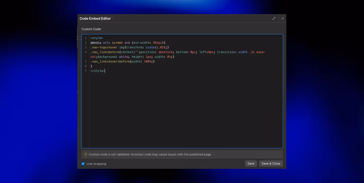
- Underline transitions on hover:
The best way to achieve a smooth underline effect is by using the :before pseudo-class. Here's how:
- Style the :before element as a thin line positioned underneath the link.
- Set its initial width to 0% and add a transition for width.
- On link hover, animate the width of the :before element to 100%.
This method creates a sleek, animated underline without affecting the surrounding layout, improving the visual polish of your navigation links.
- Fade-ins for navigation when the page loads:
The best way to achieve this effect is by using a @keyframes animation in CSS. Here's a simple approach:
- Define a @keyframes animation where:
from {opacity: 0%; transform: translateY(32px);}to {opacity: 100%; transform: translateY(0px);}
- Apply this animation to your navigation elements when the page loads.
This creates a smooth, elegant entrance effect without overwhelming the user experience.
- Scale effects for logo hover (very slight):
The best way to achieve this is by using Webflow's native :hover state. Simply:
- Select the Brand Link or Logo element.
- Switch to the
:hoverstate in the Webflow Style panel. - Apply a slight
transform: scale(1.05)or similar. - Add a smooth
transitionfor transform to make the scaling feel natural.
This native method ensures easier control, better performance, and cleaner implementation compared to using custom CSS.
Keep it subtle. Overdoing animations can distract or even annoy users.
Pro Tip: Using transition: all 0.2s ease; is a quick and convenient way to smooth out interaction effects, especially for smaller projects or when saving time. However, it’s not the most performance-oriented approach. For better optimization on larger or more complex sites, consider transitioning only specific properties (like transform or opacity) to improve rendering efficiency.Ready for a Custom Navbar?
A professional navigation bar does more than just look polished—it plays a critical role in helping users move through your site easily, improving their ability to find the right information quickly. This seamless flow is directly tied to strong information architecture (IA), a key pillar of effective UI/UX design. Clear navigation isn't just about looks; it's about function, experience, and user satisfaction.
If you're looking for expert help designing intuitive navigation systems, thoughtful IA, or smooth user flows, our UI/UX Design Services are a great place to start.
And if building a centered navigation bar still feels overwhelming after following this guide, don't worry—our Webflow Development Agency specializes in crafting polished, high-performing navigation experiences.
Let's create a navigation system that not only looks great but helps your users accomplish what they came for—faster and easier.
Frequently Asked Questions (FAQs)
How do I center a logo in Webflow's default Navbar?
You need to either restructure using Flexbox and create separate left, center, and right wrappers, or position the logo absolutely relative to the container and set:
left: 50%;top: auto;bottom: auto;transform: translateX(-50%);
This ensures the logo remains visually centered even when the navigation structure or link count is uneven.
Is a centered navbar mobile responsive in Webflow?
Yes, but you’ll need to configure a menu button or create a custom mobile navigation experience.
Can I animate my Webflow navigation links?
Absolutely—you can add hover underline animations, fades, and more using Webflow interactions or simple CSS transitions. The best way to do so would be by using CSS interactions.