

Regardless of the industry your business is in, your website has one job: move people to take action.
This guide breaks down what makes a website convert, with clear takeaways you can use today:
- What a high-converting website actually is
- The key elements that influence conversions
- Design best practices that drive action
- Real examples of sites that convert well
What Is a High Converting Website?
A high-converting website is one that contributes to the business bottom line by consistently turning visitors into leads, subscribers, or customers. It’s designed with the ultimate goal of increasing profitability through generating demos, capturing emails, or selling products / licences.
A high-converting website is more effective at guiding the user toward an action compared to other sites.
Why It Matters
Every visitor who lands on your site is a potential opportunity. A small lift in conversion rate can result in significant gains in revenue or pipeline. Use our website ROI calculator to quantify this impact. In example, increasing your conversion rate from 2% to 3% might not sound huge but that’s a 50% increase in leads.
This is why companies invest heavily in Conversion Rate Optimization (CRO). It doesn’t just make your site better, it makes your marketing more efficient.
Looking to do the same? Our Conversion Rate Optimization Experts can apply these CRO best practices to improve your site’s performance.
What Counts as a Conversion?
Conversions vary depending on your business model. Some examples:
The action must be:
- Trackable – So you know when and where it happens.
- Aligned – With your business goals and user intent.
What’s a Good Conversion Rate?
Average website conversion rates range from 2% to 5%, depending on industry. Anything above 5% is typically considered strong. That said, the "right" rate depends on your traffic quality and the complexity of your offer.
The goal isn’t perfection, but consistent improvement.
Funnel Positioning: Consideration Stage
Someone searching for "high-converting websites" already understands that websites should drive outcomes. They’re looking for strategies, examples, and frameworks that work.
That means they’re considering options more than looking to get educated.
For that reason, your content should:
- Equip them with knowledge to evaluate their own site
- Offer insights they can implement or delegate
- Provide next steps (e.g., templates, case studies, services)
This is where trust is built and where your own conversion strategy starts to work. If you're not sure where to start when building your conversion strategy, thinking from the marketing funnel standpoint helps. Our funnel mapping template provides a structured approach to plan content based on the needs of your marketing funnel. By implementing it in your workflow, each new content piece will work towards converting your visitors in a more effective manner.
Key Elements of High-Converting Websites
Great websites are built around elements that guide users to take action with as little steps as possible. Each of the following components plays a crucial role in building trust, reducing hesitation, and nudging users to take the next step.
Clear Value Proposition
Your headline and supporting text must instantly communicate what you do and why it matters. Visitors should be able to answer three questions within seconds:
- What is this?
- Is it for me?
- What should I do next?
Avoid jargon. Use simple words and language tailored to your ICP.
Prominent, Actionable CTAs
Your CTAs should be visible, specific, and action-driven:
- "Start your free trial"
- "Book a demo"
- "Get instant access"
CTAs should be placed strategically. For example, place one above the fold, after each key section where it would make sense to prompt visitors to convert, and again before the website footer.
Visual Hierarchy and Clean Layout
Use design theory to make your designs clean. Main items to focus on are spacing, font sizes, and contrast. They will help your site guide the user’s eye and make the key content easy to scan. The less content and clutter, the better for conversions. Emphasize the elements that drive action.
If you’re a B2B company, our B2B Web Design Agency can tailor these design rules and best conversion principles to speak directly to enterprise buyers.
Trust Signals
Conversion is about removing uncertainty. Reinforce trust with:
- Customer testimonials
- Third-party logos (clients, media features, integrations)
- Security badges or certifications
- Real photography or team imagery
These add legitimacy and reduce friction.
Mobile Optimization & Speed
Most visitors will interact with your site on mobile. Ensure the experience is just as clear and easy as desktop. Also, slow-loading pages lead to higher bounce rates and lost conversions. Aim for <2 seconds load time.
Relevant, User-Centric Content
Speak to your user’s pain points. Use their language. Anticipate objections. Each section should move them closer to a yes. Good copy answers questions before the user has to ask them.
Seamless Navigation
Navigation should support, not distract from, conversion. Limit the number of links on high-converting pages. Use anchor links or sticky navs to make movement easy without sending users away.
Consistency Across Media and Pages
Make the message, tone, and visual design consistent from ad to landing page to pricing to form. More consistency means less confusion.
Design Best Practices for Conversion
Design helps the site look good and work well. In the context of conversion, good design guides focus, and creates clarity.
Here are design principles that high-performing websites consistently follow.
Start With the Fold
The above-the-fold area is the first thing people see. It should include:
- A clear headline and subheadline
- One primary CTA
- Optional supporting visual (mockup, product photo, explainer)
- Trust signals
Avoid distractions in this area. Everything should point to the main action.
Use Layout to Guide the Eye
Good layouts follow a visual flow:
- Left to right (or right to left, depending on language)
- Top to bottom
Use visual cues like:
- Contrasting colors for CTA buttons
- Arrows, lines, or shapes to draw attention
- White space to separate sections and reduce cognitive load
CTA Placement Strategy
Don’t rely on a single CTA. Effective sites include:
- One CTA above the fold
- Another mid-way (after value explanation)
- One at the bottom (after social proof/testimonials)
The goal is to give users multiple opportunities to act without needing to scroll back.
Create Visual Contrast
If everything stands out, nothing stands out. Use contrast strategically:
- CTA buttons should pop against the background
- Important text (e.g. pricing, guarantee) should use bolder typography or background color blocks
Optimize for Mobile First
On mobile:
- CTA buttons should be thumb-friendly and sticky if possible
- Text must be legible without zooming
- Forms should be simplified (minimize fields)
A desktop-first design approach often breaks down on smaller screens. Prioritize mobile usability.
Remove Visual Clutter
Every design element should serve a purpose. Avoid:
- Unnecessary animations
- Too many colors or fonts
- Overly decorative elements that distract from the CTA
Clean design feels professional and builds trust.
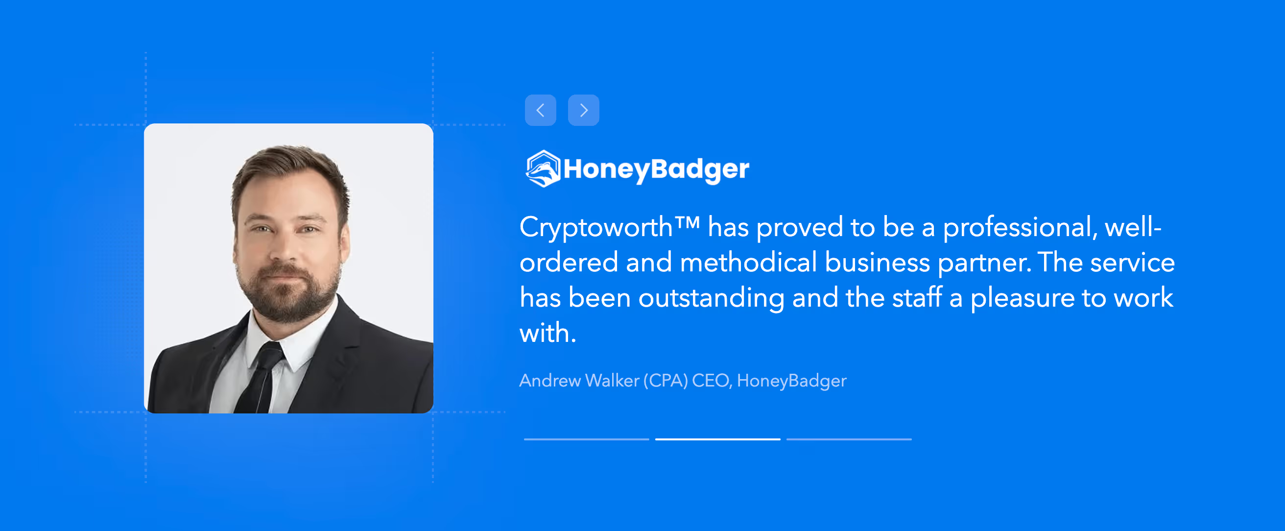
Use Real Faces and Testimonials
Faces create emotional connection. Use testimonials with headshots and names where possible. This turns abstract claims into human proof. Here's an example of such case used in CryptoworthTM.
Match Design to Ad or Entry Point
Ensure visual and message continuity. If your ad or search snippet promises one thing, the page must immediately reflect that promise. Misalignment leads to bounces.
Conversion design is strategic design. It prioritizes clarity, intent, and usability over cleverness. Your job isn’t to impress — it’s to guide.
Building and Optimizing Your Site for Conversions
You can’t improve what you don’t measure. And you can’t measure what you don’t define. High-converting websites are built with intention from the start — with clear KPIs, infrastructure, and processes in place to support continuous improvement.
Set Specific Goals and KPIs
Decide what counts as a conversion, and define the metric:
- Newsletter signup? Measure email capture rate.
- Demo request? Track form submissions per landing page.
- Purchase? Monitor checkout completions.
Then establish baseline conversion rates and set a target. Even a 1% lift can have a measurable business impact.
Choose the Right Tech Stack
The tools you use will directly impact performance:
- Fast hosting
- Lightweight, semantic code
- CMS that allows for editing, testing, and optimization (e.g. Webflow)
- CDN and image compression tools
Don’t let a slow or fragile tech foundation sabotage your conversion gains.
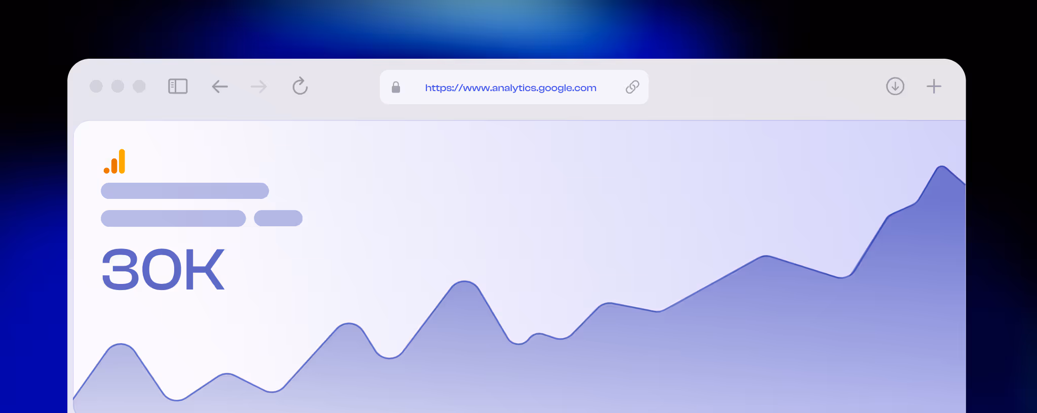
Implement Analytics and Tracking
Use Google Analytics, GA4, Hotjar, or similar to:
- Track conversions
- Identify drop-off points
- See which pages and CTAs perform best
Integrate your analytics setup during the build, not as an afterthought.
Map the Visitor Journey
Think of your site as a funnel:
- Awareness: Blog posts, social links, SEO pages
- Consideration: Feature pages, landing pages
- Decision: Pricing, demo, or contact pages
Each page should have one goal and one next step.
Use CTAs and copy to lead users naturally through this journey. Don't make them guess what happens next.
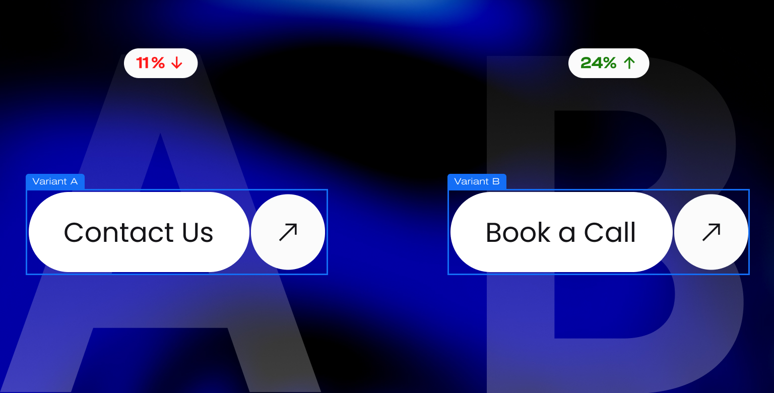
Test, Iterate, and Optimize
Adopt a CRO mindset. That means:
- Running A/B tests on headlines, buttons, layouts
- Reviewing heatmaps and session recordings
- Analyzing drop-offs in your forms or checkout flows
And most importantly, implementing what works.
Eliminate Conversion Friction
Audit all paths to conversion:
- Are your forms too long?
- Do buttons work on mobile?
- Are there broken links or unclear labels?
Each small fix removes a barrier. Together, they improve flow and boost conversion rates.
QA on All Devices
Cross-browser testing isn’t optional. Your site must:
- Load fast on mobile and desktop
- Display CTAs correctly on Chrome, Safari, Firefox
- Have functional forms and menus everywhere
A beautiful CTA doesn’t help if it doesn’t load.
Conversion optimization isn’t a one-time task. It’s a system. Build the site once, then keep refining it with better insights and sharper execution.
High-Converting Website Examples
The best and fastest way to learn is by studying what already works. The following sites demonstrate proven tactics and patterns behind successful, conversion-focused websites.
Real-World Examples
Each of these sites has been highlighted for clarity, user flow, and conversion-centric design:
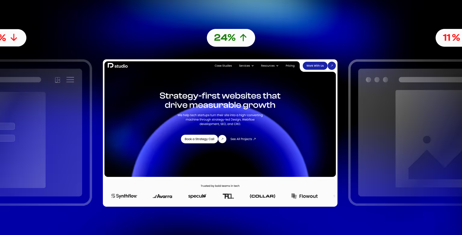
1. Webflow – SaaS
- Bold headline "Where creativity drives performance" communicates value immediately.
- Clear supporting subtext explaining what the platform enables marketers to do.
- Prominent CTAs ("Watch demo" and "Talk to sales") above the fold encourage immediate action.
- Strong trust section with recognizable client logos (Spotify, TED, Dropbox).
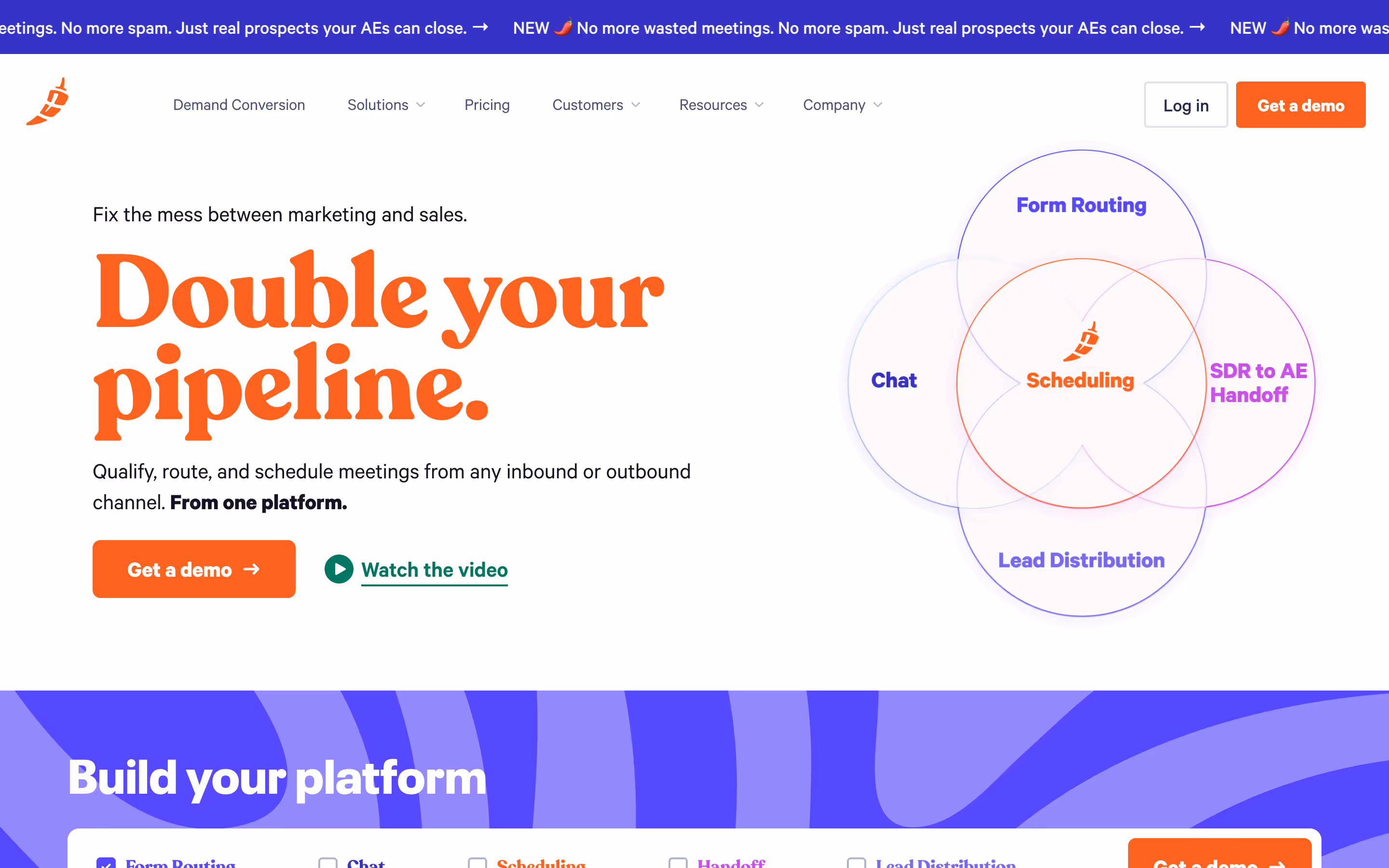
2. Chili Piper – B2B SaaS
Chili Piper is a great example of a site that converts well. Here's why:
- Powerful headline with quantified benefit ("Double your pipeline")
- Hero section with bold CTA ("Get a demo") and clear visual hierarchy
- Interactive product diagram that connects features to value (Scheduling at the center of demand gen tools)
- Platform builder section that lets the user build the sales automation product they need
- Strong use of color and contrast to highlight calls to action
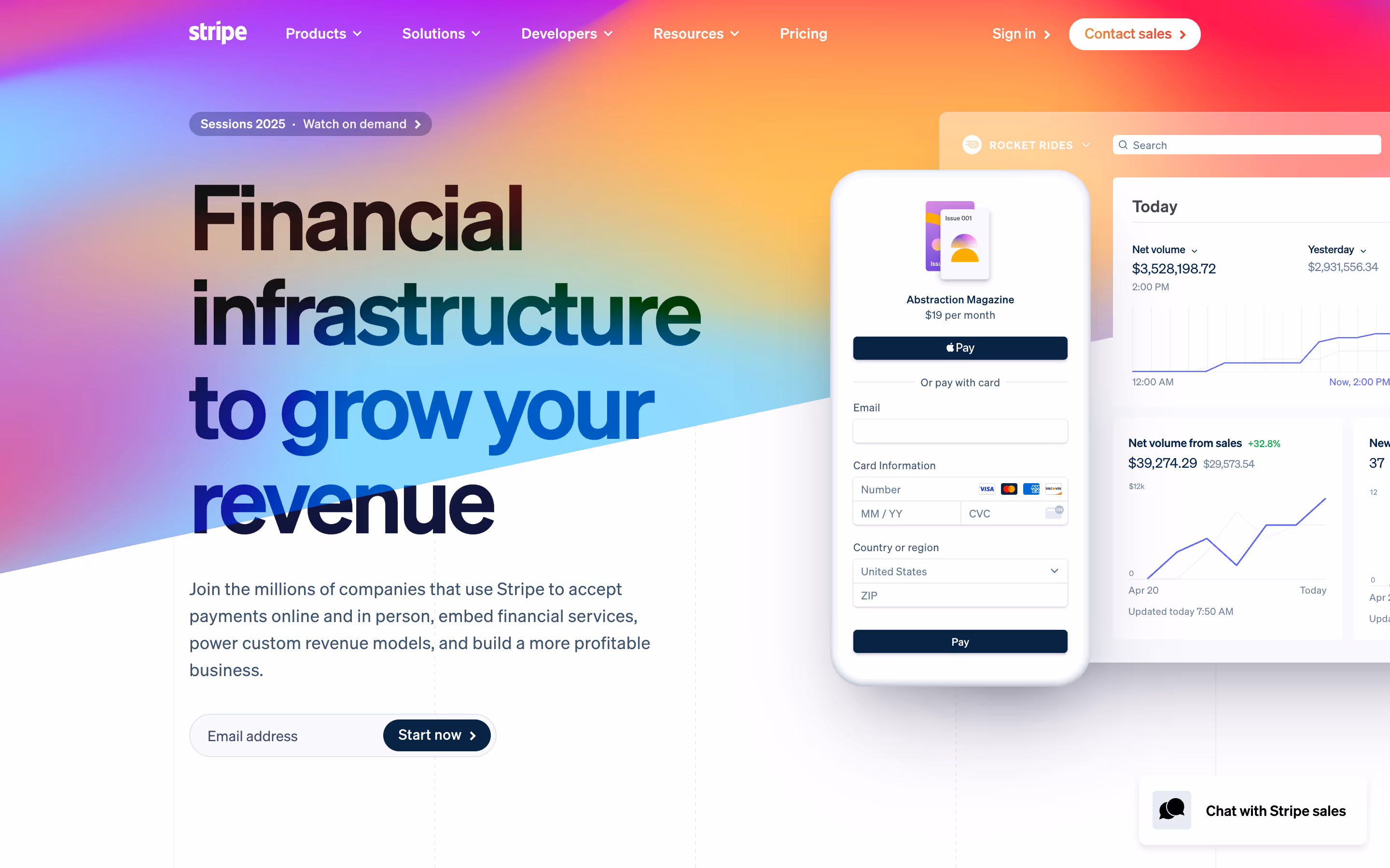
3. Stripe – Developer Tools
- Large, benefit-driven headline (“Financial infrastructure to grow your revenue”) directly states the outcome.
- Clean, modern typography and gradient visual identity create trust and draw attention to key areas.
- Embedded checkout example on the hero section visually demonstrates Stripe’s product in action.
- “Start now” email capture field positioned above the fold makes sign-up frictionless.
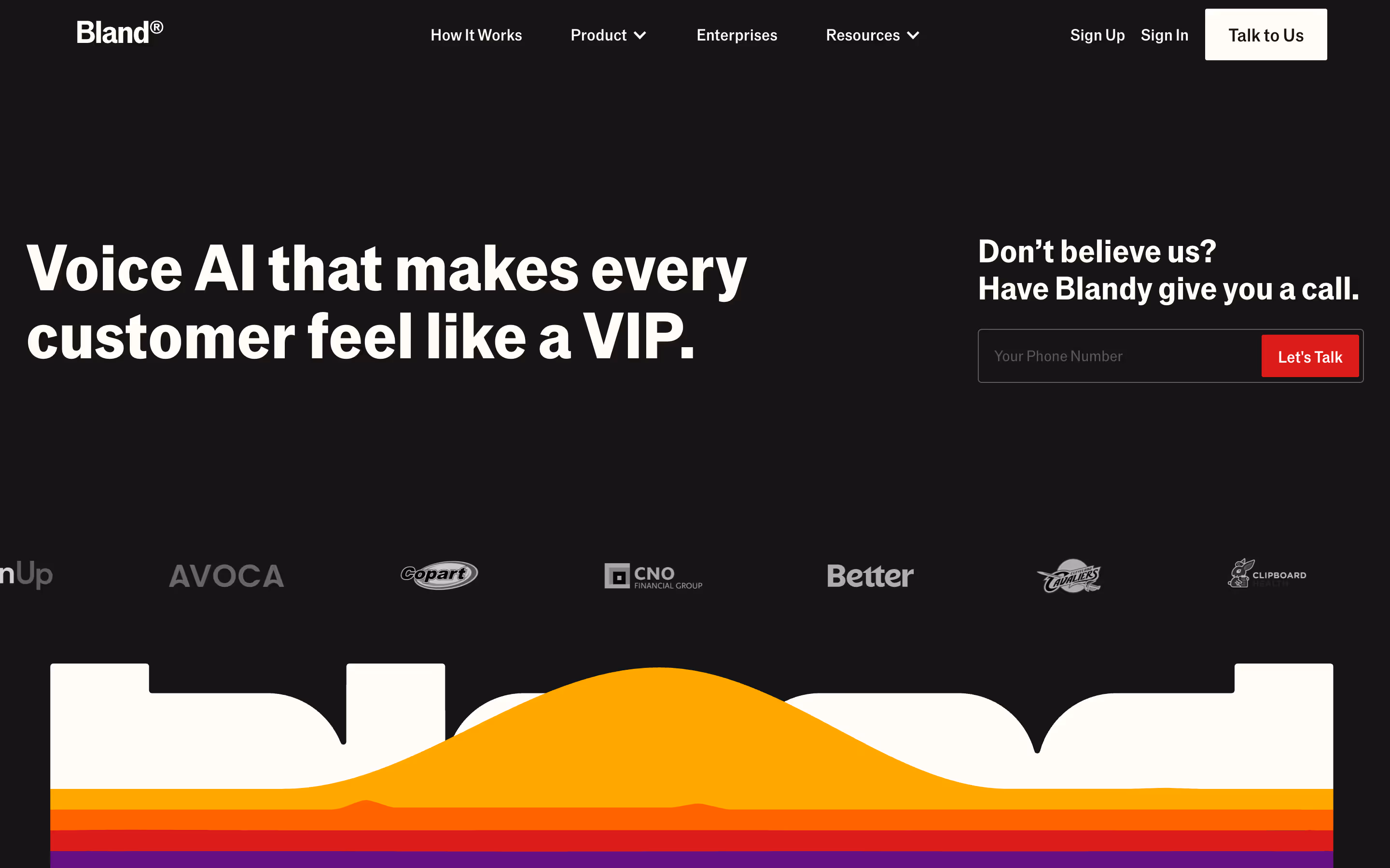
4. Bland.ai
- Headline “Voice AI that makes every customer feel like a VIP” immediately signals the benefit.
- Clean black background with high-contrast white and red elements draws the eye to CTAs.
- “Let’s Talk” form on the hero section simplifies lead capture.
- Client logos (Travelperk, Innovaccer, January, Lendi) add instant credibility.
See how we helped Bland.ai revamp their site to support their Series B raise.
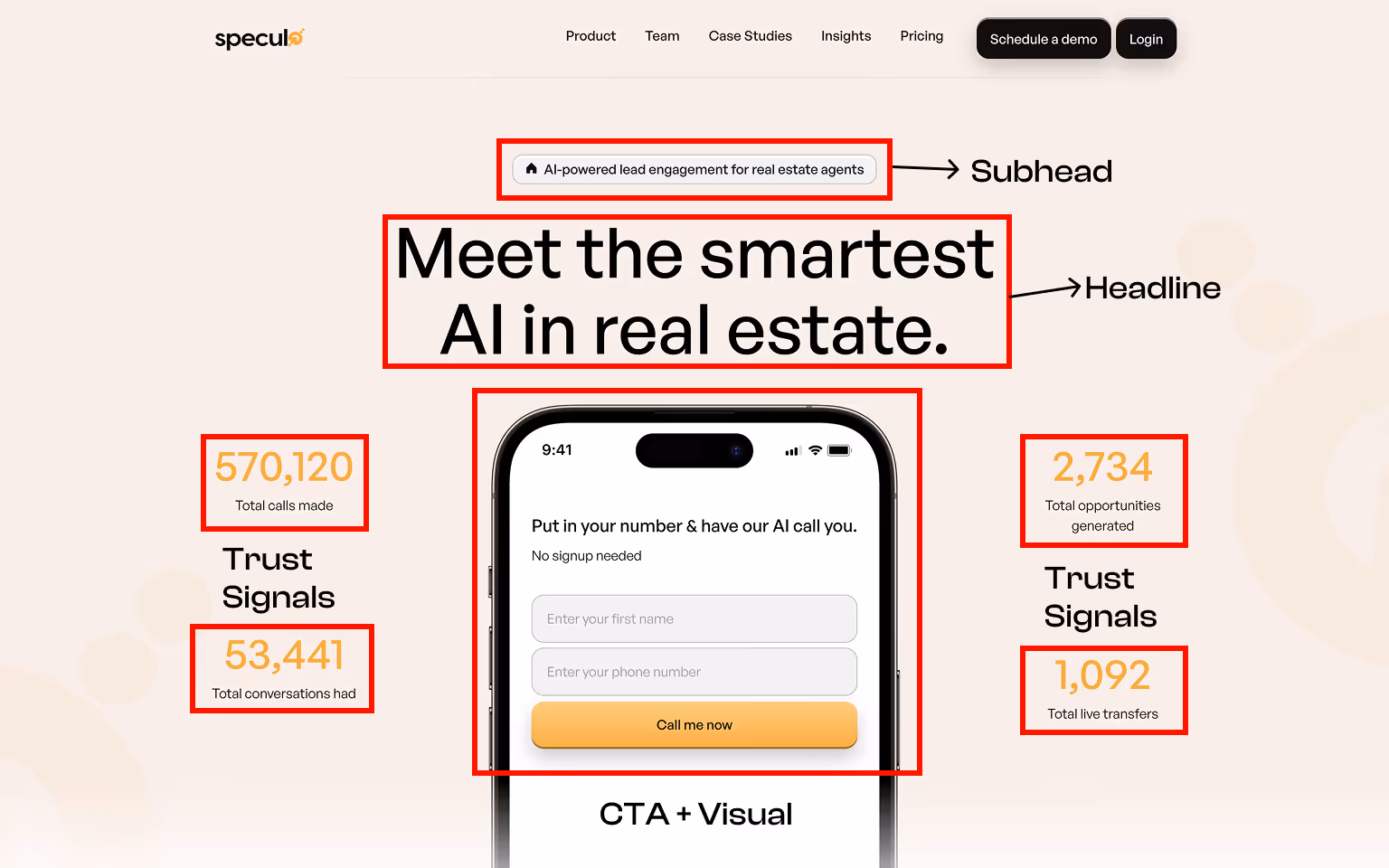
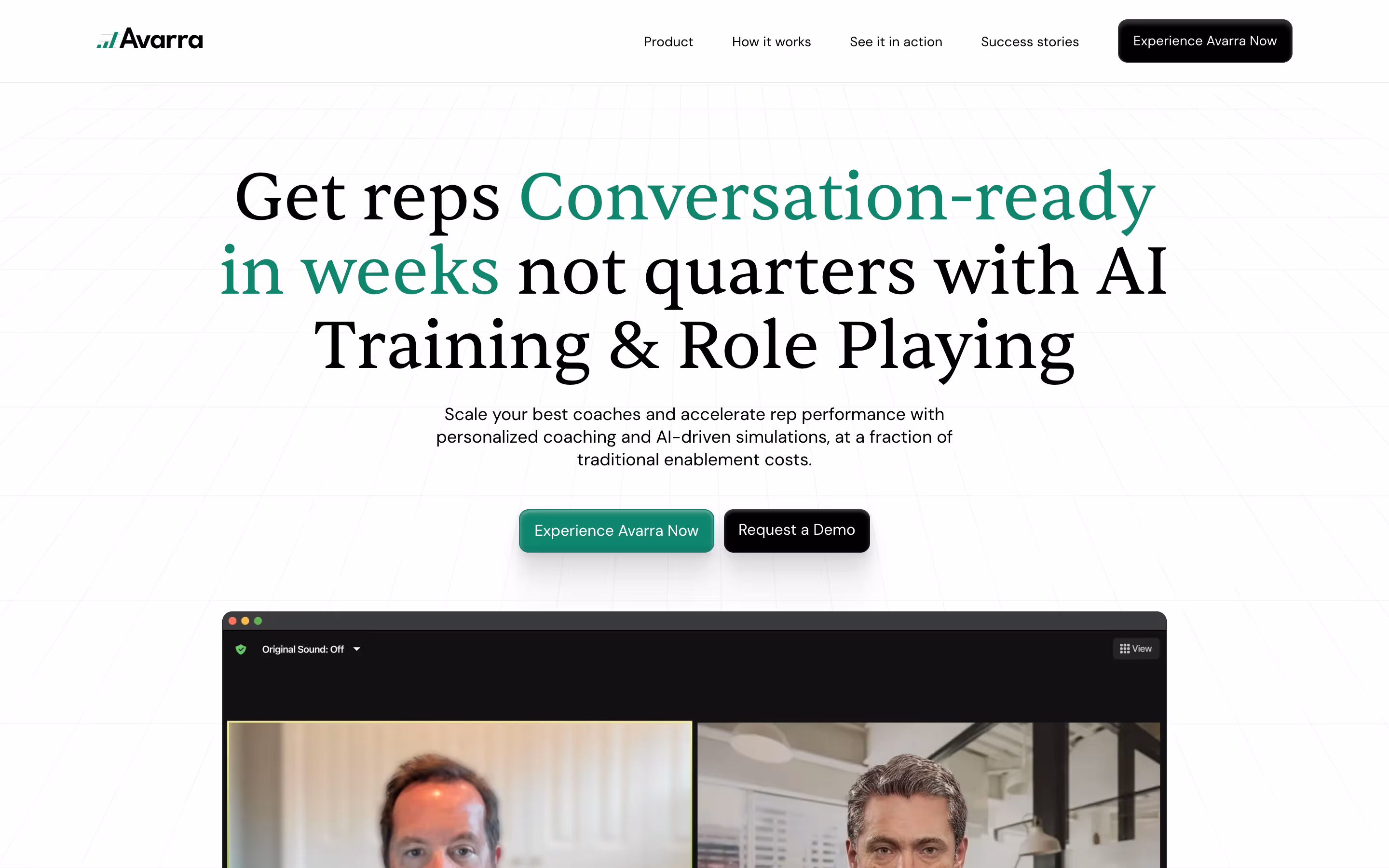
5. Avarra.ai
- Headline focuses on outcome: “Get reps conversation-ready in weeks not quarters.”
- Supporting copy highlights personalized AI training as the differentiator.
- Dual CTAs (“Experience Avarra Now” and “Request a Demo”) give visitors multiple clear actions.
- Benefit-first messaging reinforced with testimonials and success metrics further down the page.
Explore how we helped Avarra.ai reposition for enterprise buyers.
These examples showcase a balance between design, copy, and user path optimization. Want to see more examples of high-converting websites? Read our roundup of 17 Best B2B Websites in 2025 to learn what B2B brands are getting right.
Using Template Marketplaces Strategically
While Tilipman Digital doesn’t currently offer conversion-optimized templates, this article provides the principles you need to identify strong starting points.
Use marketplaces like Webflow, WordPress, Framer, or Divhunt to browse available templates. Look for layouts that already include:
- Clear above-the-fold value proposition
- Prominent CTAs
- Social proof and trust sections
- Clean content hierarchy and mobile responsiveness
Starting with a marketplace template is a faster and more affordable option than a full custom build, especially if you’re testing a new product or early-stage offer.
That said, templates are just a base. The conversion lift comes from how well you tailor the content, visuals, and UX to your offer and audience.
Need help? As a Webflow agency, Tilipman Digital specializes in custom Webflow builds, tailored to your brand and business bottom line.
Frequently Asked Questions
What is a good website conversion rate?
Across industries, conversion rates between 2% and 5% are common. For B2B and SaaS, anything above 5% is considered strong. What matters more than hitting a specific number is tracking conversion improvements. An increase from 2.4% to 3.1% could impact revenue by hundreds of thousands of dollars.
How do I calculate my website's conversion rate?
The basic formula is:
Conversion Rate = (Number of Conversions / Number of Visitors) x 100
If 50 people signed up from 2,000 visitors, your conversion rate is 2.5%.
What pages should I optimize first?
Start with your highest traffic, highest intent pages:
- Homepage
- Pricing
- Product or service landing pages
- Contact/demo request pages
Then move to blog posts with strong organic traffic — many have under-optimized CTAs or poor flow, and make sure your post-conversion experience follows best practices like those in our Thank You Page examples.
Do conversion-focused templates actually work?
When used correctly, such templates give you a simple-to-use framework. The hard and key part is tailoring it to your audience. Strong copy, brand elements, trust elements, and strong CTAs matter will make or break your campaign.
How long does it take to improve conversions?
Smaller changes (like CTA copy or button placement) can impact conversion rates within days if you have steady traffic. Bigger overhauls may take weeks to gather meaningful data. The most important thing is to test changes one at a time and measure impact.
What if I have low traffic?
Low traffic limits your ability to run statistically significant A/B tests, but you can still:
- Improve page clarity and CTAs
- Reduce friction in forms
- Make sure mobile UX is solid
- Use qualitative data (heatmaps, surveys, recordings) to identify issues
And in parallel, work on growing the traffic with content and SEO strategies.
Should I always remove navigation on landing pages?
It's one of the proven CRO tactics for high-intent landing pages. Removing navigation reduces the chance of distraction, however, it’s not a rule of thumb. Find a what works for your audience through testing.
How do I know what’s causing low conversions?
Use tools like Hotjar or Microsoft Clarity to watch user behavior. Are people scrolling but not clicking? Are they dropping off before the form? Pair this with analytics to get a full picture. The more insights you have, the better your fixes will be.
High-converting websites focus on your audience, designing every element around their decision-making process.