

A footer is a small section with an outsized job on B2B sites. It anchors navigation, builds credibility, and gives visitors a clear next step when they reach the bottom of the page.
This guide breaks down the non-negotiable elements, design best practices, and real-world examples from leading B2B brands. Use it to structure your own footer, strengthen internal linking, and add conversion paths without clutter.
Why Your Website Footer Matters for SEO & UX
Although often overlooked, a footer is a critical element that users frequently rely on. It provides an anchor for navigation, a safety net for users who scroll to the end, and a final opportunity to build trust.
From an SEO perspective, footers allow for additional internal linking and site mapping. Links placed in the footer help prevent dead ends and enable search engines to crawl and understand site structure more efficiently. They also offer space to reinforce keyword-targeted pages such as resources, case studies, or services.
From a user experience standpoint, footers are a predictable space for visitors to find information that is not always featured in the main navigation. This includes links to privacy policies, careers, contact details, or blog pages. For B2B sites, footers are essential for guiding long-sales-cycle visitors toward key decision-making content.
Finally, footers contribute to trust and credibility. By including legal information such as copyright, privacy policy, and terms of service, along with trust badges or certifications, companies can reassure potential clients that they are professional and compliant.
Key Elements of an Effective Website Footer
A well-designed B2B website footer serves both functional and strategic purposes. It should not only guide visitors but also support conversions and brand credibility. The following elements are essential:
Navigation & Utility Links
- Provide access to core site sections, often organized into columns.
- Include resources such as case studies, blog, or knowledge center.
- Add utility links like Privacy Policy, Terms, Careers, or FAQs.
Contact & Company Information
- Display company name, physical address, phone number, and email.
- For global B2B firms, consider listing office locations or linking to a locations page.
- Reinforce brand recognition with a concise company description or logo.
Legal & Trust Elements
- Always include an updated copyright notice.
- Provide links to Privacy Policy and Terms of Service.
- Showcase security certifications, industry memberships, or partner badges.
Social Media & Engagement
- Add LinkedIn and other relevant platforms for B2B networking.
- Provide newsletter signup or content subscription options.
Conversion Actions (CTAs)
- Insert a clear but secondary CTA such as "Request a Demo" or "Contact Sales."
- Encourage engagement with case studies, webinars, or whitepapers.
By combining these elements, a footer becomes more than a structural afterthought. It acts as a powerful reinforcement of trust, usability, and conversion goals.
Website Footer Design Best Practices
Designing a footer for B2B websites requires balancing clarity with usability. Working with a B2B web design agency can help ensure your footer is optimized for usability while supporting long-term conversion goals. A strong design ensures that critical information is accessible without overwhelming the visitor.
Visual Clarity
- Use a contrasting background to visually separate the footer from the main body.
- Maintain consistent brand styling without making the section too busy.
- Ensure text size and color contrast support accessibility.
Organized Layout
- Group related items under clear headings.
- Limit the number of links per column to avoid clutter.
- Use a grid system or multi-column layout for clarity.
Responsive Design
- Ensure all footer elements are easy to use on mobile devices.
- Collapse columns into expandable sections on smaller screens.
Consistency
- Match typography and design patterns used throughout the website.
- Ensure all links and CTAs in the footer are functional and up-to-date.
Simplicity & Efficiency
- Keep the footer concise while covering essential content.
- Avoid bloated designs that increase page load time or confuse users.
Following these best practices helps create footers that improve navigation, enhance SEO, and provide a final chance to connect with potential clients.
Inspiring B2B Website Footer Examples
Studying real-world B2B websites offers clear insight into how strong footers are designed and implemented. Below are three examples highlighting different approaches:
AI & B2B Startup Footer Examples
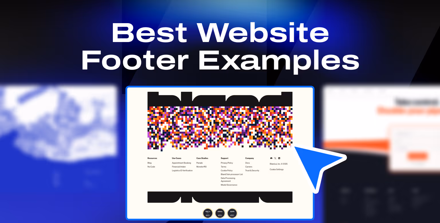
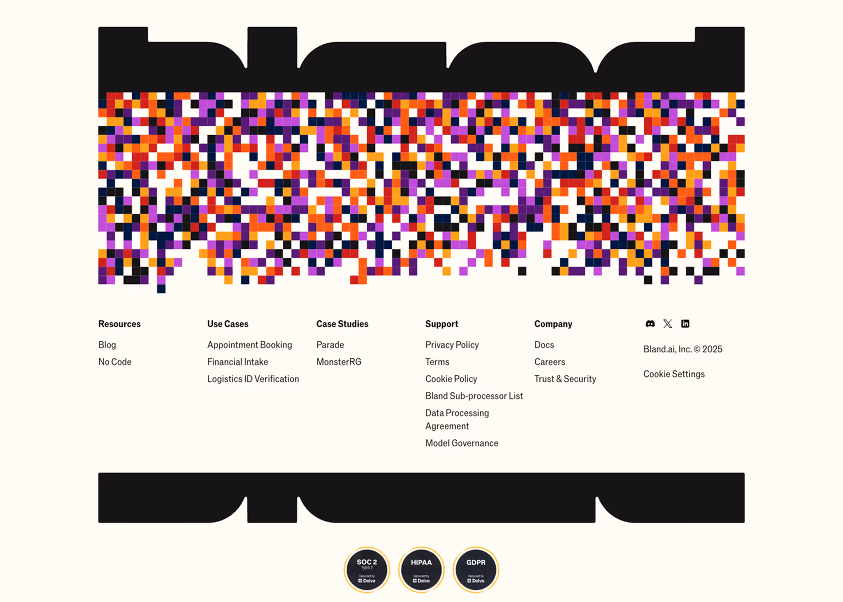
Bland.ai
Bland.ai provides AI-powered outbound calling solutions for businesses, used by sales and marketing teams to scale personalized outreach.
What we like:
- Bold and colorful branded visual branding integrated into the footer design
- Well-structured categories: Resources, Use Cases, Case Studies, Support, and Company
- Direct access to career and trust/security pages
What works well in the footer:
- Prominent compliance and trust indicators (SOC 2, HIPAA, GDPR badges)
- Clear separation of legal links (Privacy, Terms, Cookie Policy)
- Customer case studies highlighted to build credibility
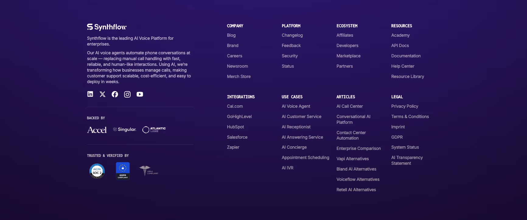
Synthflow.ai
Synthflow.ai is an AI voice platform for enterprises, helping automate customer interactions and call handling at scale.
What we like:
- Extremely comprehensive mega-footer with multiple categories: Company, Platform, Ecosystem, Resources, Integrations, Use Cases, and Articles
- Direct integration links to key platforms like Salesforce, Zapier, and HubSpot
- Inclusion of a newsroom, careers, and merch store to reinforce brand identity
What works well in the footer:
- Clear visibility of trust and compliance badges (SOC 2, GDPR, HIPAA)
- Extensive use cases and article links optimized for SEO
- Easy access to legal and transparency statements for enterprise credibility
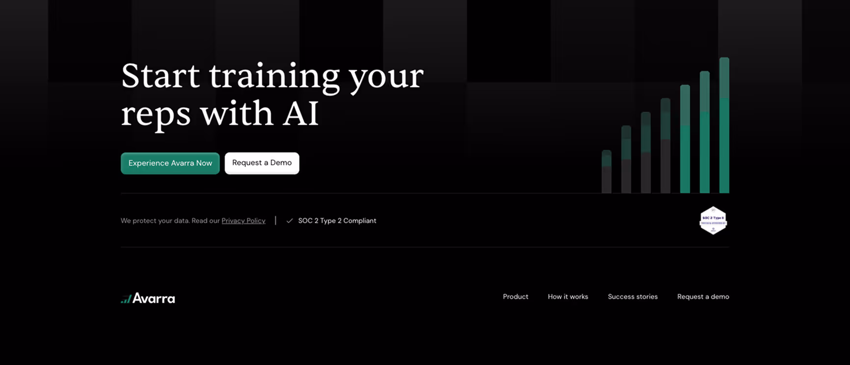
Avarra.ai
Avarra.ai is an AI coaching platform designed for GTM leaders and sales teams.
What we like:
- Clean and minimalist footer design that maintains a professional look
- Integrated branded graph showcasing business outcomes with the use of Avarra
- Simple navigation links: Product, How it Works, Success Stories, Request a Demo
- Highlighted SOC 2 Type 2 compliance badge for trust
What works well in the footer:
- Prominent conversion actions with “Experience Avarra Now” and “Request a Demo” buttons above the footer
- Privacy Policy clearly linked with compliance messaging
- Balanced simplicity that keeps focus on conversion and credibility
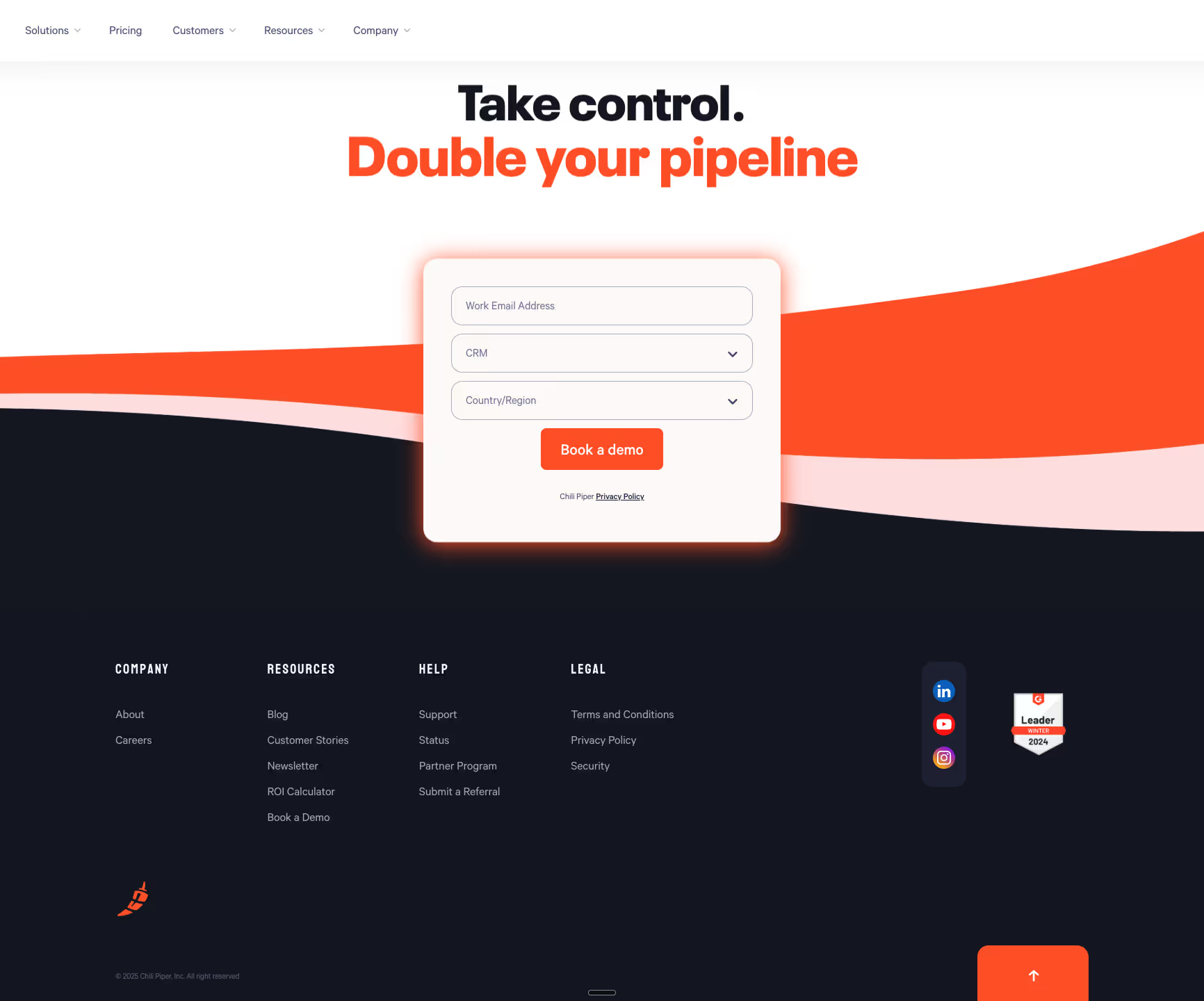
Chili Piper
Chili Piper is a scheduling and lead routing platform for revenue teams.
What we like:
- Conversion-focused footer with an embedded demo booking form
- Organized categories: Company, Resources, Help, and Legal
- Resource-rich: includes ROI calculator, newsletter, and customer stories
- Branded wave going over the footer
What works well in the footer:
- Social media links and G2 Leader badge to reinforce credibility
- Clear legal compliance with Terms, Privacy, and Security links
- Strong CTA presence to capture leads directly from the footer
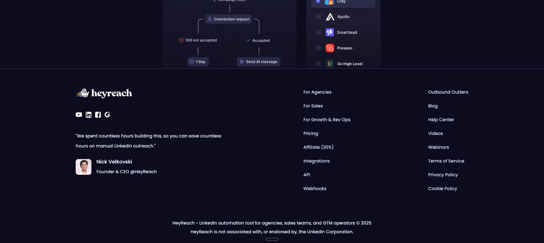
Heyreach
Heyreach is an outreach automation platform designed for sales, growth, and GTM teams.
What we like:
- Personalized founder message adds authenticity and credibility
- Strong navigation categories segmented by user type: Agencies, Sales, Growth & Rev Ops
- Social media icons clearly displayed
What works well in the footer:
- Direct links to pricing, integrations, API, and webhooks for technical buyers
- Additional resources such as blogs, videos, and webinars
- Legal and compliance links included for trustworthiness
Sevalla
Sevalla is a hosting and deployment platform by Kinsta, used by developers and businesses to manage web projects.
What we like:
- Clear security focus with certifications (SOC II Type 2, ISO 27001, GDPR, CCPA)
- Well-structured categories: Products, Resources, Company, and Legal
- System status and changelog links included
What works well in the footer:
- Transparency around security with certification highlights
- Simple layout with easily scannable columns
- Footer balances product detail with brand trust messaging

Spellbook
Spellbook is a legal AI suite used by law firms and in-house legal teams to draft and review contracts.
What we like:
- Professional, minimalist design consistent with legal branding
- Clear product and resource categories with helpful links (Clause Library, Customer Stories)
- SOC 2 compliance highlighted
- Playful diamond illustration coming from the bottom of the screen
What works well in the footer:
- Direct and easy access to About, Careers, and Press pages
- Legal links (Privacy, Refund, Terms) displayed for compliance
- Emphasis on security and credibility reinforced by compliance badge

SaaS & Tech Platform Footer Examples
SaaS and tech platforms often serve global audiences and need their websites to balance usability with scalability. Footers in this category are not just navigational aids, they are key real estate for product discovery, integrations, compliance, and community building. The following website footer examples show how leading SaaS platforms use footer design to strengthen credibility and improve user experience.
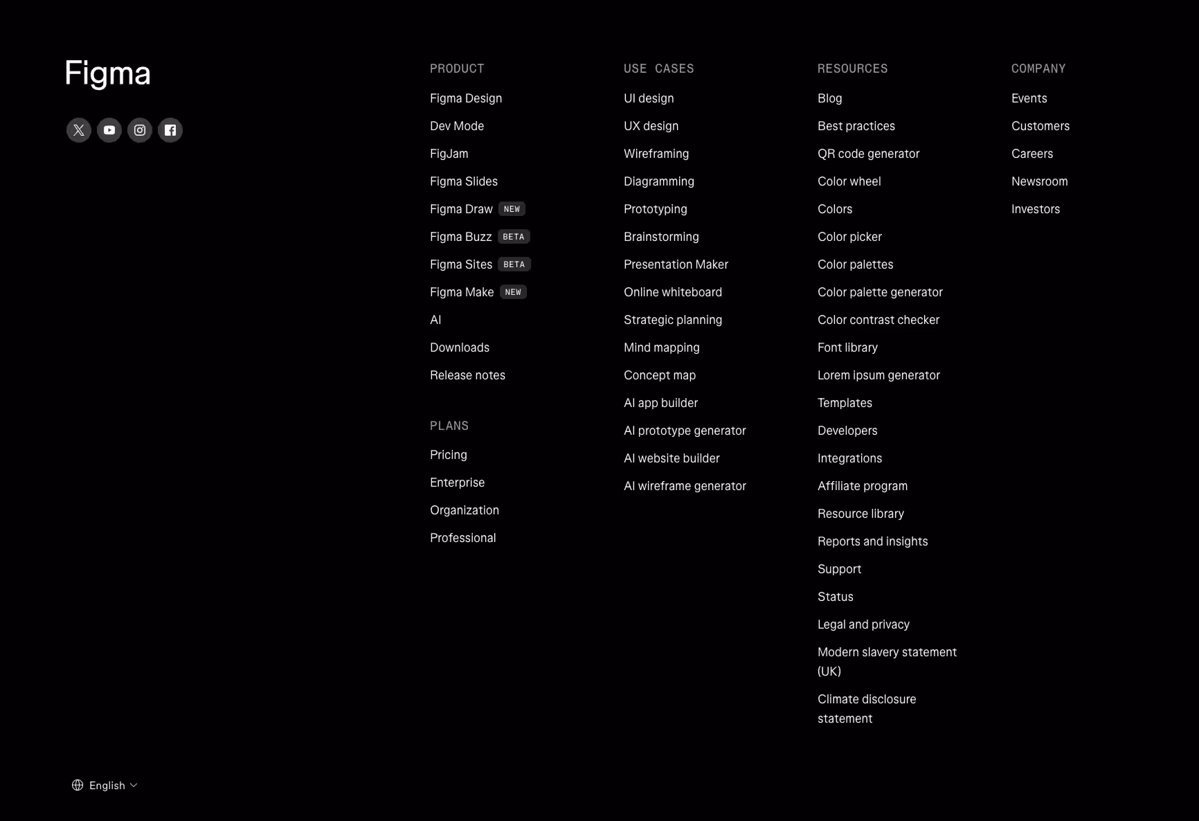
Figma
Figma is a collaborative interface design platform widely used by product teams, developers, and enterprises.
What we like:
- Mega-footer layout with clear segmentation across Product, Use Cases, Resources, and Company.
- Inclusion of product betas and new features directly in the footer (Figma Buzz, Figma Sites, Figma Make).
- Developer-friendly with integrations, templates, and documentation linked.
What works well in the footer:
- Legal and compliance links like Modern Slavery Statement and Climate Disclosure Statement for enterprise trust.
- Comprehensive resource links that support both designers and developers.
- Multilingual option, making the footer globally accessible.
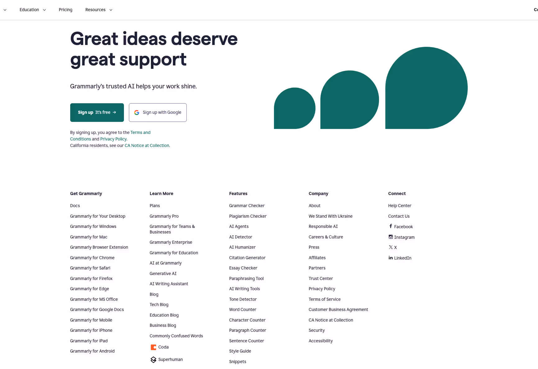
Grammarly
Grammarly provides AI-powered writing assistance tools for individuals, businesses, and educational institutions.
What we like:
- Multi-column structure clearly divided into Get Grammarly, Learn More, Features, Company, and Connect.
- Strong emphasis on AI features like AI Agents, AI Detector, and Generative AI.
- Inclusion of blogs by category (tech, business, education) for content depth.
What works well in the footer:
- Social responsibility pages (We Stand With Ukraine, Responsible AI) that align with brand values.
- Clear compliance and trust links: Privacy, Security, Accessibility.
- Well-labeled customer agreements and policies tailored for enterprise adoption.
Webflow
Webflow is a visual development platform used by designers, agencies, and enterprises to build custom websites without code. If you want a more detailed answer to the question of what is Webflow, our guide will be able to help you.
What we like:
- Expansive footer covering Product, Solutions, Resources, Company, Community, and Get Help.
- Dedicated Community section for partners, affiliates, and template designers.
- Resources hub includes customer stories, webinars, and libraries for multiple audiences.
What works well in the footer:
- Clear segmentation of content for different ICPs: freelancers, startups, enterprises.
- Accessibility and compliance links prominently placed.
- Hiring CTA (“We’re Hiring”) featured in the Company column.
As a Webflow development agency, we've seen how strategic footer design directly improves conversions for B2B clients, and Webflow does a wonderful job.

Zapier
Zapier is an automation platform connecting thousands of apps for businesses and individuals.
What we like:
- Footer prioritizes integrations and app discovery with searchable lists.
- Strong SEO-oriented layout with “Top Searches,” “Popular Apps,” and “Trending Apps.”
- Call-to-action banner above the footer (“Start free with email” / “Contact Sales”).
What works well in the footer:
- Partner and developer platform links clearly accessible.
- Social icons visible alongside compliance links.
- Alphabetical app navigation promotes scalability and user self-service.

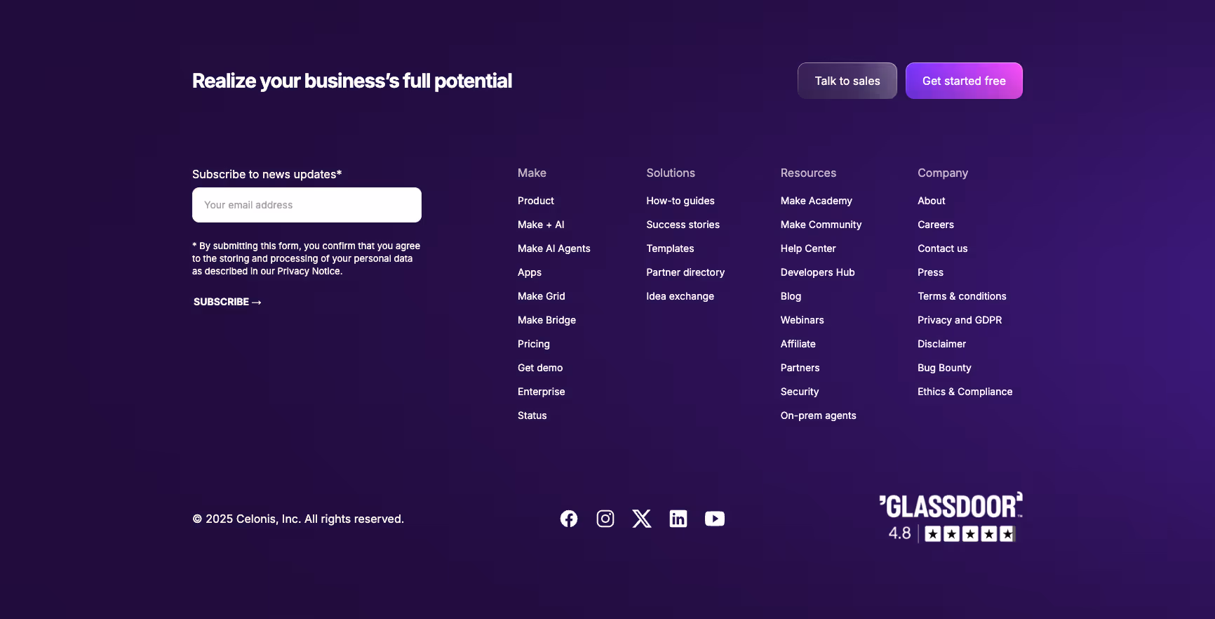
Make (formerly Integromat)
Make is a visual automation platform that enables teams to connect apps and automate workflows.
What we like:
- Balanced design combining CTAs (“Talk to Sales” / “Get Started Free”) with resources.
- Multi-column navigation covering Make, Solutions, Resources, and Company.
- Newsletter subscription form included in the footer.
What works well in the footer:
- Strong trust and compliance presence with Ethics & Compliance, Privacy, and Security pages.
- Career and press links provide transparency and employer branding.
- Resource-rich with developer hubs, success stories, and templates.
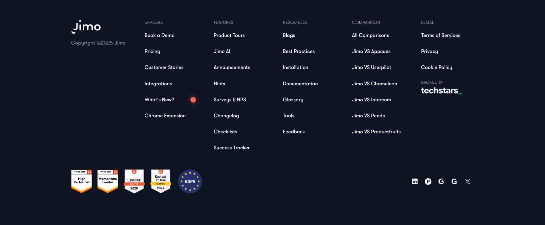
Jimo
Jimo is a product adoption and user engagement platform designed for SaaS teams.
What we like:
- Rich footer navigation including Explore, Features, Resources, and Comparisons.
- Competitive comparison links (e.g., Jimo vs Appcues, Jimo vs Intercom).
- Display of G2 awards and GDPR badge.
What works well in the footer:
- Clear customer credibility through reviews and awards.
- Links to product demos and customer stories create conversion paths.
- Techstars backing included for trust and recognition.
Popcorn
Popcorn is a collaborative research and productivity platform.
What we like:
- Unique footer organization into “The Good,” “The Boring,” and “The Cool.”
- Simple design that reinforces brand personality.
- Social media presence streamlined to key channels.
What works well in the footer:
- Clear separation of legal links under “The Boring.”
- Playful yet functional design that supports brand differentiation.
- Concise navigation avoids overwhelming the user.

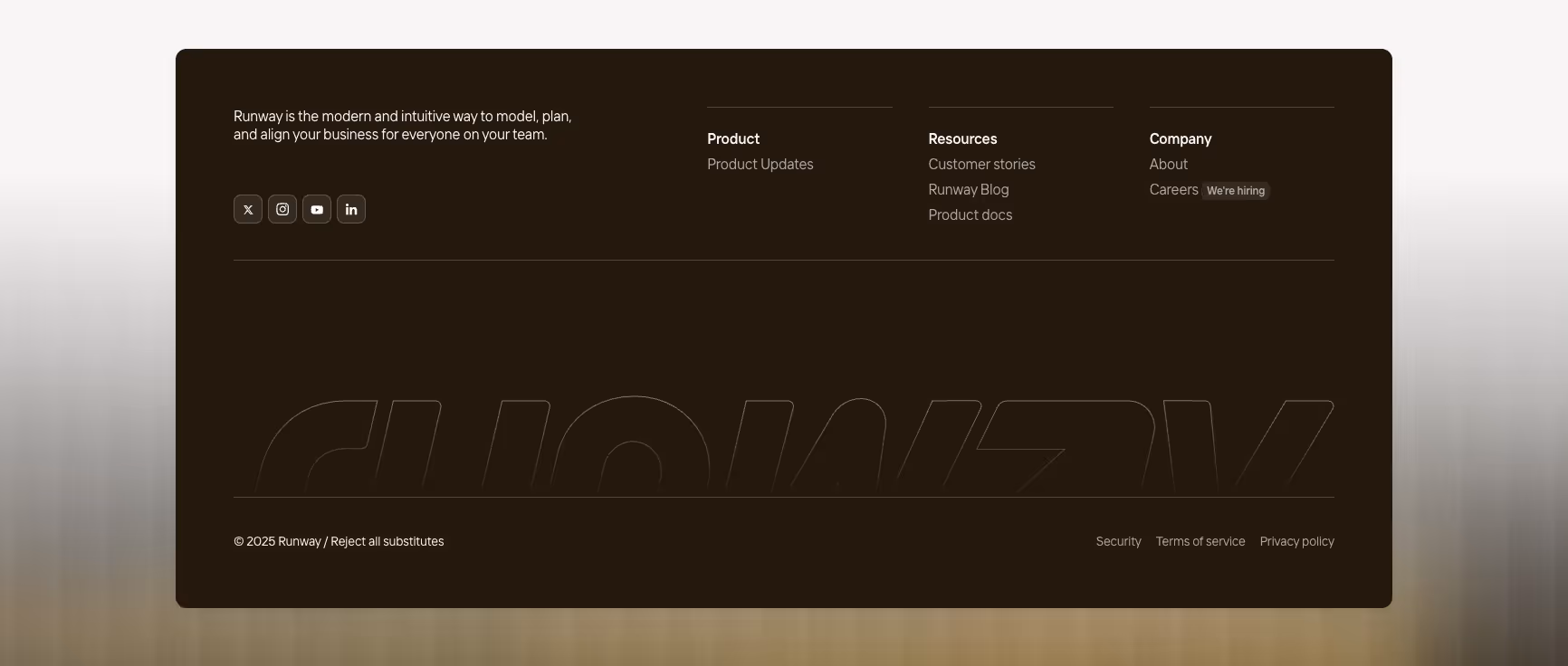
Runway
Runway is a collaborative financial planning platform for businesses.
What we like:
- Minimalist footer design focusing on essentials.
- Columns include Product, Resources, and Company, avoiding clutter.
- Social media icons are cleanly displayed.
What works well in the footer:
- Career CTA (“We’re Hiring”) included in the Company section.
- Compliance and security links placed alongside Terms and Privacy.
- Clear branding with a subtle, modern design that aligns with product identity.
Finance, Impact & Payments Footer Examples
The finance, payments, and impact sectors operate in a space where trust, compliance, and clarity are non-negotiable. These brands often balance regulatory disclosures, credibility signals, and easy navigation for multiple stakeholder groups — from investors and regulators to customers and partners. Their footers tend to be denser with resources, policies, and certifications, but they also use design to soften the complexity and build confidence.
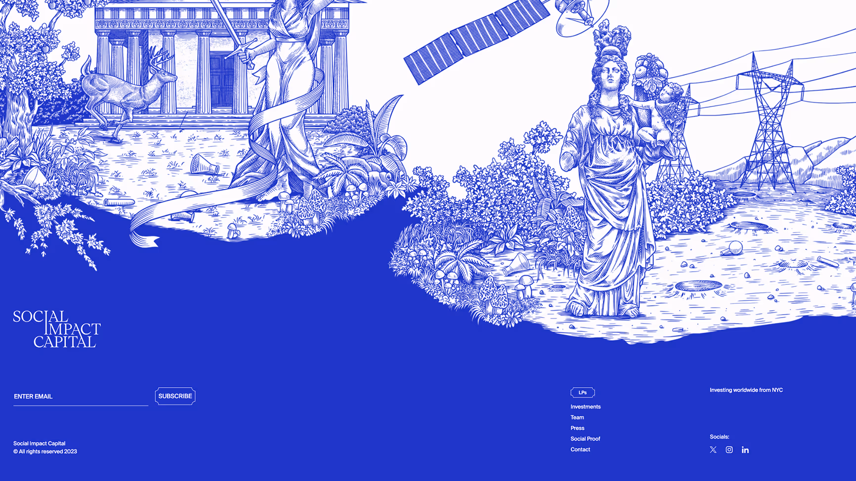
Social Impact Capital
Social Impact Capital is a venture capital firm based in NYC, backing startups with strong sustainability and social impact missions. Their audience includes institutional investors, startups, and partners seeking purpose-driven investments.
What we like
- Strong illustrative style that conveys the brand’s mission visually
- Prominent email subscription, inviting LPs and readers to stay in touch
- Clear global positioning (“investing worldwide from NYC”)
What works well in the footer
- Balanced use of visuals and functional links
- Clear segmentation for LPs (Investments, Team, Press, Social Proof)
- Minimal but effective social links
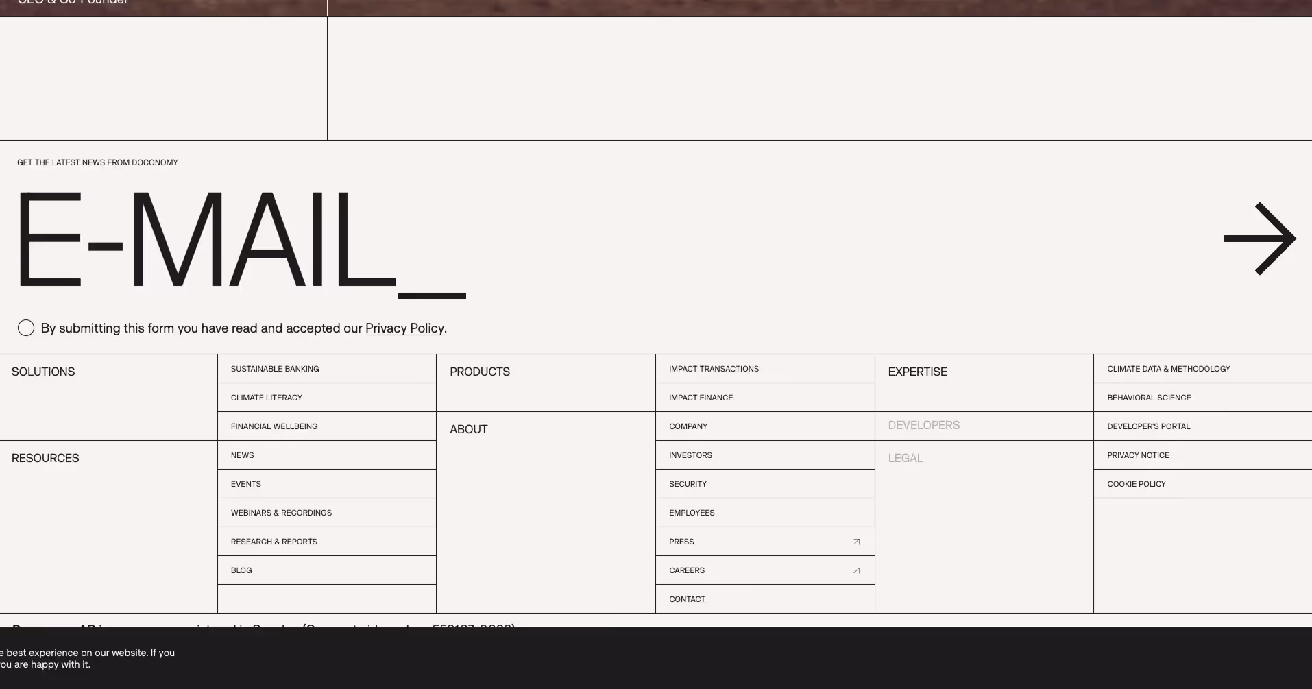
Doconomy
Doconomy is a climate fintech company offering tools and insights to measure and reduce environmental impact. Their ICP includes banks, enterprises, and consumers focused on sustainability and carbon literacy.
What we like
- Highly structured, almost grid-like footer layout
- Bold email capture CTA that reflects their strong branding style
- Coverage of both financial wellbeing and climate expertise
What works well in the footer
- Clear categorization (Solutions, Products, Expertise, Resources, About)
- Dedicated space for developers and legal compliance
- Strong educational positioning with reports, webinars, and blogs
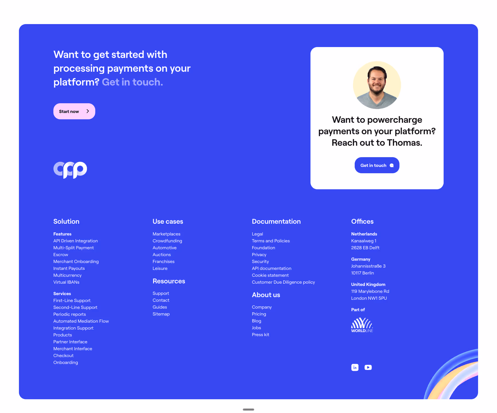
Online Payment Platform
Online Payment Platform (OPP) provides specialized payment solutions for marketplaces, platforms, and businesses handling complex transactions. Their ICP includes B2B marketplaces, crowdfunding platforms, and enterprise SaaS providers.
What we like
- Personable touch with a human face and direct “reach out” CTA
- Friendly design that makes payments feel approachable
- Extensive categorization of solutions and use cases
What works well in the footer
- Detailed breakdown of services (escrow, onboarding, periodic reports, etc.)
- Global office locations displayed for credibility
- Strong resource library (support, guides, contact)
Optibase
Optibase offers advanced A/B testing and conversion optimization tools, often used by product and marketing teams to validate hypotheses and improve UX. Their ICP includes SaaS companies, marketers, and data-driven growth teams.
What we like
- Compact but resource-rich footer layout
- Credibility reinforced through G2 ratings and GDPR compliance badges
- Extensive resources for A/B testing education
What works well in the footer
- Clear separation between product, company, and resources
- Educational resources (sample size calculators, testing ideas library)
- Easy comparison and support links for users

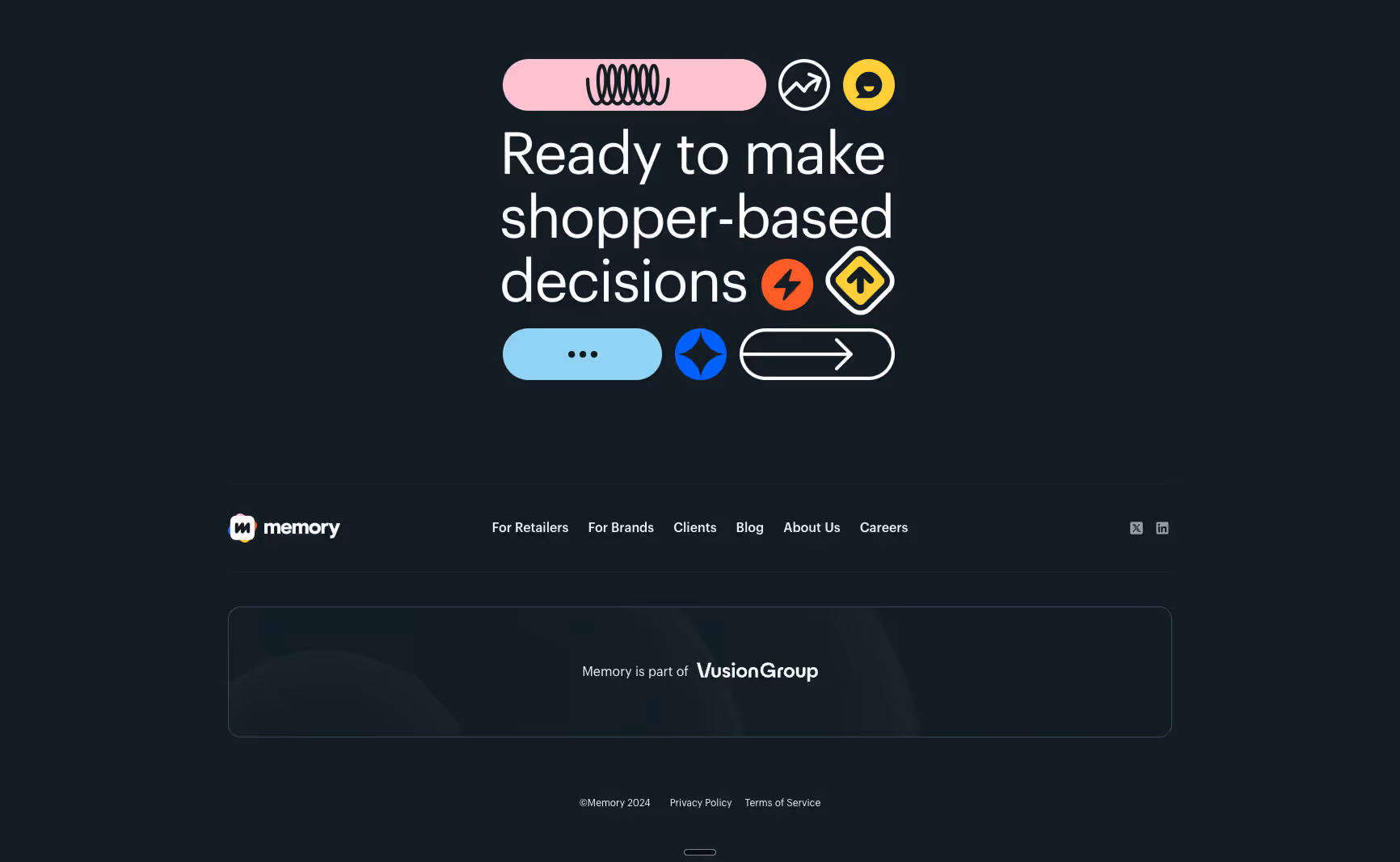
Inthememory
Inthememory (part of Vusion Group) provides retail analytics and shopper-based decision tools, helping brands and retailers optimize their strategies. Their ICP includes retailers, CPG brands, and shopper insights teams.
What we like
- Clean and minimalist design for easy scanning
- Explicit reference to parent company (Vusion Group) builds trust
- Straightforward navigation with key stakeholder links (Retailers, Brands, Clients)
What works well in the footer
- Clear and minimal structure that avoids overwhelming users
- Essential policies and copyright displayed simply
- Social icons and blog integration without clutter
Creative Agencies & Studios Footer Examples
Creative agencies and studios often design footers that reflect their brand’s personality, balancing aesthetics with essential navigation. Below are some standout examples that show how design-driven companies use footers to make an impression while keeping usability intact.
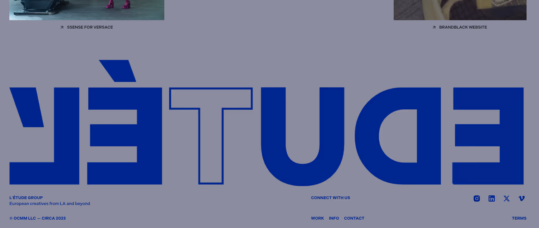
L’Étude Group
L’Étude Group is a collective of European creatives with roots in Los Angeles, working across branding, design, and creative direction.
What we like:
- Bold typographic treatment of the brand name in the footer
- Minimalist layout that places the focus on identity
- Clear and simple navigation for work, info, and contact
What works well in the footer:
- Links to social channels (Instagram, LinkedIn, X, Vimeo)
- Clean use of whitespace and oversized branding as a design element
- A distinct style that reinforces their creative ethos
Co-Labs
Co-Labs is a collaborative workspace and community in Melbourne, supporting startups, researchers, and innovative businesses.
What we like:
- Inclusion of community acknowledgment, showing cultural respect
- Clear contact information across multiple locations
- Call-to-action to join the ecosystem and stay updated
What works well in the footer:
- Prominent newsletter subscription box
- Organized layout with quick access to services, principles, and journal
- Social links for ongoing engagement

Hasko
Hasko is an investment company based in Stockholm with a focus on long-term value creation.
What we like:
- Minimalist design that communicates professionalism
- Grid pattern background adds subtle visual interest
- Clear and straightforward contact and address details
What works well in the footer:
- Focus on vision, support, and portfolio companies
- Direct access to team and news sections
- Social integration with LinkedIn for credibility

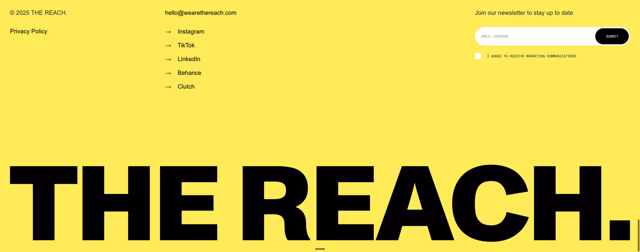
The Reach
The Reach is a creative agency blending bold design with marketing strategy to help brands extend their influence.
What we like:
- Bright, high-contrast yellow background that instantly grabs attention
- Large brand typography creating strong identity
- Direct email contact placed at the top for accessibility
What works well in the footer:
- Simple privacy policy placement
- Easy-to-access newsletter signup form
- Multiple social platforms for outreach (Instagram, TikTok, LinkedIn, Behance, Clutch)
Bunsen Studio
Bunsen Studio is a design agency specializing in branding and digital experiences.
What we like:
- Gradient background that gives the footer a modern and dynamic feel
- Strong CTA at the top: “Ready to light it up?”
- Clean division of footer content into What, Who, and Connect
What works well in the footer:
- Concise navigation to services, work, and team pages
- Contact details and social links easily accessible
- Minimalist style with a vibrant accent, aligning with their creative focus

Frequently Asked Questions (FAQs)
What should my website footer include?
Your footer should always include company contact details, essential navigation links, and legal information like copyright and privacy policy. For B2B sites, add CTAs such as "Request a Demo" or links to resources like whitepapers.
How does a footer help SEO and user experience?
Footers improve SEO by adding internal links and making the site structure clearer for search engines. For users, footers act as a reliable place to find key information or links that may not appear in the main navigation.
Should I put a CTA or form in the footer?
Yes. A footer is an ideal spot for secondary CTAs, such as newsletter signups or demo requests. It’s the final chance to engage visitors before they leave the site.
How long or complex should my footer be?
Keep it concise. Cover the essentials without overwhelming visitors. Use clear categories and avoid cramming in every possible link.
What’s special about B2B footers versus B2C?
B2B footers often highlight case studies, compliance information, and professional networks like LinkedIn. They focus on building authority and guiding prospects toward conversions rather than retail sales.